Warning: Image is too big to fit on screen; displaying at 67%
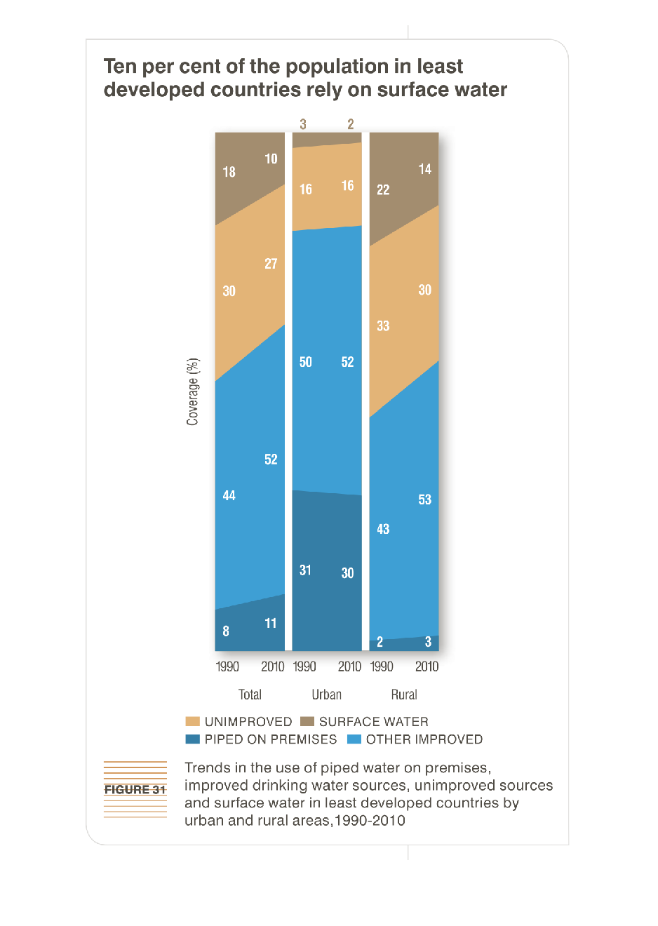
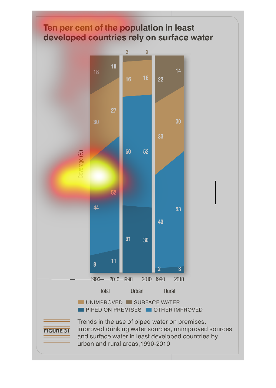
This chart describes that ten percent of the population in least developed countries rely
on surface water. Categories on the chart include unimproved and improved.
Warning: Image is too big to fit on screen; displaying at 67%
Warning: Image is too big to fit on screen; displaying at 67%
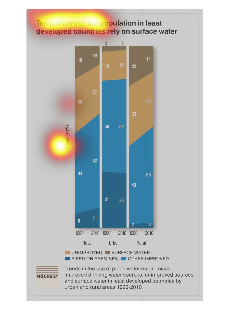
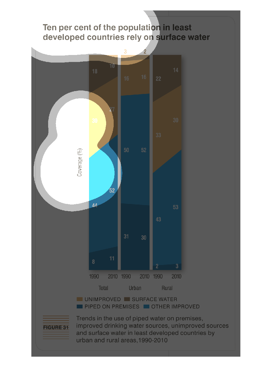
The figure presented is titled Ten per cent of the population in least developed countries
rely on surface water.  The figure is a representation of water.
Warning: Image is too big to fit on screen; displaying at 67%
Warning: Image is too big to fit on screen; displaying at 67%
ten percent of the population in least developed countries rely on surface water. Y axis is
coverage percent, X axis is the years 1990-2010, three columns from the acess showing total,
urban and rural. Urban made drastic improvements, with rural trailing far behind
Warning: Image is too big to fit on screen; displaying at 67%
Warning: Image is too big to fit on screen; displaying at 67%
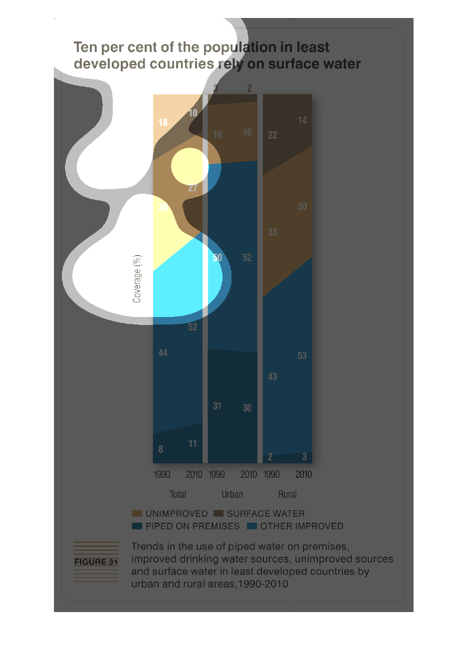
This chart describes that ten percent of the population in least developed countries rely
on surface water. The chart covers the years 1990 through to 2010.
Warning: Image is too big to fit on screen; displaying at 67%
Warning: Image is too big to fit on screen; displaying at 67%
An infographic showing that ten percent of the populations in the least developed countries
depend solely on surface water. Shows this figure has increased in recent years
Warning: Image is too big to fit on screen; displaying at 67%
Warning: Image is too big to fit on screen; displaying at 67%
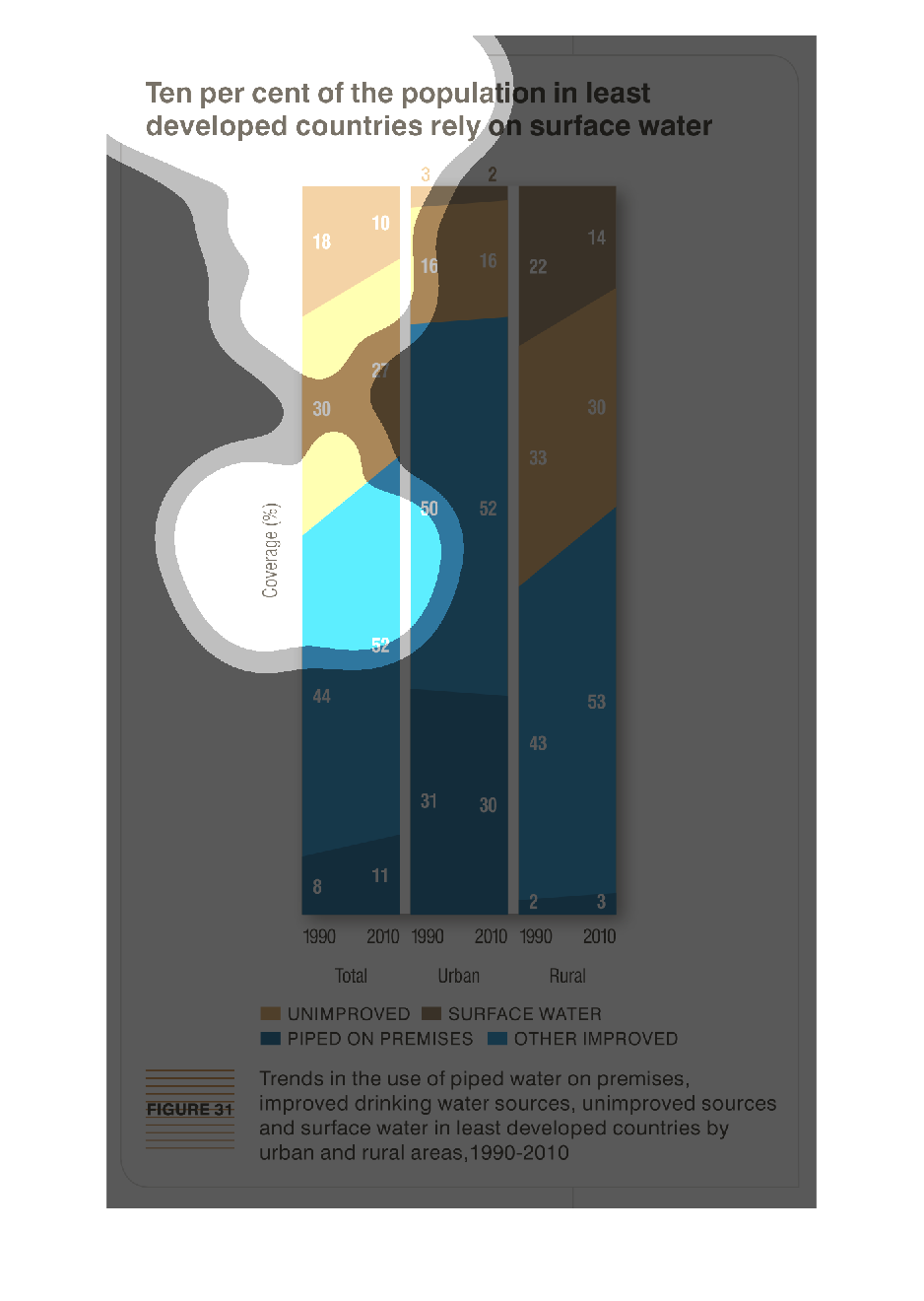
This is a graph that shows that ten percent of the total population in developed countries
at least rely on the use of surface water and it compares the years 1990 and 2010.
Warning: Image is too big to fit on screen; displaying at 67%
Warning: Image is too big to fit on screen; displaying at 67%
This graph shows the total, rural, and urban levels of different types of water with there
being clearly more improved water in the urban areas but increase in surface water in the
rural areas
Warning: Image is too big to fit on screen; displaying at 67%
Warning: Image is too big to fit on screen; displaying at 67%
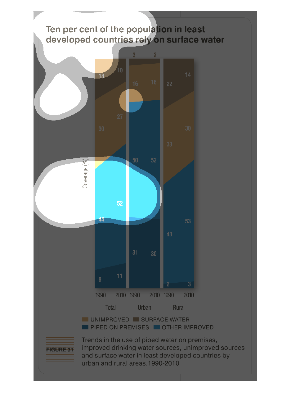
This chart shows residents of devolved countries rely on surface water. It is separated in
groups of unimproved, surface water, piped on premises and other improved,
Warning: Image is too big to fit on screen; displaying at 67%
Warning: Image is too big to fit on screen; displaying at 67%
The graph shows that ten percent of the population in the least developed countries rely on
surface water. in 1990 18 countries relied on surface water. Then in 2000 only 10 did.
Warning: Image is too big to fit on screen; displaying at 67%
Warning: Image is too big to fit on screen; displaying at 67%
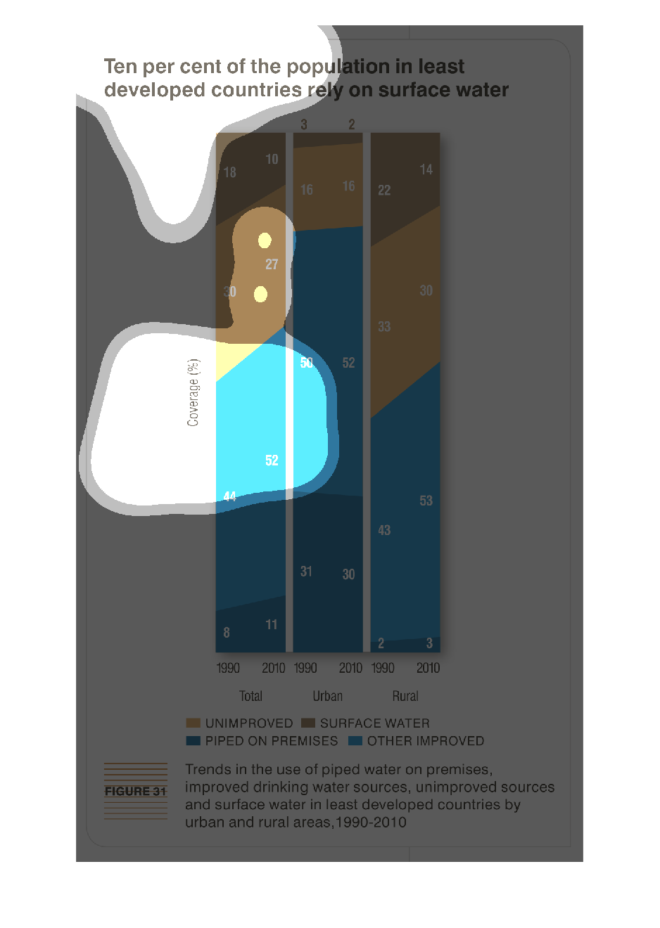
The drinkable water situation in under developed countries is very dire and in need of a miracle
hand. The fact that their has been attempts to remedy this- as the graph clearly points out
with its data- more needs to be done.
Warning: Image is too big to fit on screen; displaying at 67%
Warning: Image is too big to fit on screen; displaying at 67%
This chart shows a graph of how at least Ten percent Of the population in least developed
countries in rural and urban areas rely on surface water.The graph shows from 1990-2010 how
much and what areas are unimproved ,surface water,piped on premises and other Improved on
Rural and Urban developments.
Warning: Image is too big to fit on screen; displaying at 67%
Warning: Image is too big to fit on screen; displaying at 67%
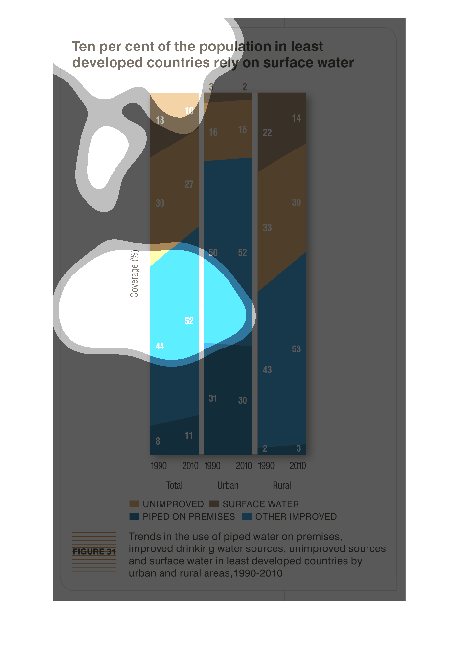
This handmade chart refers to the least developed countries populations that rely on surface
water and shows how they access it. It does not specify which poor countries
Warning: Image is too big to fit on screen; displaying at 67%
Warning: Image is too big to fit on screen; displaying at 67%
Ten percent of the population in least developed countries rely on surface water.  Range is
1990 to 2010. Divided by unimproved, surface water, piped on premises, other improved.  Example:
in 2010, 3 piped, 27 other, unimproved about half the latter, surface about twice the former.
Warning: Image is too big to fit on screen; displaying at 67%
Warning: Image is too big to fit on screen; displaying at 67%
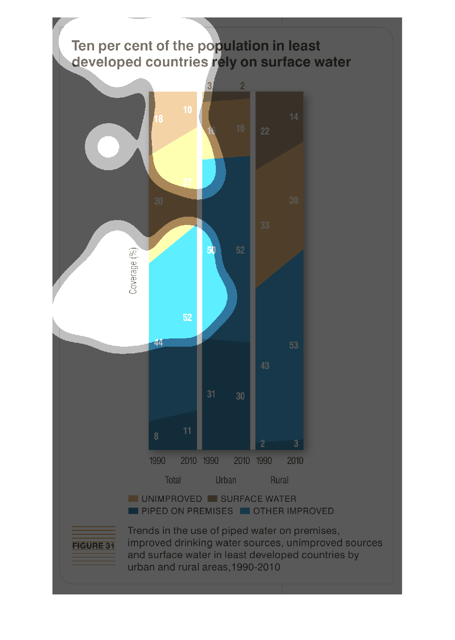
There is not enough clean water to go around, if efforts aren't being made to ensure third
world countries have what they need to survive. This chart scales the levels they have available
in each region.
Warning: Image is too big to fit on screen; displaying at 67%
Warning: Image is too big to fit on screen; displaying at 67%
The following diagram shows the percentage of people living in rural and urban areas of what
types of water they consumer to survive. It suggests that the urban areas (between 50 and
52%) have received the most improved source of water between the years of 1990 and 2010.
Warning: Image is too big to fit on screen; displaying at 67%
Warning: Image is too big to fit on screen; displaying at 67%