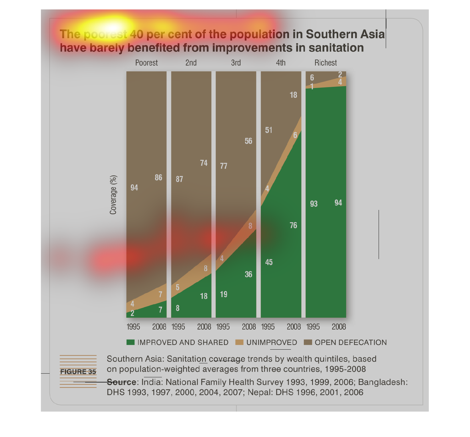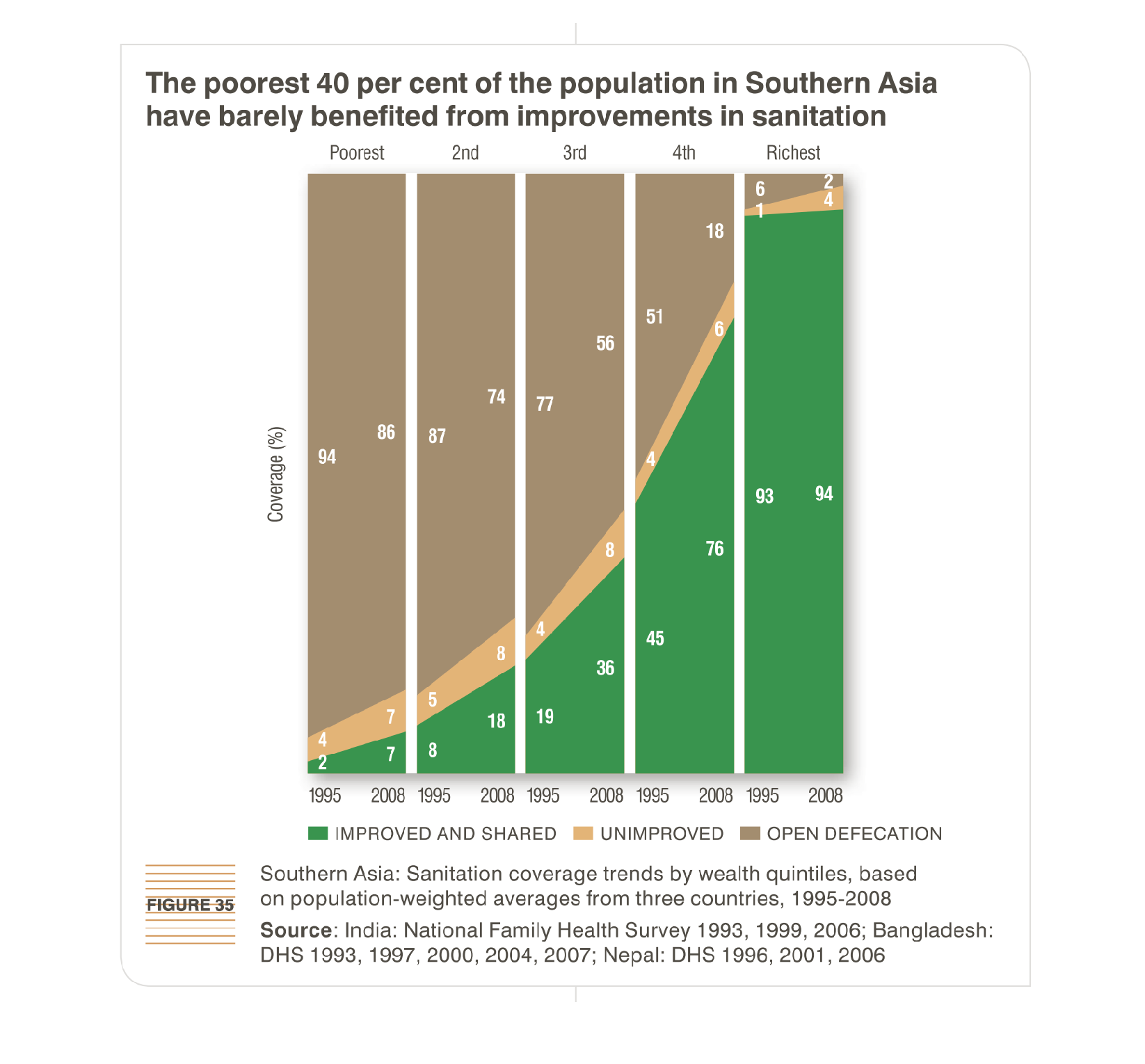
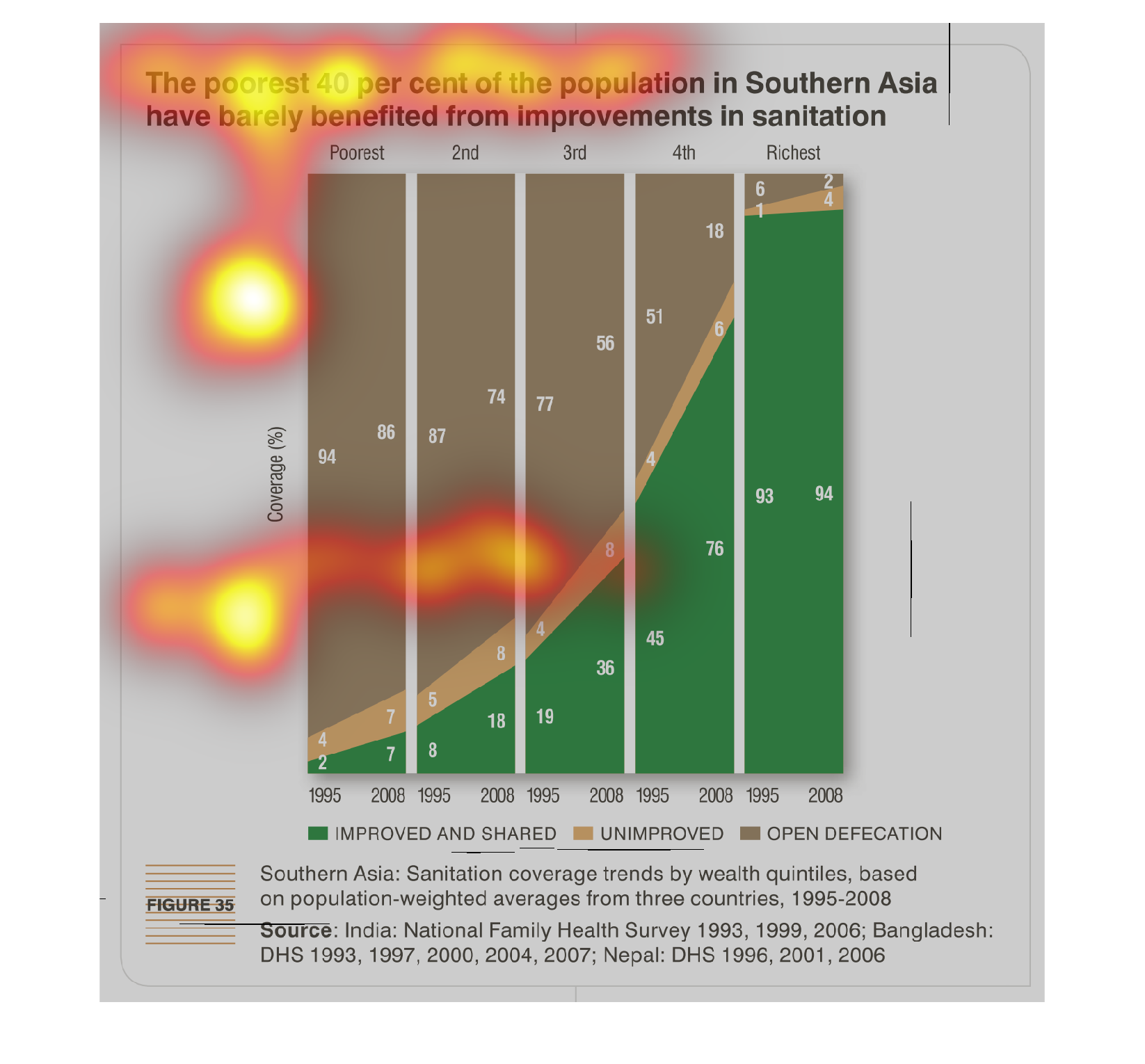
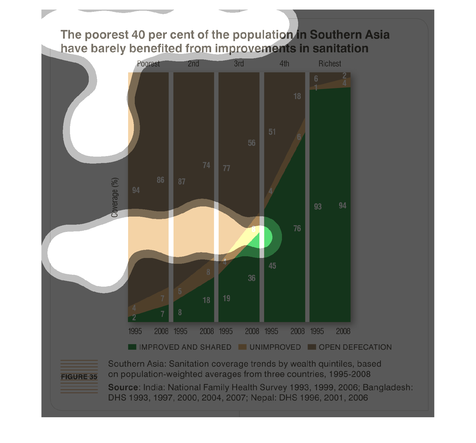
This chart demonstrates that the poorest 40 percent of residents of South Asia have not seen
the benefits of sanitation improvements. It demonstrates this by showing where different social
classes defecate.
It is the southern Asia and sanitation.  It is listed by wealth and it starts in 1995 and
goes through 2008. It lists countries like  India at the bottom
This graph shows the poorest 40 percent of the population in southern Asia that have barely
benefited from improvements in sanitation. Overall in 2008, there have been some improvements
in sanitation, but it is a gradual increase. Showing the direction in which the graph moves,
it will be years before more of Asia has full sanitation.
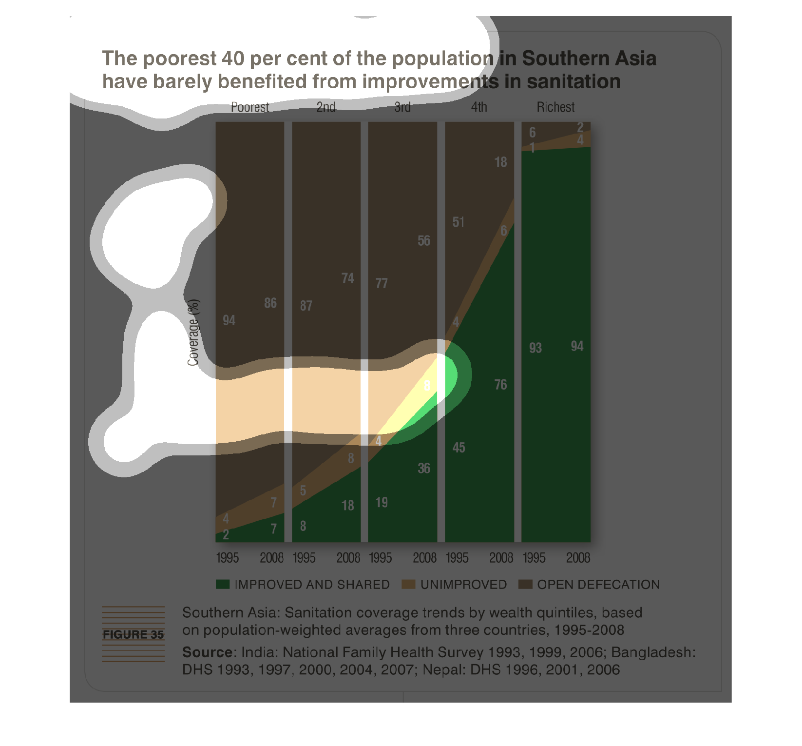
This is a graph of the poorest 40% of the population in Southern Asia and how they have barely
benefited from improvements in sanitation. Data from this graph is based on population weighted
averages from 3 countries from 1995-2008.
This chart describes the poorest forty percent of the population in Southern Asia have barely
benefited from improvements in sanitation. Categories include improved.
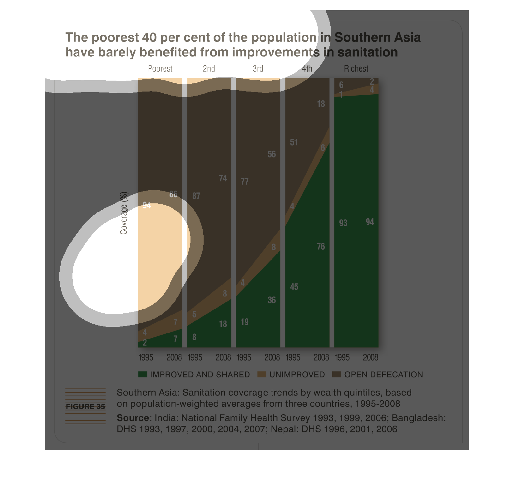
THIS PLOT SHOWS THE IMPROVEMENTS IN SATITATION IN SOUTHERN ASIA BY INCOME LEVEL. BARS REPRESENT
DIFFERENT INCOME SEGMENTS OF THE POPULATION, AND THEY ARE COLOR CODED BY THE PERCENT COVERED
BY THE IMPROVEMENTS.
This chart describes that the poorest forty percent of the population in Southern Asia have
barely benefited from improvements in sanitation. The chart is divided into three categories.
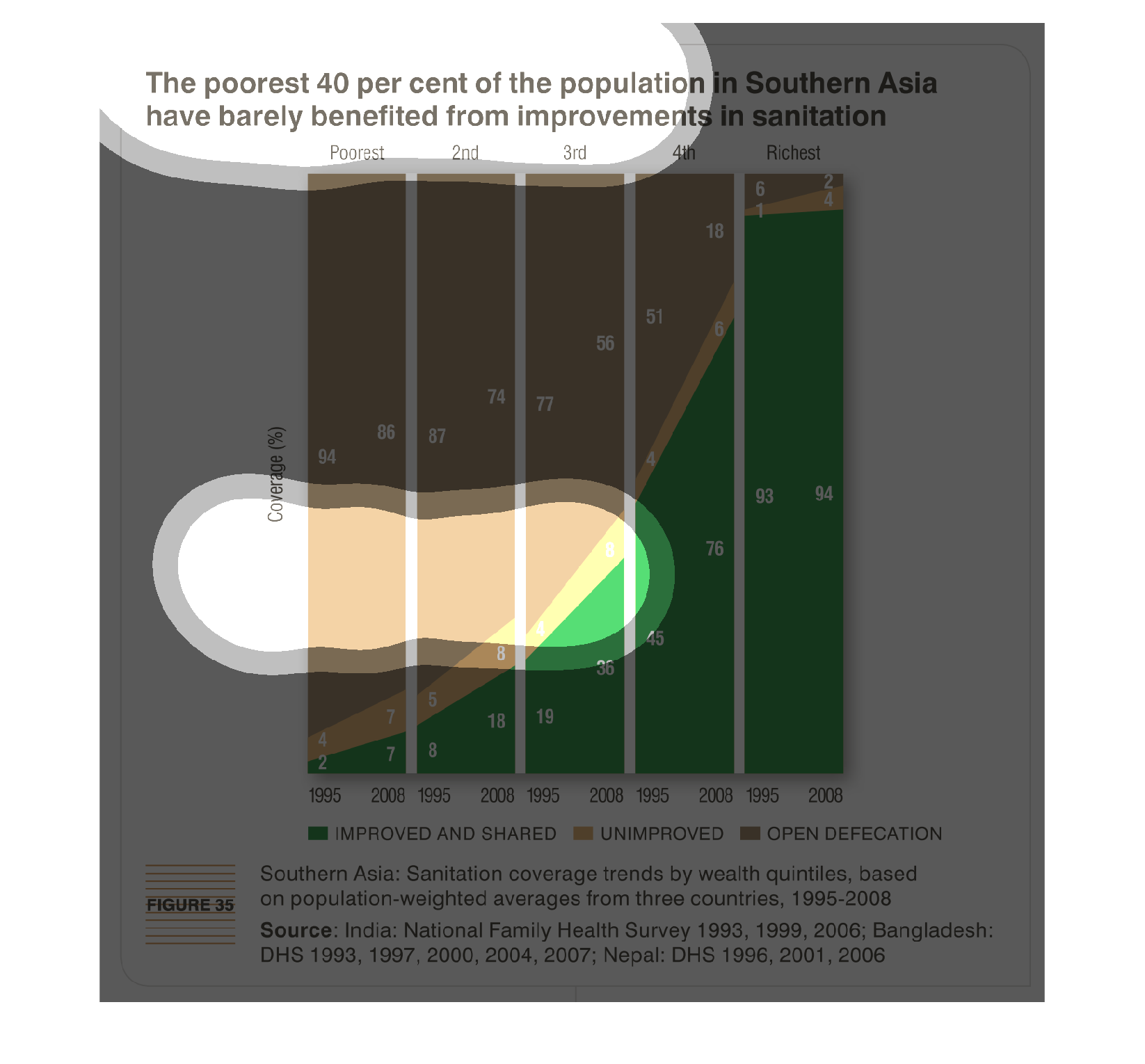
The poorest 40% of the population in southeast Asia barely benefit from improvements in sanitation.
 The poorest people have the highest rates of open defecation.
The poor get poorer, and the richer get richer. That is the basis for this graphic illustration.
In Southern Asia the wealth has gone up, but the living conditions of some- like sanitation-
have not seen an improvement.
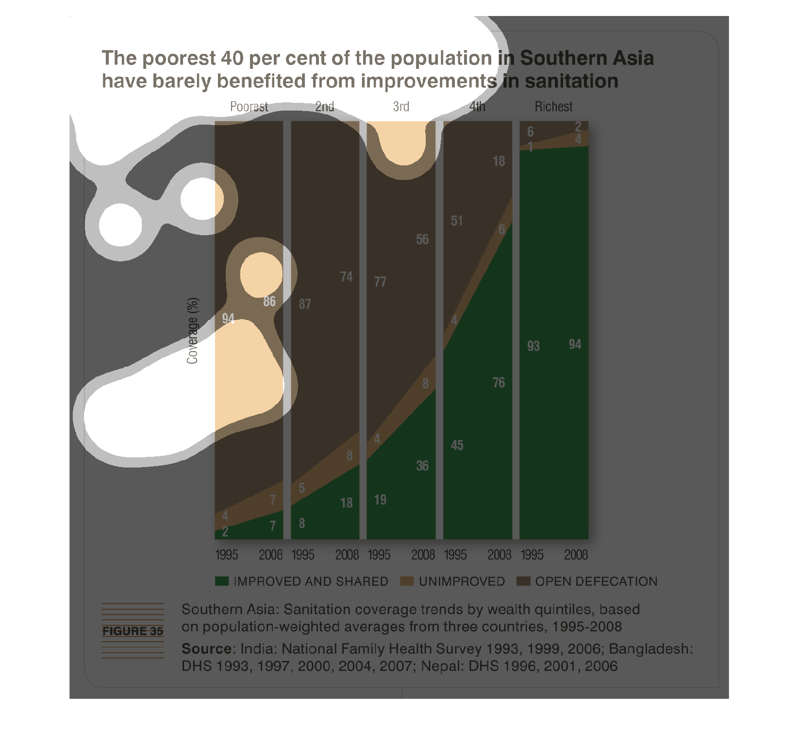
This graph shows the poorest 40 percent of population in southern asia have barely benefited
from improvements in sanitation. While other income groups have benefited, the bottom 40 percent
have seen very little improvement.
The figure presented is titled the poorest 40 percent of the population in Southern Asia have
barely benefited from improvements in sanitation.  The figure is a bar graph.
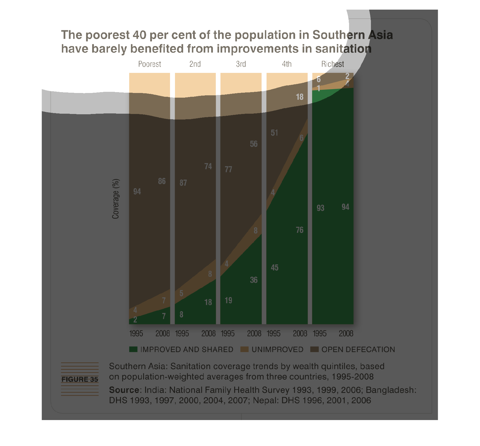
This is a graph showing the sanitation trends in Asia, by wealth showing improved, unimproved,
and open defecation. The data is from 1005-2008. It shows that the poorest four percent of
southern Asia have not really benefited from the improvements in sanitation.
The image depicts the poorest 40% of the population in Southern Asia having barely benefited
from improvements in sanitation. Years studies are 1995-2008. The Richest population was overwhelmingly
likely to have benefited from improvements, while the poorer and poorest population were less
likely and far less likely to benefit, depending on how poor they were.
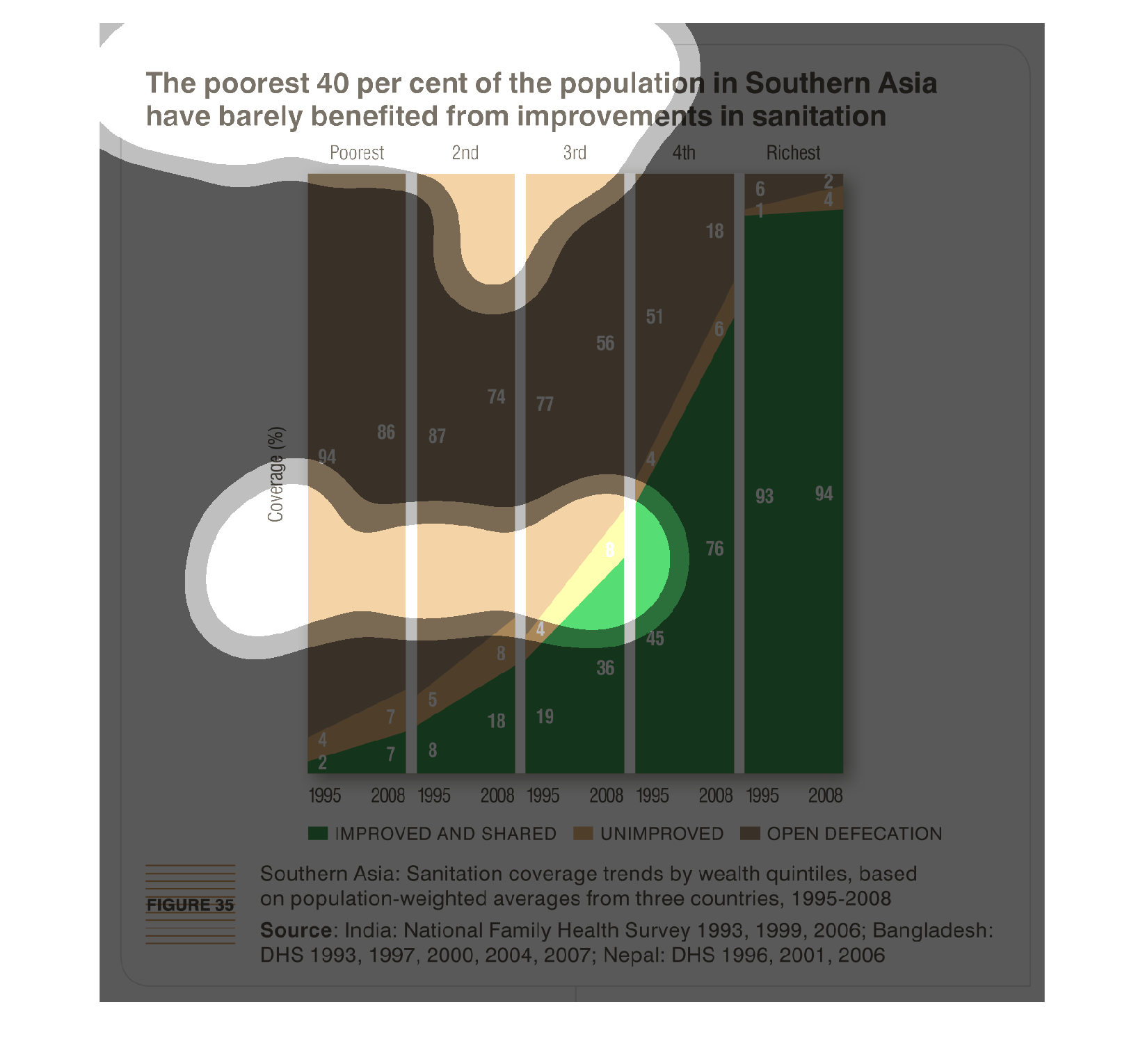
This is a graph that indicates that the poorest 40 percent of the population in southern Asia
have barely seen any improvements in sanitation. It shows the various sanitation problems
these people face.