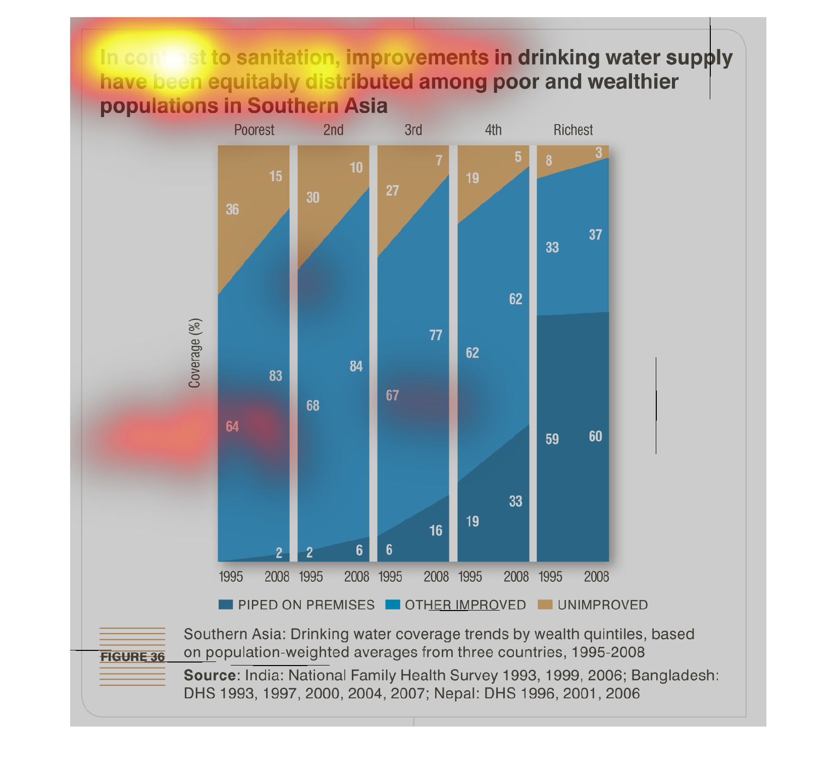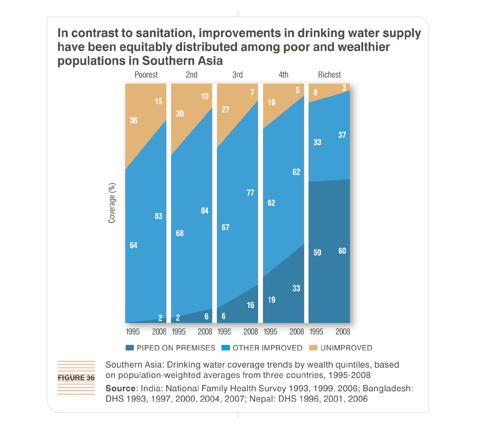
this chart mokes the sanitation of the drinking water supply in south asia. it monitors the
equal distribution between the wealthy and the poor areas.

THIS BAR CHART SHOWS THAT IMPROVEMENTS IN DRINKING WATER SUPPLY HAVE BEEN EQUALLY DISTRIBUTED
AMONG POOR AND RICH IN SOUTHERN ASIA. BAR CHARTS ARE COLOR CODED BY THE TYPE OF IMPROVEMENT.
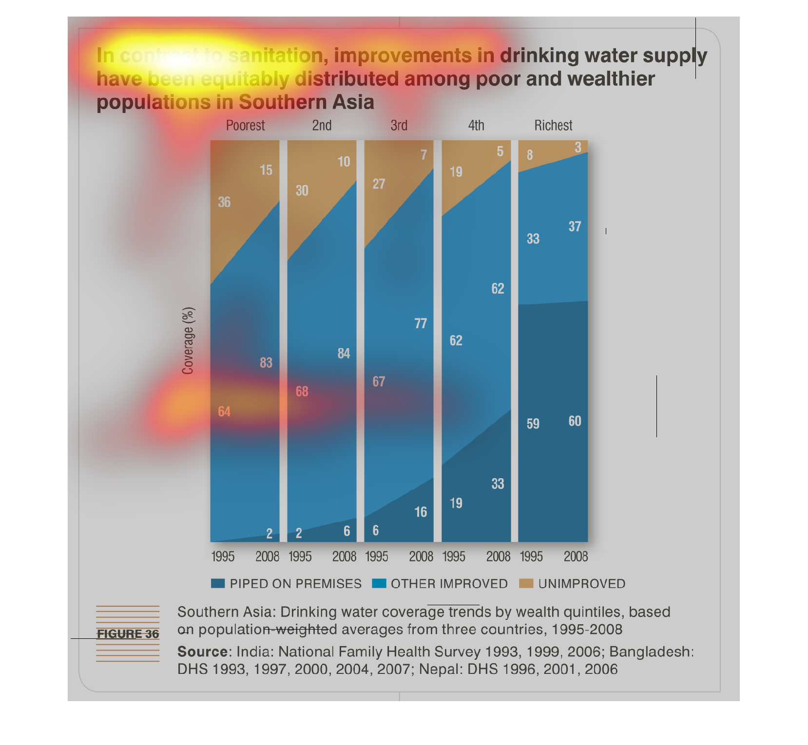
This chart describes about water distribution between poor and wealthier populations in South
Asia. The graph shows data for 1995 and 2008. Richest people are getting good water supply
whether poor people water supply is unimproved.
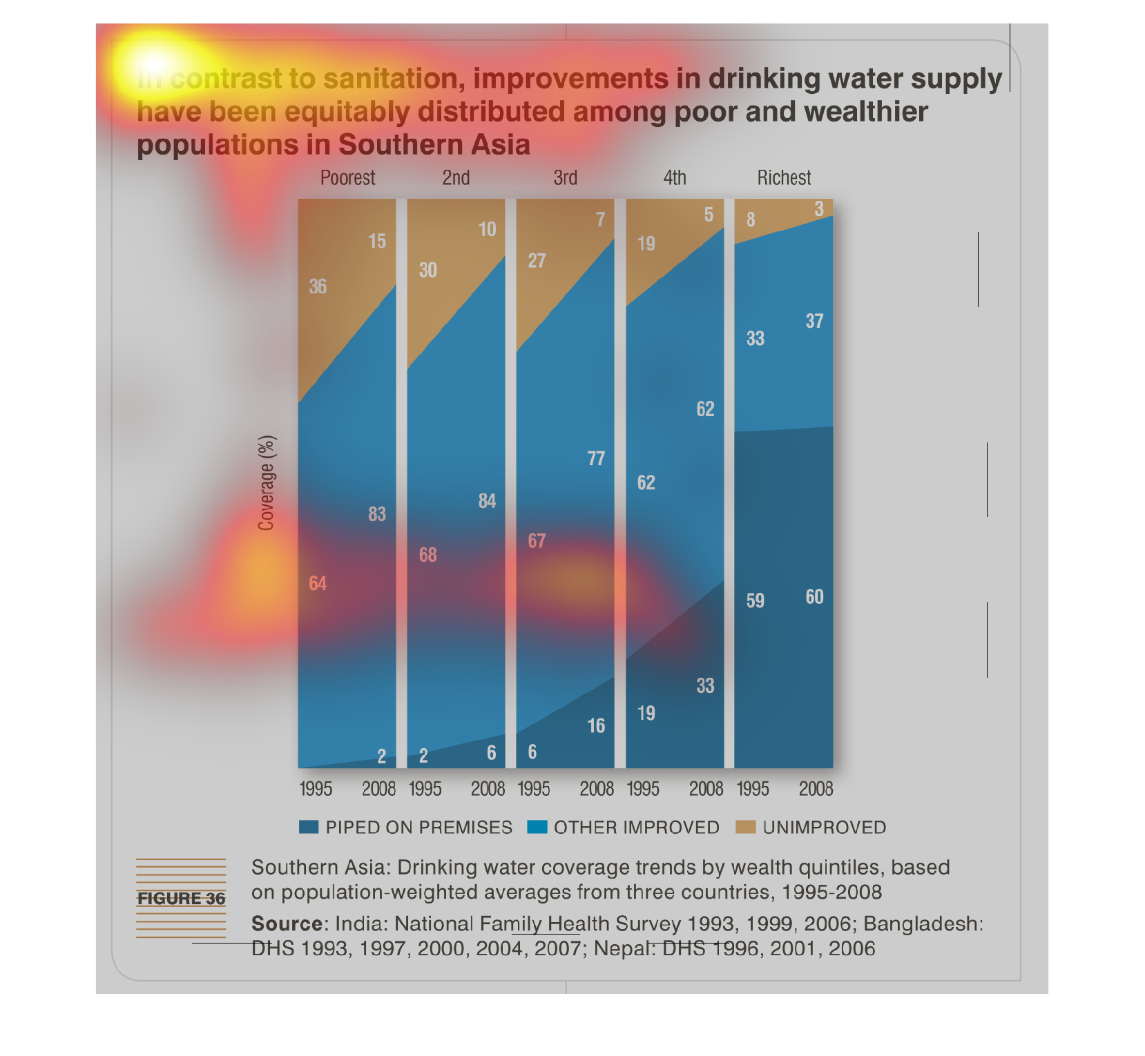
This graph illustrates the improvements in drinking water that are being made in Southern
Asia.  It shows a comparison between the years 1995 and 2008 for those areas piped on premises,
where other improvements were made, and those unimproved.
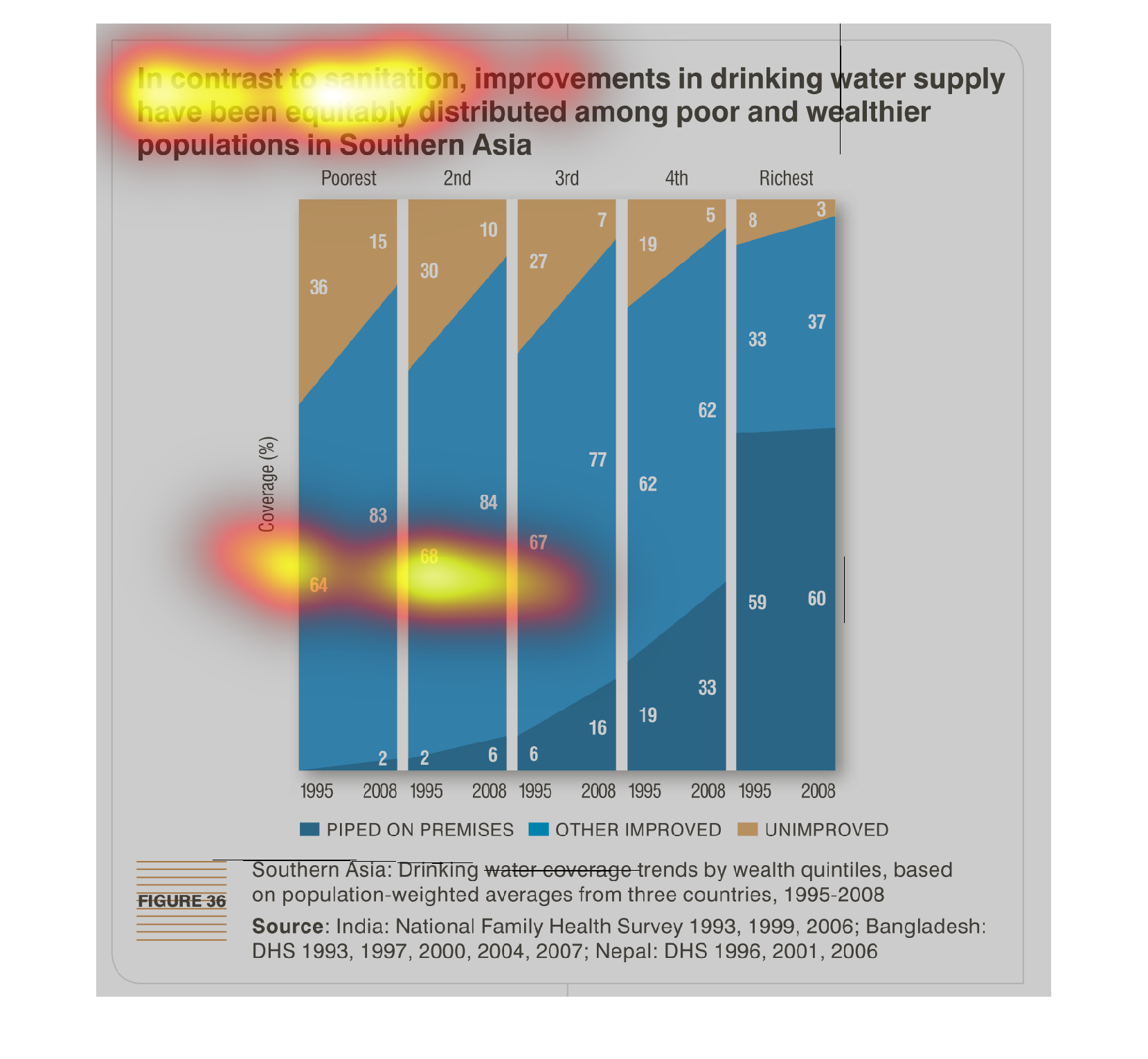
This chart is showing asia and the difference between the wealthy and poor and the sanition
of drinking water that has improved. the poorest have the worst and the rich have the best.
This chart describes in contrast to sanitation, improvements in drinking water supply have
been equitably distributed among poor and wealthier populations in Southern Asia.
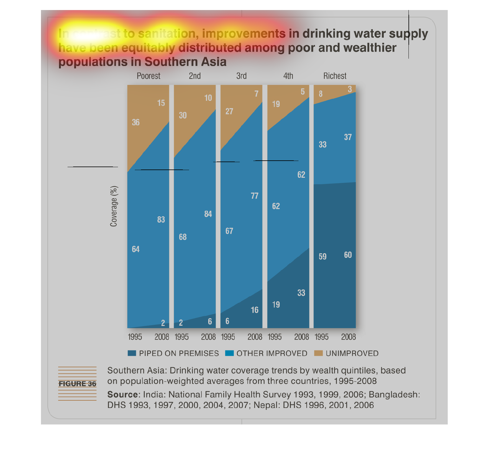
This is a set of bar charts that show the drinking water improvements in Asia for various
socioeconomic groups in two different years. The data is pretty equal for all groups.
Sanitation is a growing problem that needs to be resolved as quickly and effortlessly as possible
in Southeast Asia. The fact is that although the are receiving funds to do so, money are not
being distributed evenly.
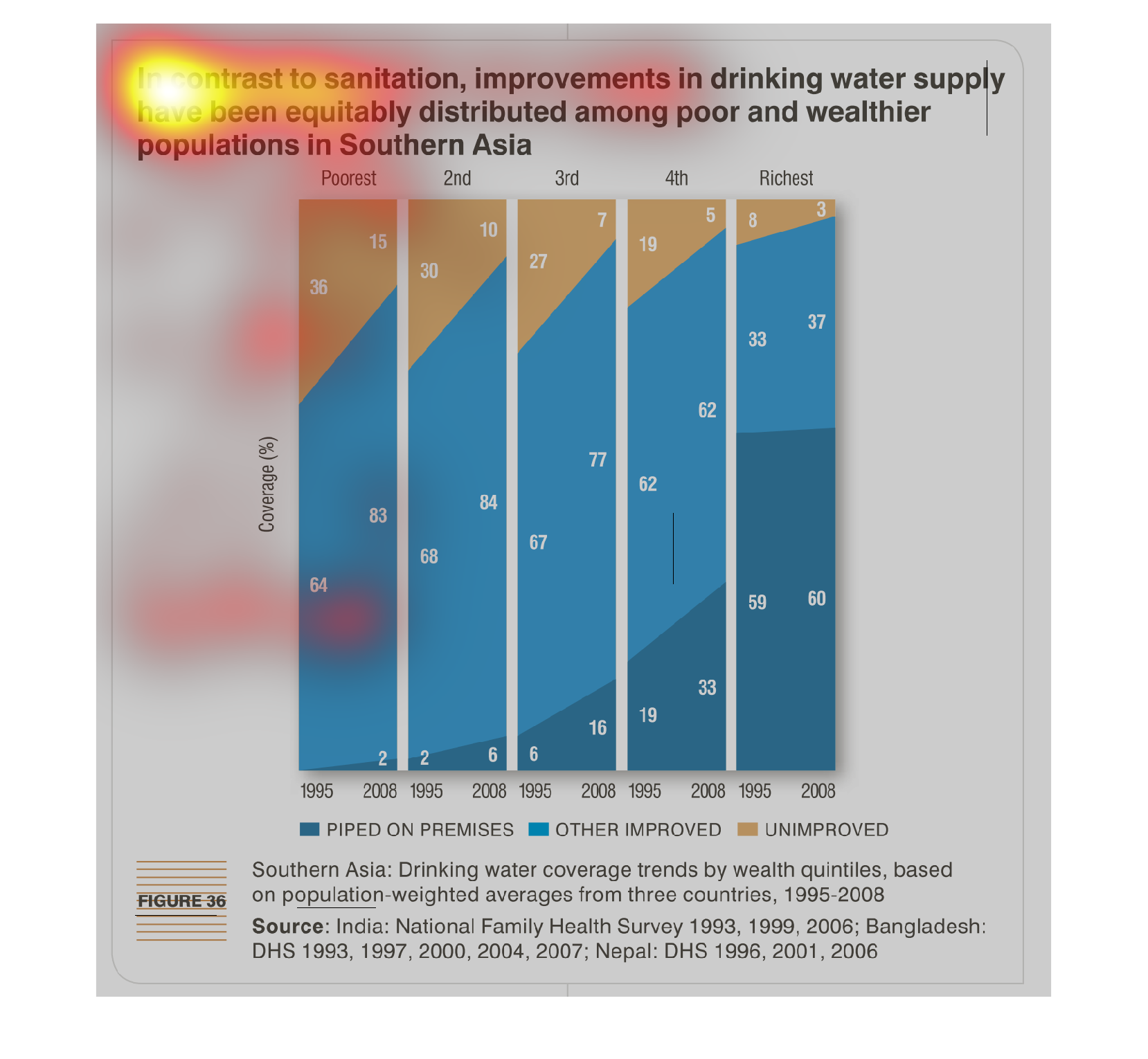
In contrast to sanitation, improvement in drinking water supply have been equitably distributed
among poor and wealthier populations in southern Asia. Graph shows the sanitation coverage
for each of the levels of wealth.
The figure presented is titled In contrast to sanitation, improvements in drinking water supply
have been equitably distributed among poor and wealthier populations.
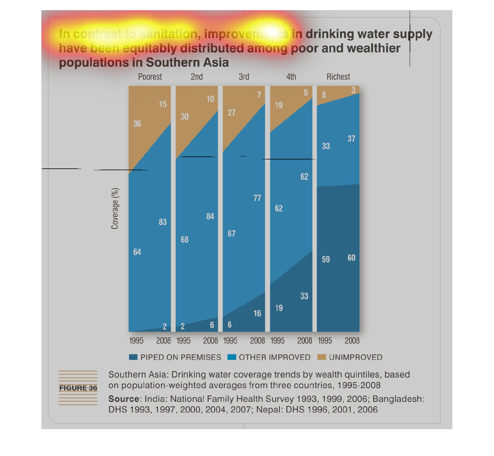

in contrast to sanitation, improvements in drinking water supply, have been equitably distributed
among poor and wealthier populations in southern Asia. wealthier are basically more likely
to have piped water, and poorer to have unimproved. this is seen an overall improvement over
time.
This chart/graph is a representation of improvements in the water supply in Asia. Poorest
had 36% increase. The richest had 3% increase. The increases were from 1995-2008
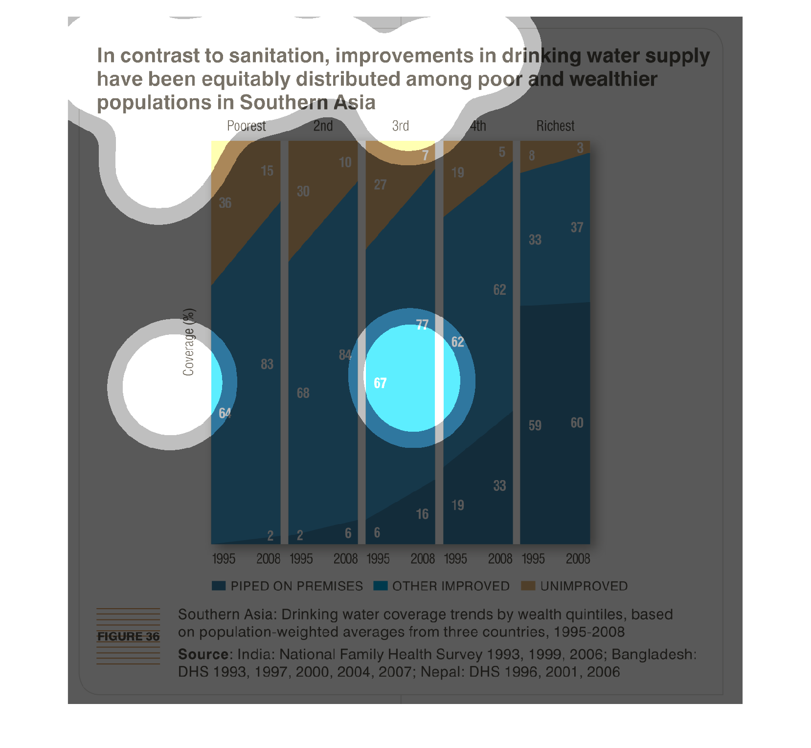
In south Asia, despite continuing sanitation issues, pipeline water has been mostly evenly
distributed among the wealthy and poor to a great degree. In 1995 only 8% of rich communities
didn't have piped water. This dropped to 3% in 2008. For poor communities in 1998 36% of the
poor didn't have piped water, while in 2008 the number dropped to 15%.
This chart describes in contrast to sanitation, improvements in drinking water supply have
been equitably distributed among poor and wealthier population is Southern Asia.
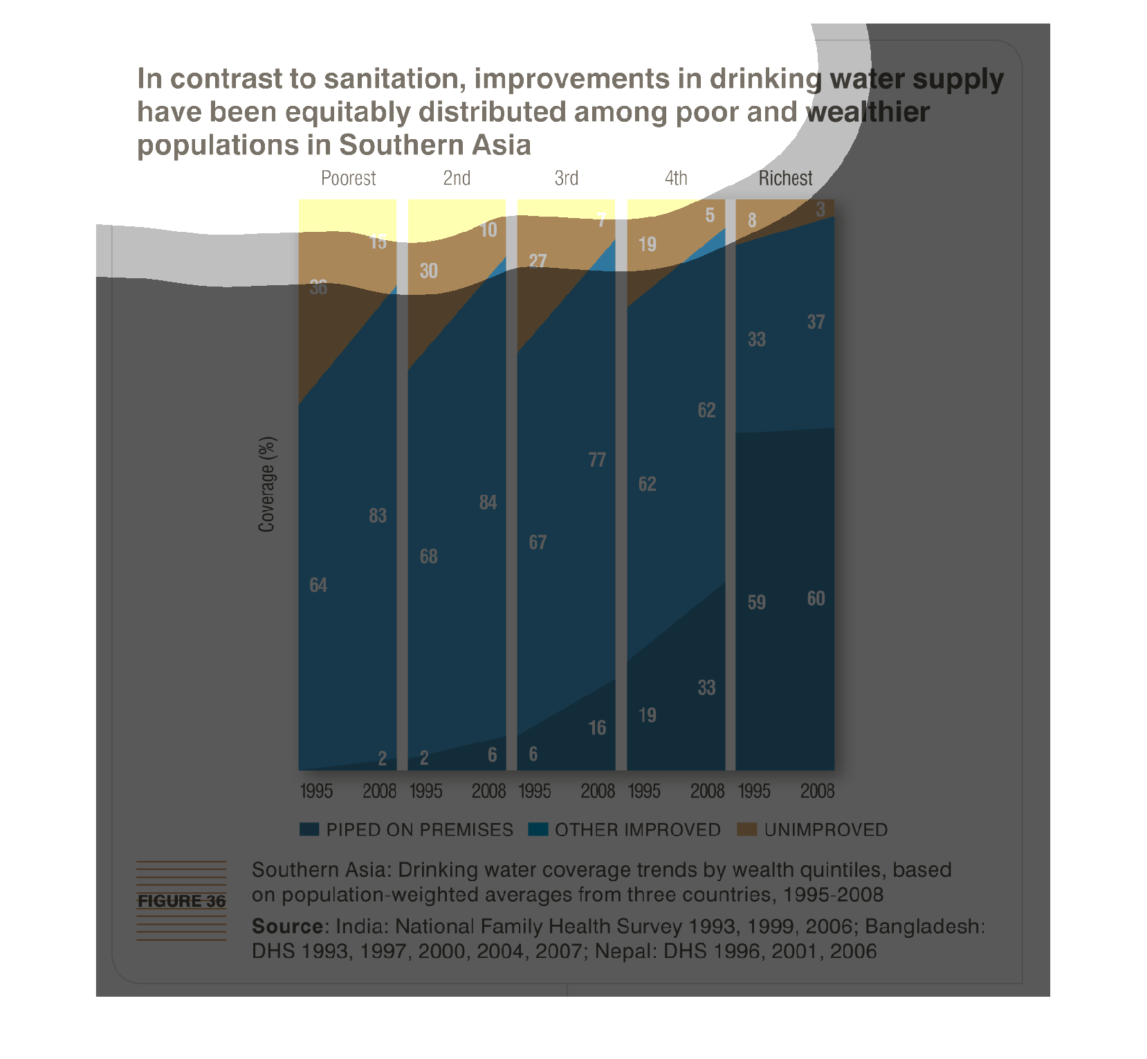
 This chart shows, based on year, how clean drinking water supplies have improved in Southern
Asia according to how much money the population makes. The chart starts with the poorest and
goes up to the richest.