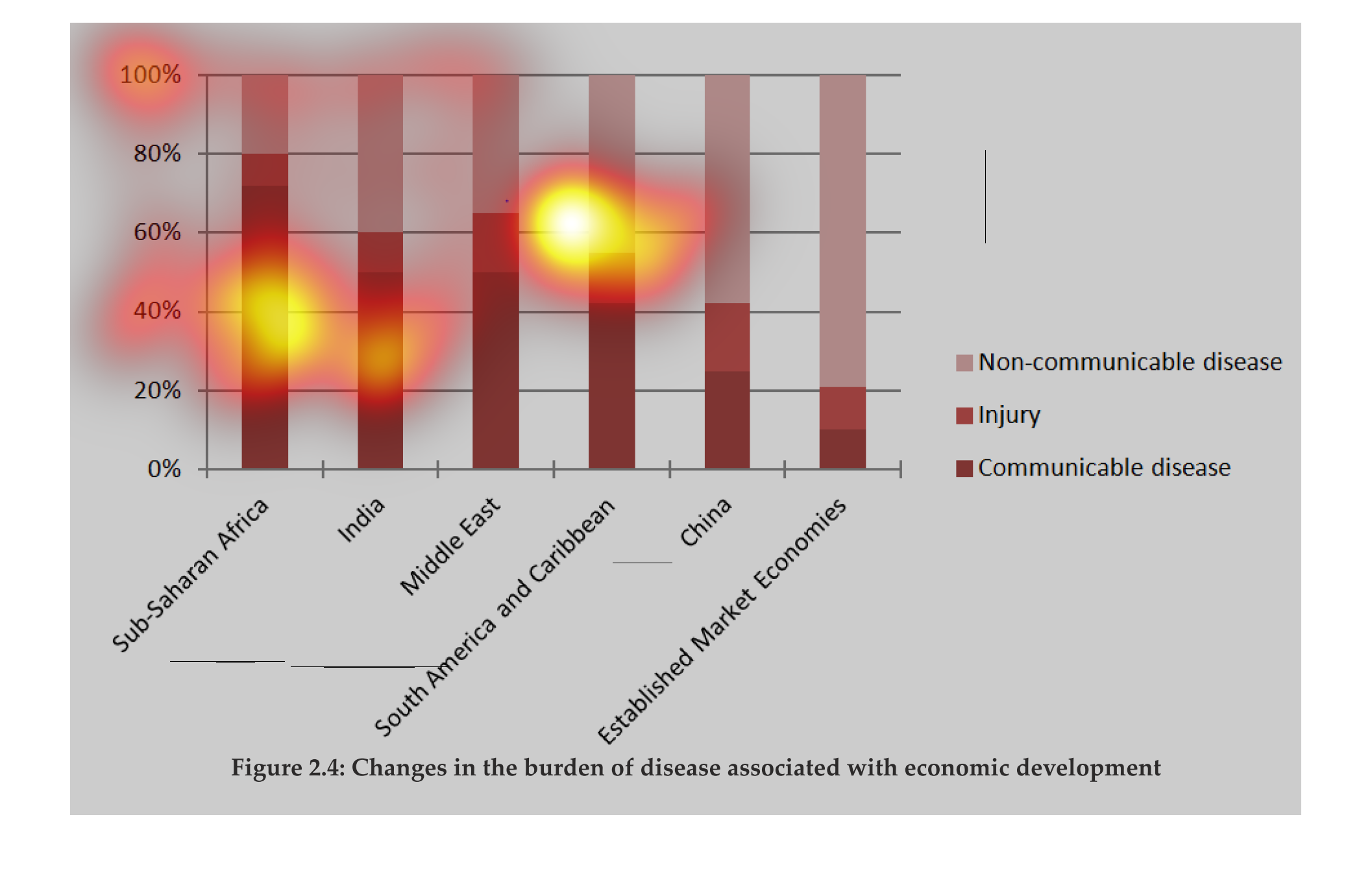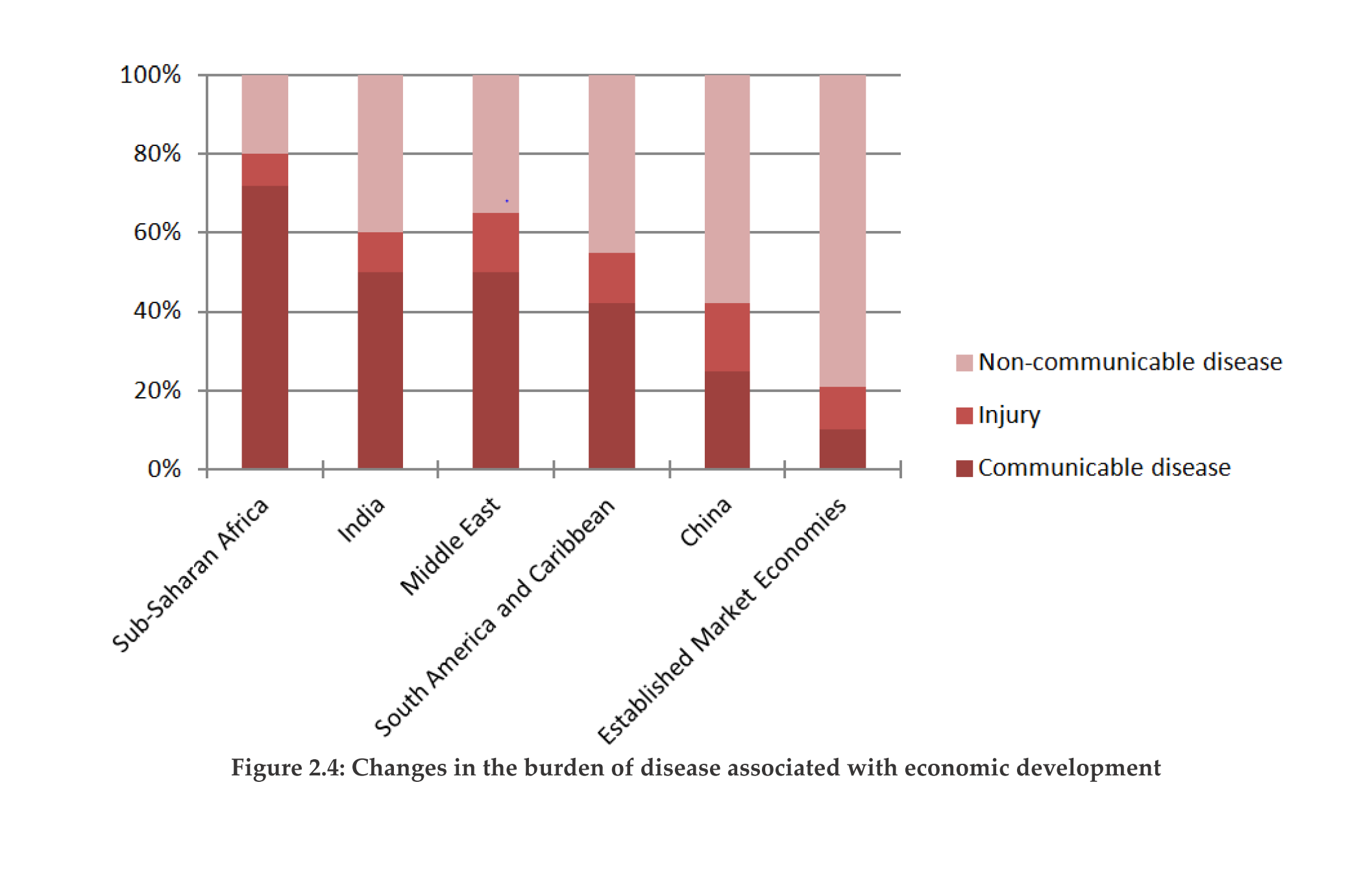
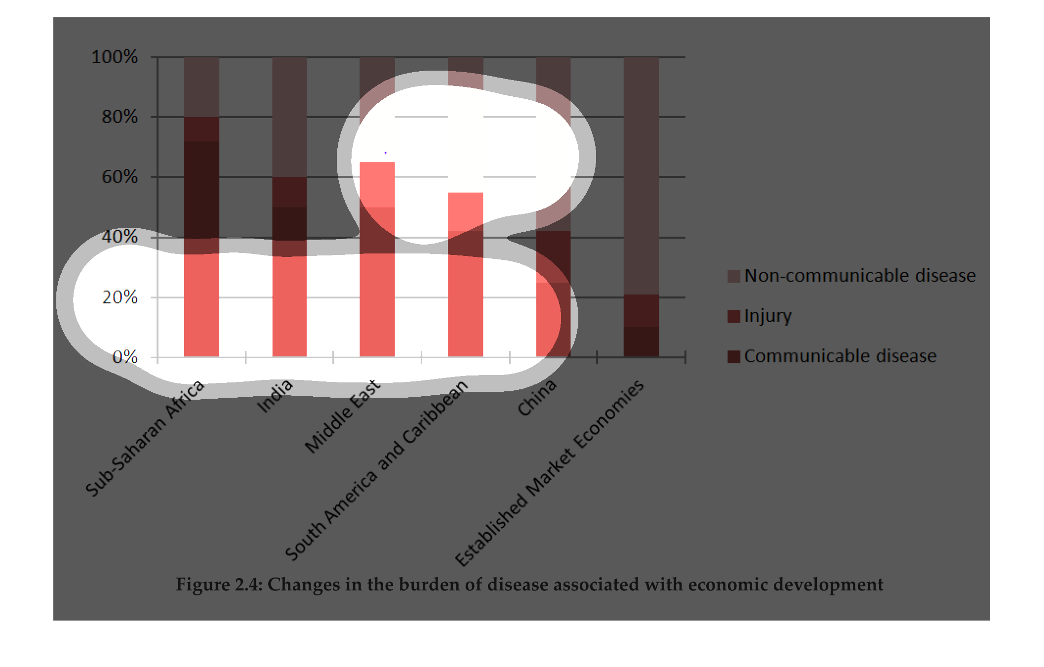
changes in the burden of disease with economic development. Y axis is percentage, X axis is
economies of different regions. Basically more developed countries have less issues, but not
a striking correlation except with non communicable diseases. injury is basically the same
across the board, communicable disease is much higher in the sub saharan region
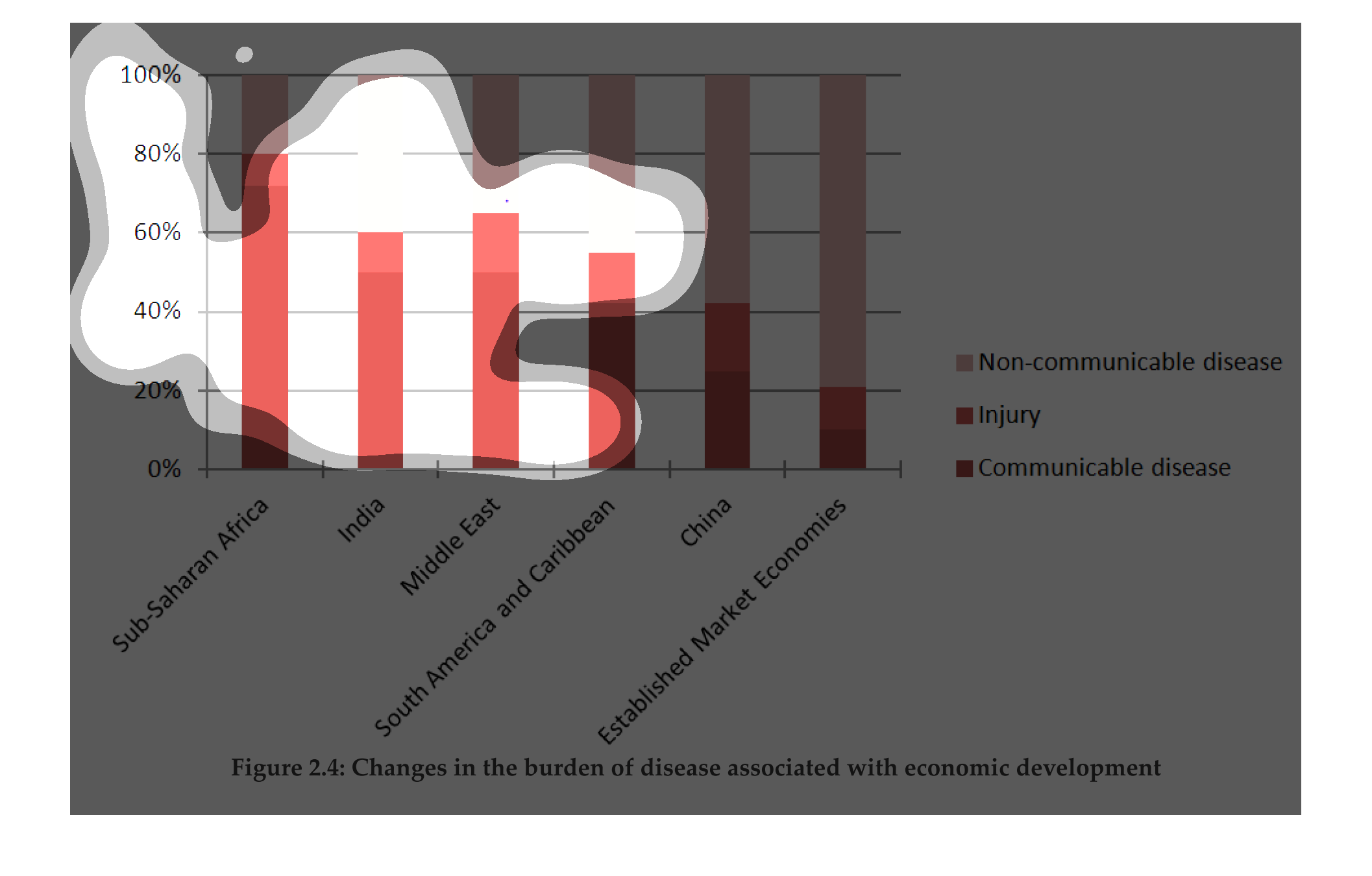
This graph represents the change in burden of disease associated with economic development.
The graphic includes China, India, Sub Sahara Africa, Middle East, South America and Caribbean,
and a base line of established market economics. According to the chart Sub Sahara Africa
has the highest level of Communicable disease while China has the lowest amount.
The chart shows the changes in the burden of disease associated with economic development.
And Sub-saharan Africa is the most burden of injury and communicable disease. And India reached
60% of most burden injury and communicable disease. And Middle East is the second most burden
of injury and communicable disease. And South america and carribbean is 55% of most burden
injury and communicable disease. And China is 40% of most burden injury and communicable disease.
And lastly the Established Market Economy is the most lowest percentage of burden injury and
communicable disease.
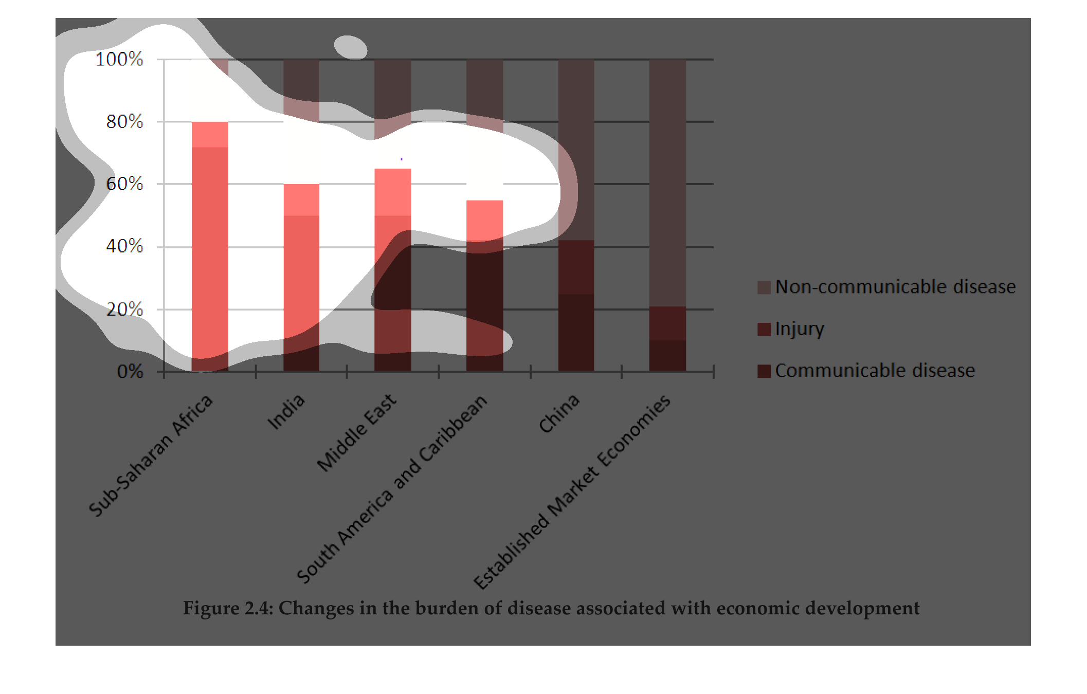
This is a chart that shows the amounts of deaths for the various regions of the world. It
covers both the developing and developed regions of the world.
The graph shows the burden of diseases associated with economic development assorted emerging
markets such as China, Africa, India, and South America. The types show are communicable disease,
non-communicable disease, and injury.
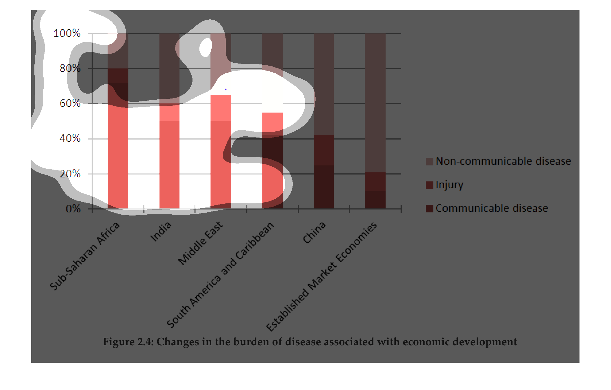
This graph shows the change of burden of diseases associated with economic development. The
highest was Saharan Africa and then India. It associated with injury, as well.
"Changes in the burden of disease associated with economic development."  The percentages
of types of diseases(communicable, non-communicable, and injury) were measured for different
types of countries, while the only strictly economic category was, "Established Market Economies,"
but it's unclear as to whether or not there is any overlap with any of the other categories.
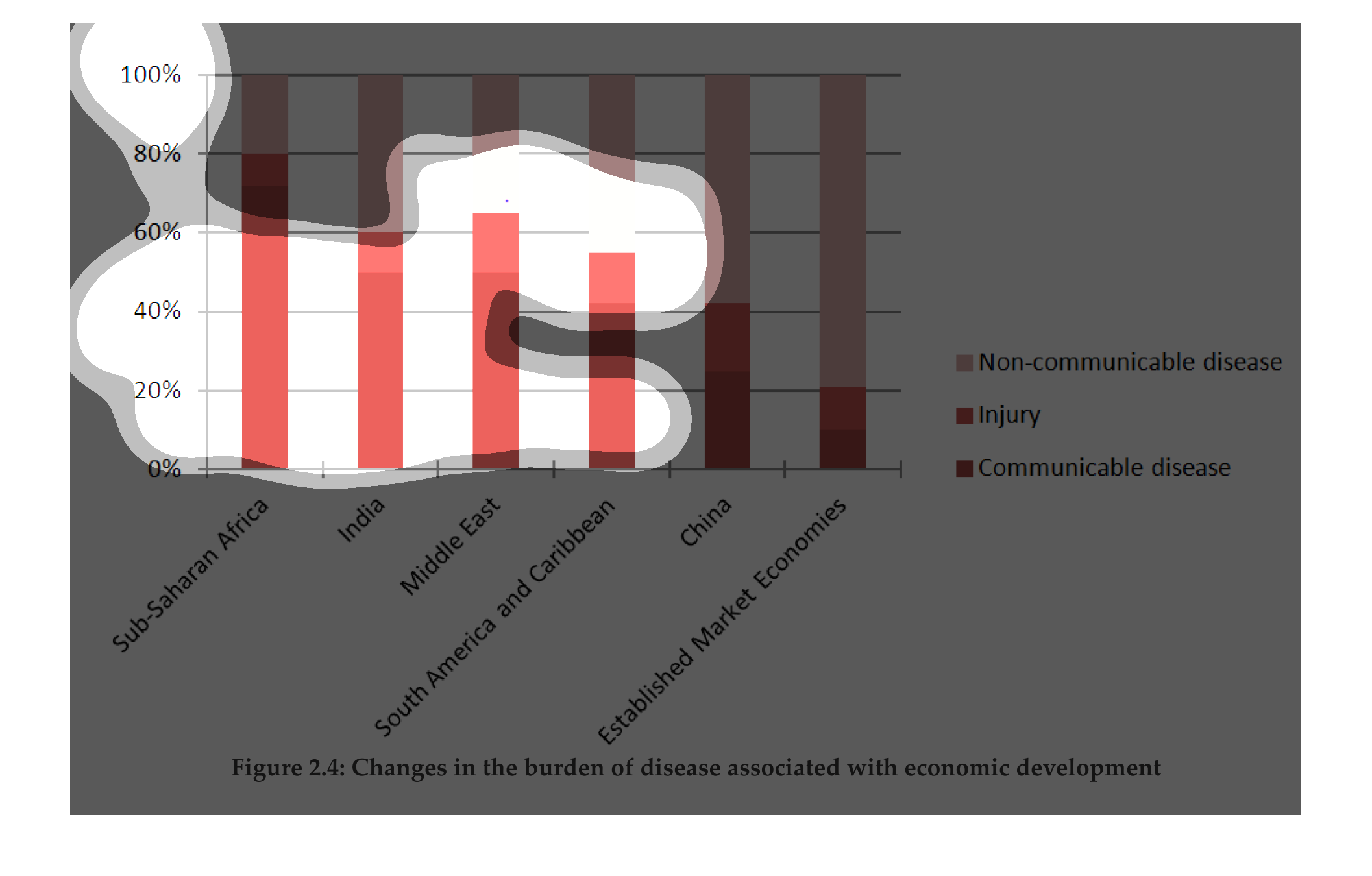
This chart shows how economics of diseases affect people. The informTion is presented by country
and compares the countries to each other. Information on injuries and diseases are presented.
This chart describes changes in the burden of disease associated with economic development.
Categories on the chart include India, the Middle East, and the Caribbean.
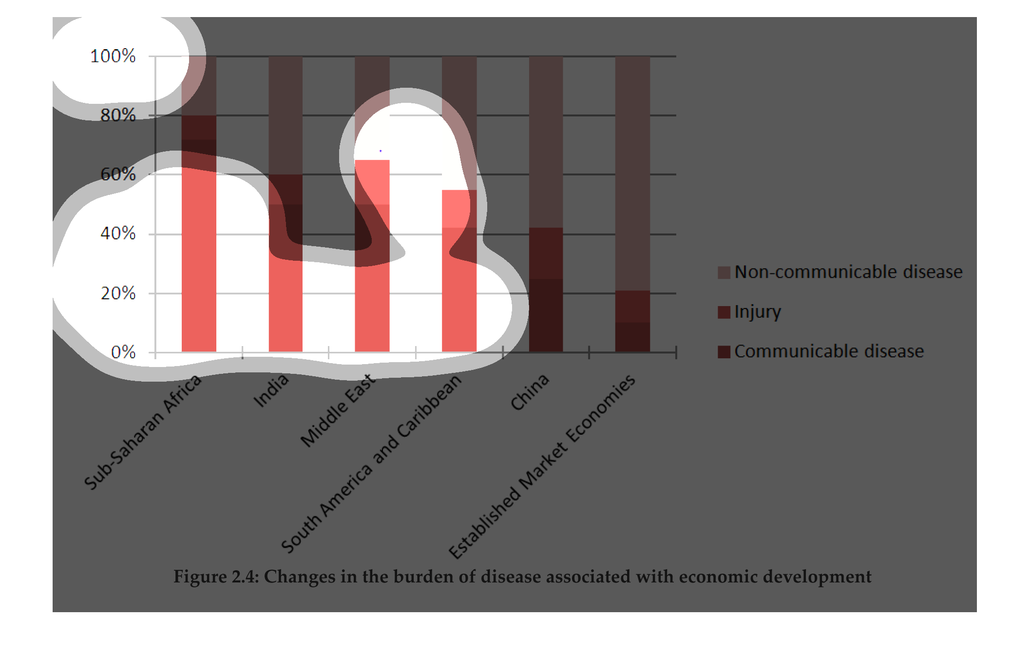
The figure presented is titled Figure 2.4: Changes in the burden of disease associated with
economic development.  The figure is a representation of disease.
An infographic showing the changes in the burden of a disease associated with economic development
levels. for various regions. Showing communicable diseases greatest in Africa
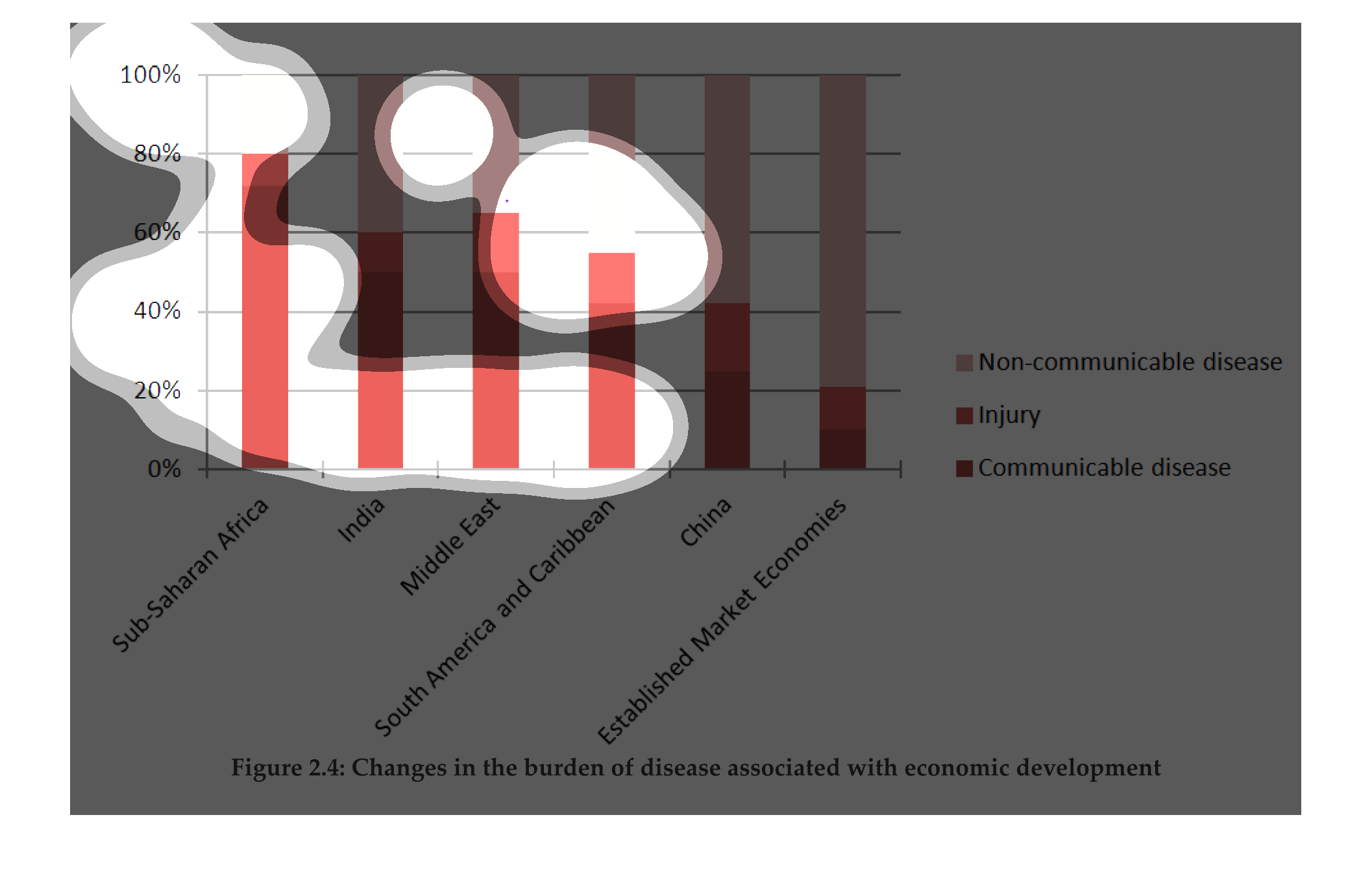
The chart shows the changes in the burden of disease associated with economic development.
 It includes  non-communicable disease, injury, and communicable disease.
This chart describes changes in burden of disease associated with economic development. categories
on the chart include non-communicable disease, and injury.
Third world countries are afflicted with a bunch of disadvantages, but one of the most glaring-
as this study tries to show- is the amount of ailments that go unreported due to lack of funds.