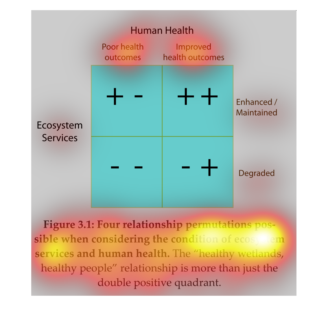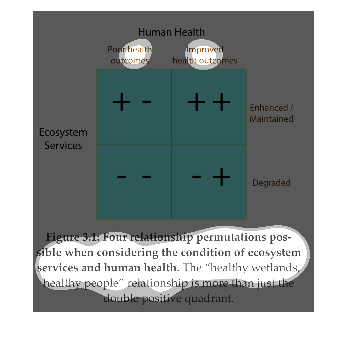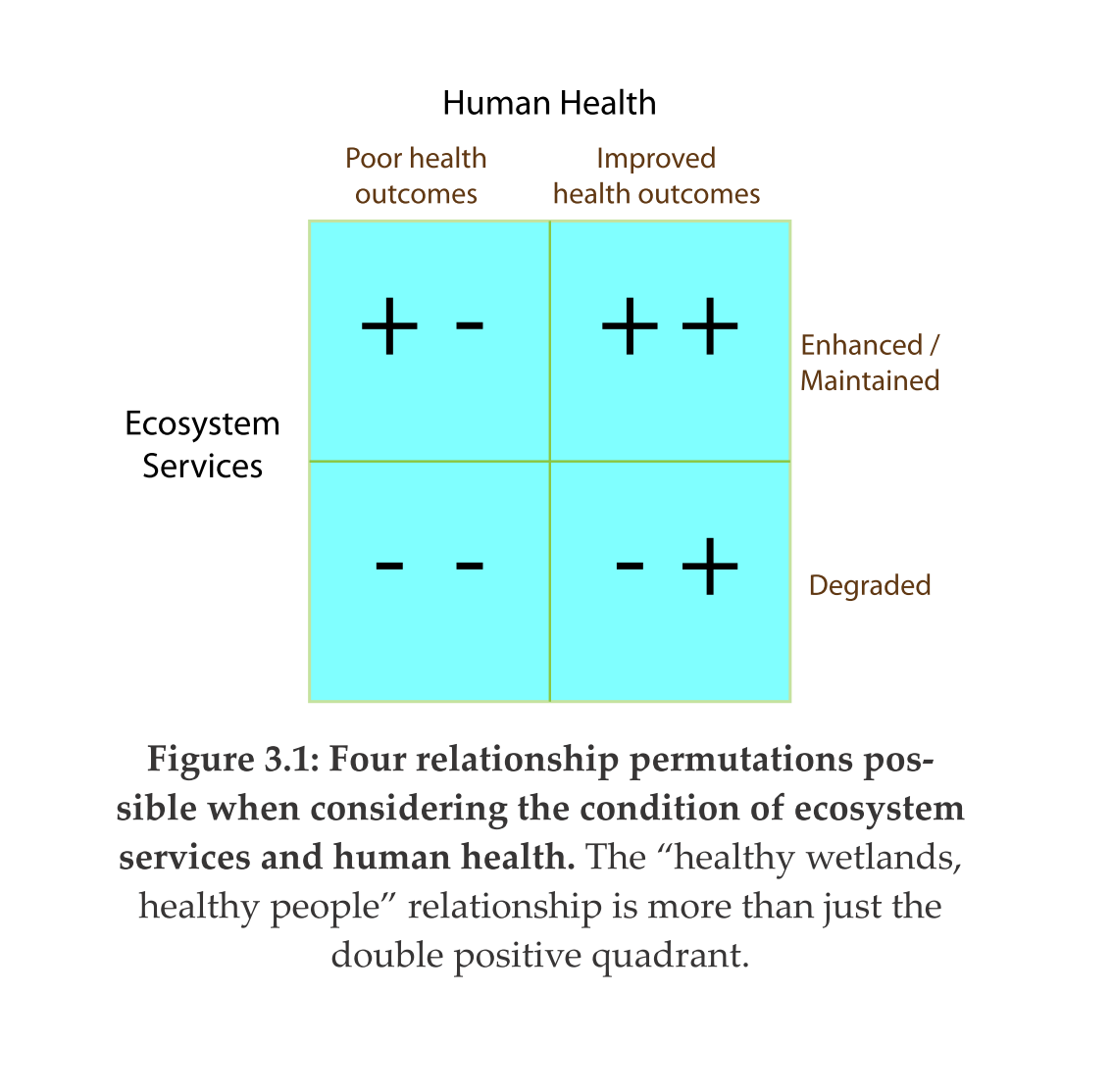
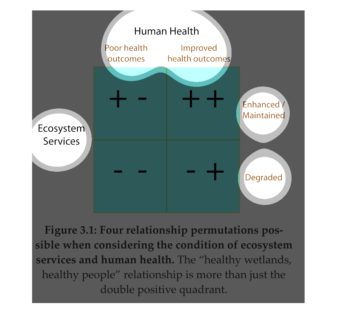
The chart shows the four relationship permutations possible when considering the condition
of ecosystem services and human health. The healthy wetlands, healthy people. Relationship
is more than just the double positive quadrant. And it gives the relation of  the outcome
of the poor health and improved health of a human.
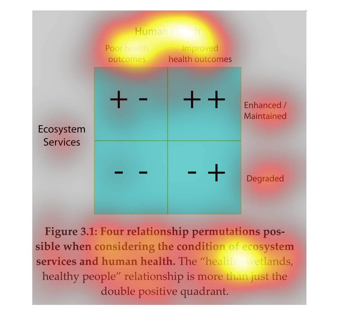
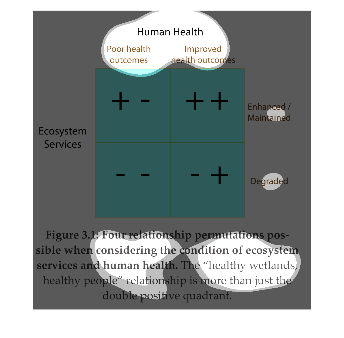
The image shows a type of box with 4 quadrants you would see in biology which use recessive
and dominant genes to determine the outcome. This image uses improved health outcome, poor
health outcome, enhanced/maintenance, and degraded.
This is a graphic that is being used to illustrate the importance of a good ecosystem. It
shows the poor outcomes on health and also the improved outcomes of health.
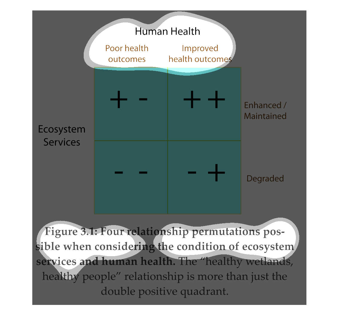
Human Health. two columns; poor health outcomes, improved health outcomes. on the left representing
both rows; ecosystem services. On the right, two rows; enhanced maintenance, and degraded.
This setup creates four boxes tp left is +-, top right is ++. bottom left is --. bottom right
is -+. This is figure 3.1 representing four different relationship permutations
Health is a delicate thing. You can have it now- be able to run and jump like an Olympic level
athlete- the next you can't even get out of bed to defecate. These are realities we must all
contemplate, as this illustration takes pains to explain how our ecosystem plays a part in
being healthy and unhealthy.
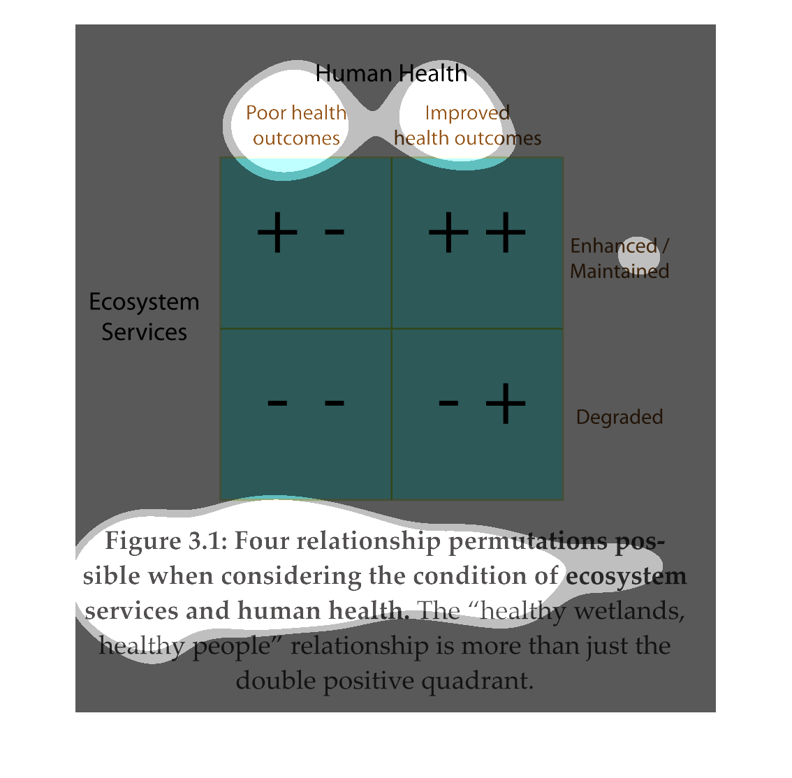
All men must die, no matter how they take care of themselves; doesn't matter if you eat right,
exercise, and don't consume alcohol or drugs, you will still die. But the illustration at
least shows ways you can try to avoid it as much as humanly possible.
Human health. Four boxes from top left to bottom right; +-,++,--,-+. Top left poor health
outcomes, top right improved health outcomes, entire left side ecosystems services, left side
enhanced maintenance, degraded.
This handmade chart talks about access to health care but nothing about which country or region.
It is a bit hard to read to figure out what is going on
This is a visualization of human health and the relationship it has to ecosystem services.
There are four possibilities, however the "healthy wetlands, healthy people," do not necessarily
fall into the double positive. Although the description of the picture and what the picture
suggests doesn't seem to add up.
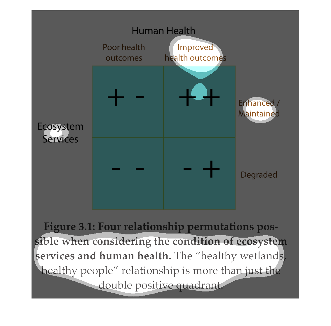
This chart describes four relationship permutations possible when considering the condition
of ecosystem services and human health. the "health wetlands, healthy people" relationship
is more than just the double positive quadrant.
This is a image that shows the relationship between a healthy person and ecosystem services.
It shows that there is a positive of relationship between a healthy person and ecosystem.
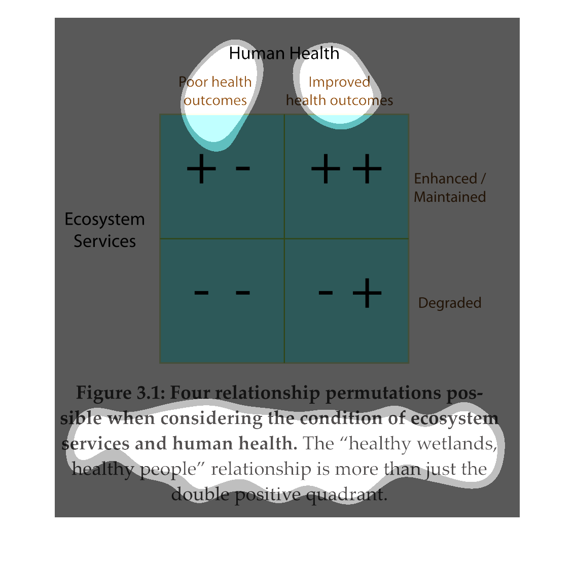
This chart describes human health. Specifically, four relationship permutations possible when
considering the condition of ecosystem services and human health.
The figure presented is titled: Human health.  The figure is an actual representation of the
statistical data in regard to the health of human life worldwide.
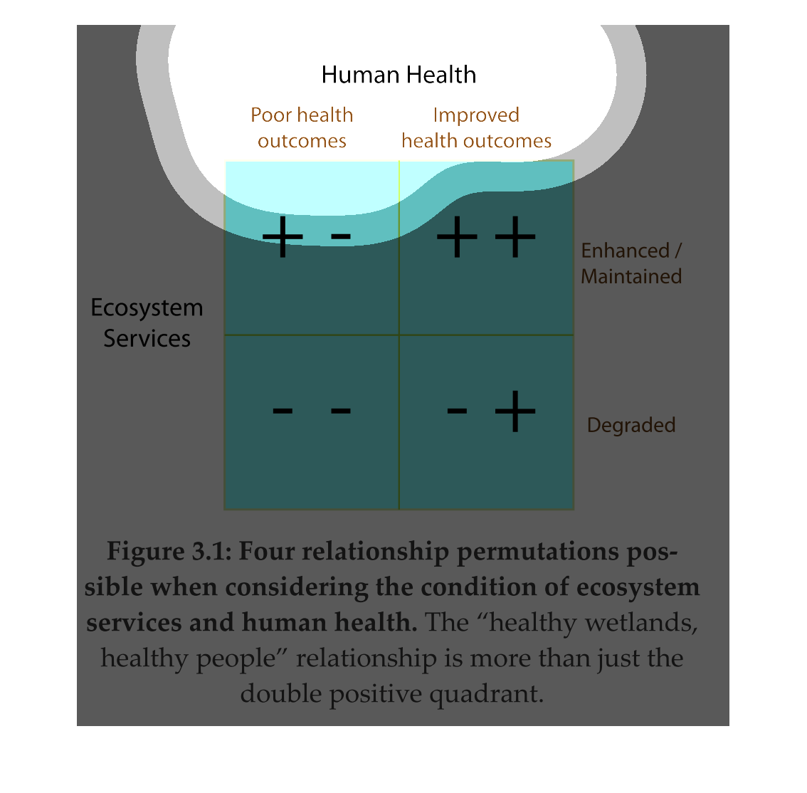
Figure 3.1  Human Health Diagram - 4 relationship permutations possible when considering the
Ecosystem Services and Human Health - Enhanced or Degraded  Poor vs. Improved Health Outcomes
The image depicts human health outcomes and 4 permutations possible when considering when
considering the condition of ecosystem services. the data indicates that healthier environments
lead to healthier humans.