THIS PLOT SHOWS THE ADULT PER CAPITA CONSUMPTION OF ALCOHOL IN LITERS OF PURE ALCOHOL IN 2005.
COUNTRIES ARE COLOR CODED ACCORDING TO THEIR ALCOHOL CONSUMPTION.
In 2005, countries were monitored on their adult alcohol consumption (ages 15 and up). The
US met was right in the average rank, where as other countries in the European region were
much higher in ranks. The age of alcohol consumption varies significantly, and based on these
findings, it appears that the Russian area as well as Australia tends to have higher alcohol
consumption than the remainder of the world.
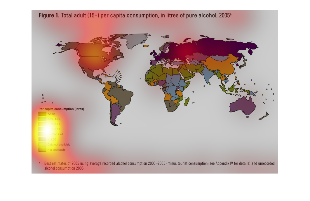
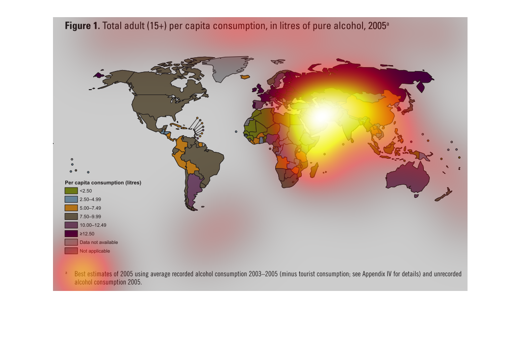
figure 1 total adult (15+) per capita consumption in litres of pure alcohol as 2005 data.
We see a map of the world that is color coded according to a key. Largest consumers being
European nations, Russia and the ukraine, closely followed by argentina and australia, all
of North America and the rest of the world, African countries having the lowest rates in the
world
This is a map that shows the distribution of adult per capita consumption in pure alcohol
in the year 2005 across all regions of the world. It shows this consumption in liters.
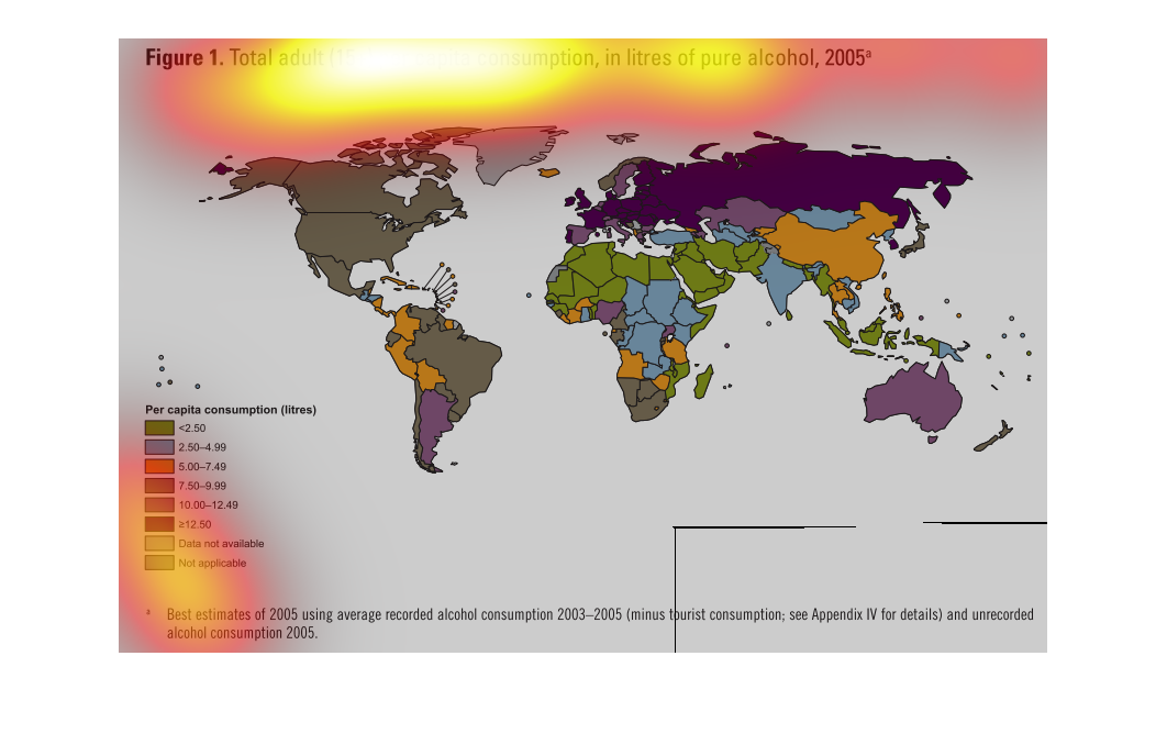

The chart shows the total adult consumption in liters of pure alcohol per capita in the year
2005.  Europe, Russia, and Australia have the highest consumption, while North America has
the lowest.
This graph shows the consumption of pure alcohol (in liters) in 2005 of various countries
on earth.  Those countries with the highest consumption (over 12.5 liters per capita) include
Russia and various parts of central Europe.  Countries with the lowest consumption include
northern africa and the middle east (at the lowest end of the specturm<2.5 liters per capita)
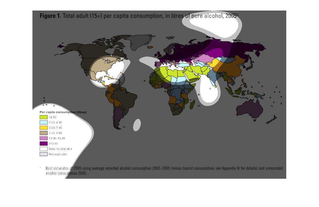
The figure presented is titled Figure 1: total adults (15+) per capita consumption in litres
of pure alcohol, 2005.  The figure is a representation of alcohol.
The graph uses a global map to illustrate the total number of adults, aged 15 and older, on
a per-capita basis who consumed alcohol in litres in the year 2005
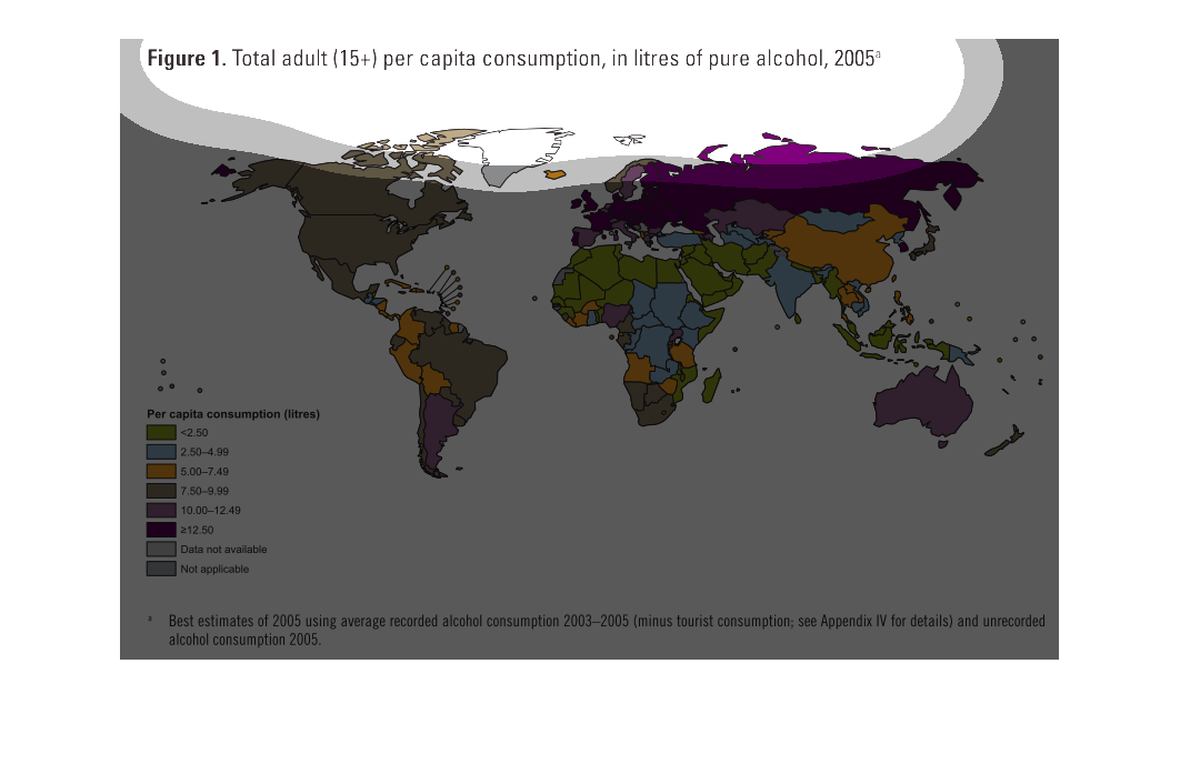
This graph shows the amount of pure alcohol consumed by adults, per capita, in 2005. According
to the graph, adults in countries in northern Africa and southern Europe consumed less pure
alcohol then most other countries; with much of the rest Europe consuming the most.
This chart describes total adult (15+) per capita consumption, in liters of pure alcohol,
for the year 2005. Different categories are represented by different colors.
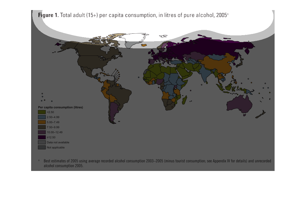
The image is a world map that shows the number of litres of pure alcohol consumed by adults
in each country between 2003 and 2005.  The creator has subtracted the amount consumed by
tourists, and defines adults as anyone 15 years of age or older.  Areas in Green show consumption
of less than 2.50 litres per capita.   Areas in Blue show consumption of 2.50 to 4.99 litres
per capita.   Areas in Orange show consumption of 5.00 to 7.49 litres per capita.   Areas
in Brown show consumption of 7.50 to 9.99 litres per capita.   Areas in Light Purple show
consumption of 10.00 to 12.49 litres per capita.   Areas in Dark Purple show consumption greater
than 12.50  litres per capita. Areas in Light Grey show areas where date was not available.
  Areas in Grey show areas where a measurment is not applicable do to little or no population.
    Areas in Blue show a consumption of 2.50 to 4.99 litres per capita.
This 2005 world map shows the total percentage of adult (being over 15) of consumption of
pure alcohol. Each country is color coded and shaded for per capita delineation.
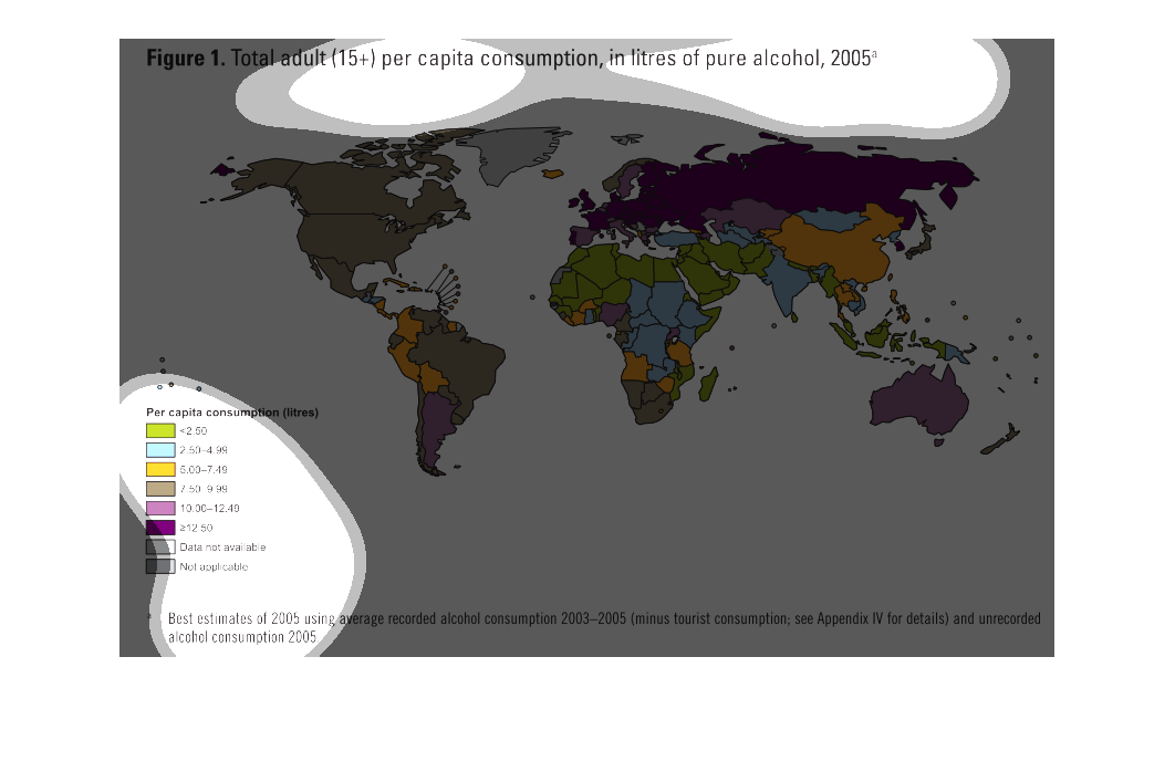
The consumption of Alcohol is quite large in the world. In this chart the study conducted
tries to illustrate that fact per capita, and how they differ in variations of Alcohol.
The image depicts total adults (15+) per capita consumption, in liters of pure alcohol, 2005*.
Russia, Western Europe, Australia and parts of South America lead consumption across the world.