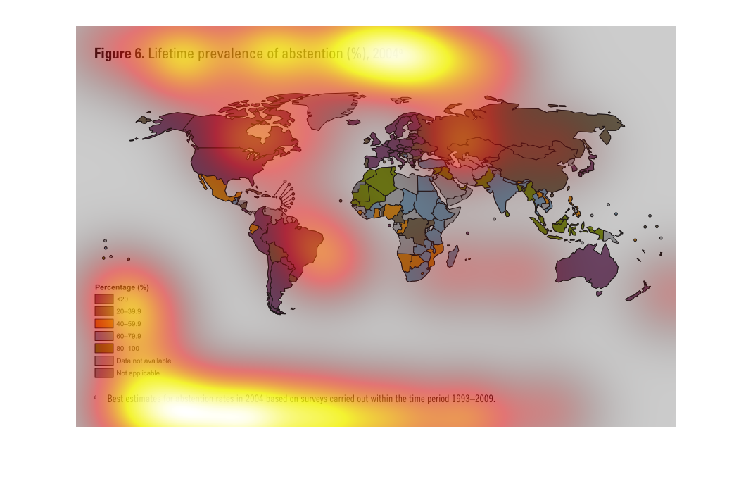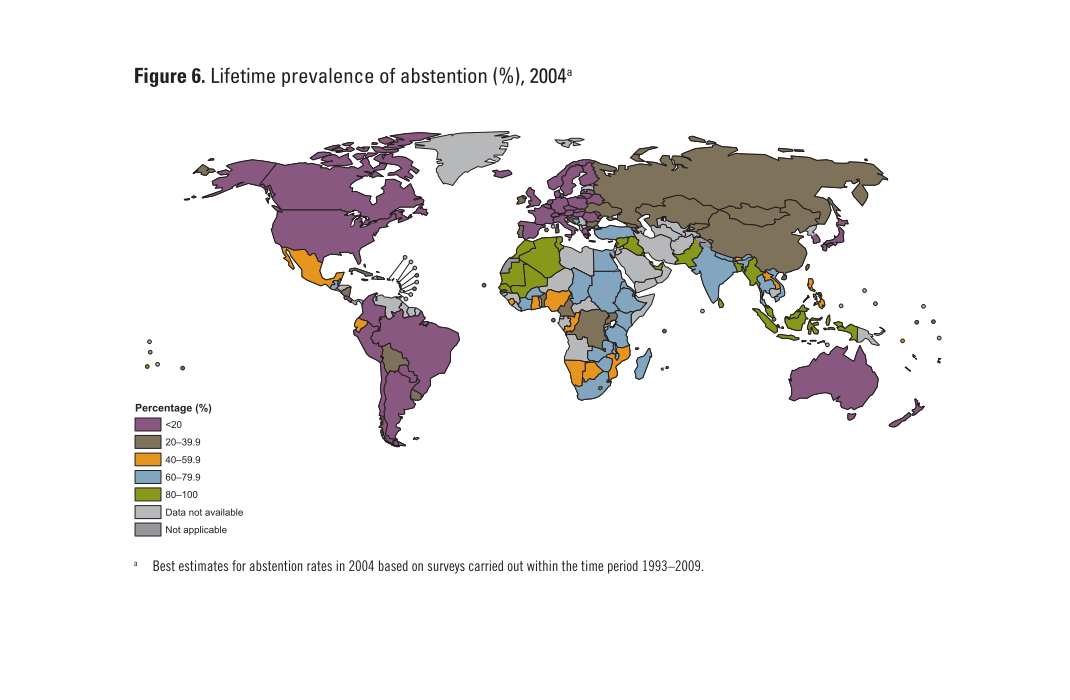
This chart clearly displays the lifetime prevalence of abstention in percentage for the year
2004. The United States, Canada, Most of Europe, Most of Brazil, And Australia, fall in the
20 percent category.
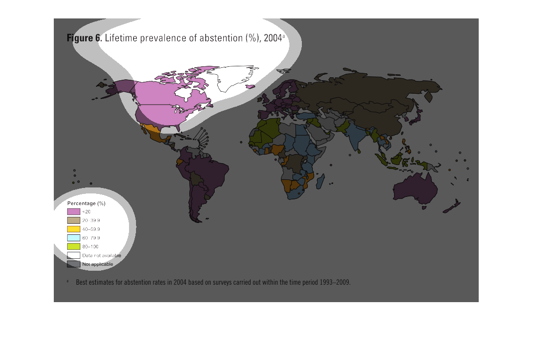
The image shows a map of the world and is titled, lifetime prevalence of abstention. The percentage
shows to be the highest in heavily modernized countries.
The figure presented is titled lifetime prevalence of abstention (%), 2004.  The figure is
an actual representation of the prevalence of lifetime abstention.
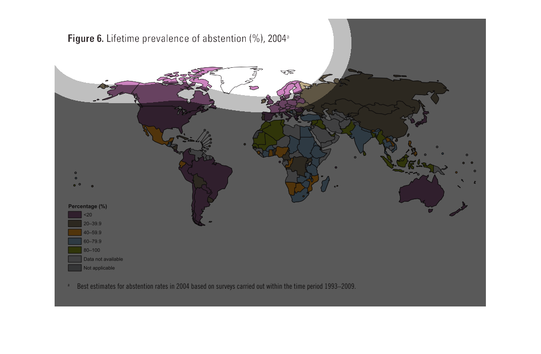
This chart describes lifetime prevalence of abstention. Different categories and percentages
on the chart are represented by different colors. Including pirple.
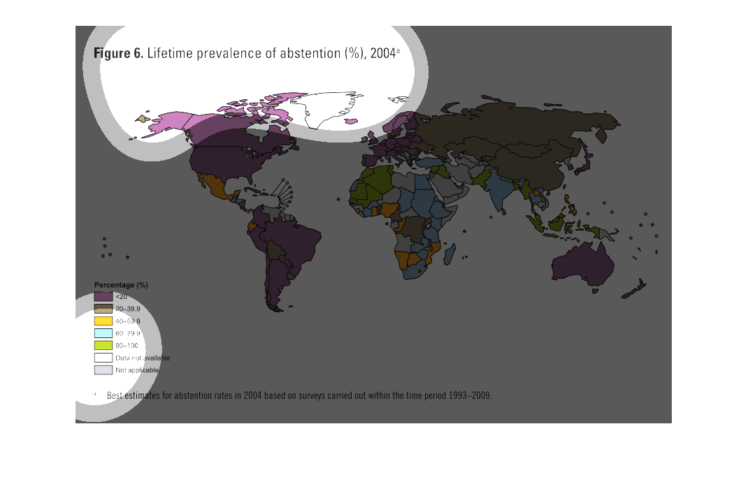
This handmade chart shows the percentage of the population that exhibit abstention (from sex
most likely). most of the world is below 20% but some have higher rates
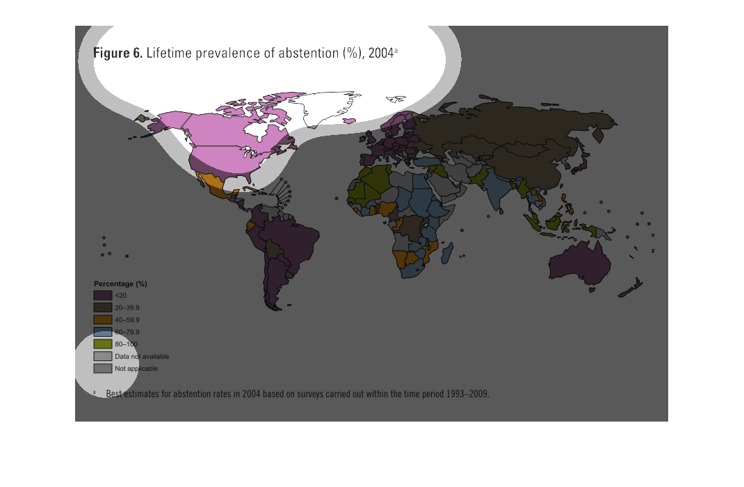
figure 6 lifetime prevalence of abstention percentage in 2004. We see a color coded map of
the world. With highest percentages occurring in the united states, cananda, south america,
europe, and australia
Lifetime prevalence of abstention in 2004. This is an estimated percentage based on surveys
from 1993-2009. The USA and Canada, most of south America, a bit of Europe and all of Australia
are under 20%. Asia is mostly from 20-39.9%. Some parts in Africa and South America are not
applicable
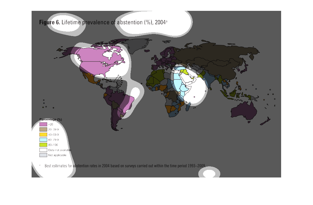
The image shows the rate of abstention around the globe. The continents with the highest percentage
of abstention are North America, South America, Europe and Australia.
This is a color coded global map depicting the lifetime prevalence of abstention in percentage
in the year 2004. The lowest rates were in the Americas, Europe and Australia as a whole.
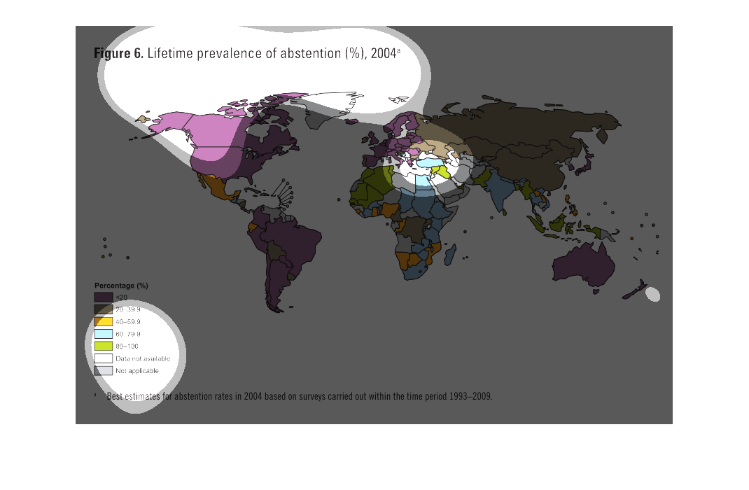
The chart represents in numbers and colors on a global map the percentage of the population
of each country that has abstained from voting their entire lives as of 2004.
This graph is a graph of the United States of America and the map is color coded  the graph
shows which countries or a stance and which countries isnt
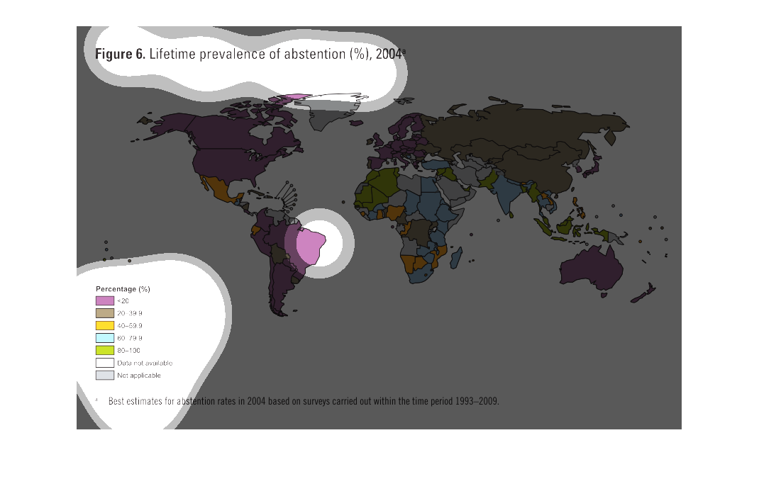
This study conducted between 1993 to 2009 showcases the world's view of abstention, broken
down by national borders. It is quite useful to see the extent to which people view this issue.
The figure is a map presenting data on the lifetime prevalence of abstention (as a percentage)
in countries throughout the world in the year 2004.  The data is based on best estimates as
a result of surveys.