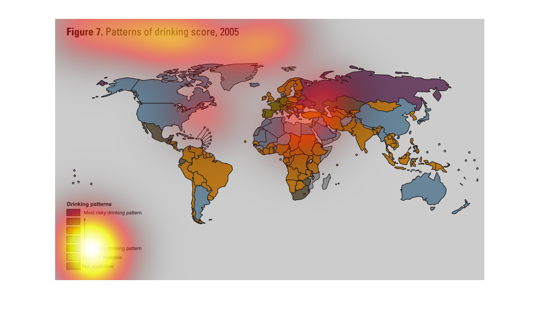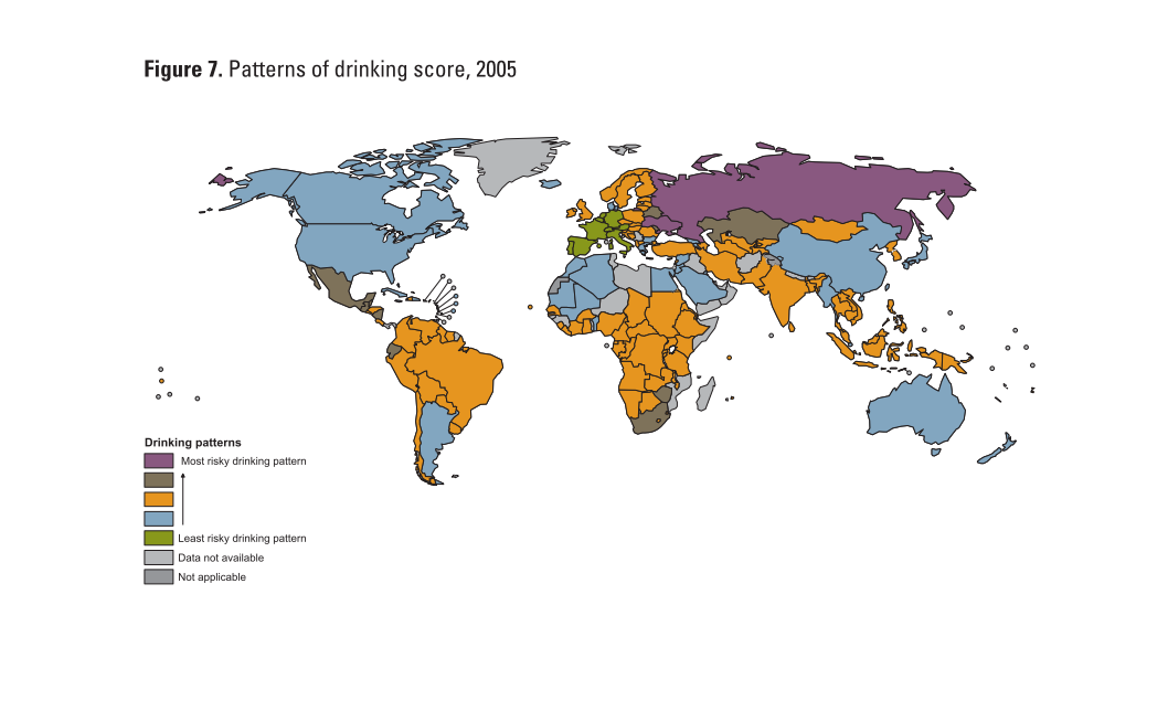
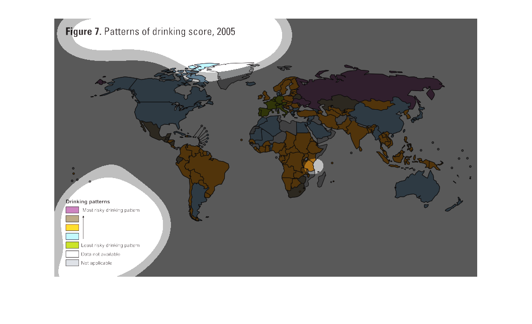
This chart consists of a world map detailing drinking habits in different countries. It shows
how risky different countries' drinking habits tend to be.
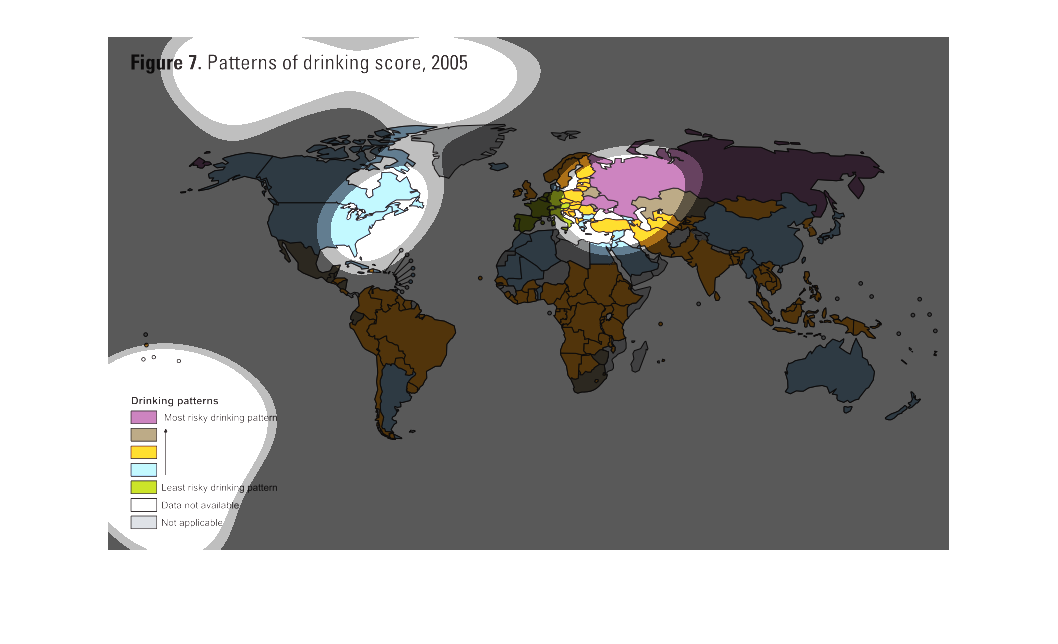
This is a map of patterns of drinking score, 2005. The United States of America has a moderate
level of risky drinking behavior. Most of South America has a slightly riskier level of drinking
patterns.
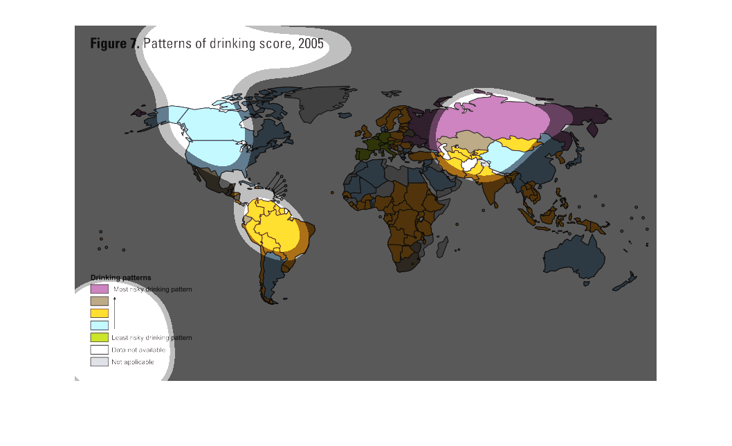
THIS MAP COLOR CODES THE RISK OF DRINKING BEHAVIORS/PATTERNS IN DIFFERENT COUNTRIES. PURPLE
IS THE MOST RISKY BEHAVIOR, AND GREEN IS THE LEAST RISKY, WHILE GREY IS NO DATA.
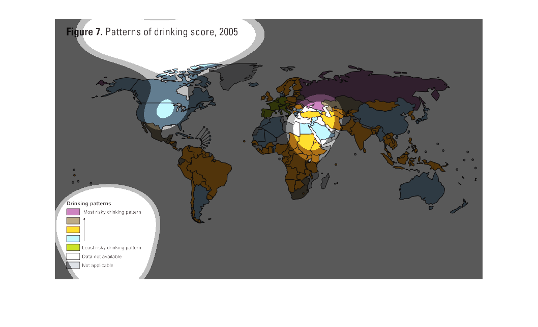
The figure describes patterns of drinking throughout the world.  Russian people have the riskiest
drinking patterns. Countries in Western Europe have the least risky drinking patterns.
This shows the patterns of drinking for people across the world from 2005.  The most risky
drinking patterns are highlighted in purple and the least risky are in light green.
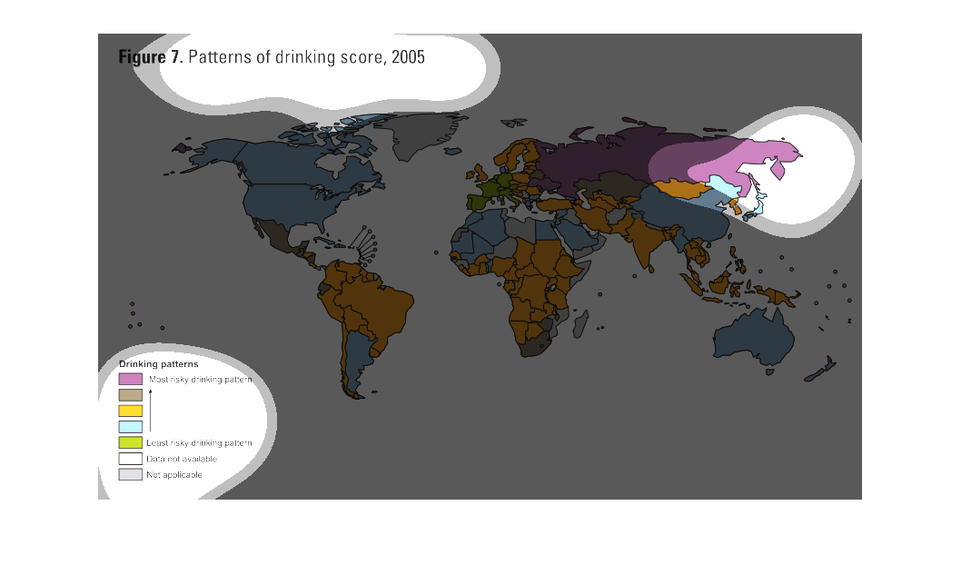
This map of the world shows the drinking patterns of different countries. The US is not applicable,
but parts of Asia - mainly Russia - have the most risky drinking patterns. Countries in Europe
seem to be less risky.
The globe likes to drink! This illustration shows how the world enjoys a cocktail or two depending
on the occasion, and it is so common that it should be considered part of the human experience.
this is describing part of the worldwhich is divided in to different  continents and or countries
 deciding drinking platforms.. where is alcohol problems are more prevalent deciding of the
 area..... it is a graph showing who and how much people drink. It is a comparison throuout
out the world and is color coded
This figure represents the patterns of drinking score worldwide. The nations are colored based
on alcohol consumption/risk. Purple being the most risky, grey being a non risky nation.
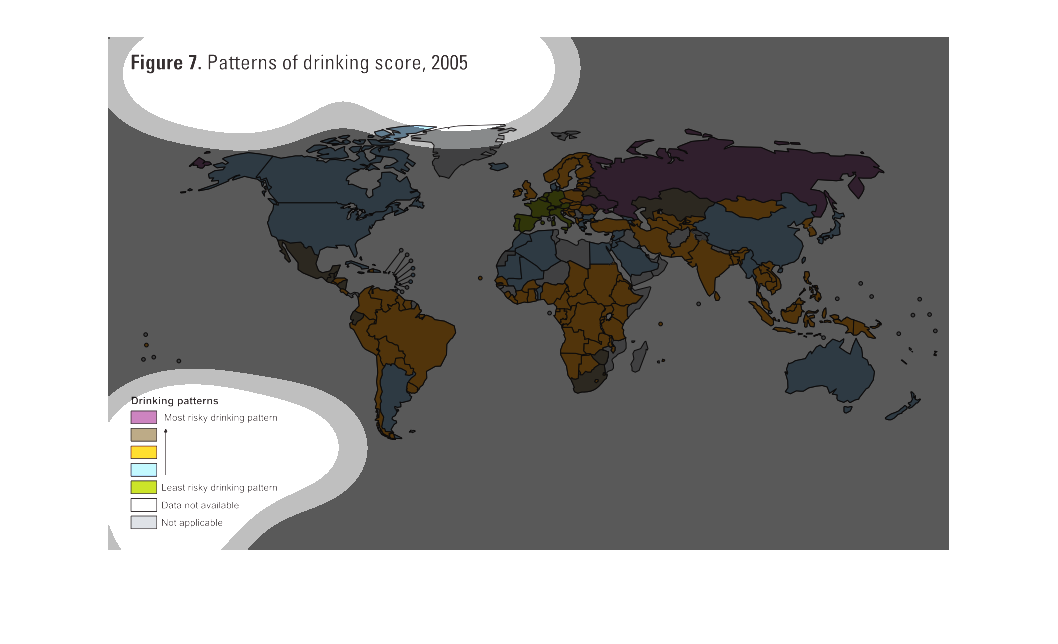
The figure presented is titled figure 7: patters of drinking score, 2005.  The figure is shown
with a map of the world and is a representation of drinking score.
This is related to a study done in 2005, showing the detailed patterns of drinking score around
the world. The measures range from the most risky drinking patterns, to the least risky behaviors.It
appears that Russia has the most (purple), while the eastern European countries show the least
(green).
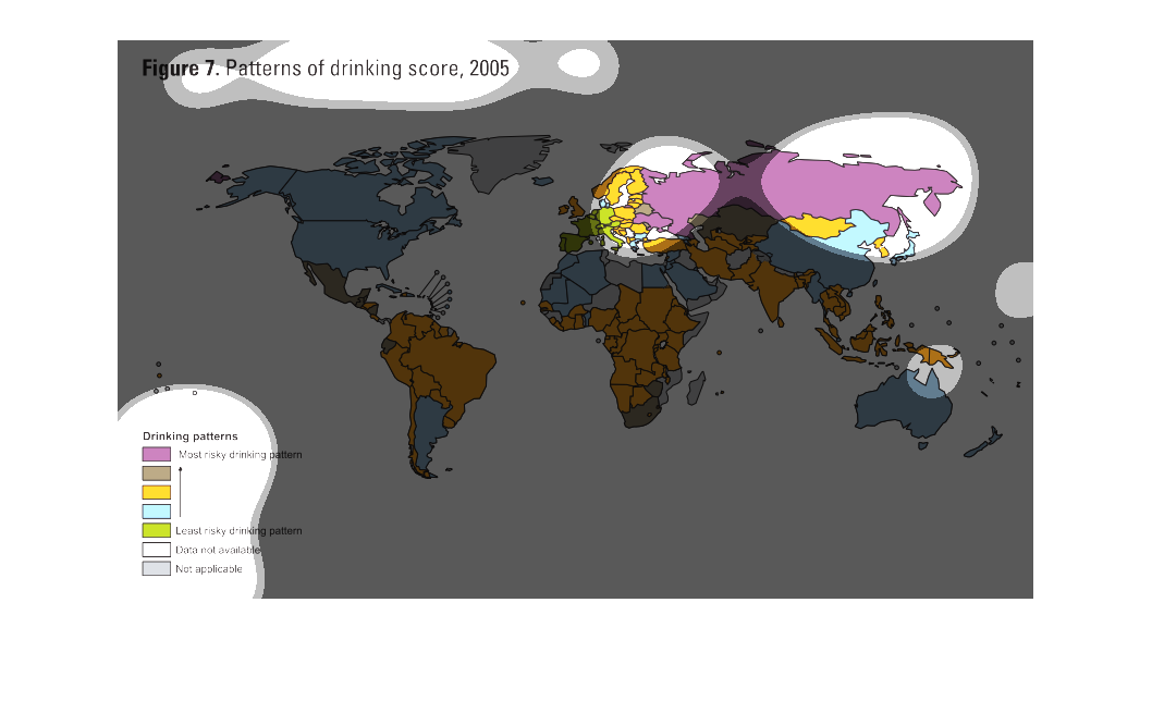
This chart describes patterns and drinking score for the year 2005. Different countries on
the map are represented by different color codes on the chart.