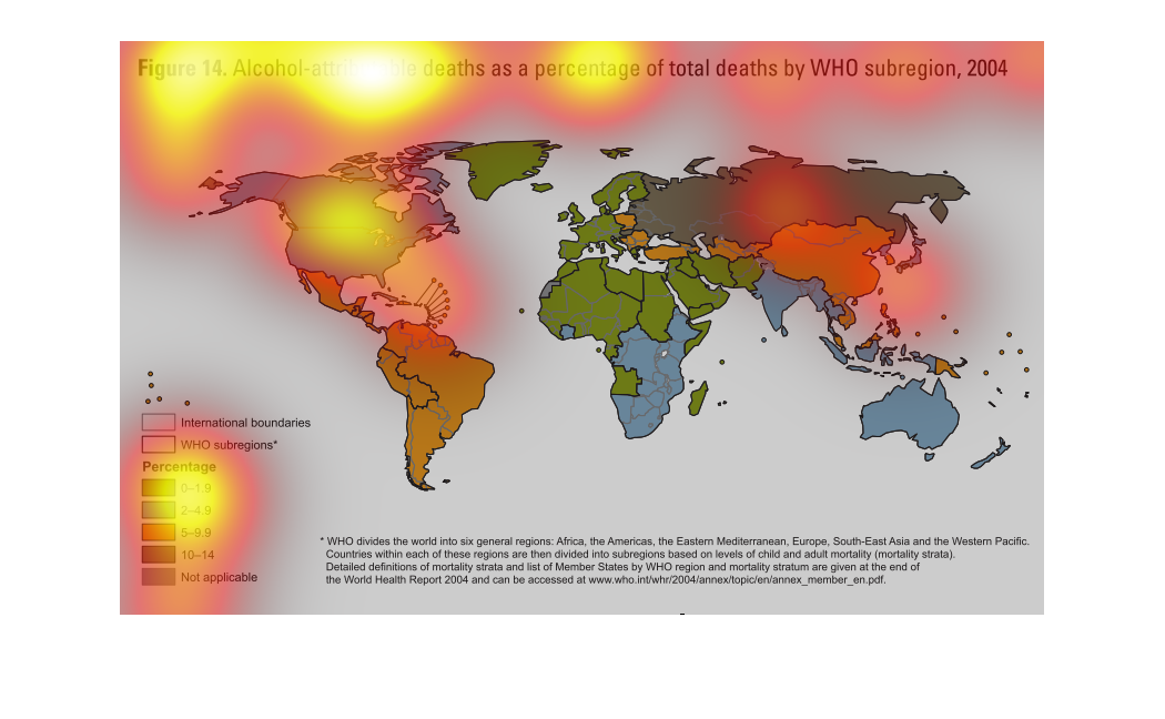
This is a world map that shows the number of alcohol-related deaths in different regions as
defined by WHO.   Europe and northern Africa show the lowest, with Russia, or the area that
used to be the USSR, shows the highest level.
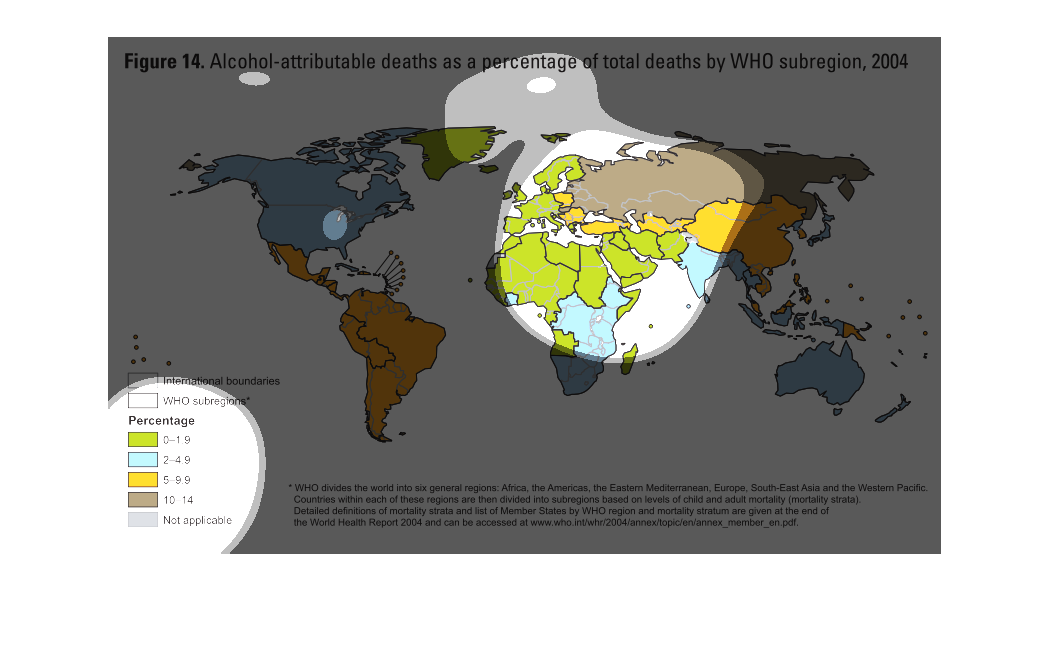
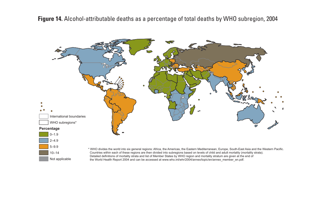
World map divided into six general regions, sub divided into smaller regions, showing the
World Health Organization (WHO) statistics on child and adult mortality rates.
In this study conducted in 2004, the researchers try to illustrate the damage Alcohol really
does to a society. We see all the listed deaths caused by alcohol worldwide during that year.
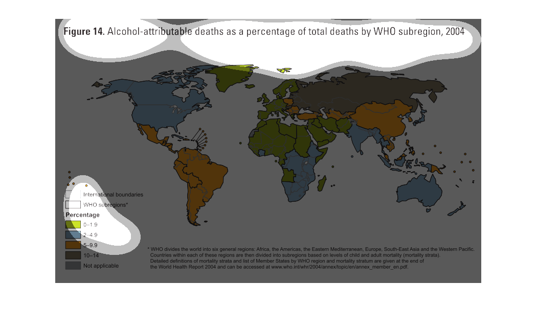
This 2004 world map shows the total alcohol-attributable deaths as percentage of total deaths
by WHO regions. Each nation is colored and shaded by percentage.
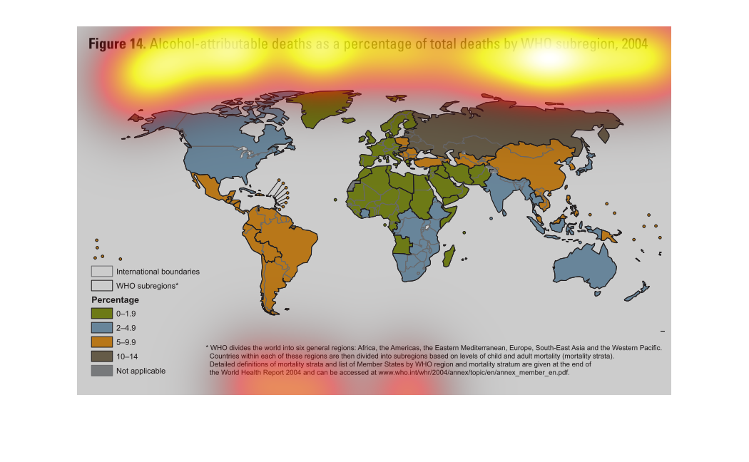
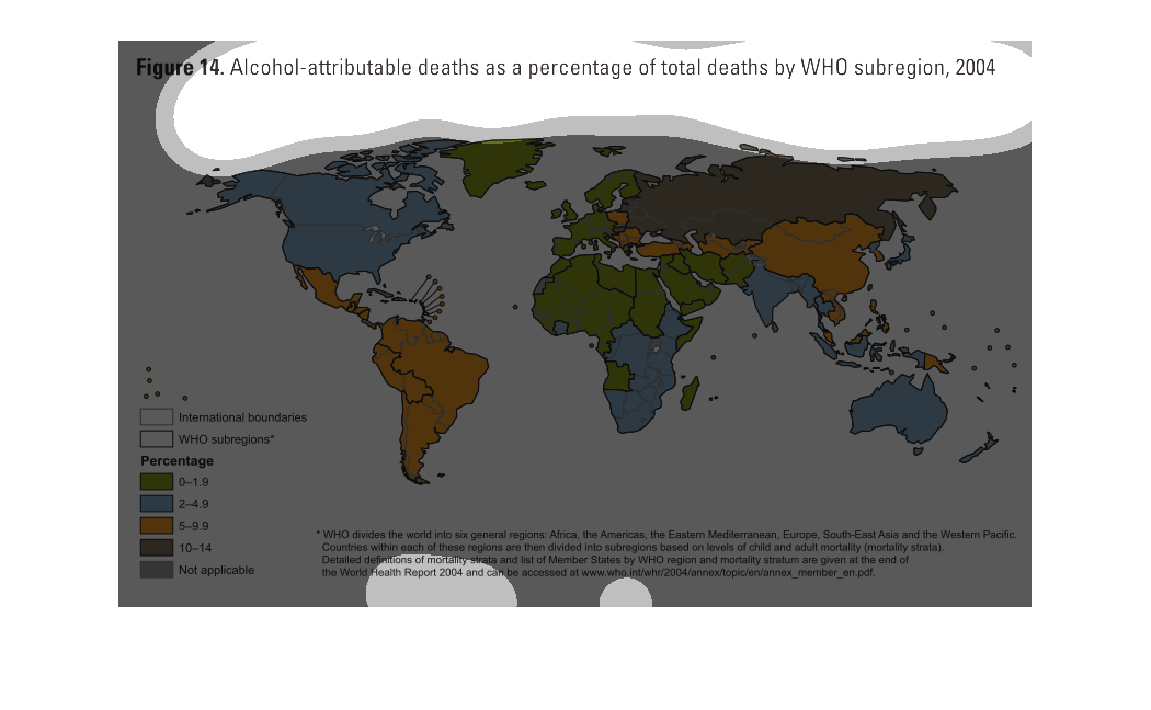
This chart describes alcohol-attributable deaths as a percentage of total deaths by WHO sub-region
for the year 2004. Different categories are represented by different colors.
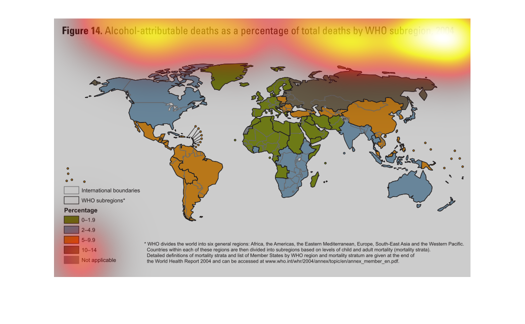
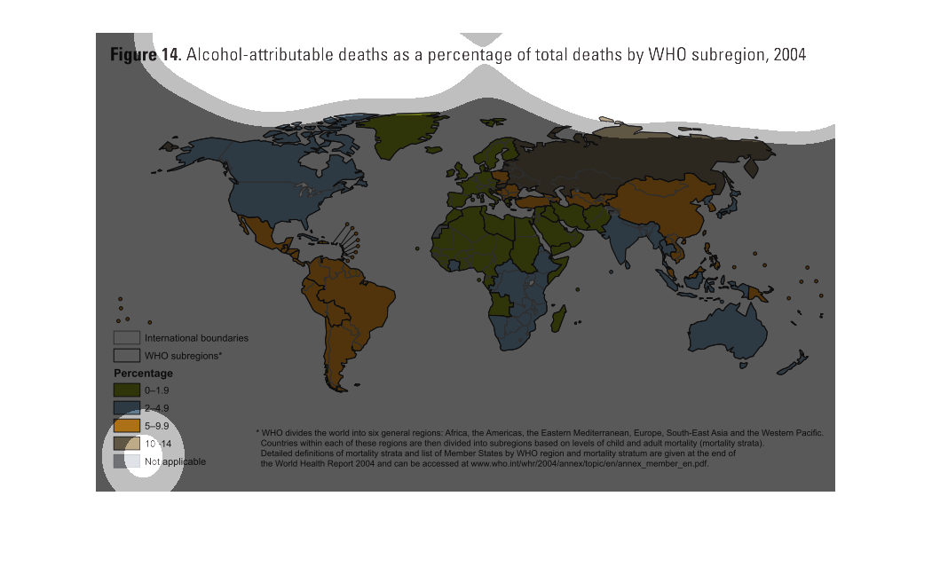
This is a map of alcohol attributed deaths as a percentage of total deaths in each WHO region
in 2004. Russia has the most alcohol attributed deaths as a percent of total deaths.
The image depicts alcohol-attributed deaths as a percentage of total deaths by WHO sub-region,
2004. Russia appears to have the highest alcohol-attributed deaths throughout the world, followed
by China.
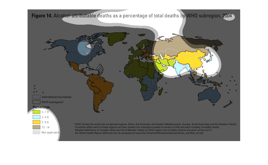
THIS MAP SHOWS THE PERCENTAGE OF DEATHS ATTRIBUTABLE TO ALCOHOL IN EACH WHO SUBREGION AS A
PERCENTAGE OF TOTAL DEATHS IN THAT SUBREGION IN 2004. GREEN IS THE LOWEST AND BROWN IS HIGHEST.
This chart describes alcohol attributable deaths a percentage of total deaths by WHO sub region,
for the year 2004. Different categories are represented by different colors.
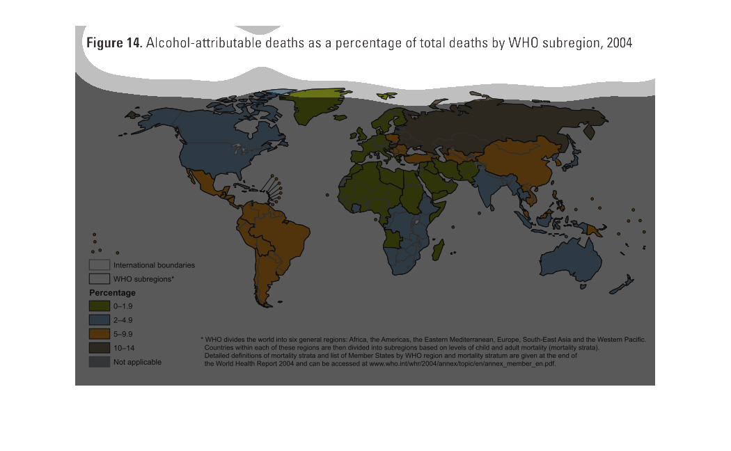
This is a color coded global map depicting alcohol attributed deaths as a percentage of total
deaths by WHO subregion in the year 2004. It shows that Asia/Russia has the highest percentages.
This map shows the amount of alcohol deaths as a percentage of total deaths worldwide. Central
and South America had higher than average rates, but Russia had an astronomical amount.