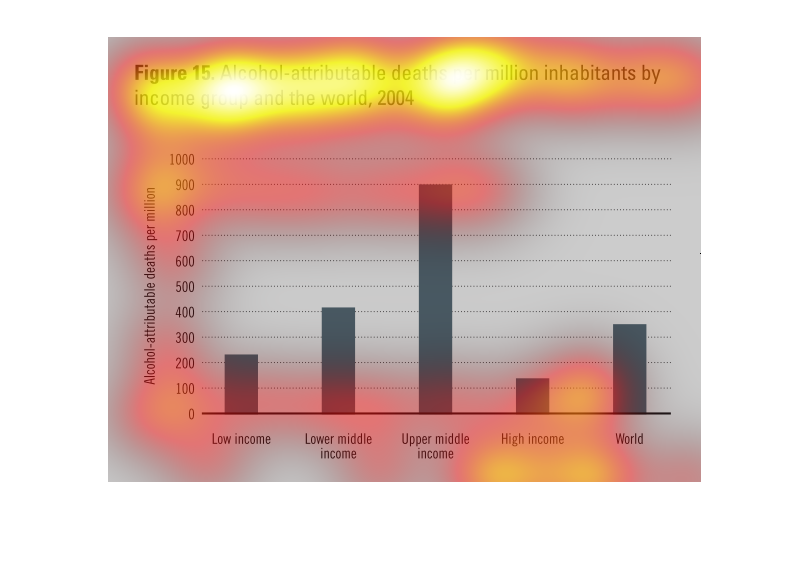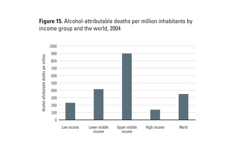
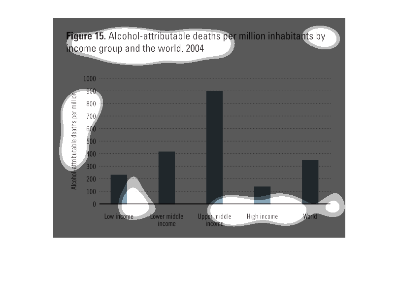
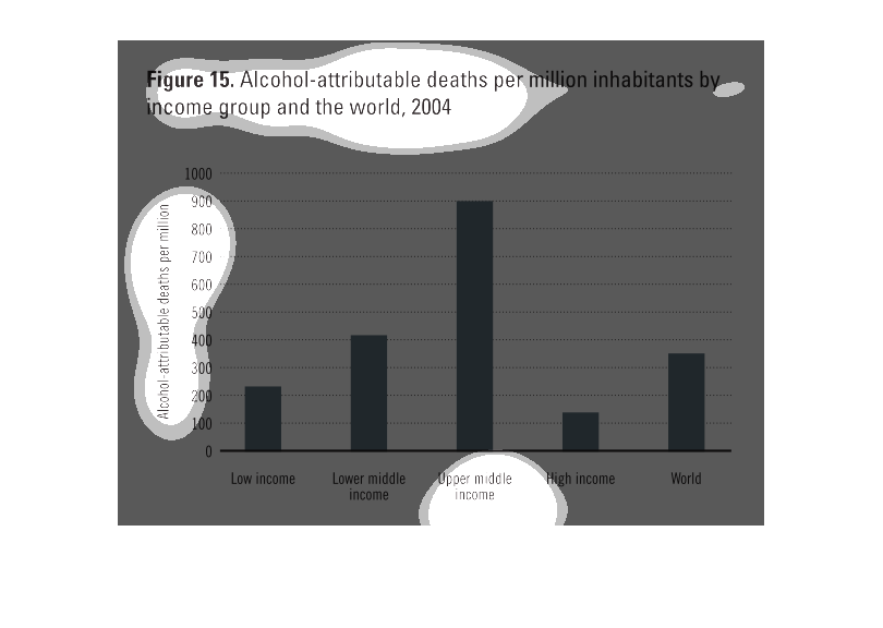
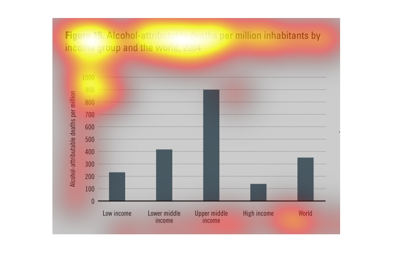
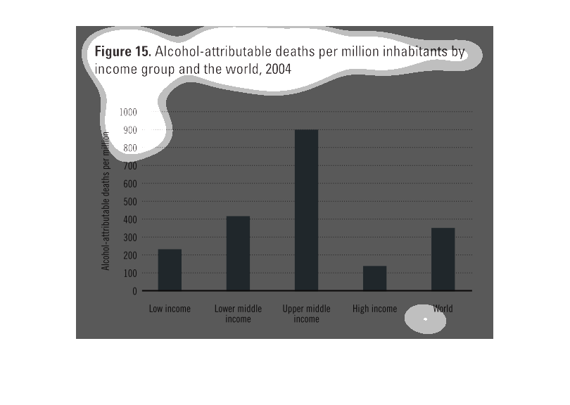
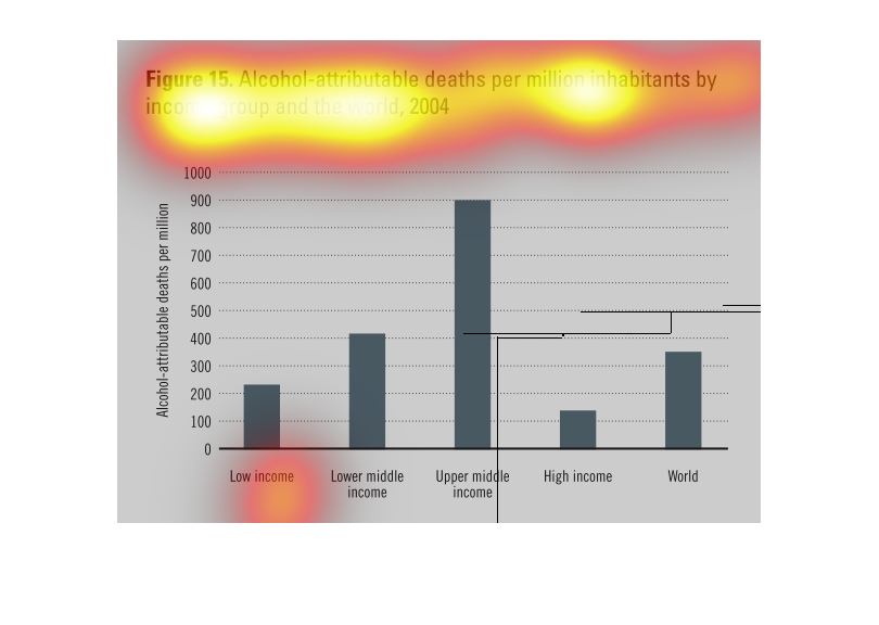
This is a graph of alcohol related deaths per million inhabitants by income group and the
world. The highest amount of deaths occurs in the upper middle class range.
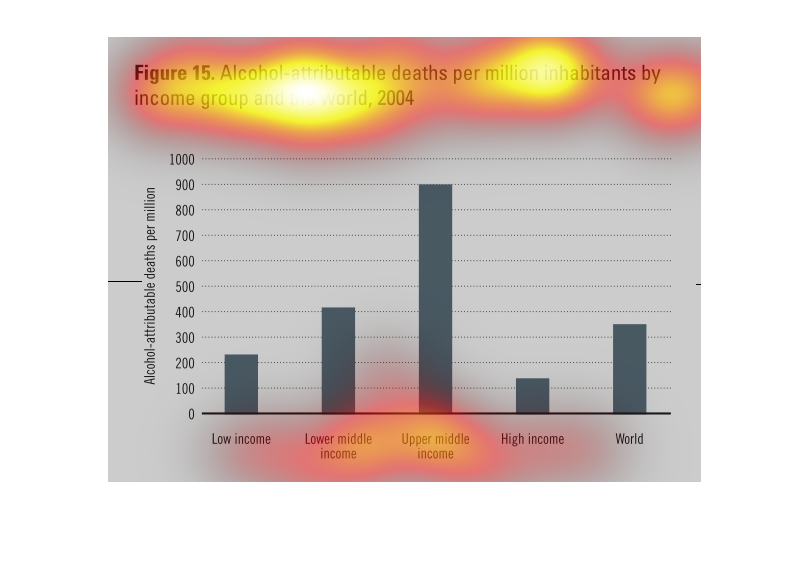
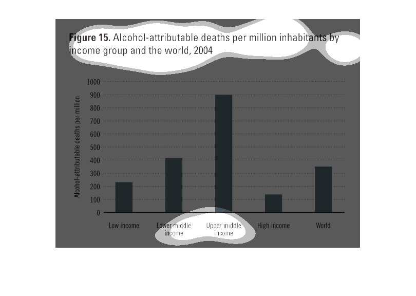
Deaths attributable to alcohol per million inhabitants by income group, and by the world in
2004.  The categories measured are lower; lower middle; upper middle; high; and world.   The
upper middle have the most alcohol related deaths by far (around 900), while high income have
the least (just over 100).
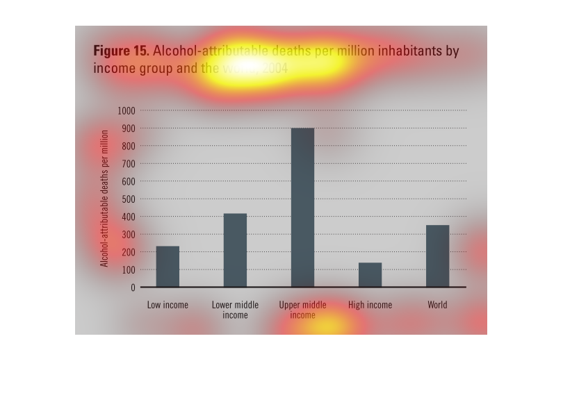
The figure presented is titled figure 16 alcohol attributable deaths per million inhabitants
by income group and the world, 2004.  The figure uses bar  graphs.
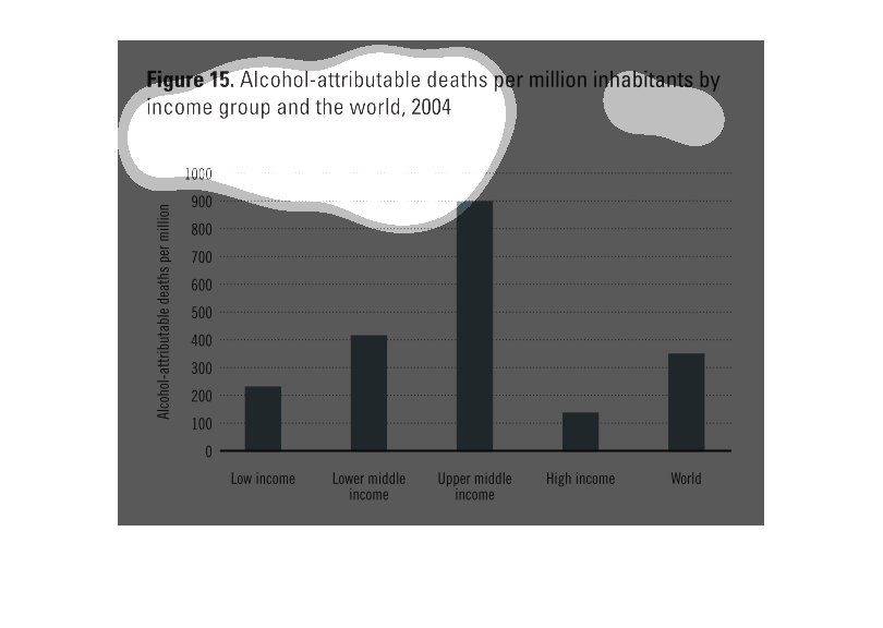
The chart shows alcohol attributable deaths per million inhabitants byu income group through
out the world in 2004.  Upper middle income has the highest rate.  While High income is the
lowest.
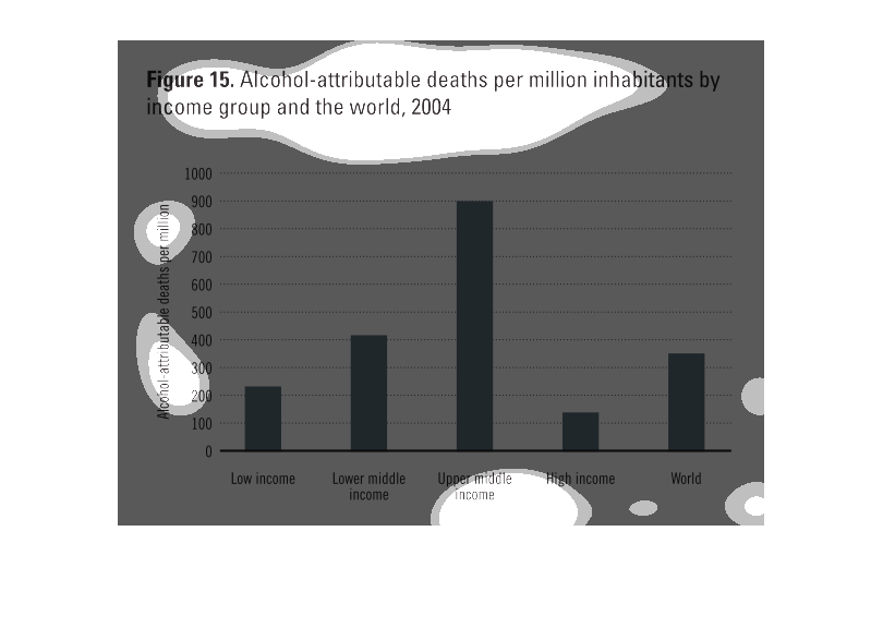
This chart describes alcohol attributable deaths per million inhabitants by income group and
the world, for the year 2004. Categories on the chart include low income.
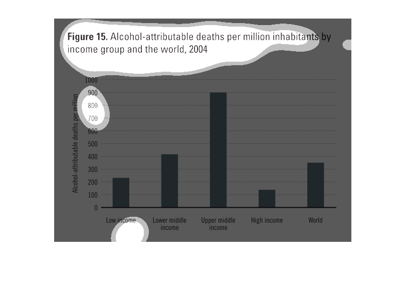
This is a bar chart of alcohol-attributed deaths per million inhabitants by by income group
and the world 2004. There is a high spike around upper middle income and the rest is relatively
low.
This is a graph of alcohol attributed deaths per million inhabitants by income group and the
world in 2004. Alcohol attributed deaths are most common amongst the upper middle class.
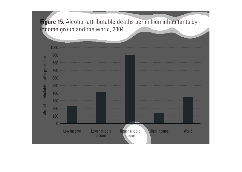
this bar graph shows alcohol attributable deaths per million inhabitants by income groups
and the world. 2004 was the year the research was analyzed.  The upper middle class income
level has the highest deaths, reaching the 900 million amount of deaths.
THIS PLOT SHOWS THE NUMBER OF ALCOHOL-RELATED DEATHS PER MILLION DEATHS FOR DIFFERENT INCOME
GROUPS AND THE WORLD AVERAGE. UPPER MIDDLE INCOME HAS THE HIGHEST DEATHS PER MILLION STATISTIC.
graph about alcohol attributive deaths per million inhabitants by income group in the world.
 upper middle class had the most and high income had the least.
The image depicts a bar graph of alcohol attributable deaths per million inhabitants by income
group and the world, 2004. Categories include: Low income, lower middle income, upper middle
income, high income, and World. The data indicates that the upper middle income group has
a higher attributable death count when compared to others groups.
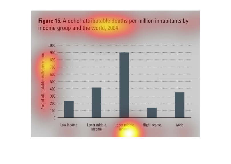
This graph is in relation to alcohol deaths per million inhabitants based on economic income
status as compared to the world. Research in this graph is from 2004. The upper middle class
has the most alcohol attributed deaths in comparison.
This chart describes alcohol attributable deaths per million inhabitants by income group and
the world, for the year 20004. Categories on the chart include low income.
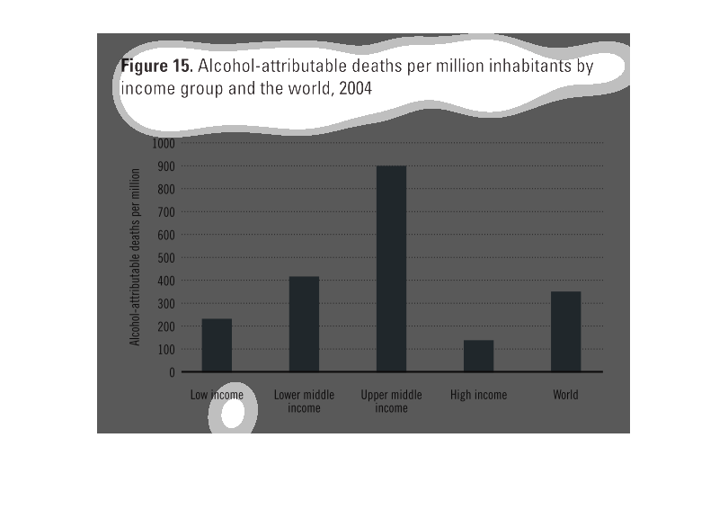
this chart shows the relation between income level and number of deaths attributed to alchol.
this graph shows for example that the upper middle incomebracket had the highest number alcohol
related deaths (9000)as opposed to the higher middle income only haveing a little over 100.