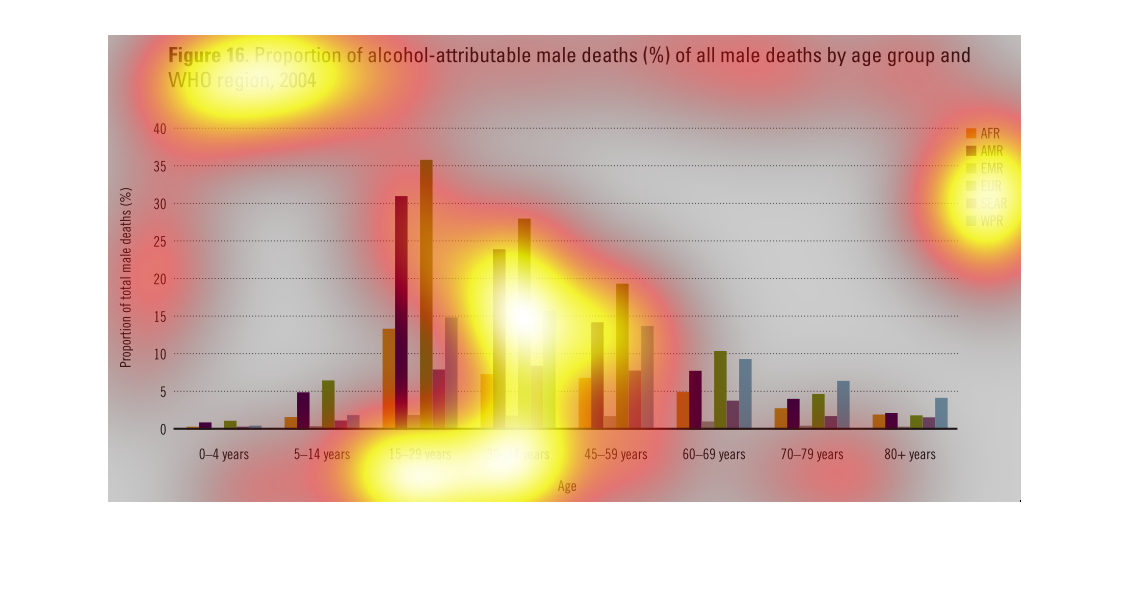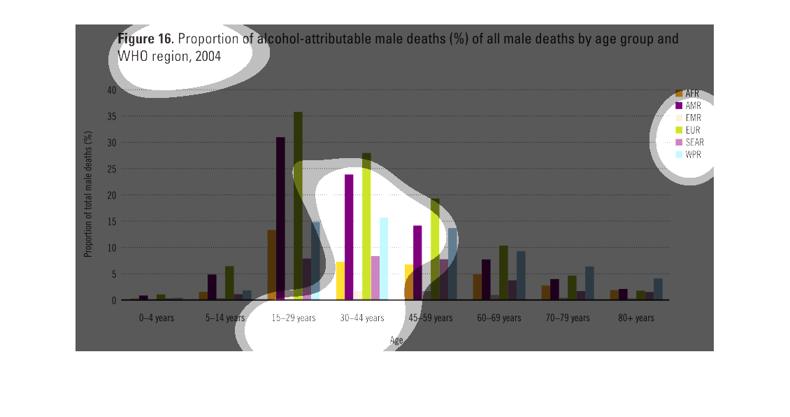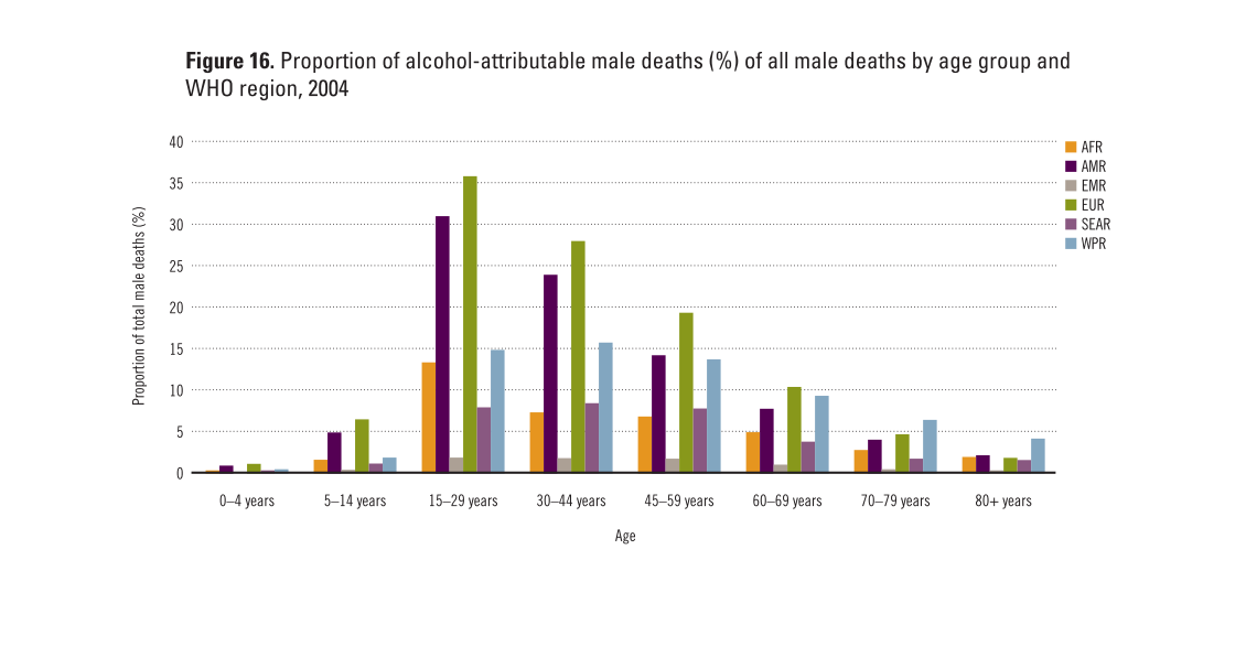
Figure 16 shows a graph of the proportion of alcohol attributable male deaths of all male
deaths by age group and WHO region. Men between the ages of 15 and 29 show the most risk for
this type of death.
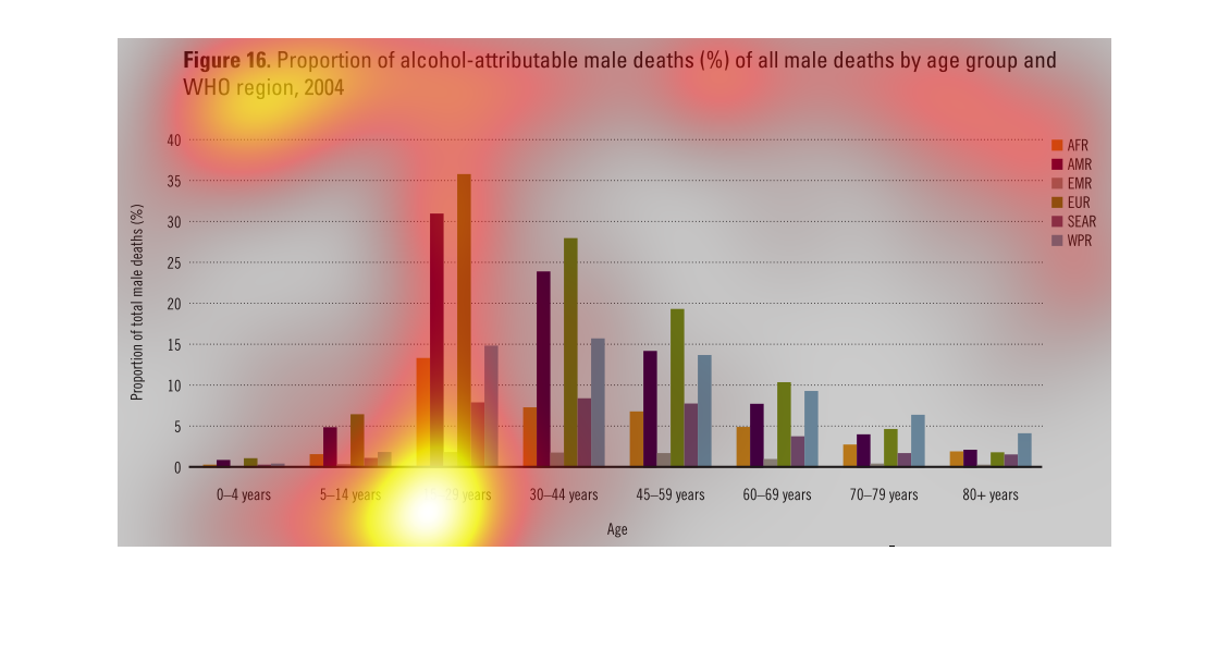
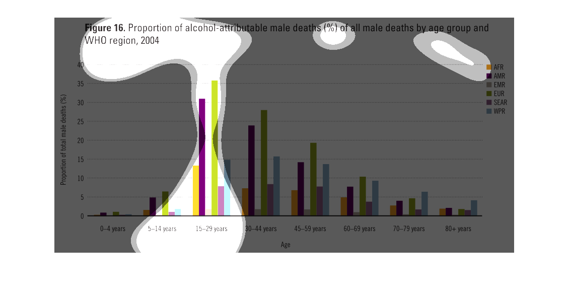
All men must die, this is quite literal from looking at this graph. The graph showcases the
various alcohol related deaths of males, broken down by age and demographic.
This chart describes proportion of alcohol attributable male deaths (%) of all male deaths
by age group and WHO region, for the year 2004. Categories include ages 15-29 years.
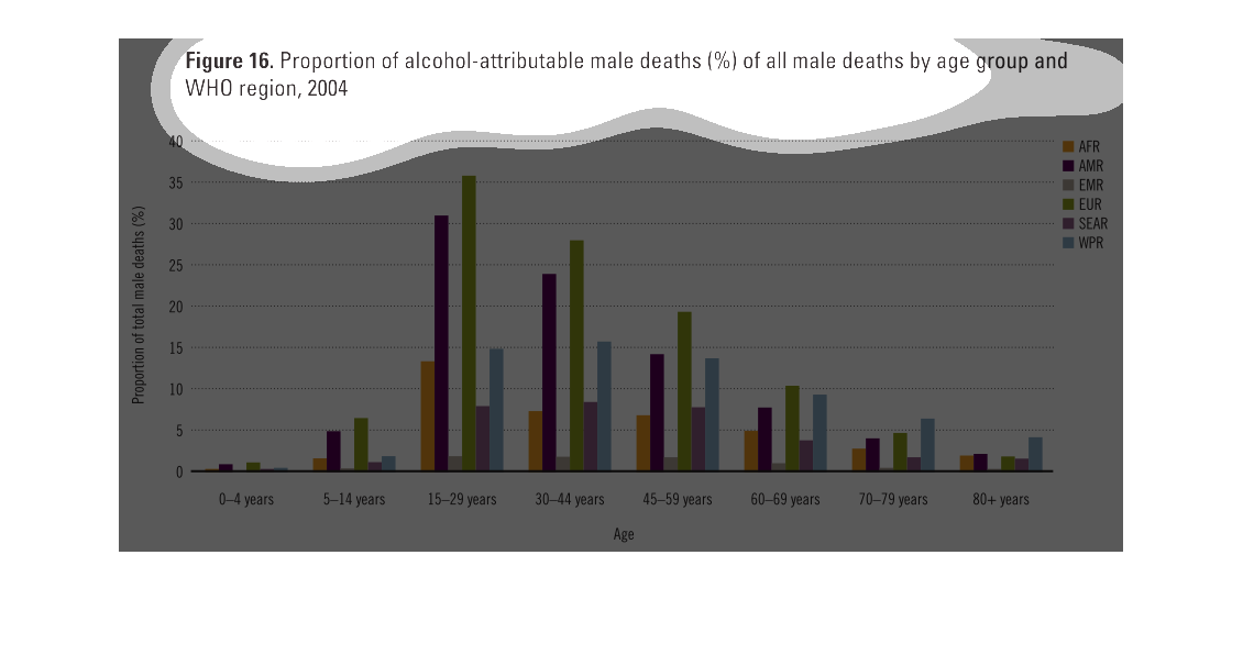
its a graph showing the proportion of the percentage of males in different regions that die
because of the usage of alcohol. Its giving statistics on each region .
The chart shows the proportion of alcohol-attributable male deaths to by age group and region
in 2004.  Most of these deaths occur between ages 15 - 29, and the WHO region with the most
is EUR.
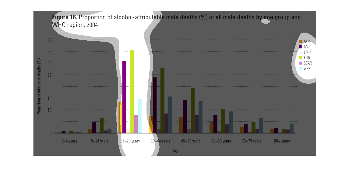
The image depicts the proportion of alcohol-attributable male deaths, in percentages, of all
male deaths by age group and WHO region, 2004. Age group 15-29 years old appears to have the
highest level of alcohol-attributable deaths of any present age group across all regions.
This graph illustrates the proportion of alcohol attributed male deaths as a percentage of
all male deaths by age group and WHO region in 2004. 15 to 29 years old represents the highest
age group fro deaths.
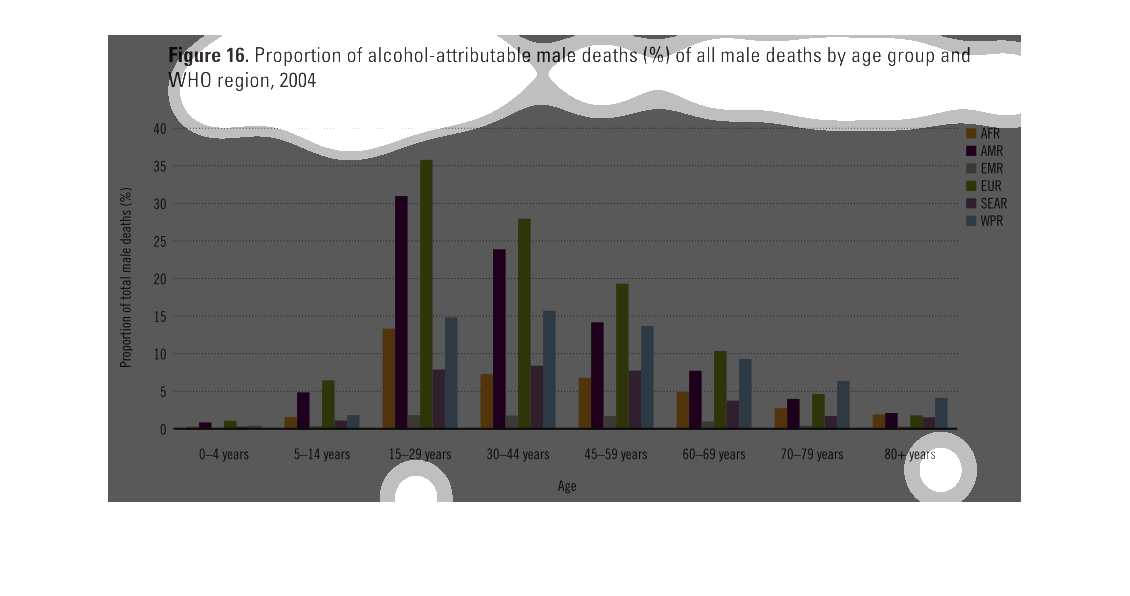
This chart shows the attribution of alcohol to male deaths, separated by age groups and WHO
regions. The vertical bars are color coded into regions, and each age category is group together,
with the values trending down as age increases.
The figure presented is titled figure 16 proportion of alcohol-attributable male deaths (%)
of all male deaths by age group and WHO region, 2004.  The figure is a bar graph.
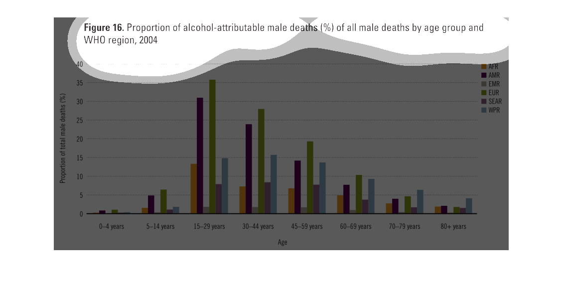
This chart describes proportion of alcohol-attributable male deaths (%) of all male deaths
by age group and WHO region, for the year 2004. Categories are represented by different colors.
This is a bar chart of alcohol attributed male deaths by percent for various regions and age
groups. Data is from the WHO. There is a large spike around  15-29 years and declines on each
side with very little for under 15 years.
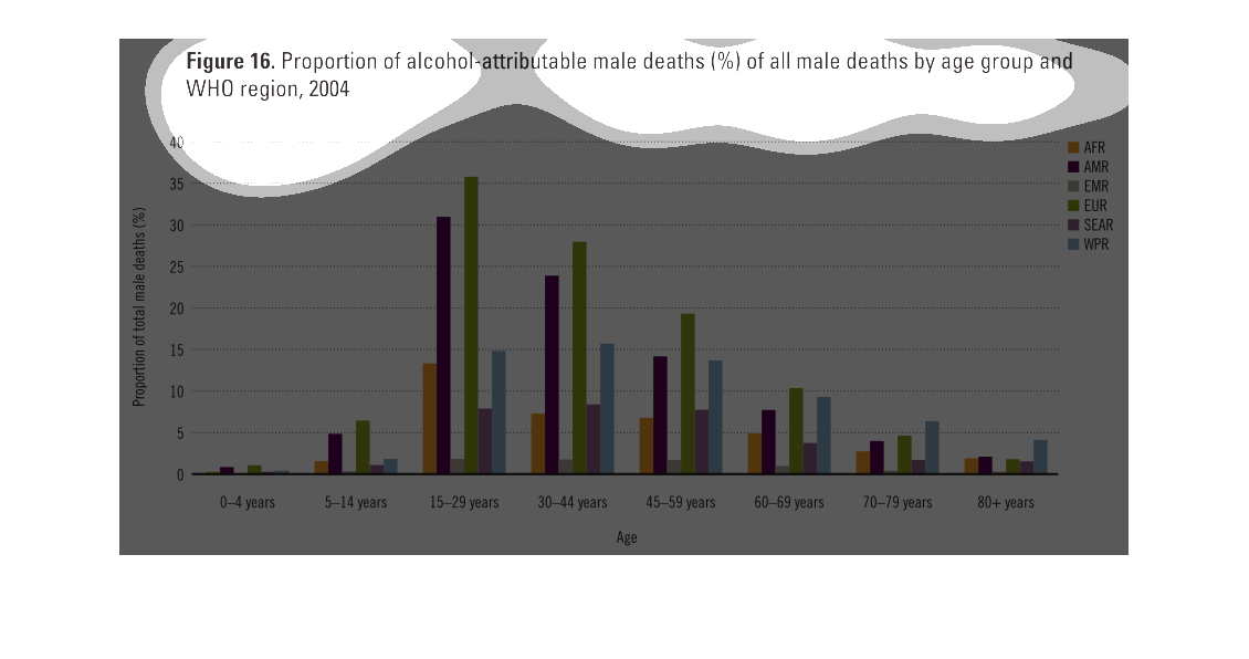
This is a graph that shows the proportion of alcohol attributable deaths within the male population
as a percentage of the overall male population with the WHO region in the year 2004.
figure 16 proportion of alcohol attributable male death % of all male deaths by age group
and WHO region, 2004. Y axis shows proportional percentage. X axis shows age groups each with
different colored bars as shown in the key representing different regions abbreviated with
acronyms.basically showing teenagers to 44 year olds are at the highest risk especially in
Europe and America