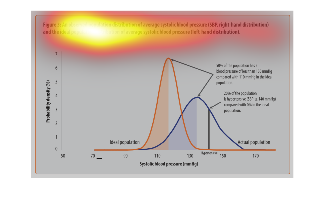
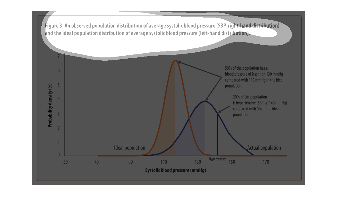
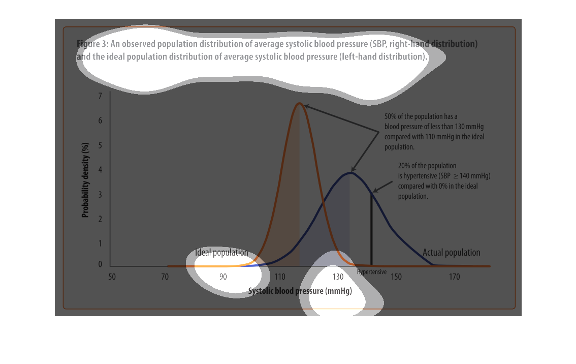
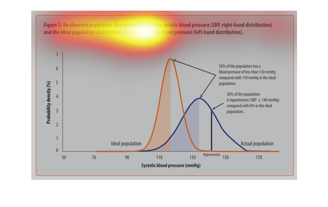
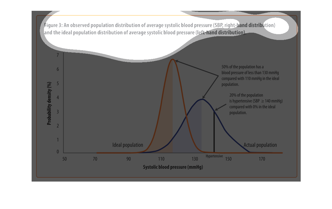
This graphs displays the average blood pressures of an obese population, and the ideal blood
pressures of a population in two lines. The obese population averaged 20 percent hypertensive
while the ideal number in that regard is 0.
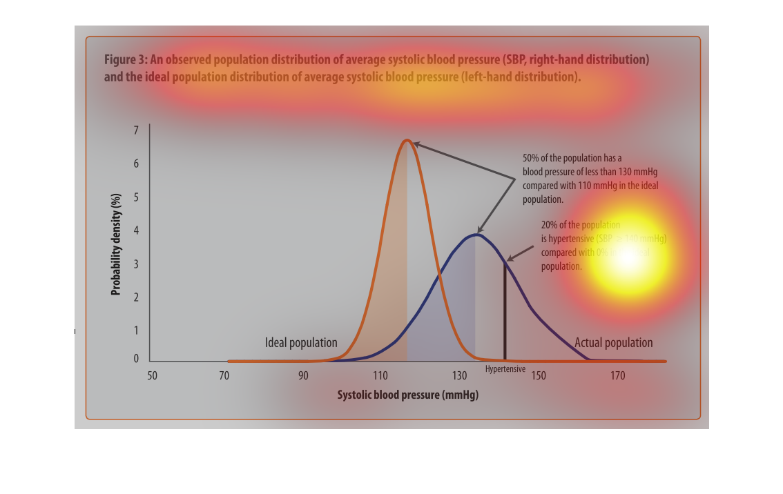
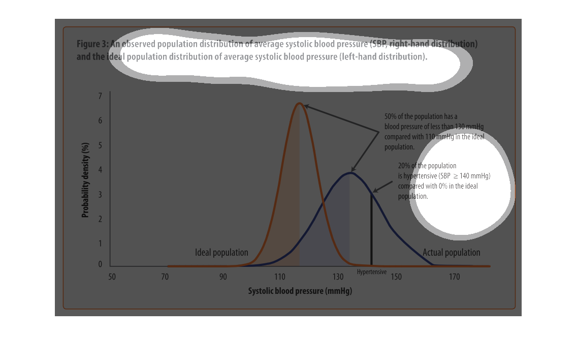
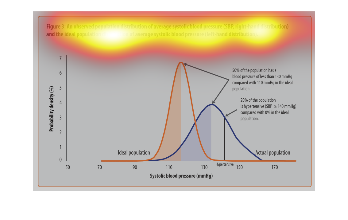
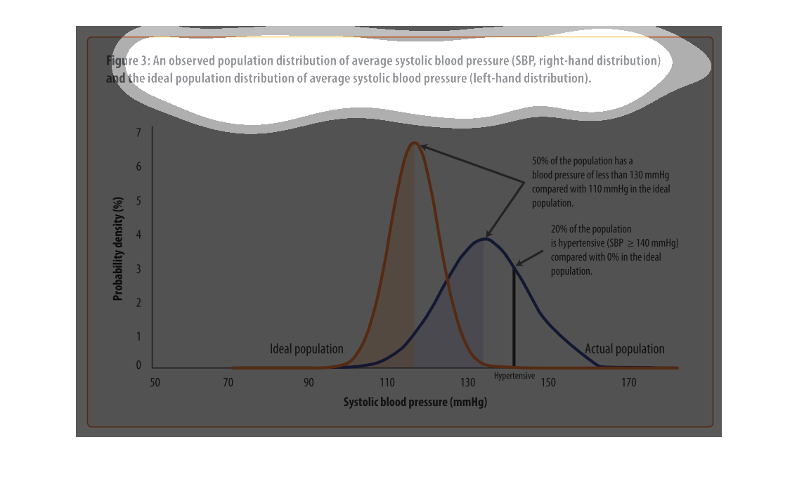
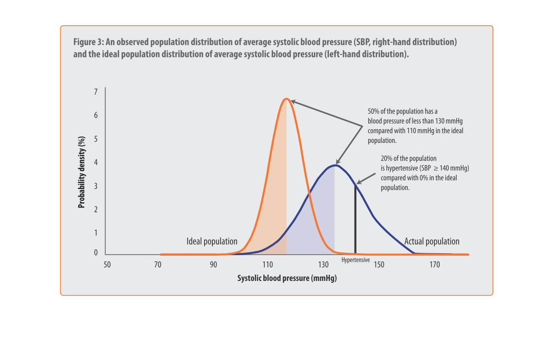
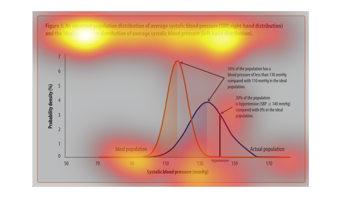
This chart describes an observed population distribution of average systolic blood pressure
(SBP, right-hand distribution) and the ideal population distribution of average systolic blood
pressure.
this graph has a bunch of lines on it and the colos or orange and blues abd the line goes
up and down. 50% of the population needs help and we need to help each other
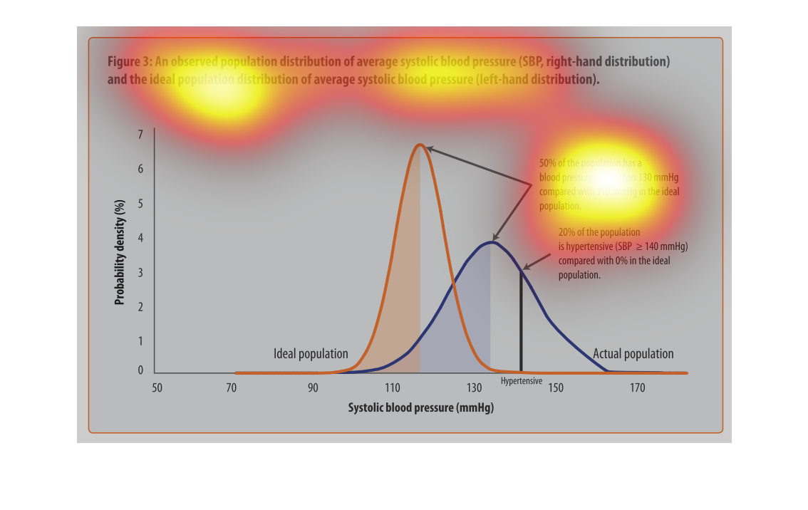
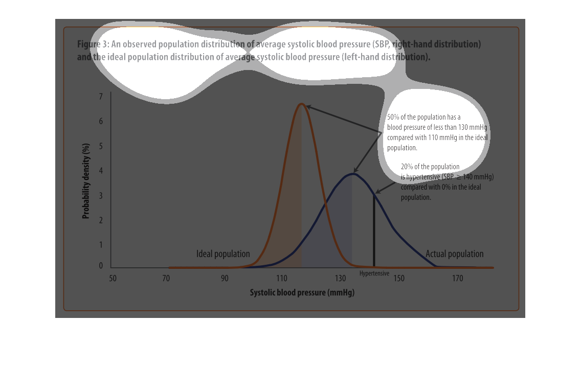
The chart shows average and ideal blood pressures.  We can see that 50% of the population
has acceptable blood pressure.  20% is too high.  The actual population's blood pressure is
generally way higher than the ideal blood pressure.  The yellow line for the ideal peaks while
the blue line is still getting started.
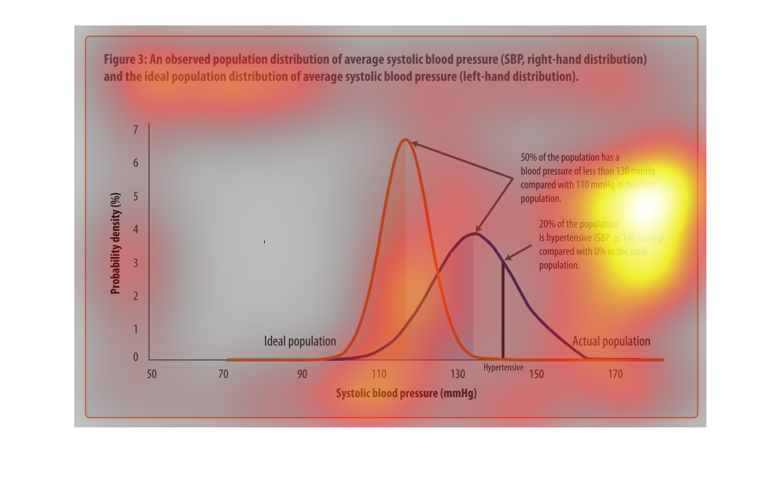
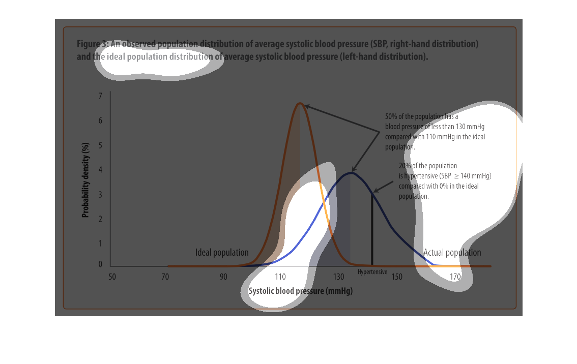
An infographic showing systolic blood pressure graphed as a distribution for an ideal population
and the actual population. Showing actual population blood pressure on average higher
Blood pressure is a serious issue. If you don't have it under control then it more than likely
will wind up killing you. This graph illustrates the real average blood pressure of people
and the ideal blood preasure they ought to have.
This graph shows probability of complications, separated by blood pressure (those with high
blood pressure,etc). Those with the highest blood pressure have the highest probability of
experiencing complications.
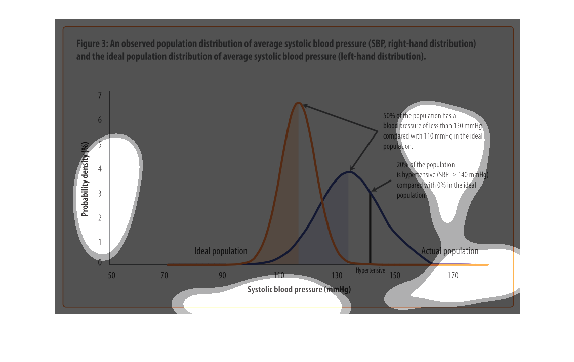
This is a graph showing an observed population distribution of average systolic blood pressure
(SBP, right-hand distribution) and the ideal population distribution of average systolic blood
pressure (SBP, left-hand distribution).
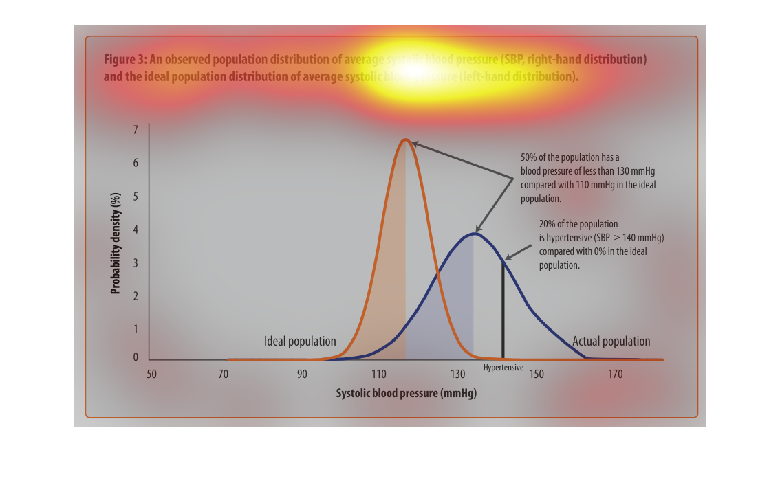
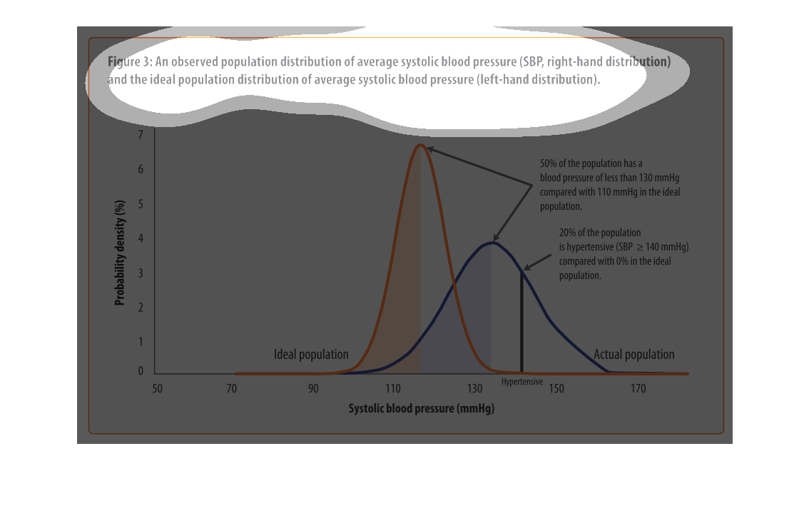
It is a graph depicting the relationship between different kinds of blood pressure. They are
showing how the population differs with what kind of blood pressure they have, and the different
levels between them.
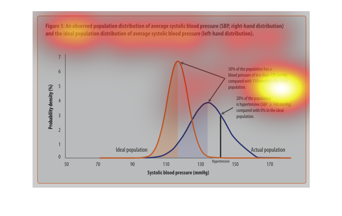
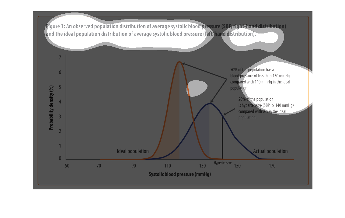
The figure presented is titled Figure 3: and observed population distribution pf average systolic
blood pressure.  The figure is a representation of average blood pressure.
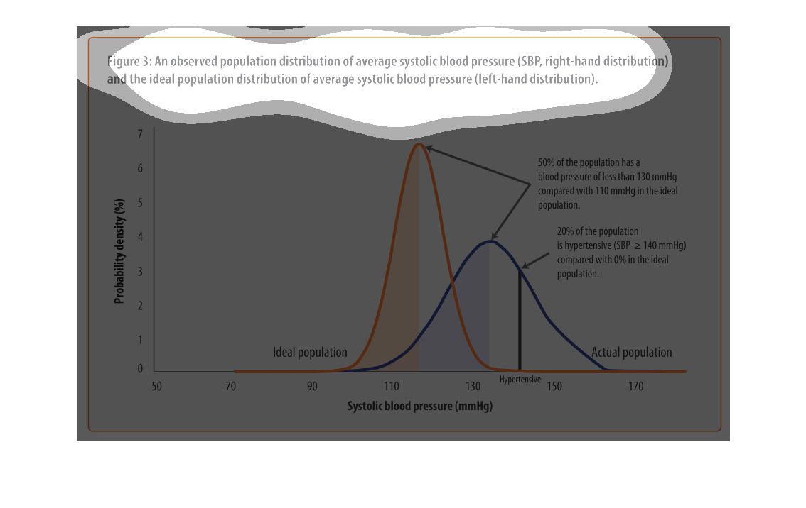
This handmade chart shows the actual versus expected distribution of systolic blood pressure.
But it does not specify what populations or regions or anything else
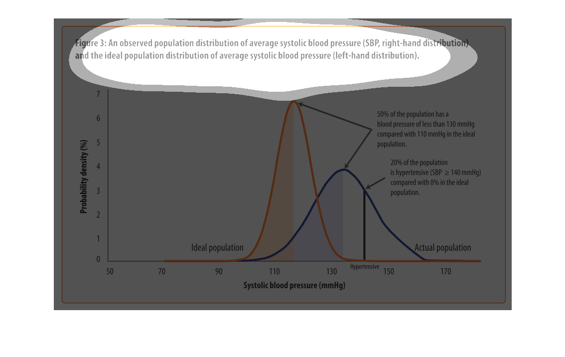
The graph contained within this images seems to detail the average systolic blood pressure
(SBP) within certain population distributions and their comparison to the average SBP distribution
within a geographic area.
This chart describes an observed population distribution of average systolic blood pressure
(SBP, right-hand distribution) and the ideal population distribution of average systolic blood
pressure.