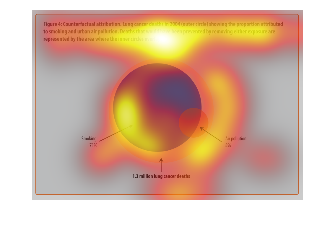
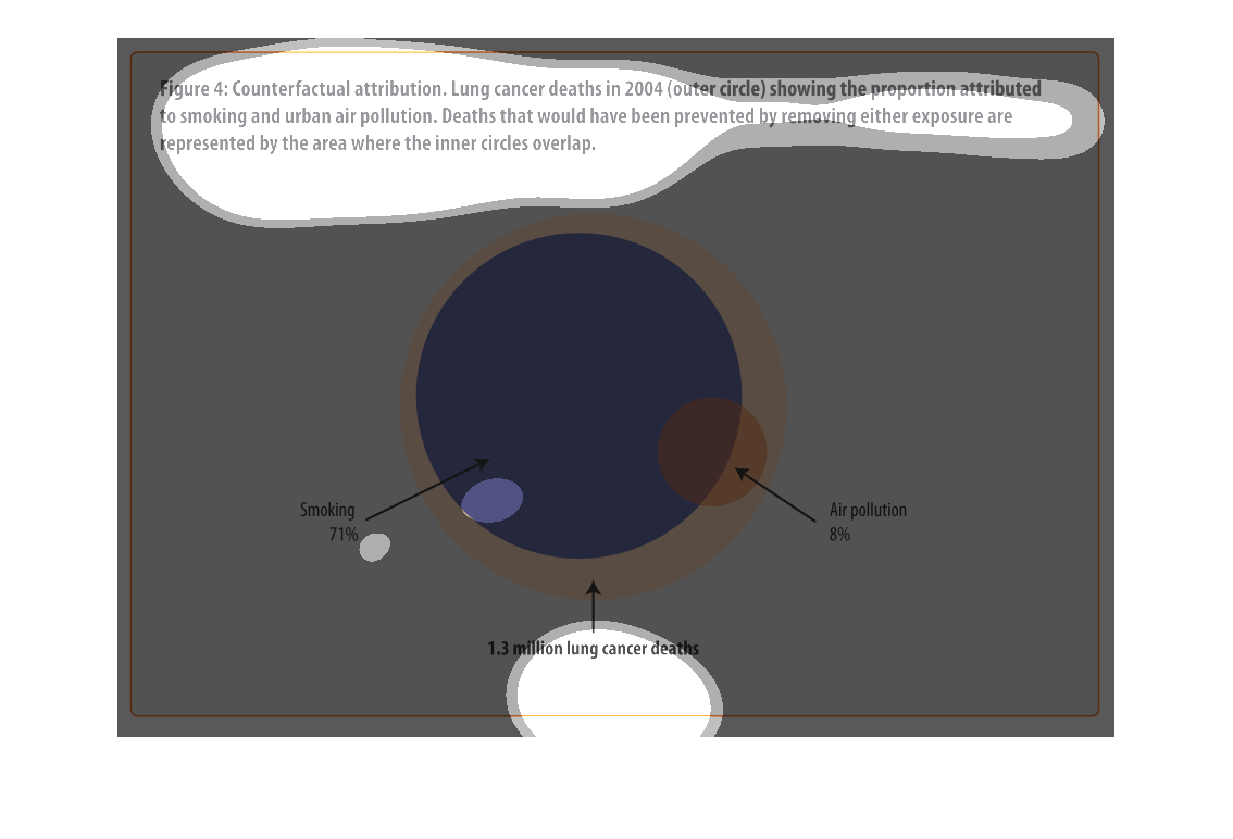
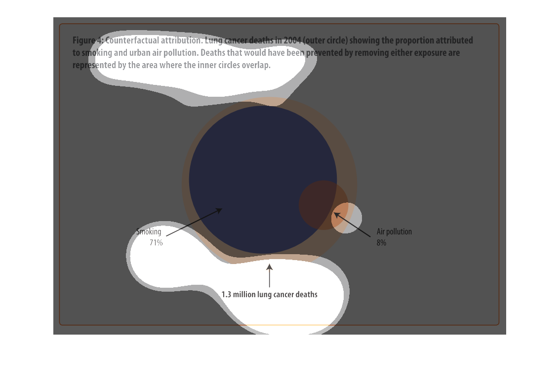
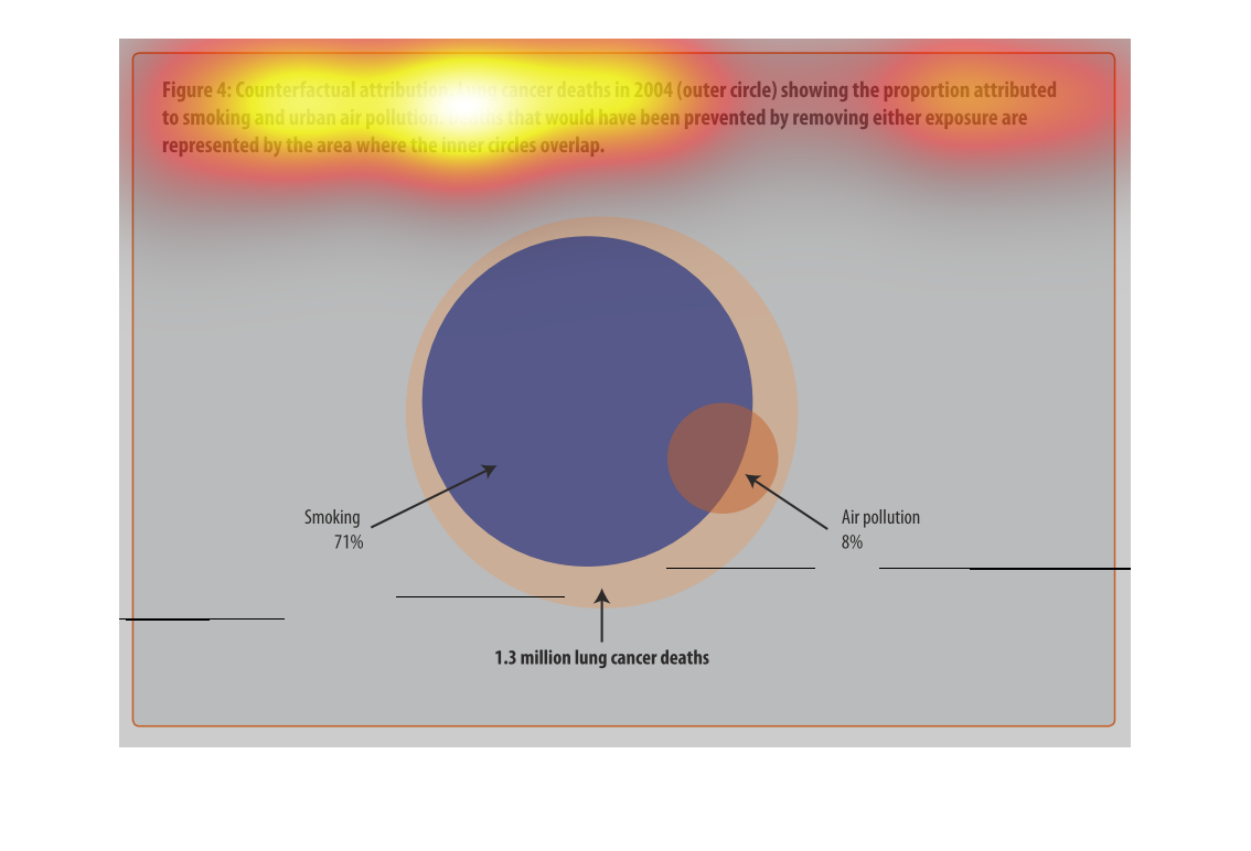
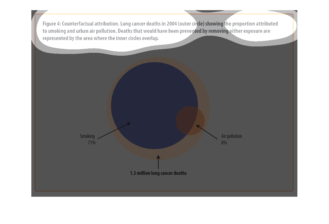
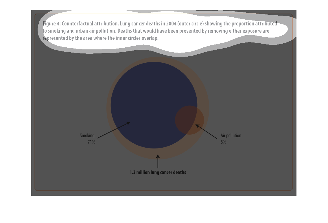
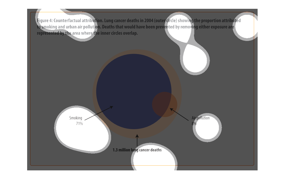
The figure presented is titled Counterfactual attribution.  Lung cancer deaths in 2004 (outer
circle) showing the proportion attributed to smoking and urban air pollution.
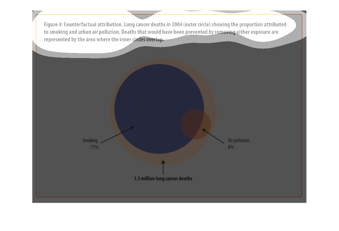
The image depicts a lung cancer deaths in 2004 in the outer circle, showing the proportion
attributed to smoking and urban air pollution. Deaths involved would have been prevented by
removing exposure are represented by the area where the inner circle overlaps. Smoking accounts
for 71% of deaths, air pollution accounts for 8% of deaths, with 1.3 million lung cancer deaths.
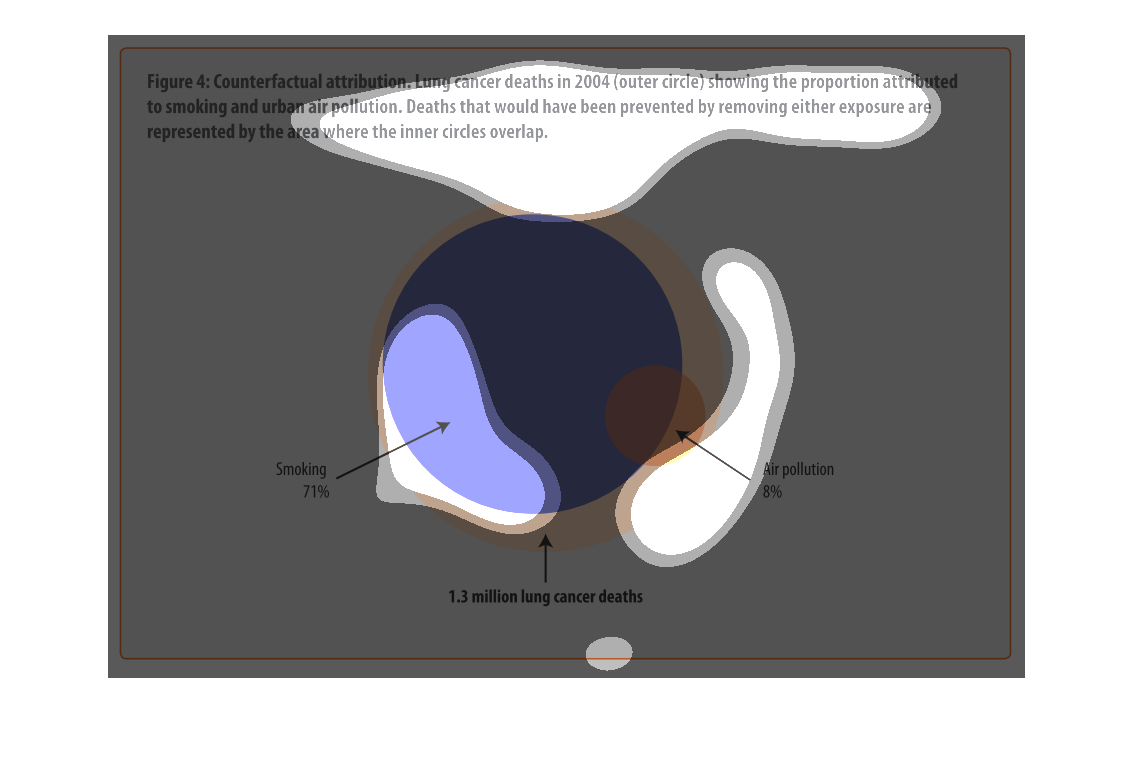
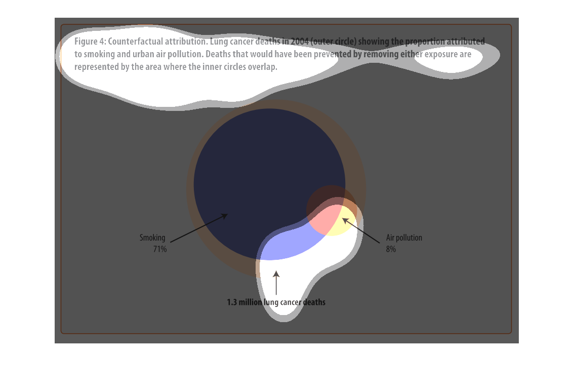
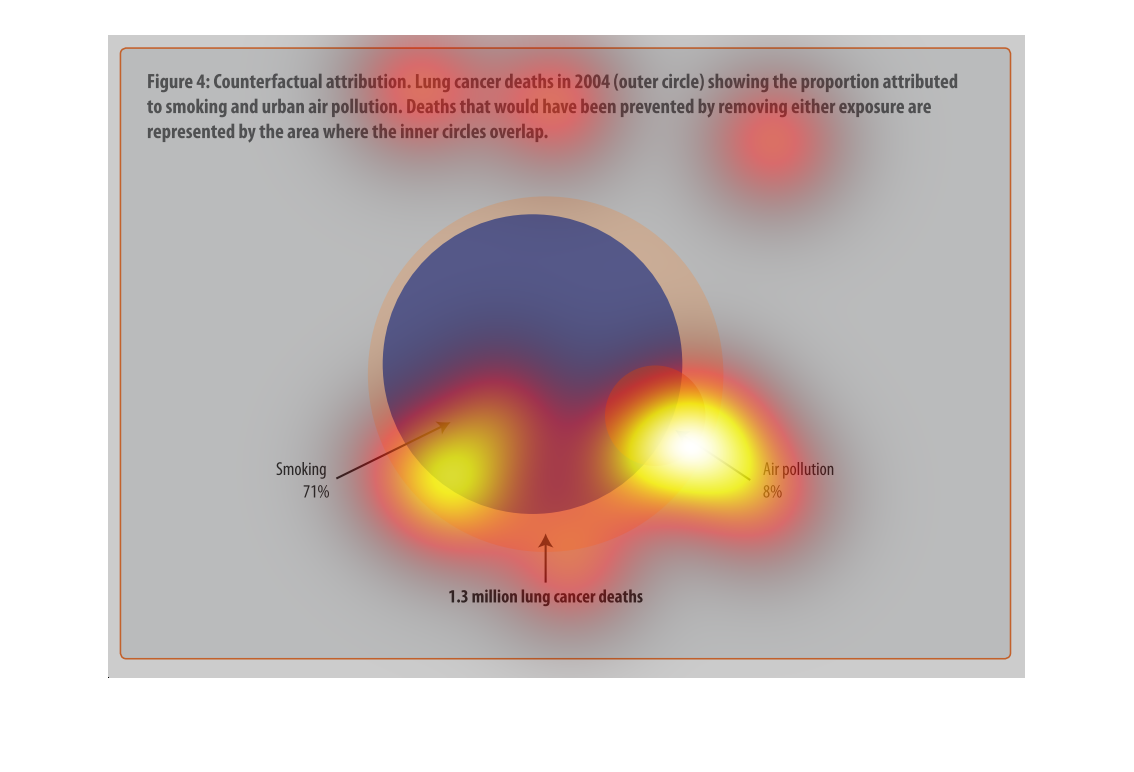
figure 4: counterfactual attribution. Lung cancer deaths in  2004 (outer circle) showing the
proportion attributed to smoking and urban air pollution. Deaths that would have been prevented
by removing either exposure are represented by the area where the inner circle overlap. We
see a big circle representing all lung cancer deaths, a slightly smaller circle within representing
death by cancer, and an even smaller side circle representing pollution related deaths.
This graphic shows lung cancer deaths, represented by a colored circle and interlapping with
other circles showing the attribution to smoking and air pollution.
This graph illustrates the efforts to combat the affects of lung cancer. This also shows the
wide variety of lung cancer's affects on the populace, as well as causes.
This is a purple curcle with an ivory ring around it. there is an arrow as well as a red call
on the lower right of the ball. There is a paragraph above and labeling below.
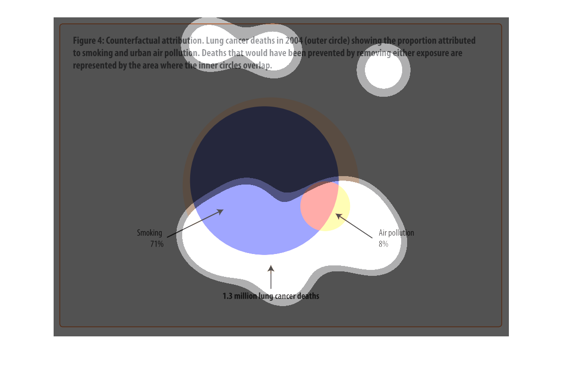
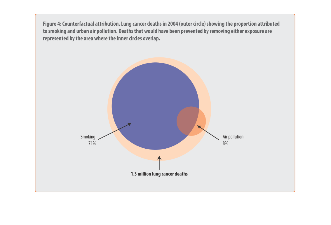
This is a chart that illustrates counterfactual attribution of lung cancer deaths in the year
2004 and it shows the proportion that is attributed to smoking and urban air pollution.
This is a graph of lung cancer deaths in 2004 and the proportion of those deaths which could
claim lung cancer and a/or air pollution as a factor in the death.
This chart describes counterfactual attribution. Lung cancer deaths in 2004 showing the proportion
attributed to smoking and urban air pollution. Deaths that would have been prevented.
this is a circle graph and has a lot of nice colors on it the grpah represtnd who has cancer
and how mant percent of the world who dont have c ancer.
The pie graph depicted in the picture displays the correlation in deaths from lung cancer.
It demonstrates that smoking is the leading cause of lung cancer at 71%.
Lung Cancer deaths in 2004 are depicted in this chart, and their correlation to both smoking
and urban air pollution. The overlap between the circles reveals preventable deaths. Smoking
is responsible for 71% of fatalities, with air pollution accounting for 8%. 1.3 million deaths
total.