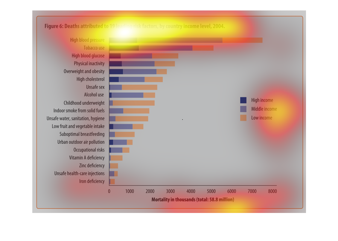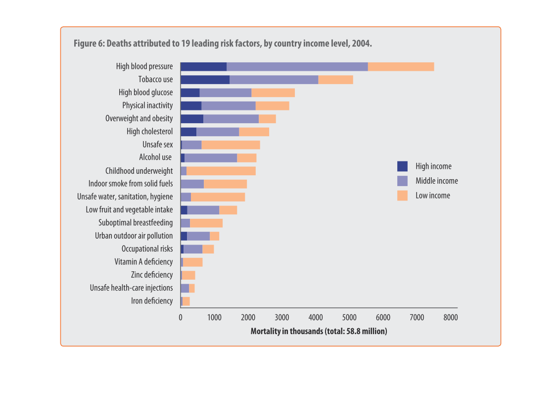
This graph shows the number of deaths in (an unspecified) country by 19 different risk factors
in 2004 by income level. High blood pressure, for example, is the risk factor associated with
the most deaths (between seven and eight thousand) and it affects high, middle, and low income
people pretty evenly. Many of the risk factors, especially nutrition-related ones, disproportionately
affect low income people, however.
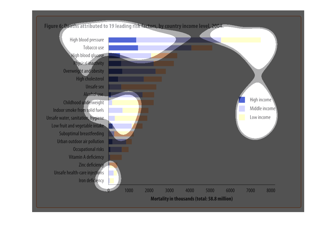
This chart describes deaths attributed to 19 leading risk factors, by country income level,
for the year 2004. Categories on the chart include high blood pressure.

This is a graph of deaths attributed to 19 leading risk factors by country income level in
2004. The most common cause of death among high income people was high blood pressure.
Deaths related to 19 known risk factors by income level and country, 2004. The factors from
most deaths to least are: high blood pressure, tobacco use, high blood glucose, physical inactivity,
overweight and obesity, high cholesterol, unsafe sex, alcohol use, indoor smoke from solid
fuels, unsafe water or sanitation, low fruit and vegetable intake, suboptimal breastfeeding,
urban outdoor air pollution, occupational risks, Vitamin A deficiency, zinc deficiency, unsafe
healthcare injections, and iron deficiency.  58.8 million people measured.  High income deaths
are less common while middle and low seem fairly well divided except a few categories where
low income have most deaths.
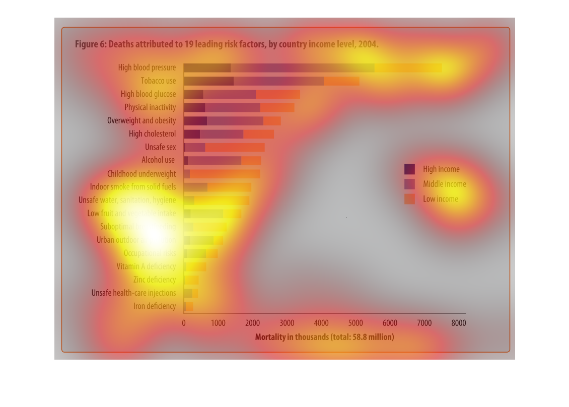
This chart shows the leading death risk factors for various countries based on income level
for 2004.  Higher incomes shows increased risk factors such as high blood pressure and tobacco
use. Lower income shows increased risk factors such as childhood underweight and unsafe sex.
The figure presented is titled Figure 6.1 deaths attributed to 19 leading risk factors by
country income level, 2004.  The figure is a representation of deaths.
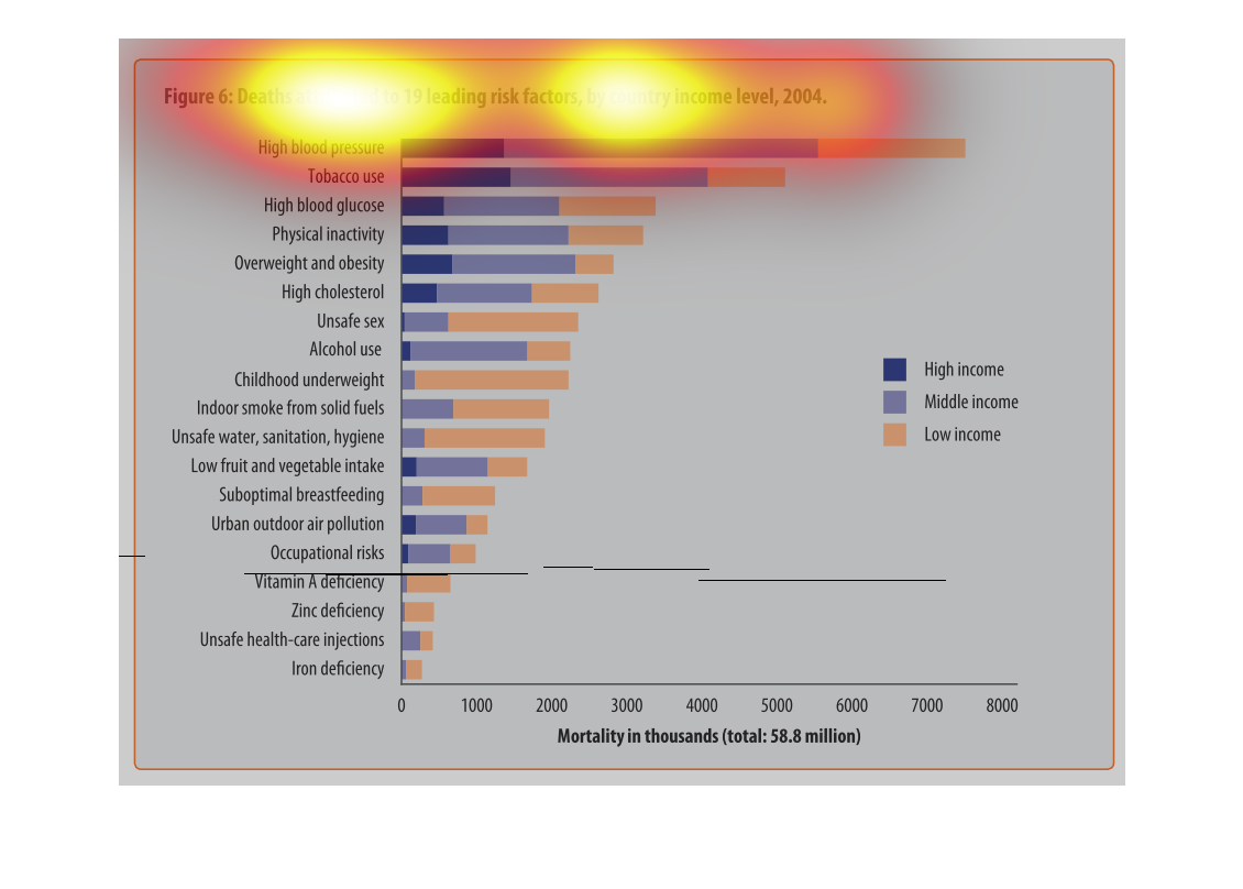
this graph is used to compare the morality rate in certain activities or different cause such
as alcoholism, unsafe sex and so on. Its identifying the mortality rate of  high, middle,
and lower classes. The lower income people with high blood pressure seem to have the higher
death percentage.
The chart contains a list of deaths by country income level according to the nineteen leading
factors in the year 2004.  High blood pressure is by far the leading cause, while iron deficiency
is lowest on the chart.
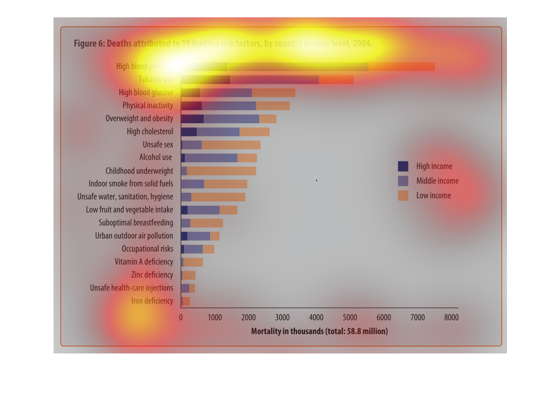
This graph shows deaths that are attributed to 19 leading risk factors by country and income
level in 2004. High blood pressure had an alarmingly high level of deaths for high income
earners. Unsafe sex is the cause of death for many low income earners.
This is a bar chart of three different data points. It shows the deaths attributed to 19 leading
risk factors by country and income level in 2004. High blood pressure and tobacco use are
the top two factors. It is a steady decline after them.
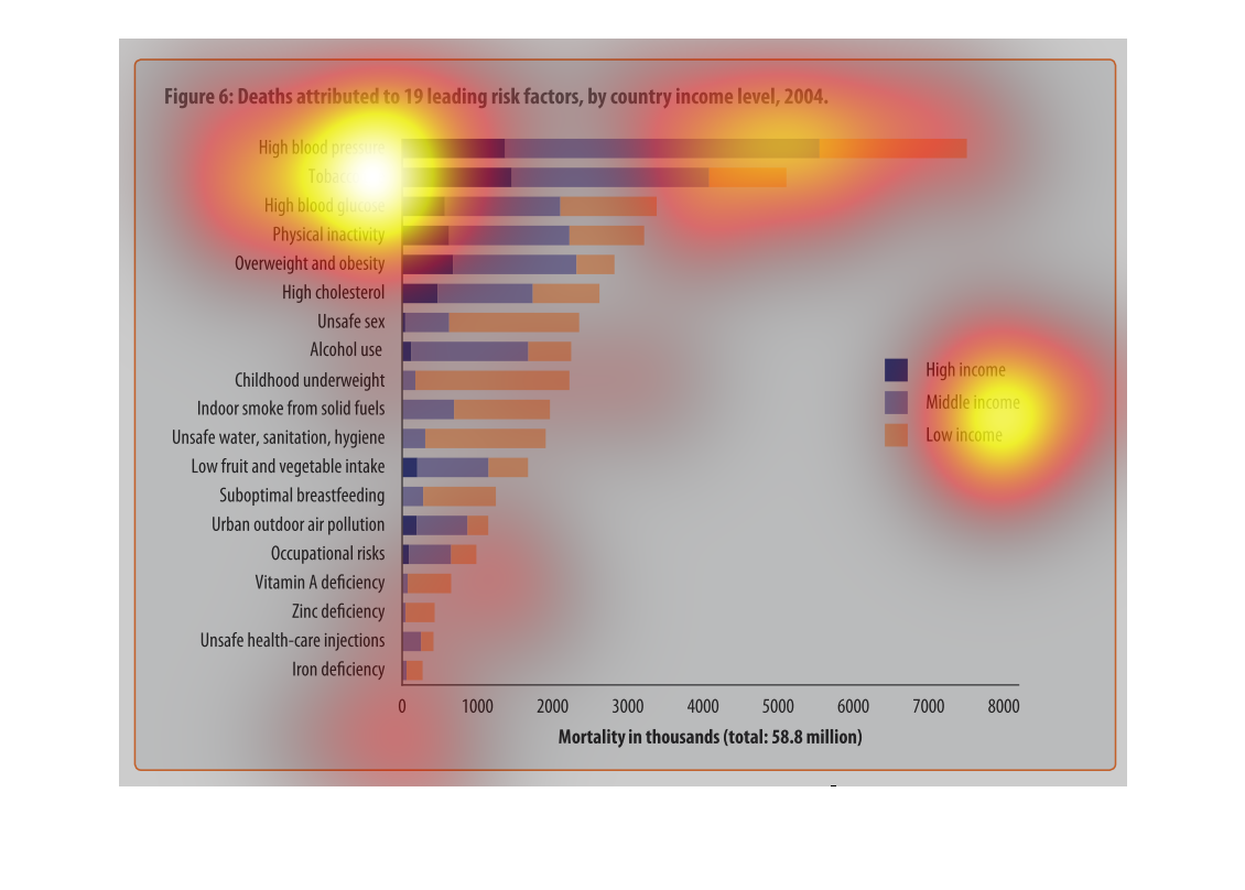
THIS PLOT SHOWS THE NUMBER OF DEATHS ATTRIBUTED TO VARIOUS FACTORS. THE LARGER THE BAR, THE
MORE DEATHS ARE DUE TO THAT FACTOR. EACH BAR IS DIVIDED INTO COLOR ZONES BASED ON INCOME.
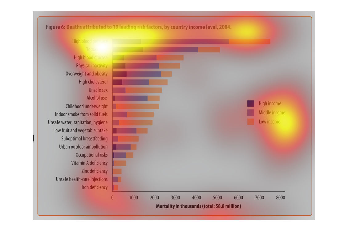
It shows number of deaths based on risk factors and income, shows the difference between what
wealthy and poor people die more commonly from and gives you and idea as to why.
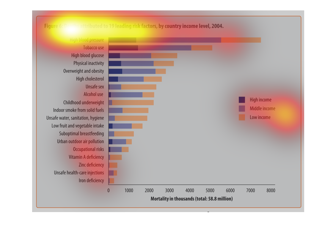
This chart describes deaths attributed to 19 leading risk factors, by country income level,
for the year 2004.Categories on the chart include high blood pressure.
This 2004 study shows the higest risk deaths in relation to income. So by the graph is shows
of those that died from high blood presure 7500 of them were low income individuals; whereas
those with high incomes only had a little over a thousand. there is no mention of the income
brackets used.