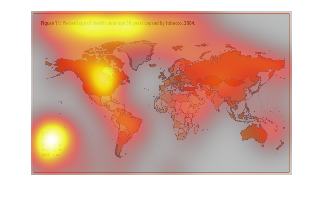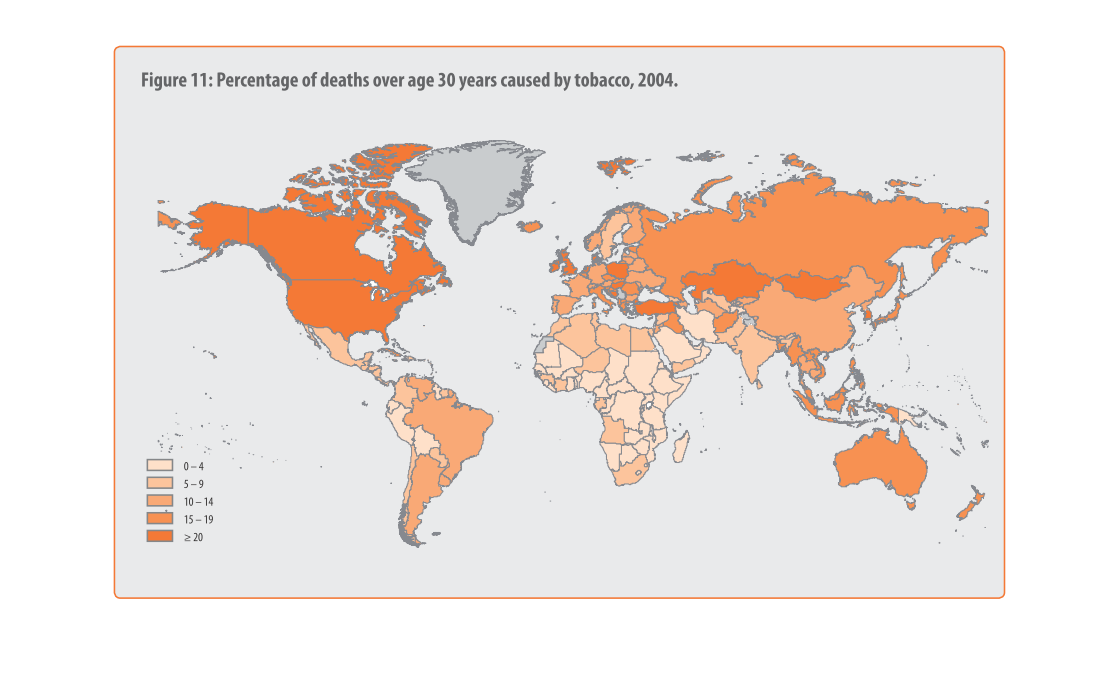
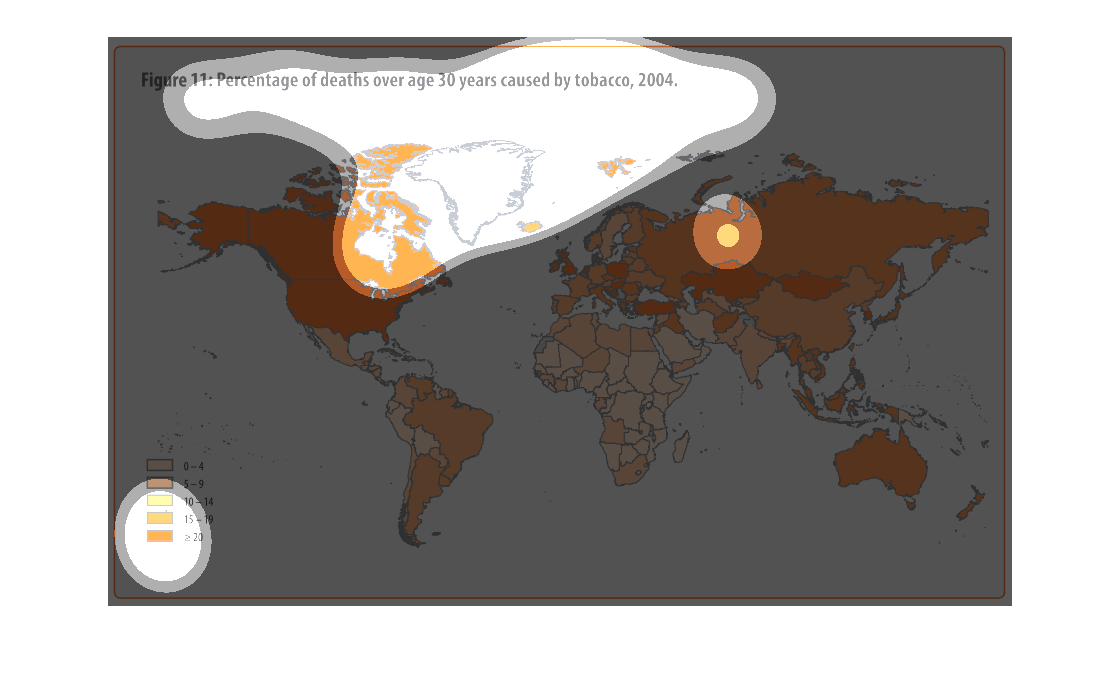
This chart describes percentage of deaths over age 3o years caused by tobacco, for the year
2004. Different categories on the chart are represented by different colors.
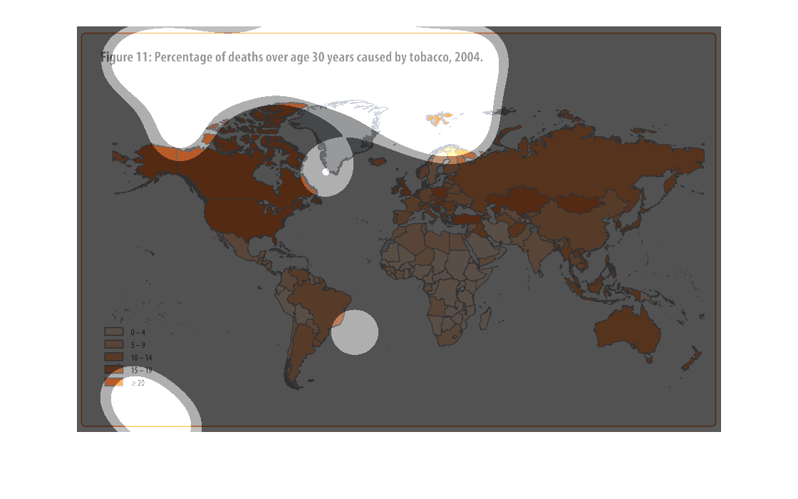
The image depicts the percentage of deaths, globally, over age 30 years caused by tobacco,
2004. High percentages of tobacco deaths are present across the entire planet. North America,
Russia, Western Europe, Australia, and many more countries suffer very similar statistical
percentages of death, with Africa having noticeably less deaths.
This graph shows how many deaths their have been over 30 years due to tobacco. The darker
the color means the more people are killed and the lighter the color means the less people
are killed. Gray means none have been killed.
This shows the data related to death from tobacco dating back to 2004. It seems that the death
is at least higher than 20 million in most major countries.
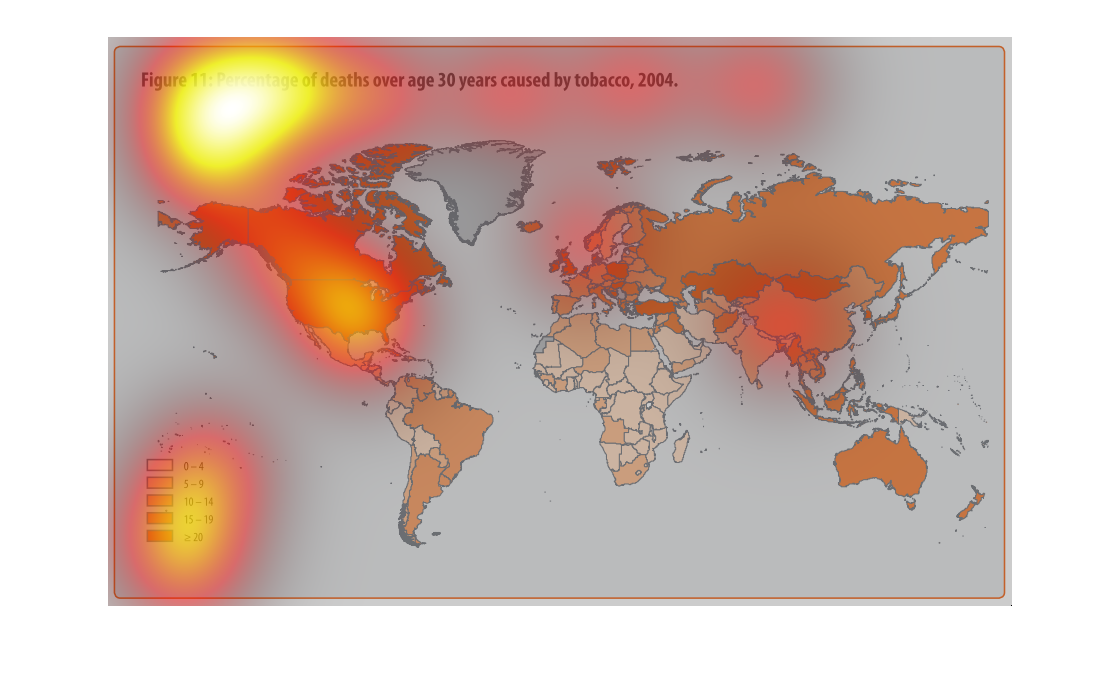
Chart showing the percentage of death worldwide over age thirty years caused by tobacco in
the year of 2004. Color coded in multiple shades of the color orange.
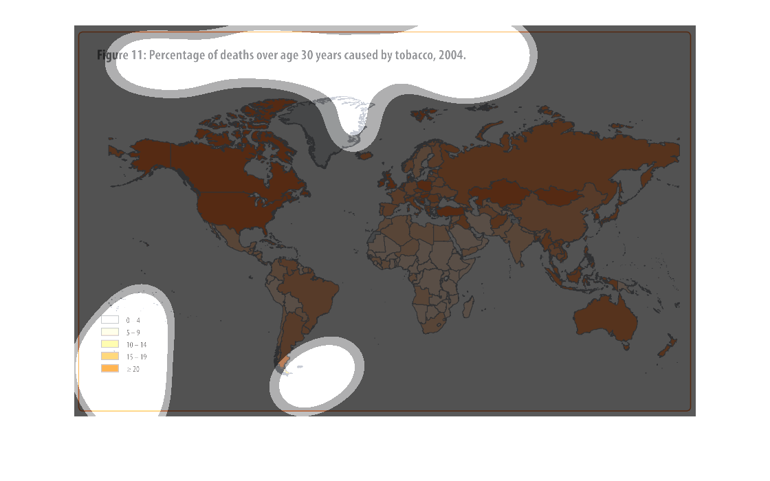
This chart references the percentage of deaths over age 30 caused by tobacco.  The more developed
countries have the highest rates of deaths as opposed to those considered under or undeveloped.
Tobacco is wacko, kills millions every year. This study- conducted in 2004- with roughly a
couple of million deaths- hits home just how utter devastating Tobacco is on a grand scale
world wide.
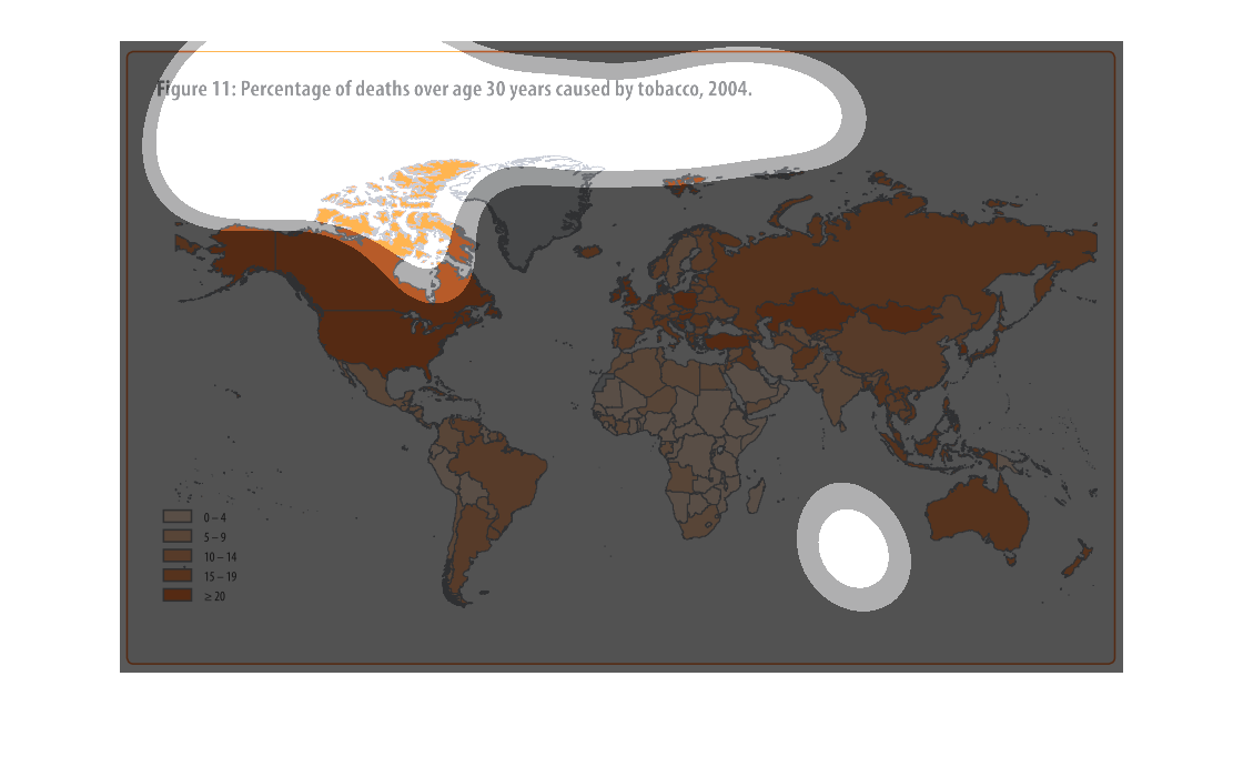
figure 11, percentage of deaths over age 30 years caused by tobacco, 2004. We see a color
coded map of the world, highest prevalence is in north america followed by select european
and asian countries, australia and the rest of the world
This chart shows the percentage of deaths of those over 30 years old that was caused by tobacco.
The united states and Canada both show over 20% while all of South America shows 19% or less.
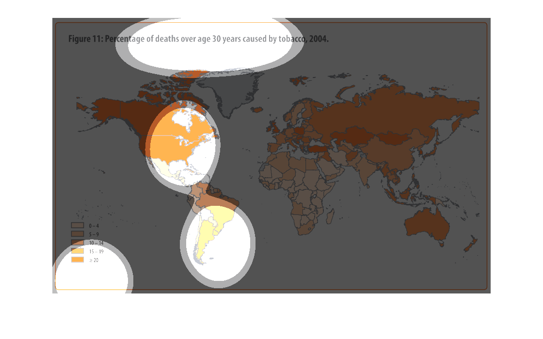
THIS PLOT SHOWS THE PERCENTAGE OF DEATHS OF PEOPLE OVER 30 YEARS OLD CAUSED BY TOBACCO IN
2004. THE DARKER THE COLOR ORANGE, THE GREATER THE NUMBER OF DEATHS.
Tobacco kills. You would be hard pressed to find anyone that hasn't at least a distant relative
or a friend's acquaintance that hasn't fallen to its destruction. This illustration the wide
spread affects on a global scale of tobacco.
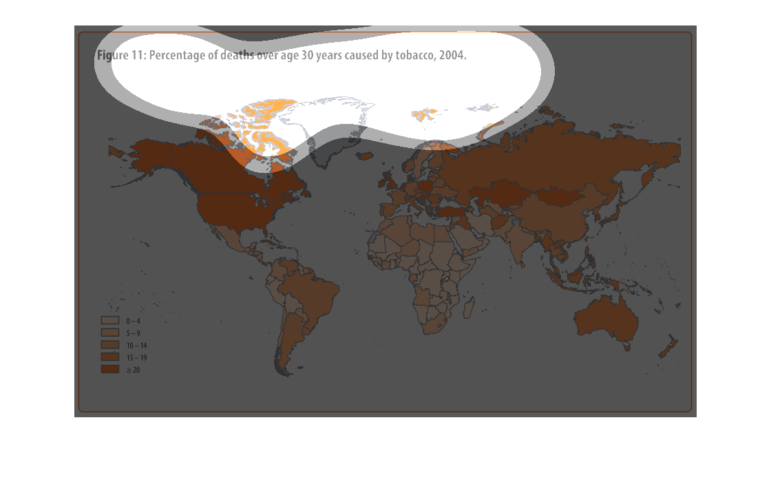
This chart describes percentage of deaths deaths over age 30 years caused by tobacco, for
the year 2004. Different categories on the chart are represented by different colors.
Figure 11: Percentage of deaths over age 30 years caused by tobacco, 2004. There is a color
code chart to show colors to percentage numbers comparison down at the bottom left.
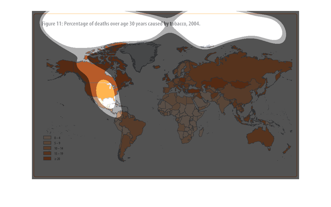
Percentage of deaths over age 30 yrs due to use of tobacco 2004.  United States has total
coverage of every state with +20 deaths.  28 small areas within the entire world that meet
the minimal 0-4 deaths due to tobacco.  Throughout the remaining world besides the United
States have anywhere from 5 to +20 deaths for the year of 2004.