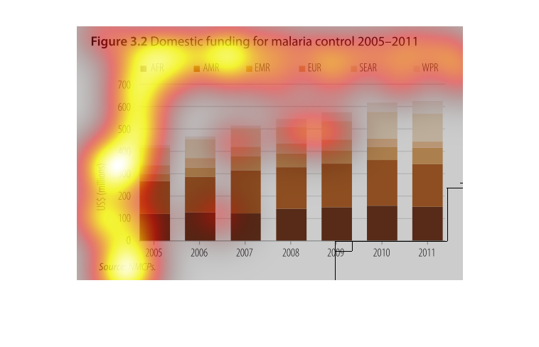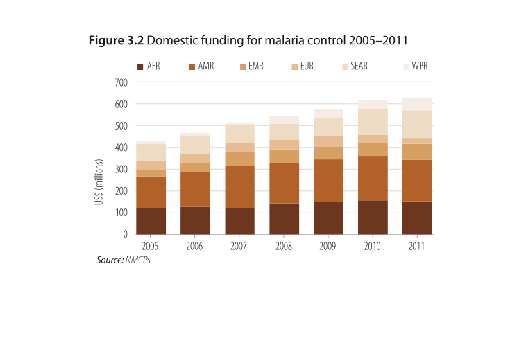
A infographic showing the amounts of domestic funding for malaria control from 2005-2011.
It shows a general increase from all sources but nothing significant
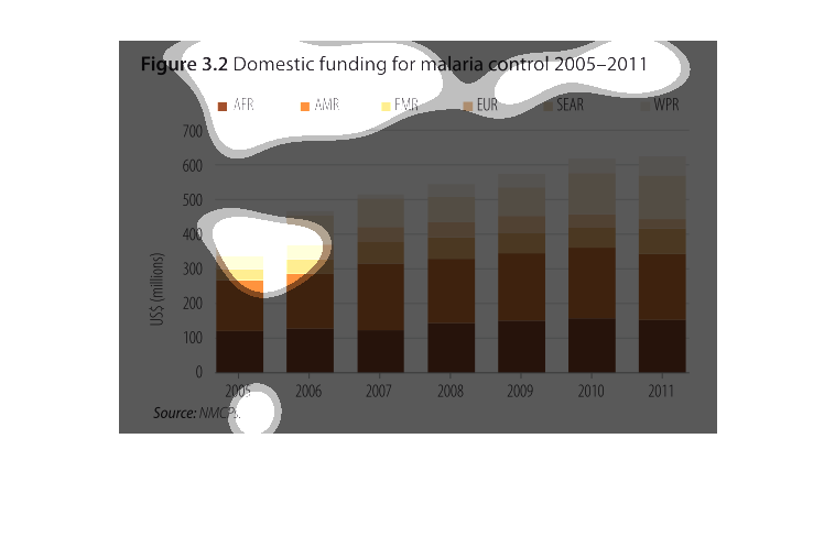
The graph shows the amount of domestic funding dedicated to the fight against malaria. Each
country is depicted as a different color on the graph over the course of 7 years.
This chart describes domestic funding for malaria control, for the years 2005 through to 2011.
The highest spike on the chart occurs in the year 2009.
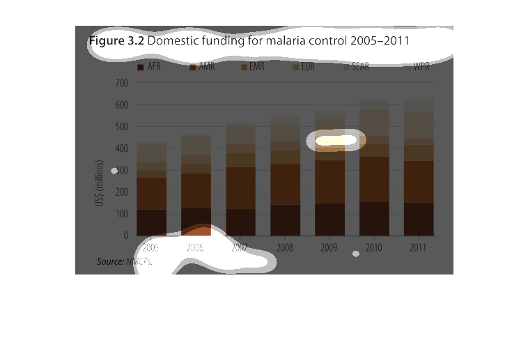
This graph illustrates funding (in US dollars) for malaria control from 2005 to 2011. The
funding is increased for each country as the years progress, until the year 2011.  The funding
drops slightly this year.
This chart shows the domestic funding for malaria for 2005-2011 for countries across the world.
 For all combined countries, the domestic funding has increased from approximately US$ 400
million in 2005 to approximately US$ 600 million in 2011.
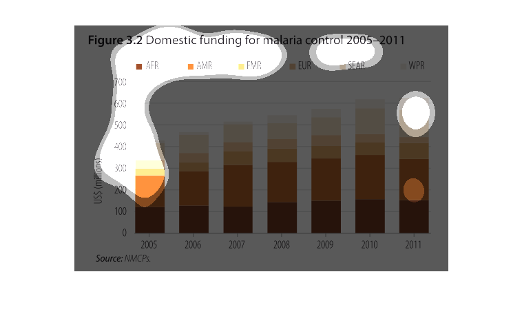
This chart shows the amount of domestic funding for malaria control from 2005 to 2011. The
funding has overall increased steadily, with the majority consistently coming from Africa
and America.
The figure presented is titled Figure 3.2: Domestic funding for malaria control 2005-2011.
 The figure is a literal representation of the data for funding.
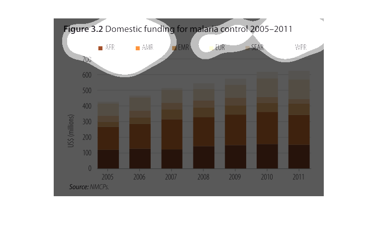
i believe this bar graph is used to calculate the amount of money a certain region uses in
regards to certain years. In this case 2011 had the most with 600 million in WPR.
The graph shows domestic funding for malaria control  from 2005-2011 in various regions including
Africa, America, EMR, Europe, SEAR, and WPR. The aggregated domestic funding for malaria control
in the regions studied increase from 2005-2011, with a steady increase every year. Europe,
SEAR, EMR, and WPR had the lowest values each year, while Africa and America had higher values
each year.
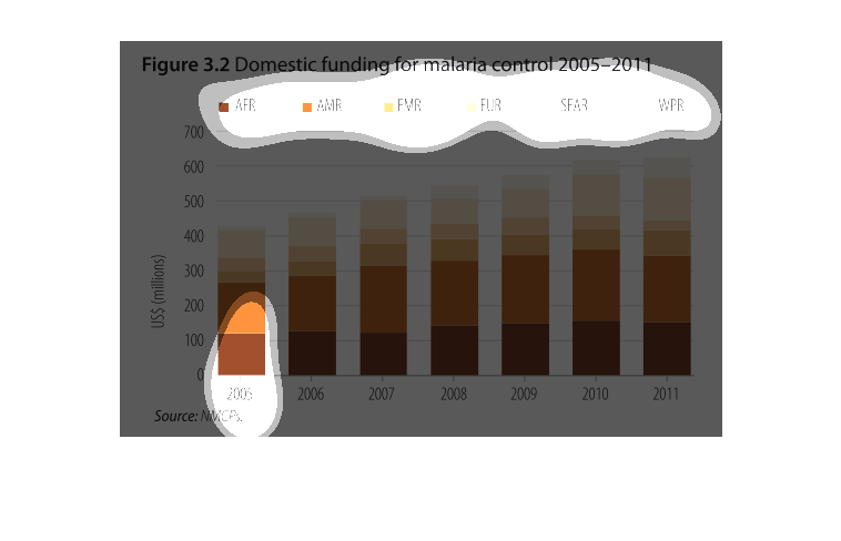
This chart shows the domestic funding of malaria control from 2005-2011. Africa accounts for
a major portion of malaria deaths. Overall, global malaria control has increased over time
and with more funding.
This graph shows the domestic funding for Malaria control from 2005-2011. Africa and America
consistently have spent the most trying to control Malaria, and the money spent has steadily
increased throughout each year.
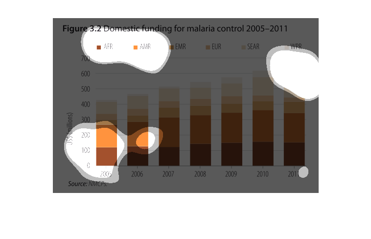
This study was conducted from 2005-2011, about the world spending in Malaria treatments where
ever the disease rears its ugly head. The spending went up incrementally over the years, illustrating
how it is a growing problem.
figure 3.2 domestic funding for malaria control 2005 through 2011. Y axis is united states
dollars in millions, the X axis is by year, each year has column divided by colors highlighting
each region of the world. Basically we see a rise in US dollars every year overall
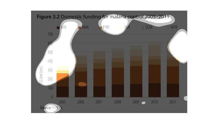
It shows the amount of funding different countries have spent on controlling malaria. The
graph is displaying based on country and how many millions of US dollars spent.