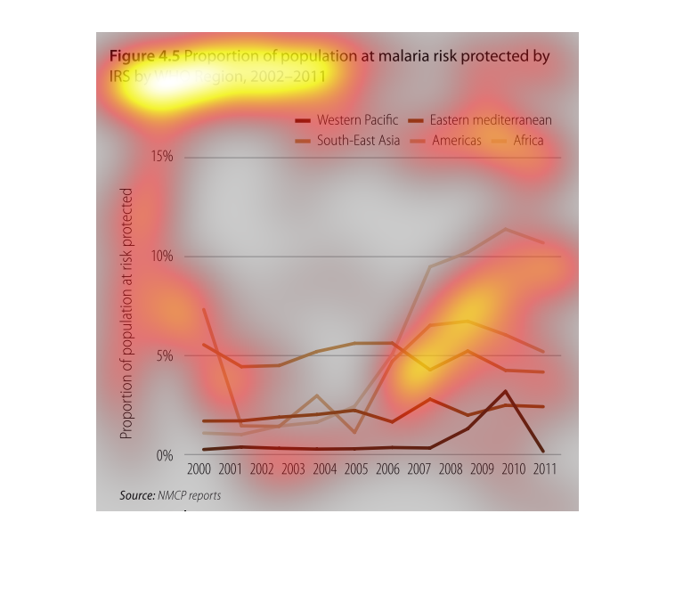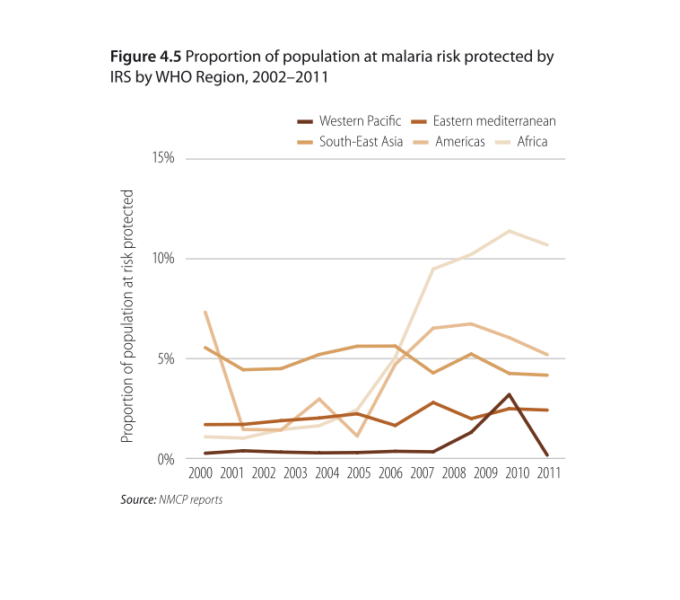
Population that is in a malaria risk zone that are protected by an IRA zone. The risk is shown
from 2000-2011. The lines are separated by color for each country. Each color moves up and
down based upon each countries protection. Without seeing everything at once it is difficult
to tell the colors apart, because they are too close in hue.
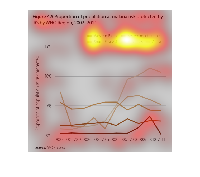
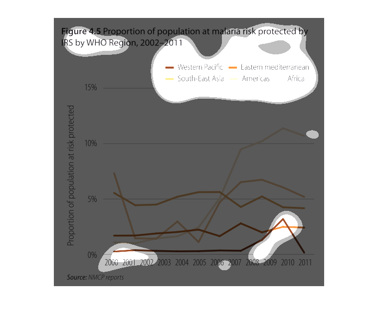
The chart depicts individual countries represented by different colored lines. The lines indicate
the number of people within that specific country that are protected against malaria according
to the WHO.
Its titled "Proportion of Malaria Risk Protected by IRS. The graph shows Western Pacific,
South-East Asia, Eastern Mediterranean, Americas and Africa. The y axis shows the percentage
of risk and the x axis shows the year. The graph is based on a 2002-2011 survey an the source
of information is from NMCP report.
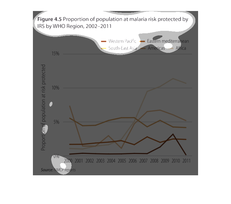
figure 4.5, proportion of population at malaria risk protected by IRS by WHO region, 2002-2011.
Y axis shows proportion at risk protected, X axis shows data by year. Numbers peaked between
2009 and 2010 and then declined.
This chart describes proportion of population at malaria risk protected by IRS by WHO region,
for the years 2002 through the year 2011. The highest spike on the chart is between 2009 and
2010.
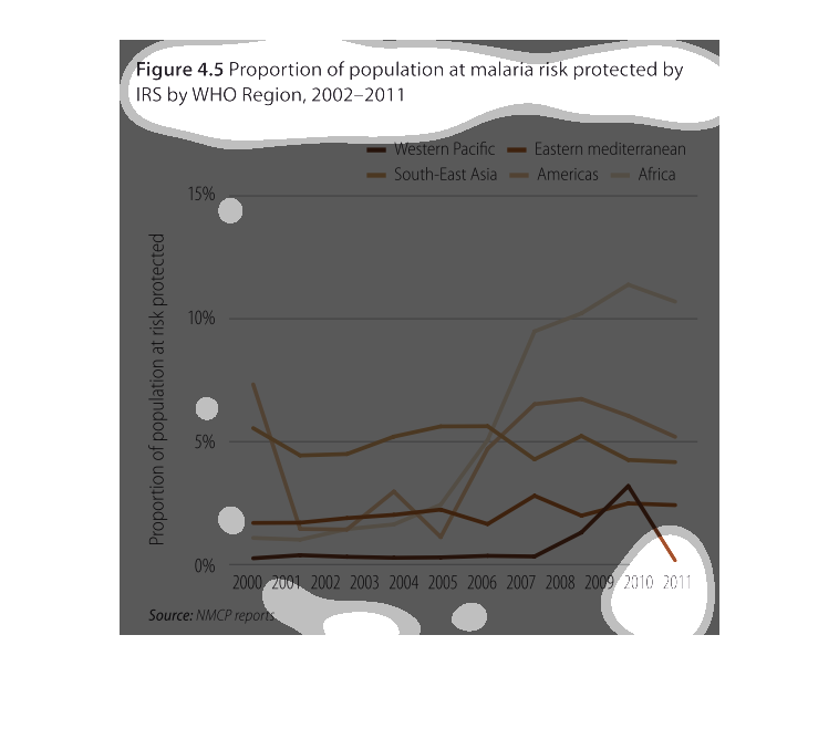
This chart describes proportion of population at malaria risk protected by IRS by WHO region
for the years 2002 through 2011. categories on the chart include Western Pacific.
This is a graph showing the correlation between malaria deaths and governmental support. Deaths
decrease as support increases. It seems to get less frequent as time goes on in general.
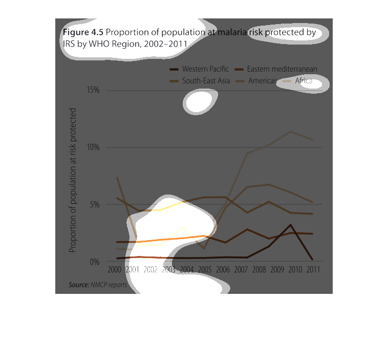
The figure presented is titled Figure 4.5: proportion of population at malaria risk protected
by IRS by WHO region.  The figure is a representation of malaria risk.
This is a color coded chart depicting the proportion of population at malaria risk protected
by IRS by WHO region in the years 2002 to 2011. The largest gains are shown to be in Africa.
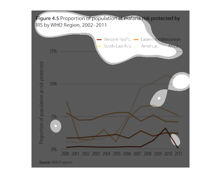
The chart describes the porportion of the population at malaria risk protected by IRS by WHO
region 2002-2011.  The x axis represents year and the y axis shows the proportion of population.
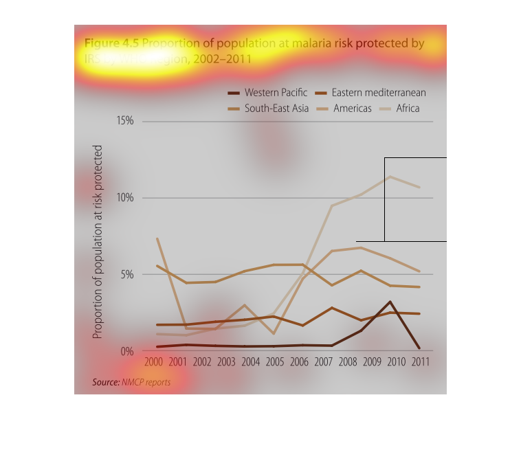
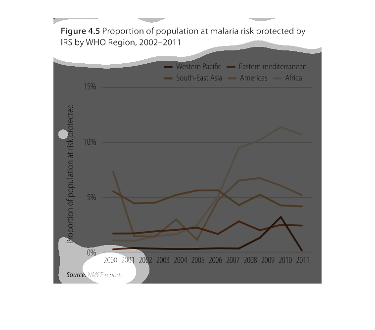
The graphic shows the proportion of the population at risk for Malaria protected by the World
Health Organization for the years 2002-2011. The rates for Africa have increased. The Western
Pacific has remained constant except for an increase and then decrease around 2009. The others
increased around 2005 and trend downward since.
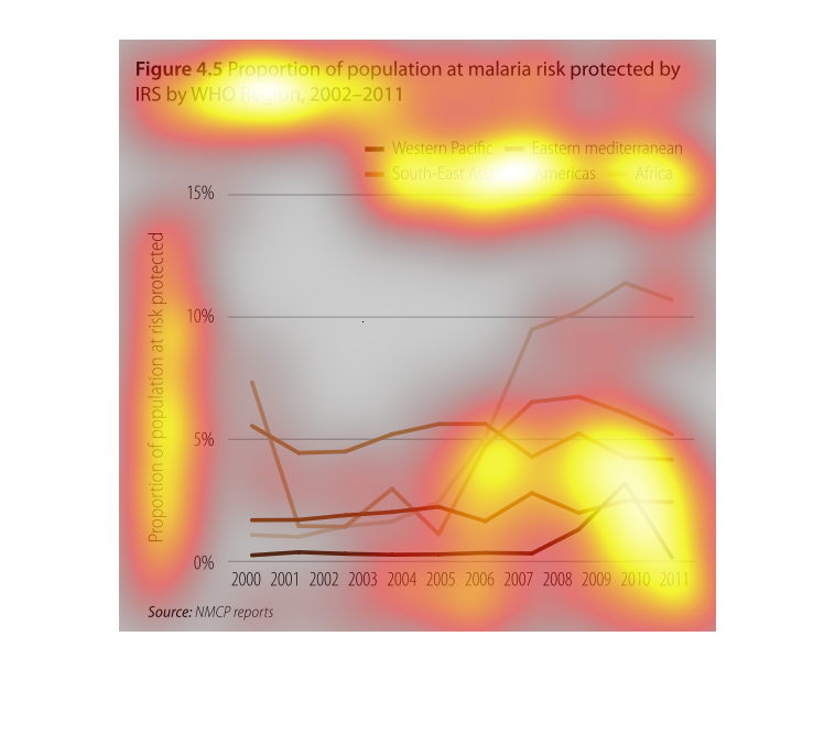
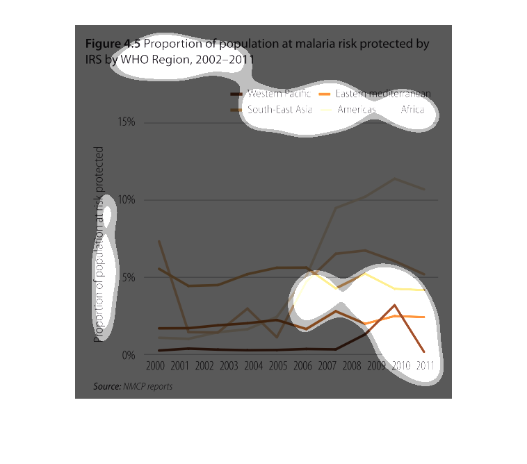
This is a graph that illustrates the proportion of the population that is actually at malaria
risk that is protected by IRS in the WHO regions for the years 2002 - 2011.
figure 4.5, proportion of population at malaria risk protected by IRS by WHO region 2002 through
2011. Y axis is proportion of population at risk protected, X axis is the aforementioned years.
Each line represents a country
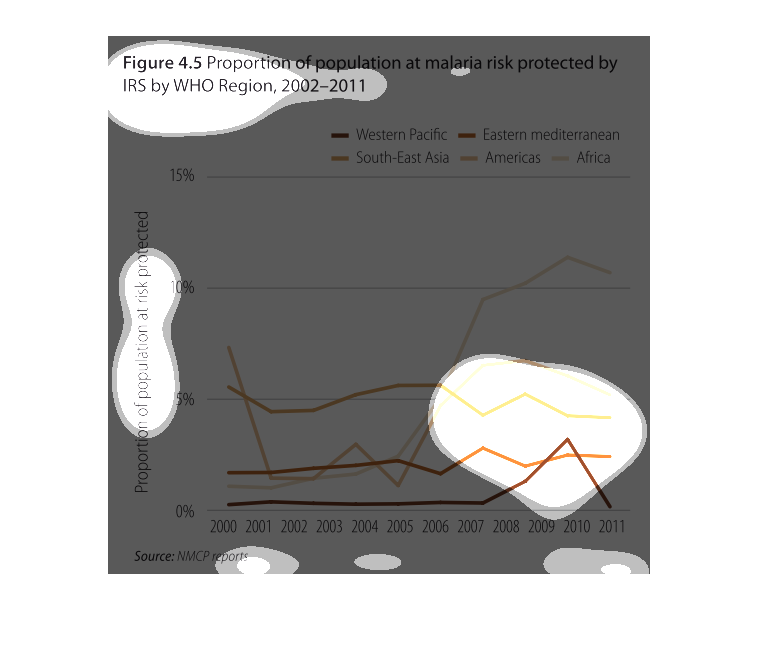
A chart showing the proportion of the population at malaria risk that is protetced by IRS
by WHO region, 2002-2011. Africa, one of the most at risk regions shows an increase in protection
levels, more so than the other regions by 2011.