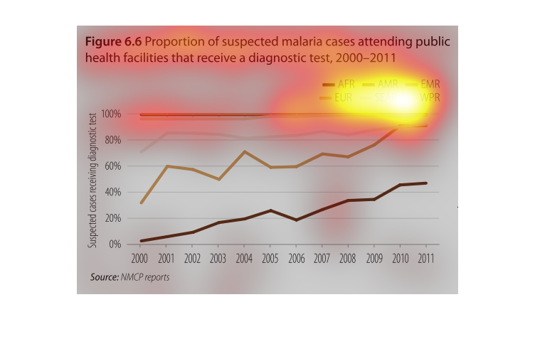
This is a graph that shows the proportion of malaria cases patients that are attending health
facilities to receive the diagnostic test to determine if they are sick.
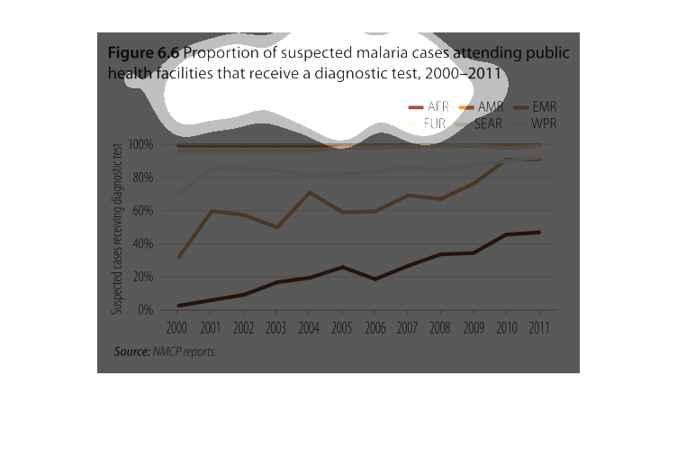
This graph shows information on various countries use of malaria diagnostic testing. It compares
the percentage of malaria diagnostic tests given between the years of 2000 to 2010.
This chart describes the proportion of suspected malaria cases attending public health facilities
that receive a diagnostic test, for the years 2000 through to 2011.
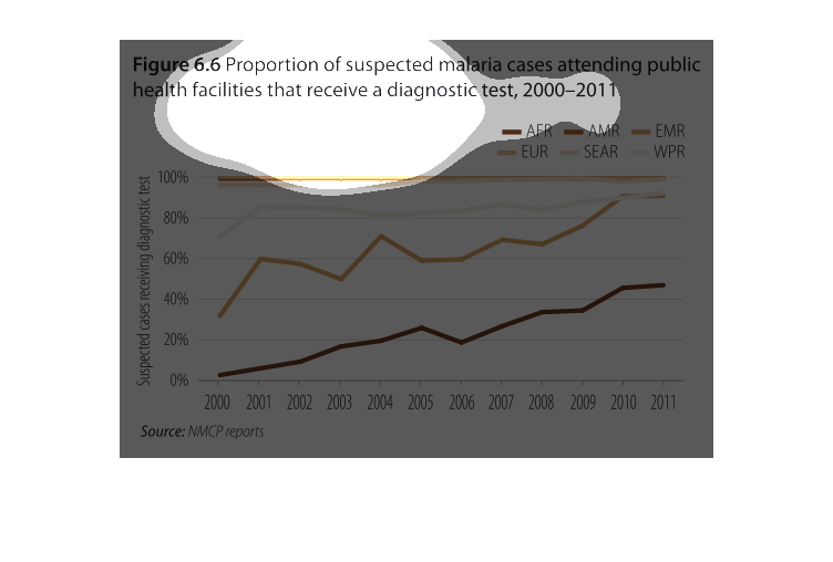
This chart shows the proportion of suspected malaria cases from 2000 to 2011 that actually
receive a diagnostic test. Differente WHO regions are color coded, and the lines trend up
over the years.
The image depicts the proportion of suspected malaria cases attending public health facilities
that receive a diagnostic test, 2000-2011. Africa appears to have less suspected cases reported
attending public health facilities, while all other regions have far more malaria cases reported
at medical facilities.
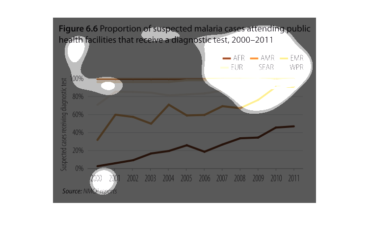
figure 6.6 proportion of suspected malaria cases attending public health facilities that receive
a diagnostic test, 2000 to 2011. Y axis suspected cases receiving diagnostic test, X axis
shows each year. This is a line graph with six lines each representing a different region.
Each region has seen a rise in cases, excpet for two which remained the same...at nearly 100%
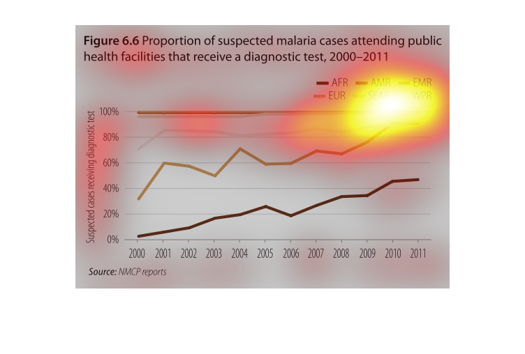
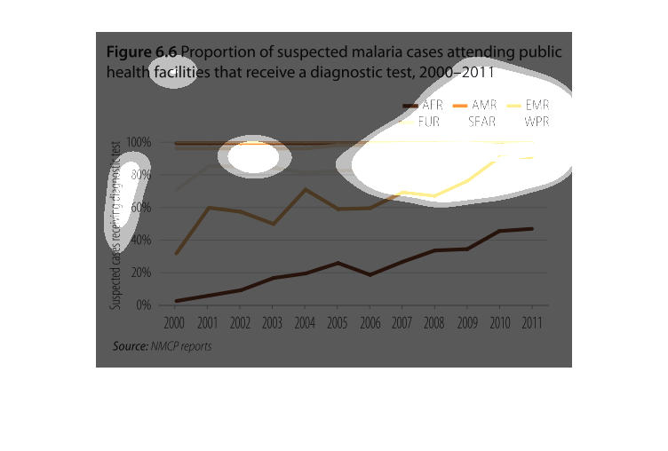
Proportion of suspected malaria cases that receive a diagnostic test when attending a public
health facility for years 2000-2011, by geographic area (AFR, EUR, AMR, SEAR, EMR, WPR).
While rates have increased for all geographic areas overall, it appears that Africa has the
lowest rate of diagnostic testing, with Europe second-lowest.  All other geographic areas
have much higher rates of testing (including 100%).  I am not sure which geographic areas
SEAR, EMR or WPR are referring to.
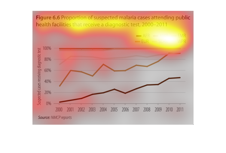
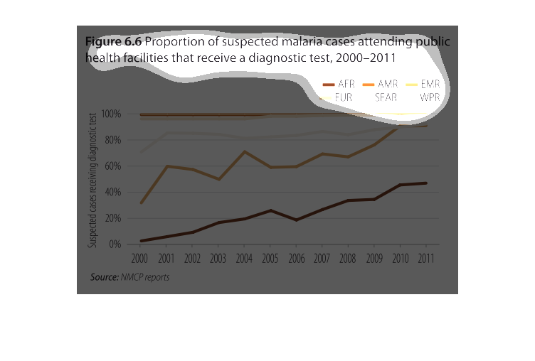
This figure shows trends  of proportion of suspected malaria cases attending public health
facilities that receive a diagnostic test, from 2000-2011. The trend lines represents different
continents
According to the figures on this chart, the proportion of suspected malaria cases attending
public health facilities that recieve a diagnostic test between 2000 and 2011 is shown.
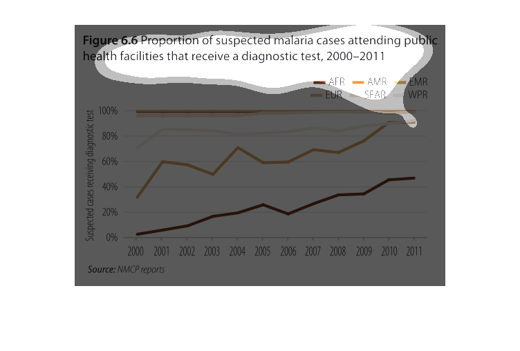
This graph indicates the proportion of suspected malaria cases attending public health facilities
the receive a diagnostic test. This graph is for the years 2000-2011. AMR AND EUR are at 100%,
followed by EMR.
The figure presented is titled figure 6.6 proportion of suspected malaria cases attending
public health facilities that receive a diagnostic test, 2004.
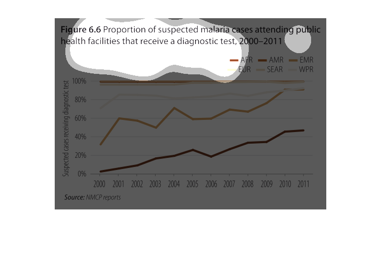
This graph refers to the suspected malaria cases between 2000-2011. In all continents is this
increasing trend. America is the lowest, while Africa is the highest.
This graph shows the proportion of suspected malaria cases attending public health facilities
that receive a diagnostic test between 2000 and 2011. In all nations, the percentage has increased
from 2000 to 2011. The greatest percentage increase can be seen in African countries.
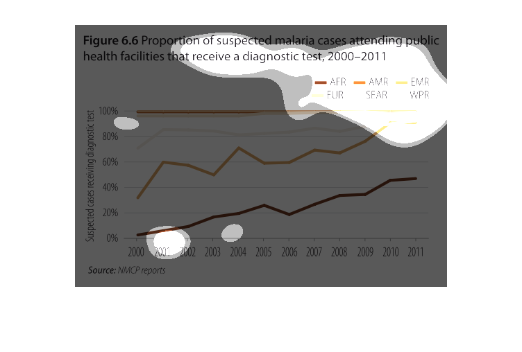
This chart describes proportion of suspected malaria cases attending health facilities that
receive a diagnostic test, for the year 2000 through 2011.
Proportion of suspected malaria cases attending public health facilities that receive a diagnostic
test 2000-2011. AFR has the least and EMR and EUR have the most although it has been consistent.
Other countries seem to be on the rise. The rise of the graph is the percentage and the run
is the year