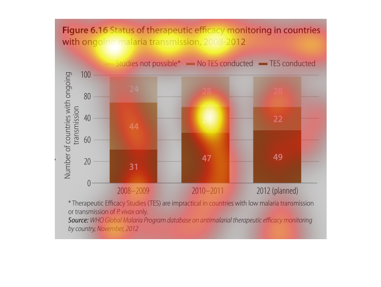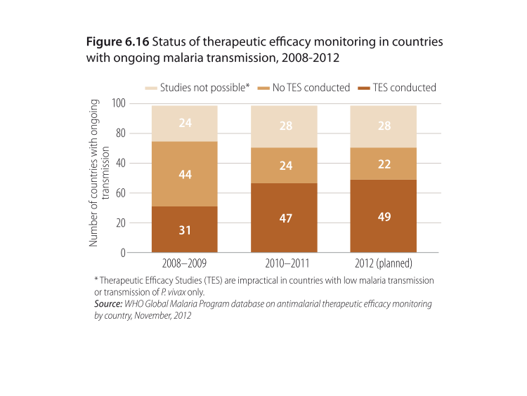
These graphs show the status of the therapeutic efficacy monitoring with ongoing malaria transmission,
from 2008-2011. Three colored vertical bars are shaded by TES availability and grouped by
year, with the number of counties being the vertical axis.
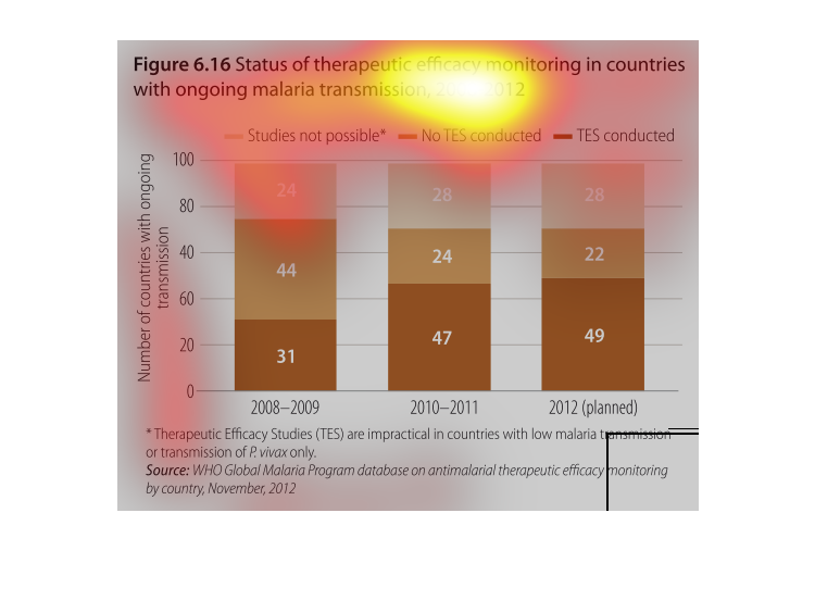
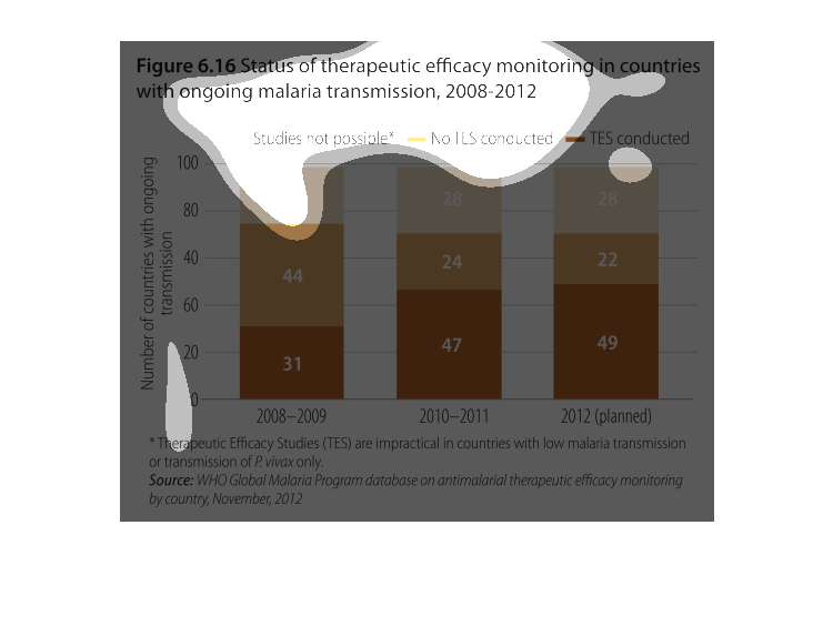
This is a figure showing the status of therapeutic efficacy monitoring in countries with ongoing
malaria transmission from 2008-2012. Overall the most was in 2012 when the TES was conducted.
The chart shows Therapeutic efficacy monitoring in countries that have malaria transmission
though the years 2008 to 2012. Each year presented on the chart shows how many people were
TES conducted, TES not possible, and TES not conducted.
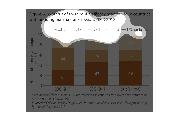
The map depicts a status of therapeutic efficacy monitoring in countries with ongoing malaria
transmission, 2008-2012. Numbers appear to be increasing from 2008-2011, and increasing slightly
further in 2012.
This is a graph that illustrates the status of therapeutic efficacy monitoring in countries
with ongoing malaria transmission between the years 2008 and 2011.
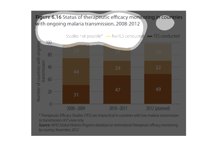
This chart describes status of therapeutic efficacy monitoring in countries with ongoing malaria
transmission, for the years 2008 through to the year 2012.
This chart show the Therapeutic Efficacy Study conducted between 2008 and 2011.  Also showing
planned studies for 2012.  The studies are conducted to monitor malaria transmission.  It
does not give specific countries but instead the number of countries where the studies are
taking place.
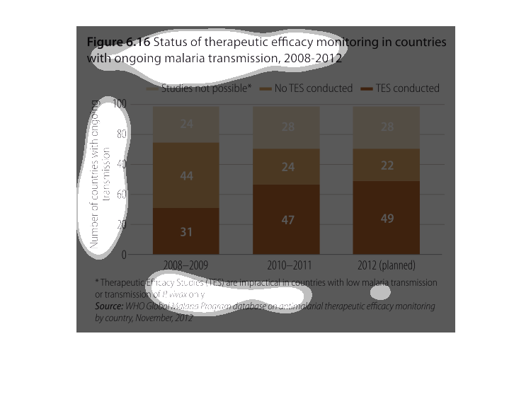
This is a graph showing the number of countries that have an ongoing transmissions of malaria.
It shows how the countries are monitoring the disease over the years.
This chart describes status of therapeutic efficacy monitoring in countries with ongoing malaria
transmission, for the years 2008 through 2012. Categories include different years.
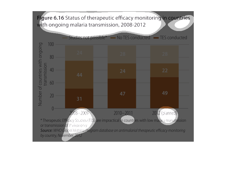
status of theruputic eficacy monitoring in countries with ongoing malaria transmission in
the years 2008-2012, i believe 2008-2009 was the lowest of all of the years
The figure presented is titled figure 6.6 status of therapeutic efficacy monitoring in countries
with ongoing malaria transmission.  The figure shows status of countries.
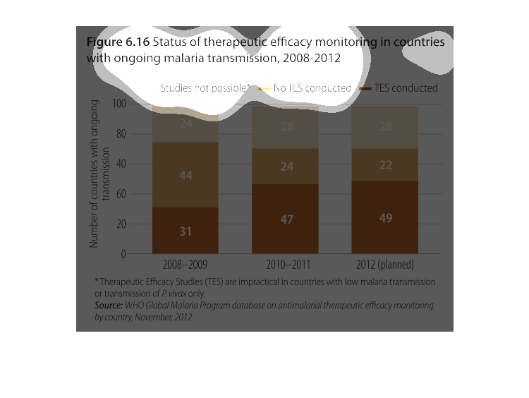
These charts describe the therapeutic efficacy for countries with malaria monitoring systems,
in 3 groups: 2008, 2010, and a planned 2012 data set. The vertical bars representing the data
is color coded into TES and non TES conduction.
It's a graph comparing the years 2008-2009 with 2010-2011 and 2012 for the status of theraputic
efficieny monitoring with ongoing malaria transmission. The graphs show the number of countries
with ongoing transmission.
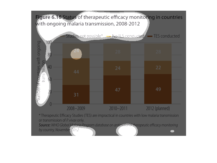
figure 6.16 status of therapeutic efficacy monitoring in countries with ongoing malaria transmission
2008 though 2012, Y axis is number of countries, we see three columns rising from the X axis,
each representing 2008-2009 and 2010-2011 and 2012-2013.
THis shows how medicine efficacy progresssed in different time periods. It is represented
by three different bars. They each represent a different time period.