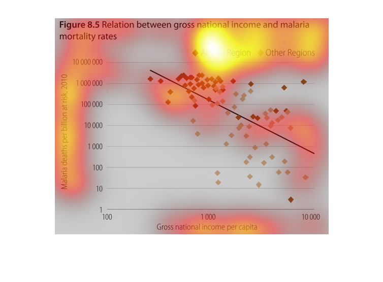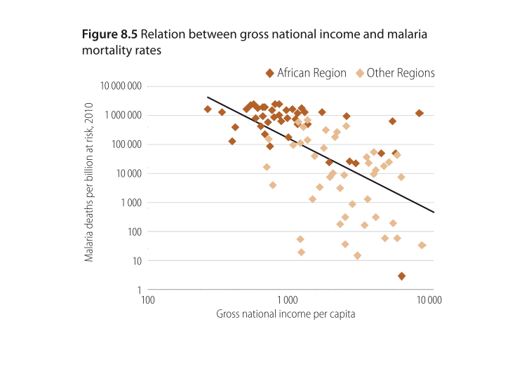
The line chart shows the relationship between the  gross national income of African and other
regions along side the malaria mortality rates. The chart shows that as the GNI rises, the
mortality rates tend to sharply drop.
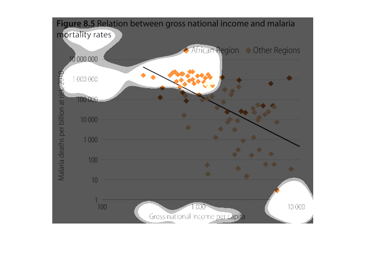
THIS GRAPH SHOWS THE RELATIONSHIP BETWEEN GROSS NATIONAL INCOME AND MALARIA MORTALITY RATES,
COMPARING THE AFRICAN REGION AND OTHER REGIONS IN MALARIA DEATHS PER BILLION VS. GROSS NATIONAL
INCOME PER CAPITA
The graph describes the relationship between gross national income and malaria mortality rates.
The graph shows a higher mortality rate for lower gross national income.
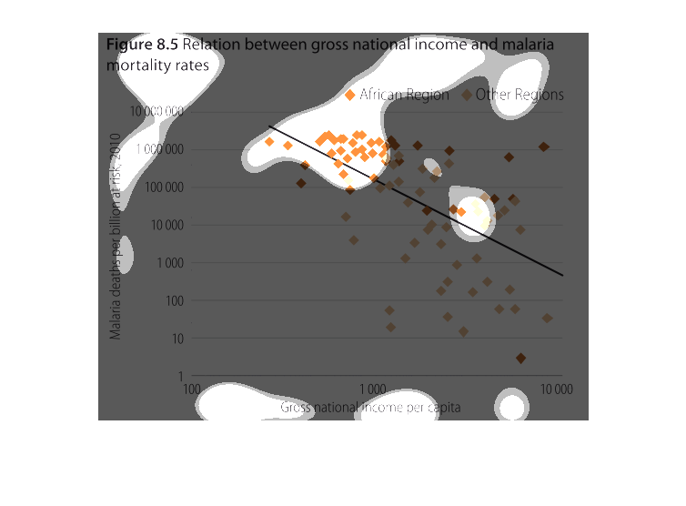
The figure presented is titled relationship between gross national income and malaria mortality
rates.  The figure is a representation of the income and malaria.
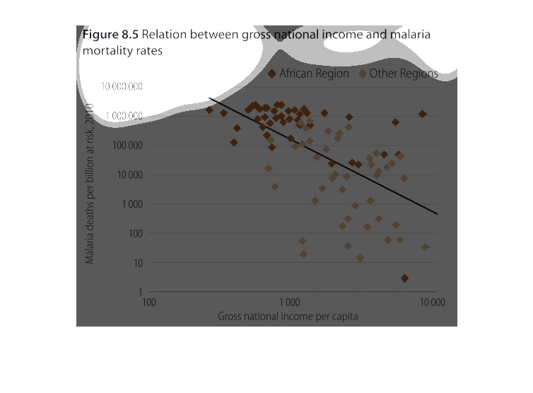
The graph shows the correlation between malaria deaths and the national income. The more a
country suffers from malaria the lower their national income. The majority of low-income,
high-infection countries are African.
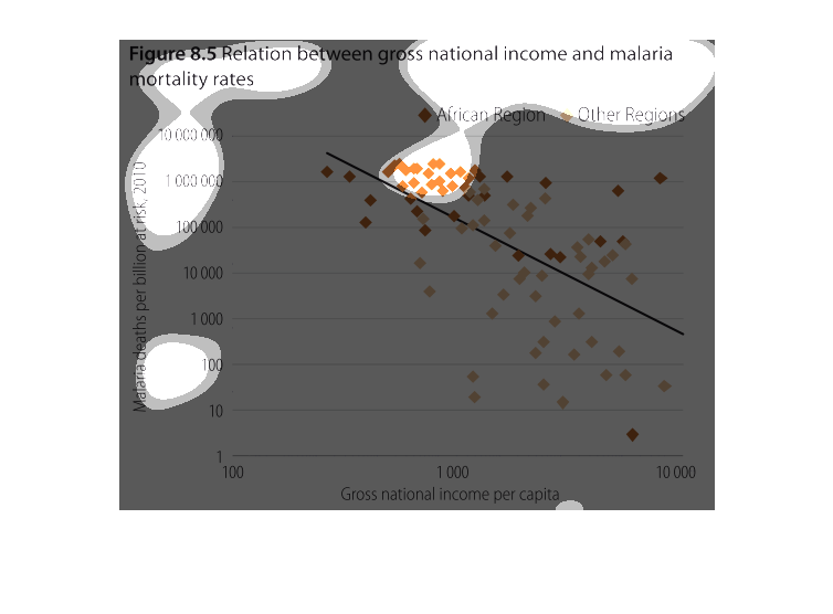
This chart describes the relation between gross national income and malaria morality rates.
The chart is divided into two sections, African regions and other regions.
figure 8.5 relationship between gross national income and malaria mortality rates. Y axis
shows malaria deaths per billion at risk, 2011, X axis shows gross national income per capita.
There is an obvious correlation the less income there is, there are some outliers.
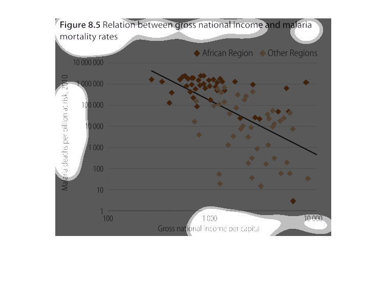
This handmade chart shows the relationship between gross national product and malaria rates.
It seems to have a negative correlation with poor countries having higher rates

This graph illustrates the relationship between gross national income and malaria rates for
African regions.  It shows that those with higher incomes have lower instances of malaria.
figure 8.5, relation between gross national income and malaria mortality rates. Y axis is
malaria deaths per billion at risk, X axis shows gross national income per capita. The trend
that we see is that lower income places are at higher risk, although there are many outliers
in this graph
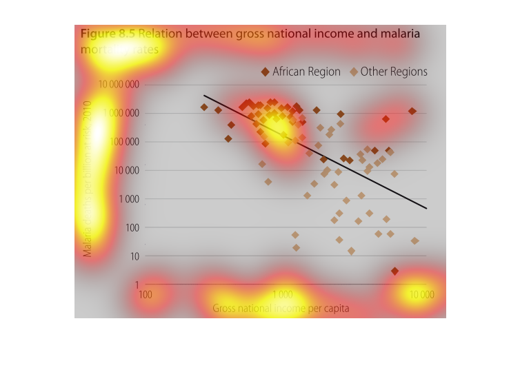
The chart shows the relationship between the relative wealth of a country and the death rate
caused by malaria. What it shows is an inverse relationship between the two. As the national
gross income increases, the number of reported malaria related deaths declines.
This is a plot chart depicting the relation between gross national income and malaria mortality
rates. It shows a direct correlation between fewer deaths as income level rises.
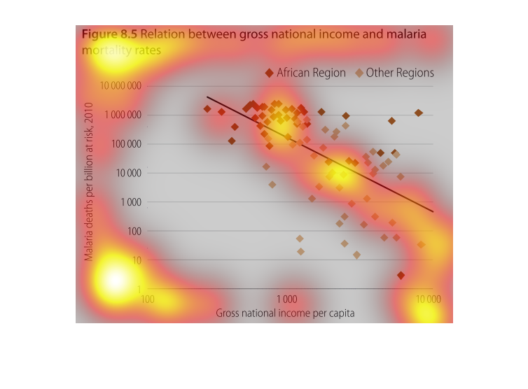
This chart describes relation between gross national income and malaria mortality rates. Different
categories are represented by different colors on the chart.
The graph shows the relationship between gross national income per capita and malaria deaths
per billion at risk (for the year 2010).  The graph presents data for African regions and
other regions.