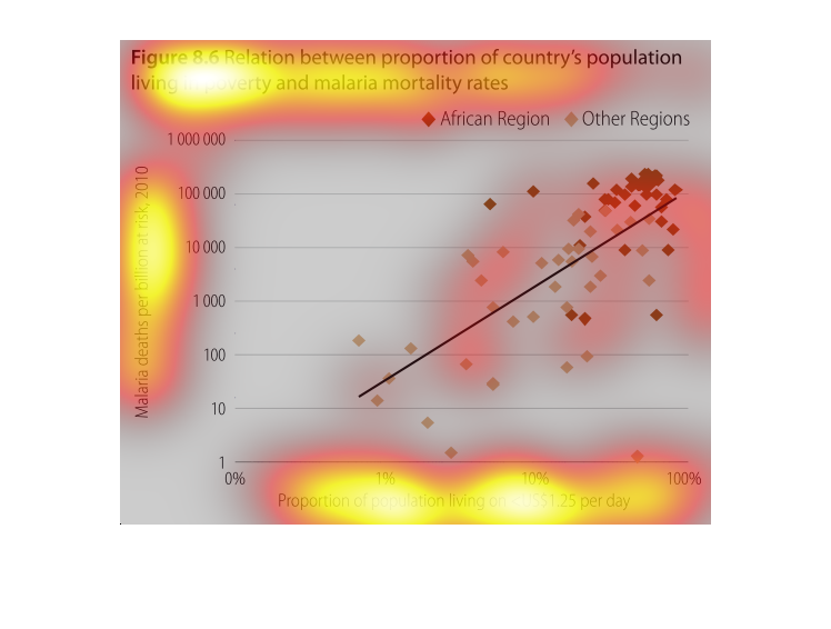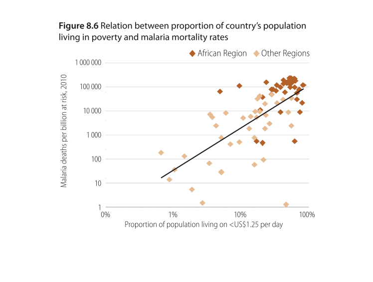
This chart describes relation between proportion of country's population living in poverty
and malaria mortality rates. Different categories are represented by different colors.
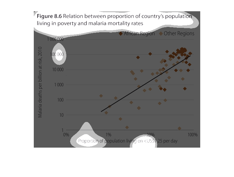
it is a graph showing the proportion of countries that are living in poverty and the countries
that are affected by malaria. It is a graph that was taken in 2010.
This graph tries to illustrate that the poorer the nation, the less access to rudimentary
things like clean water, food, and medical care lead to illnesses. Widespread Malaria is a
great cause of these things.
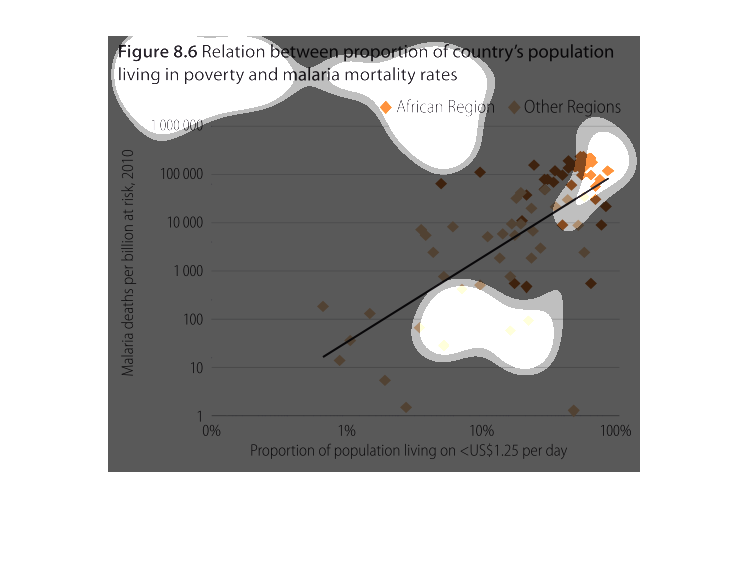
figure 8.6, relation between proportion of country's population living in poverty and malaria
mortality rates. On the Y axis is malaria deaths per billion at risk, 2010, on the X axis
is proportion of population living on less that $1.25 USD per day. There is an obvious correlation,
especially in the poorest of the poor populations, few outliers.
This chart shows proportions of malaria mortality rates bases on poverty levels per billion
in 2010. The mortality rates in Africa, more specifically those living on less than $1.25
per day, are much higher than other countries.
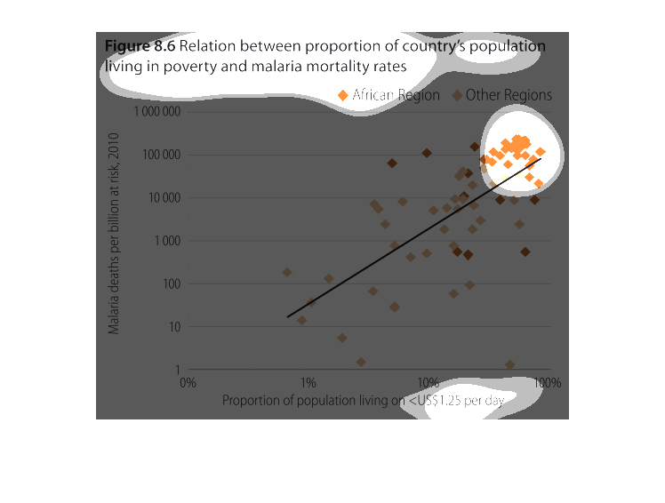
This chart describes relation between proportion of country's population living in poverty
and malaria mortality rates. Different categories are represented by different colors.
This is a graph showing the relationship between the proportion of a countries poor population
to the malaria mortality rate. It shows there is a relationship that the more poor the population
the higher risk of malaria.
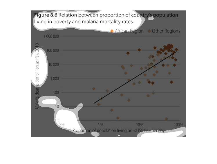
World malaria mortality rates correlated with povert rates. African regions are separate from
all others, and the points appear as a scatter plot trending upwards: the more poor means
more deaths.
The figure presented is titled figure 8.6 relation between proportion of country's population
living in poverty and malaria mortality rates.  The figure represents poverty and malaria.
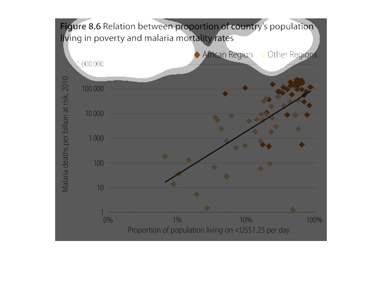
This chart shows the relation between porport and it shows a line this is a math problem and
it looks hard. This is a line graph and it shows the population.
This is a chart that shows the relation between the proportion of a country's population living
in poverty and malaria rates . There is a high concentration of data points when the poverty
is high and death rate is also high.
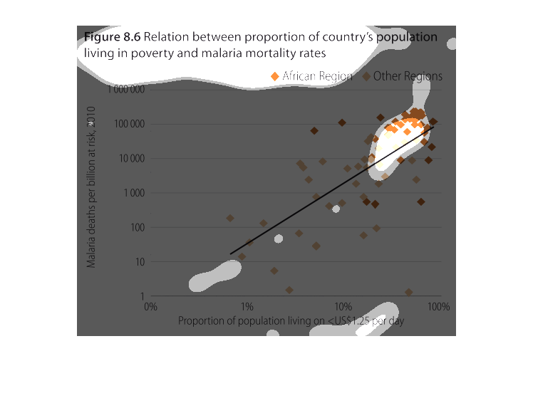
This is a graph that illustrates the relationship between a country's population to those
living in poverty and malaria mortality rates. It shows this for the Africa region and also
other regions.
The image depicts the relation between proportion of country's population living in poverty
and malaria mortality rates. The data compares African region versus Other regions. Africa
appears to have higher mortality rates.
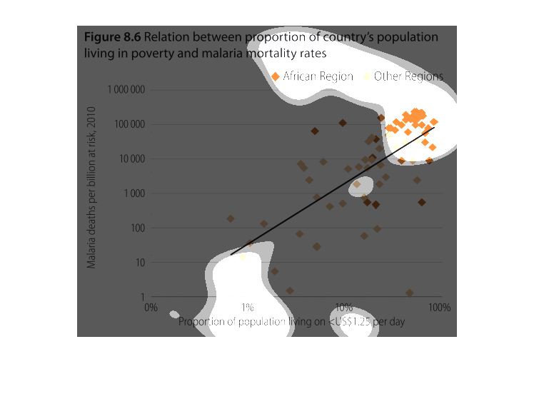
figure 8.6 relation between proportion of country's population living in poverty and malaria
mortality rates. Y axis malaria deaths per billion at risk, 2010. X axis proportion of population
living in poverty on less than $1.25 US dollars per day. What we see is a general correlation
with some outliers. It is very obvious at the poorest of the poor that deaths definitely occur
more often.