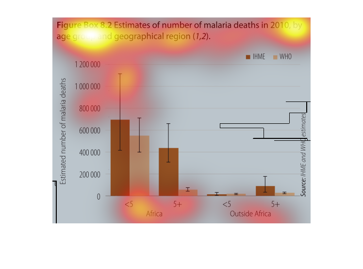
This bar graph indicates the estimated relation between malaria deaths and age group/geographical
location. it is clear that the number of malaria deaths in Africa compared to those outside
of Africa is significantly higher. In Africa, the amount of deaths caused by Malaria in people
under the age of 5 years old is higher than those above the age of 5. Outside of Africa the
number of deaths from malaria in people under the age of 5 is less than that of the number
of deaths in those above age 5.

This chart describes estimates of number of malaria deaths in the year 2010, by age group
and geographical region. Categories on the chart include outside Africa.

A chart outlining the number of malaria deaths in 2010. It organizes the information by age
and geographic location and includes death estimates from the groups IHME and WHO.
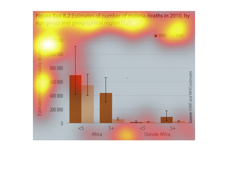
This chart graphed estimated deaths caused by malaria 2010 and categorized them by age group
and geography. Africa had significantly more deaths in children under the age of 5 than outside
of the country.
Malaria is a terrible sickness that no one should experience. This graph shows the amount
of people that get it every years, and the mortality rates between the age groups.
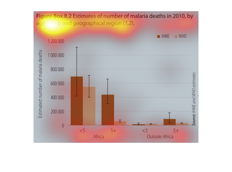
This chart describes estimates of the number of malaria deaths in 2010, by age group and geographical
region. The highest spike on the chart is between 600,000 and 800,000.
This graph depicts the estimated death from malaria in 2010 by age and demographic area.
There are number of deaths depicted from IHME and WHO specifically in Africa and then total
not in Africa.  However the majority of malaria deaths are in the African region.

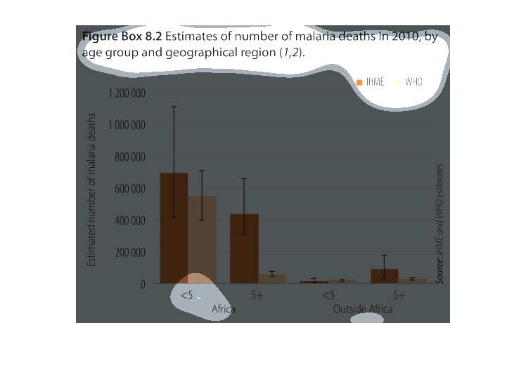
This chart estimates the number of malaria deaths in 2010 by age groups and region they are
in. Africans less than 5 years old have about 700,000 deaths outside Africa there are about
10,000 deaths. This shows that Africa has the most malaria deaths.
This graph illustrates the estimated number of malaria deaths in 2010 by age group and geographical
region. It contains both IHME and WHO figures for Africa.

The figure presented is titled Figure box 8.2 Estimates of number of malaria deaths in 2010
by age group and geographical region.  The figure shows data for malaria deaths.
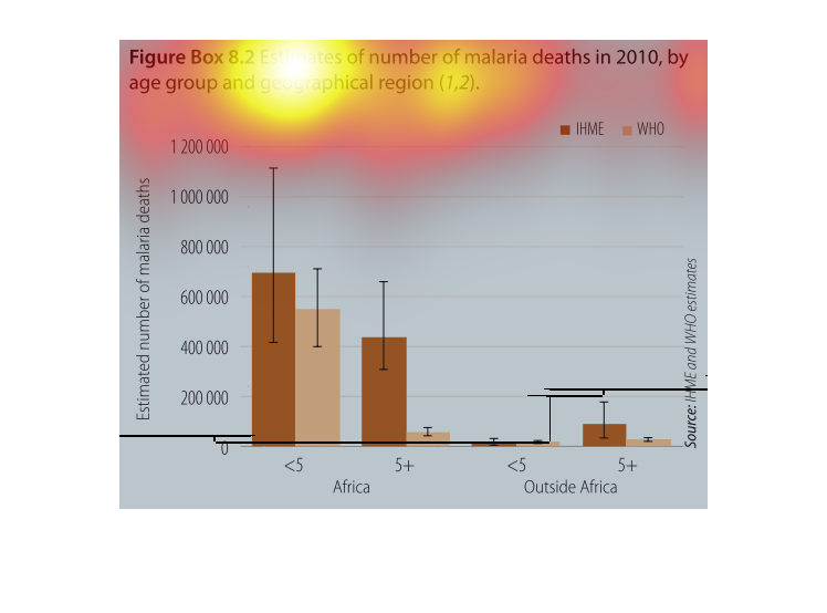
 This chart compares malaria deaths in 2010 by age group and geographical region using a bar
chart. It is broken down to two separate regions, Africa, and outside of Africa and two separate
age groups, those children older than five, and younger than five.
The image depicts the estimated number of malaria deaths in 2010, by age group and geographical
region. Data compares Africa vs Outside Africa. Africa shows a much higher number of malaria-related
deaths across the board when compared to Outside Africa.
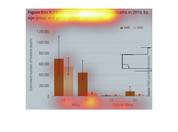
A bar chart infographic showing the estimated number of malaria deaths from 2010 broken down
by age group and geographic location. Generally shows children under 5 in Africa die most
often