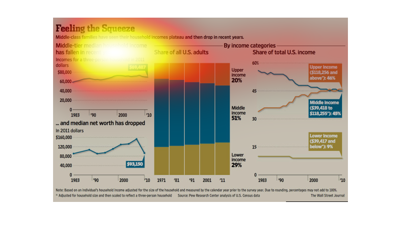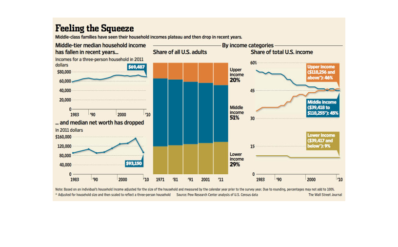
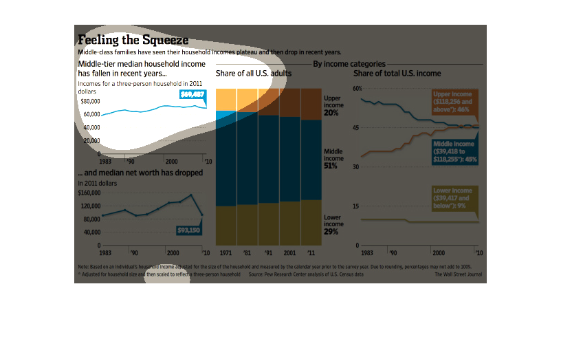
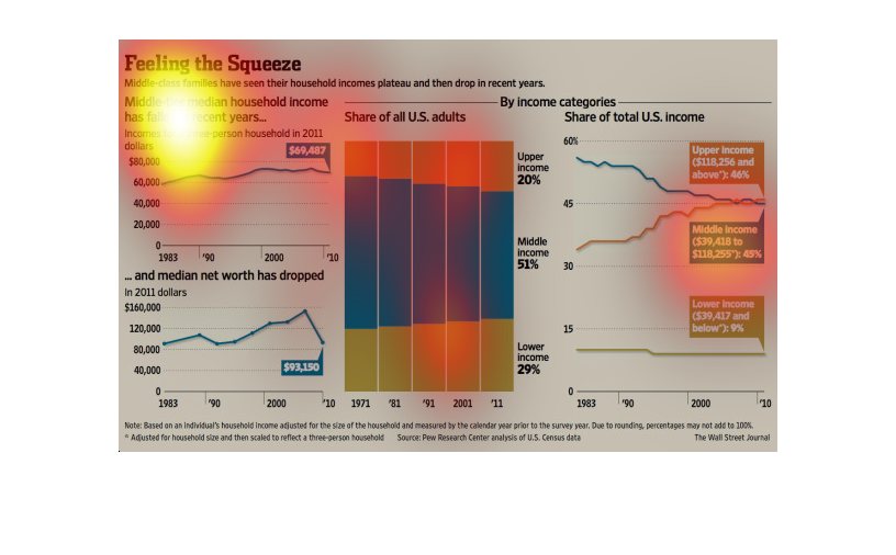
This image shows how household incomes have plateaued in recent years and then slowly declining
more recently.  It also show how median net worth has also declined.
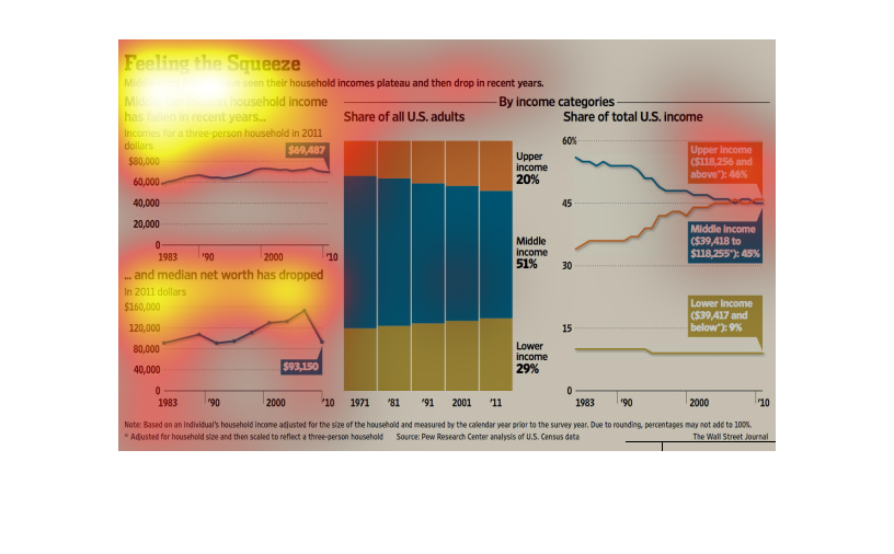
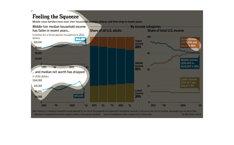
This chart describes feeling the squeeze. Specifically, middle-tier median household income
has fallen in recent years. Different categories on the chart are represented by different
colors.
There is text saying feeling the squeeze.  There are charts in the middle of the screen which
depict statistics,  There are charts to the right of the screen of income,
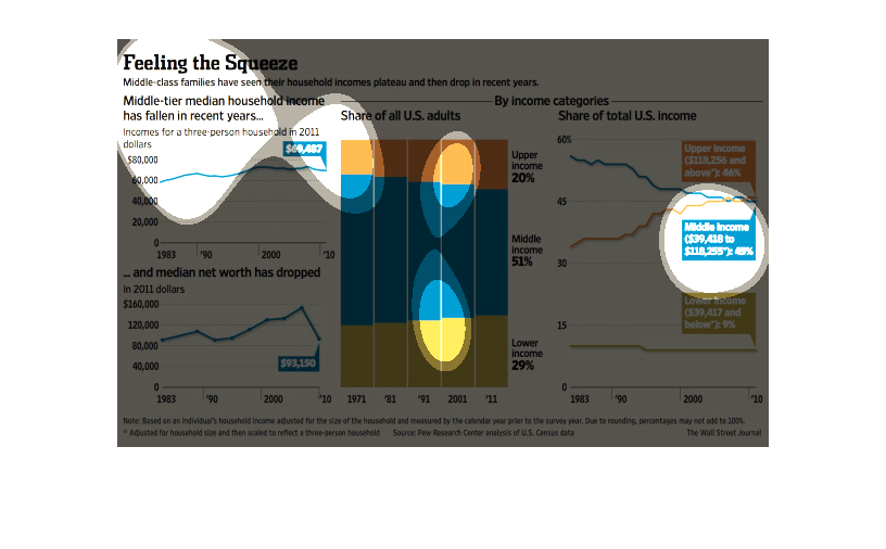
This chart describes feeling the squeeze. Specifically that middle class families have seen
their household incomes plateau and then drop in recent years.
This char/graph is titled "Feeling the Squeeze", which is about how families with average
incomes meet their house mortgage demands every month. It shows lower income is 29 percent
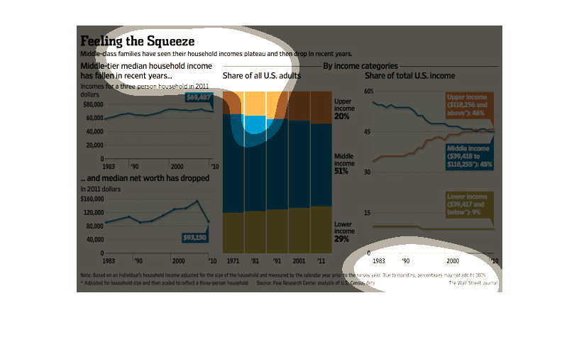
This image shows the median income for high-income, middle-income, and low-income families
in the United States. Over the years the middle-class income has dwindled, while high-income
and low-income median incomes' have increased.
This graph illustrates the squeeze that has been placed on middle class family income in recent
years with incomes for a 3 person household in dollars and the share of total US income that
is for high, middle, and low income classes.
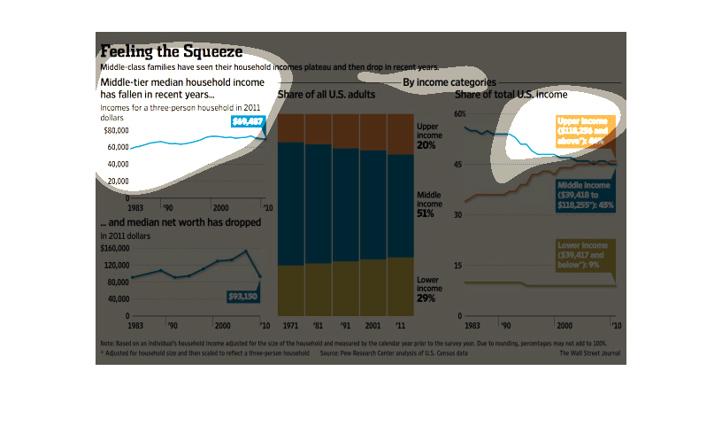
The figure presented is titled Feeling the Squeeze.  The figure is an actual representation
of the statistical data for median level income and its fall.
Feeling the squeeze. Middle tier median  household income has fallen in recent years. Share
of all U.S. adults heads the first graph that is bigger than the others.
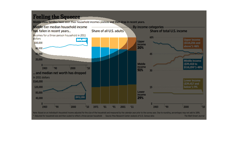
This is a graph that shows the impact of the economy on the middle-class population. it shows
that this population is actually feeling the squeeze and it covers the years 1883 to 2010.
This is a graph showing the rapid decline of the median average household income in the united
states along with graphs showing the lower and upper class income classes as well.
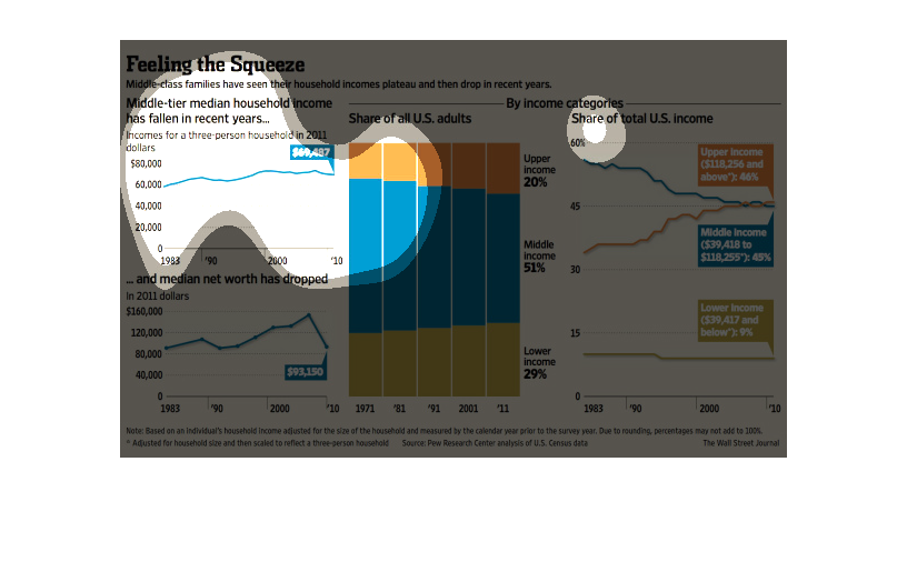
feeling the squeeze.middle class families see incomes plateau and then drop in recent years.
1971 through 2011 is seen on the X axis of this graph which displays incomes for different
classes in the bars, each is sectioned into thirds according to class. Basically the trend
is that the middle class is being phased out slowly while the rich get richer and the poor
are getting poorer
This is a series of infographics rather than just a single graph.  The piece is making arguments
for how and why middle class America is struggling.  Since there are multiple variables contributing
to that struggle, they chose to use multiple graphs focusing on slightly different items.
 Not meant for just a general overview passing by, but to spend some time reading through
the details of the information provided in graph form.
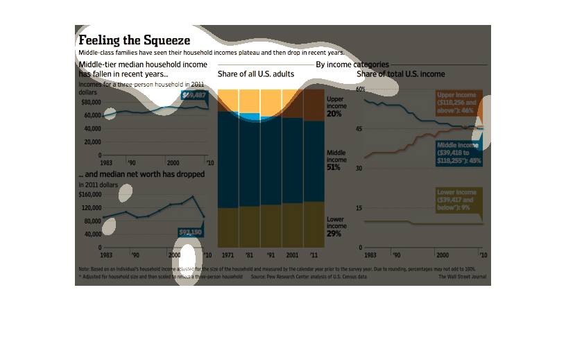
This is a series of color coded charts showing that middle class families have seen their
incomes plateau and then drop in recent years in terms in median middle class income data.