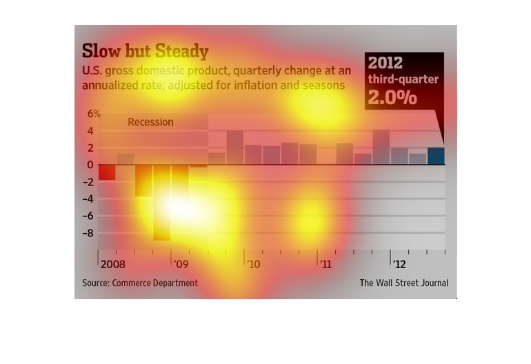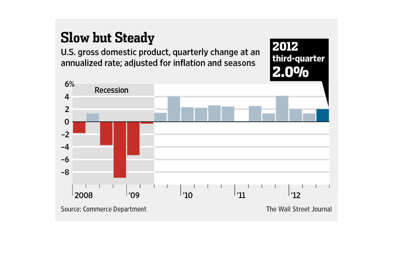
This is a publication from the Wall Street Journal showing how the economy is slowly but steadily
recovering from the recession.  It covers from 2008 through 2012.  Between 2009 and 2010 is
where the rebound began to show.
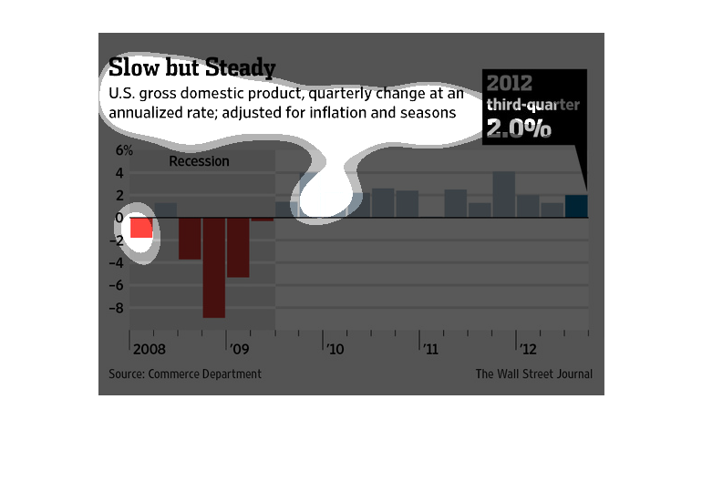
This chart describes slow but steady. Specifically, US gross domestic product, quarterly change
at an annualized rate; adjusted for inflation and seasons.

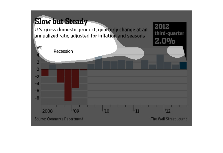
This graph illustrates the United States gross domestic product rate quarterly change rate
adjusted for inflation and seasons from the years 2008 to 2012.
This chart shows the quarterly change at an annualized rate which is adjusted for inflation
and seasons for US gross domestic product.  It's information is taken from years 2008 thorough
2012.  In 2012 during the third quarter, it's a rate of 2.0%
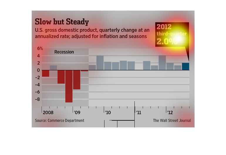
This is a chart of the change of gross domestic product and annualized rate, adjusted for
inflation and seasons. Data is for 2012 and during the 3rd quarter the output is 2%.  There
is a recession until 2009 and then t is in the positive.
The figure presented is titled Slow but steady.  The figure is an actual representation of
the statistical data for the United States gross domestic product.
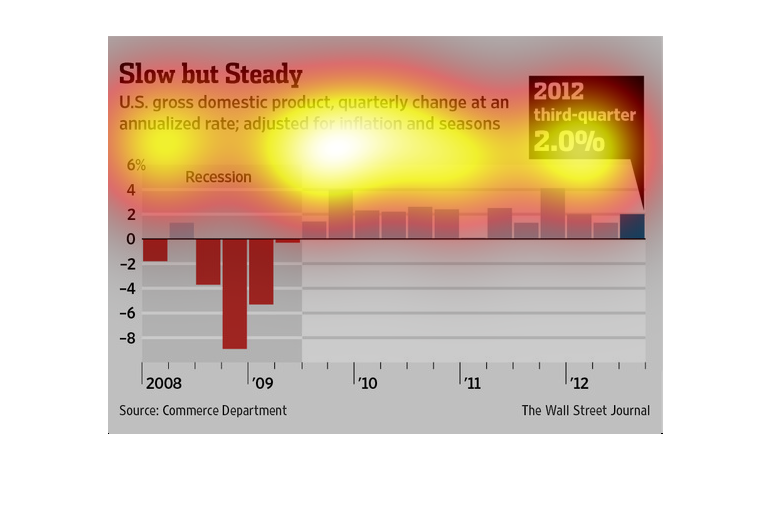
This is a graph that is being used to illustrate the status of the gross domestic product
in the United States of America. It shows that the improvement is slow but steady between
the years 2008 and 2012.
Slow but steady, United States gross domestic product, quarterly change at an annualized rate;
adjusted for inflation and seasons. Y axis is percentage, X axis is years 2008-2012, We see
a severe plummet in the first year, part way through 2009 it rises into the positive and then
evens out.
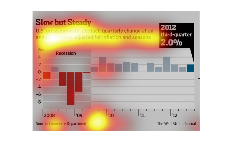
This is a graph that shows the timeline of the slow but steady US GDP growth since 2008 and
the recession until 2012. This is a wall street journal study produced with the commerce department
information.
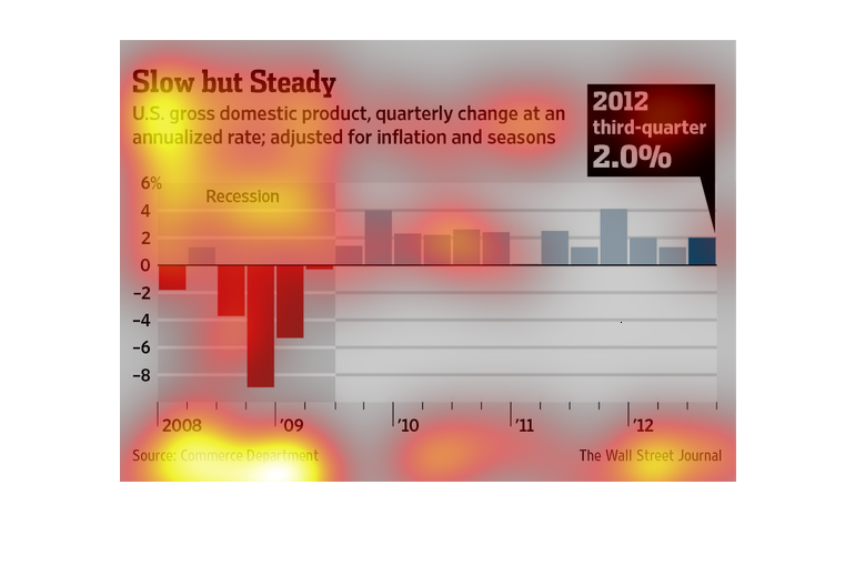
slow but steady Unites States domestic product, quarterly change at an annualized rate; adjusted
for inflation and seasons. Years 2008 through 2012 , we see the recession recovery and leveling
out
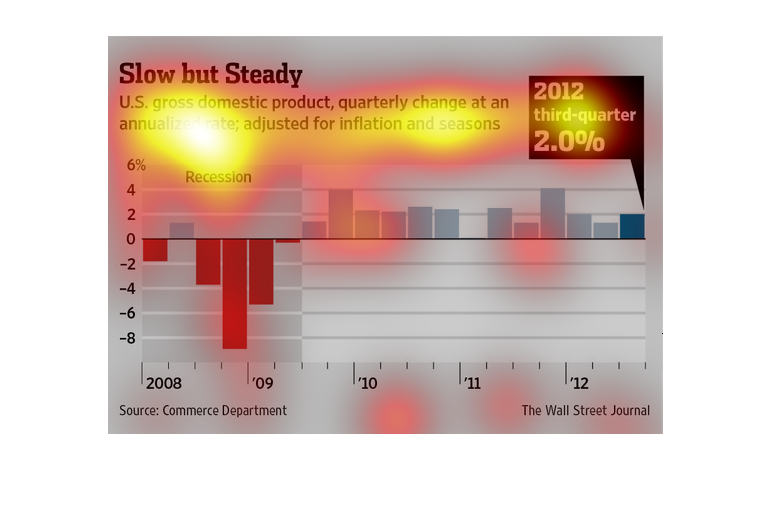
This is a color coded bar graph depicting a slow but steady United States gross domestic product
in terms of a quarterly change an annualized rate and adjusted for inflation.
This chart describes slow but steady. Specifically, US gross domestic product, quarterly change
at an annualized rate; adjusted for inflation and seasons.
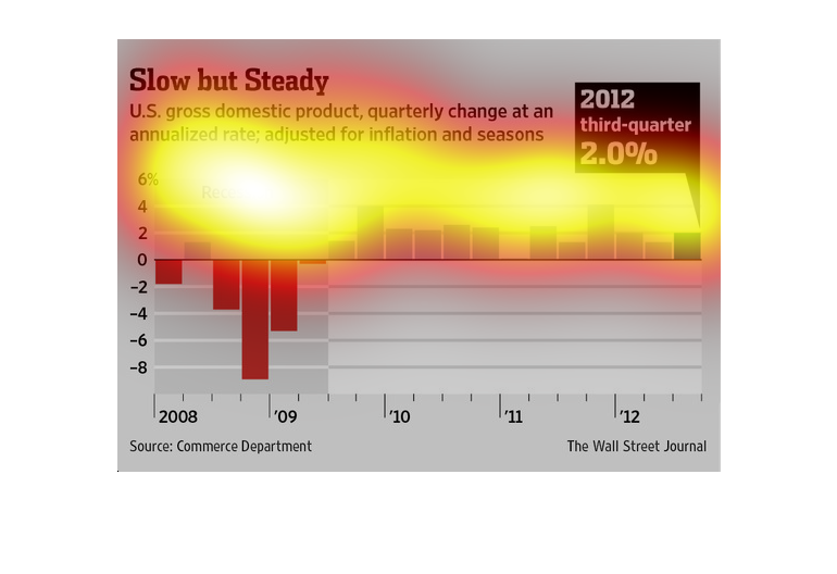
the name of this graph is called slow but steady and its talking about domestic product and
how it help the population recession is the name there are three bar graphs