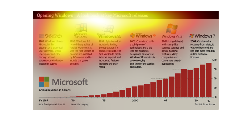
The chart shows the timeline of the Windows icon on Microsoft computers. The timeline shows
the appearance of the icon and some notes about the operating system upon its release.

An infographic showing the history of Microsoft Windows versions spanning from Windows 1.0
to Windows 7 and showing annual revenue in billions with expontial growth

This show the different versions of Microsoft Windows and the changes that were made each
year. It begins with 1985 and continues to 2009.  These show the upgrades that occurred each
year.


This is a graph displaying the revenue made while Windows continues to grow and improve. Each
Windows update has a description of its display and functions and how much revenue was made.
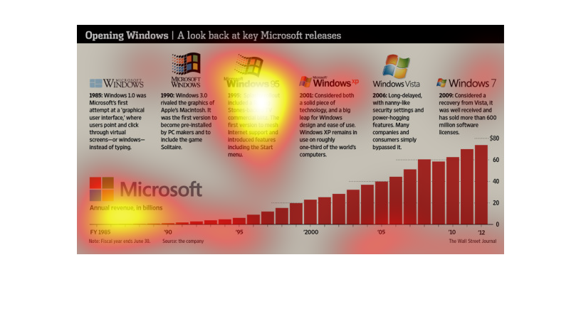
This is a graphic that is meant to look at all the various major releases of the popular Microsoft
windows operating systems between the years 1985 and 2009.

It is a timeline of versions of Windows over time, describing what the operating systems name
and some features. The graph at the bottom dictates  how much revenue the company made over
the past couple decades.
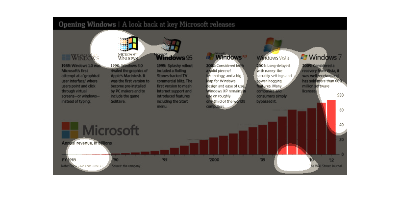
This is a description of the changes over the years of Microsoft from 1990 through 2009..
the changes throughout the year and the logos.  It describes the price of technology the looks
It even describbes on how many people purchased this soft ware ... by 2009 there were 600
million software license that were purchased.
This image depicts the release and effects of Microsoft products. This began with 1.0, followed
by 3.0, 95, XP, Vista, and eventually Windows 7. The revenue in billions steadily increased.
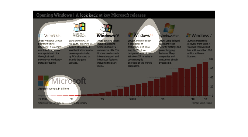
This handmade chart shows the evolution of the windows operating system from microsoft and
what the features are over time for each operating system.

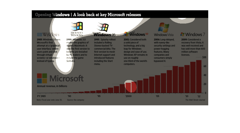
The graphic contained within this images seems to detail the chronological timeline of the
various versions of the Windows Operating System, from Windows 1.0 all the way to Windows
7.
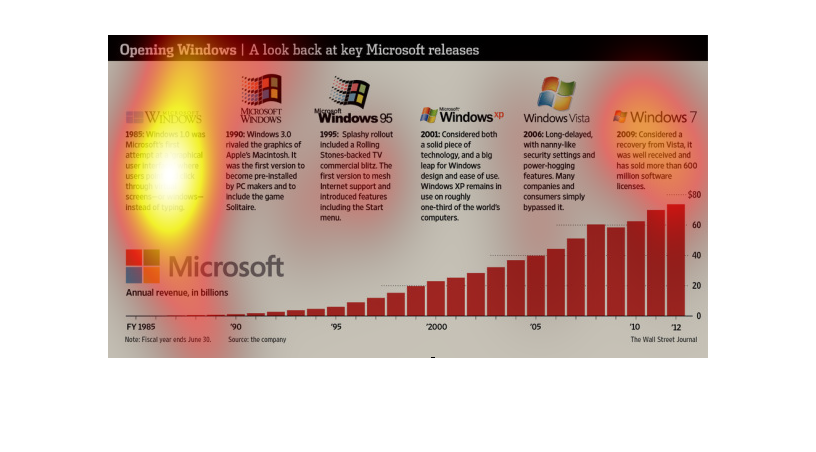

This chart describes opening windows. Specifically, a look back at key Microsoft releases.
Applications on the chart include Windows 1.0, and Microsoft Windows 3.0.
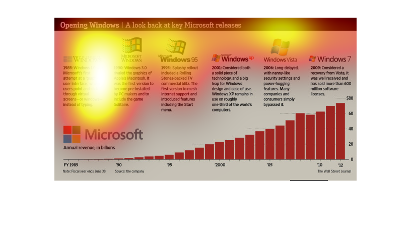
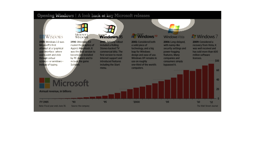
This chart describes opening windows. A look back at key  releases. Categories on the chart
include different versions of the Microsoft windows application.