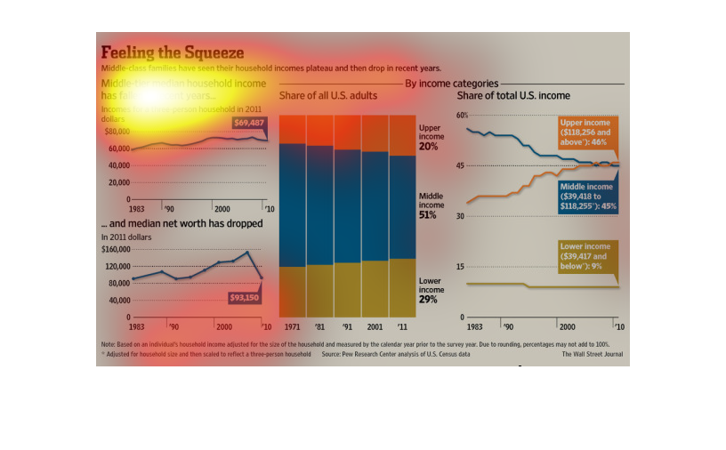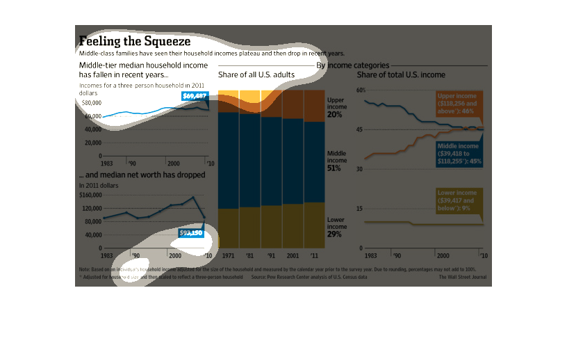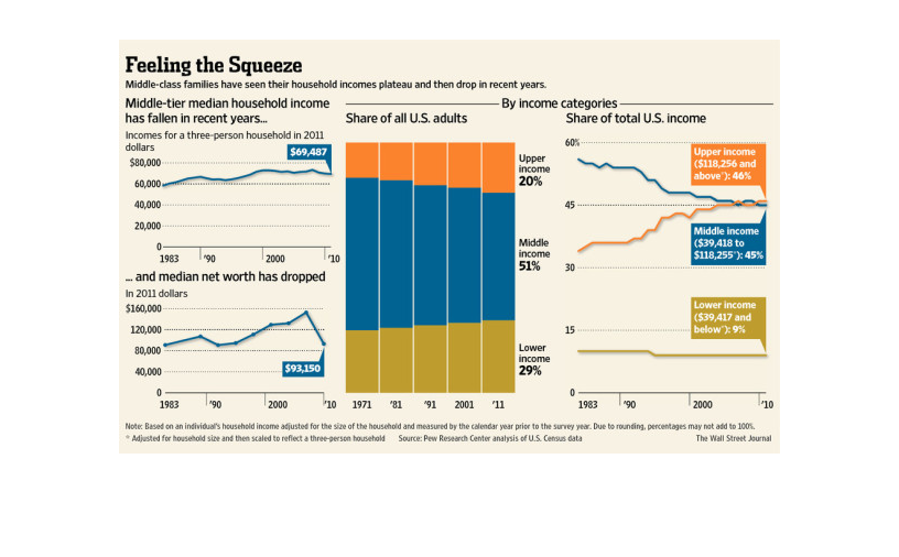
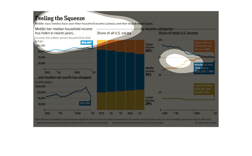
This is a color codes chart depicting that middle class families have seen their incomes plateau
and then drop in recent years. Is is shown to be a smooth and steady decline.
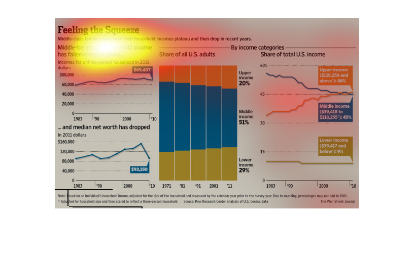
This chart shows the growing divide between middle and upper class households.  As the income
and assets of the middle class have dropped the upper class has risen
The chart/graph shows  the heading of the feeling of the squeeze. It gives the examples that
middle class families have seen the value of their homes drop off and go down to no value.
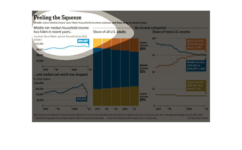
Middle-class families are starting to see a significant decrease in the household incomes
after a recent plateau.  Low income families have increased over the years, reflecting the
income differences from middle-class families. Also, the median net worth has dropped after
steadily increasing over the decades. Upper income families has also increased at a total
of 20% of all families for 2011.
This is a chart of "feeling the squeeze." It details how middle-class incomes have plateaued
and then fell. It shows that the income for three person households is just under $70,000
and that there are more "rich" people and more "poor" people while the percentage of middle
class continues to shrink.
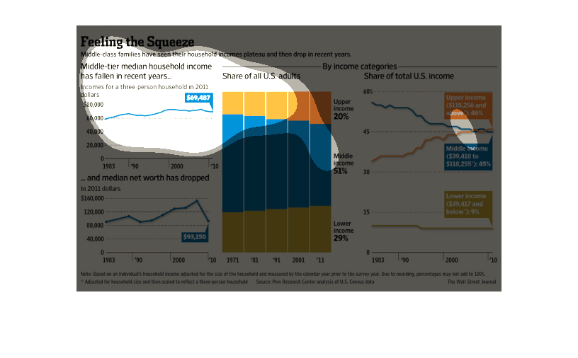
This chart describes feeling the squeeze. Specifically, middle class families have seen their
house hold incomes plateau and then drop in recent years. Categories are represented by different
colors.
Feeling the Squeeze middle-class families have seen their household incomes plateau and then
drop in recent years. Middle-tier median household income has fallen in recent years... Income
for a three person household in 2011 dollars, 1983= $60,00, 2010=$69,487. And median net worth
has dropped, 1983= $95,000, 2010= $93,150.
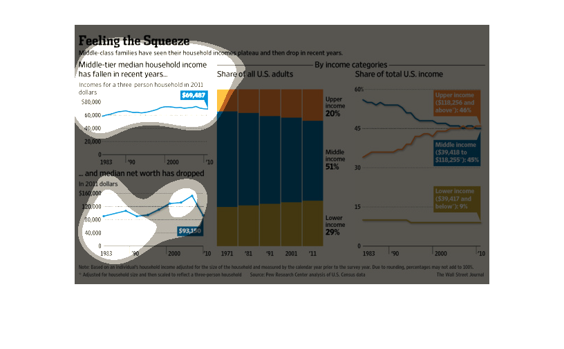
Middle-tier median household income has fallen in recent years, and median net worth has dropped.
Middle class income now accounts for 51% of the shares of all US adults.
Feeling the squeeze as it relates to the shriinking incomes of families.  This relates to
middle tier families ( three person family). Color represent the lower, middle, and upper
income families.
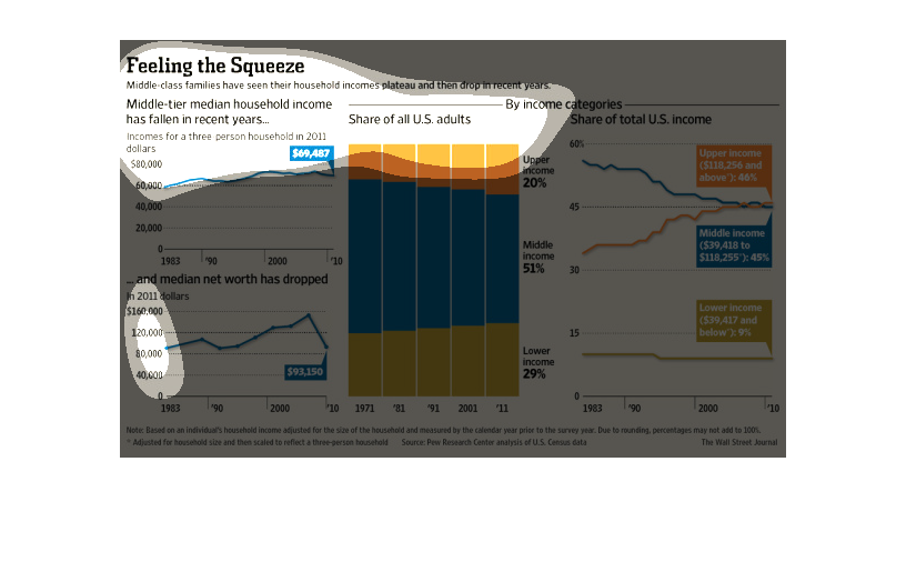
The figure presented is titled: Feeling the squeeze: Middle class families have seen their
income plateau and then drop.  The figure shows the relative drop of income.
This graph discusses the pressures the middle class of america.  Since around 2005 (before
which the rate of net worth and income were growing) there has been a sharp decrease in the
net worth and income of middle class families.  The number of middle class families has only
changed slightly since the 1970s.   Movement has been towards both the upper class and the
lower class.  However now the middle class accounts for almost the same percent of income
as the upper class.
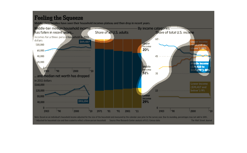
The graph shows how middle class income families are feeling the squeeze because their incomes
have plateaued and then dropped in recent years and indicates that the percentage of middle-income
families has dropped steadily since the 1970s.
This chart describes feeling the squeeze. Specifically, middle class families have seen their
household incomes plateau and then drop in recent years.
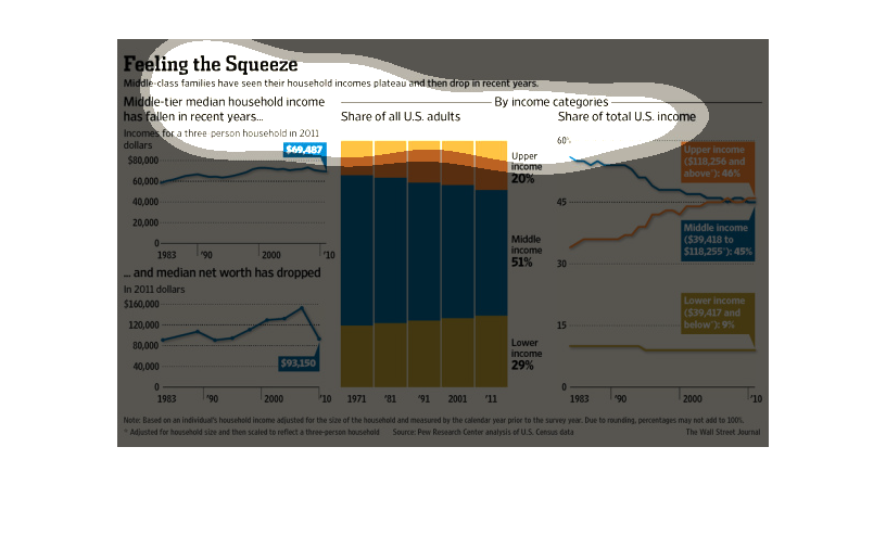
Even though they saw we have recovered from the recession, in truth the funds released into
the general population as ''relief'' have not been adequately dispersed, in truth that have
remained with a small segment of the populace.
The image depicts how middle-class families have seen their incomes plateau and then drop
in recent years. The data shows how failed right-wing economic policy is crushing the middle
class.