Workloads often change, sometimes because there is no work to be had, other times expenses
simply cannot meet demand. In this study it tries to showcase the intricacy of these matters
in a logical manner.
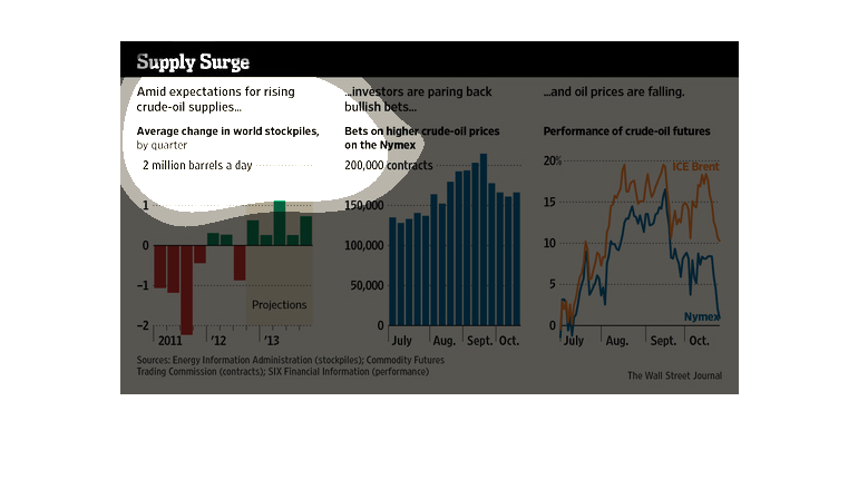
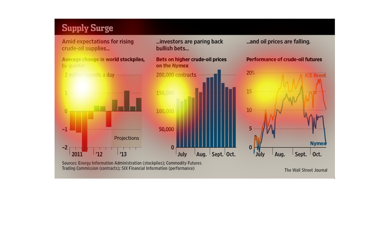
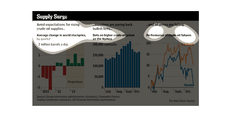
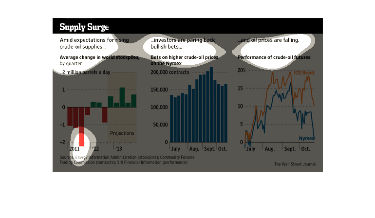
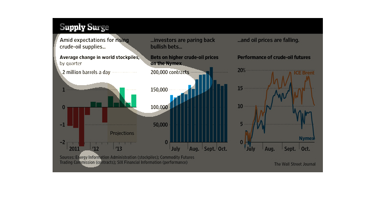
These three data charts show supply surge. The left shows the change in the stock market over
a single day, while the center shows bets on higher crude oil prices. Finally on the right
a series of colored lines shows the trend of falling oil prices over a 4 month period.
These graphs explore the causes supply surges of crude oil. It is based on 3 different reasons:
expectations of supplies, investors paring back, and falling oil prices. There are three different
graphs, each assigned to one specific reason. The first graph breaks down expectations between
the years 2011-2013. The second explores investor rates during the summer months. The third
shows oil price fluctuation also during the summer months.
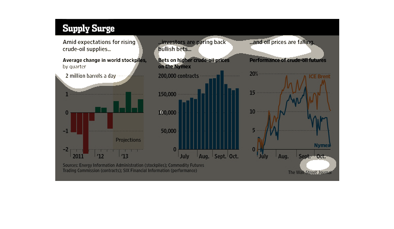
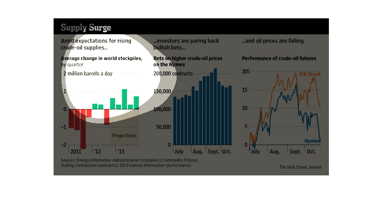
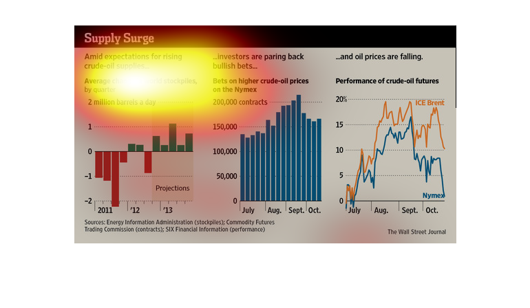
The figure presented is titled Supply Surge: Amid expectations for rising crude oil supplies...
investors are paring back bullsh bets.  The figure is about oil supplies.
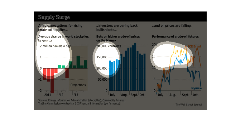
This image describes how the stock prices and market in general of crude oil is changing and
will change over time due to a general belief that the price of it will rise. Overall, it
shows that during times it is projected to rise, stockpiles of oil should increase, and the
expected return on investments should fall dramatically.
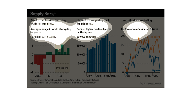
This is a series of graphs and charts depicting that there is a supply surge of crude oil
into the market and that bets on higher crude prices have been in a steady decline.
This is a graphic that shows that there is a very significant and noticeable surge in the
supply of  fuel in the form of crude oil. This also shows the performance of crude oil futures.
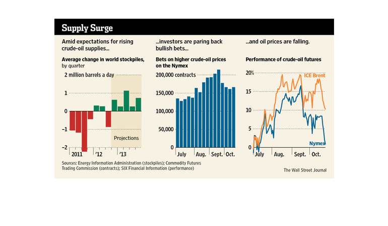
The image depicts rising expectations amid rising crude oil supplies. Year studied was 2011.
Based on the data, expectation as well as prices rose as the year progressed, with a noticeable
decrease toward the end of the year.
the name of this graph is called the supply surge and there are three graphs and they all
represents oils and how oil has changed over the years. and how the price go higher.
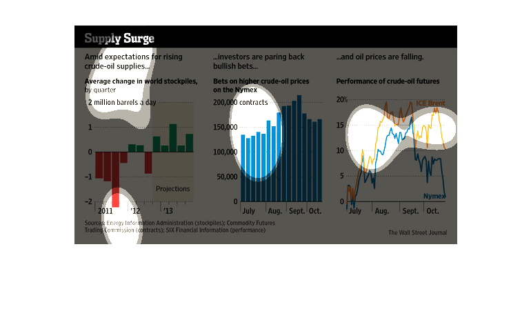
This chart actually includes three different over time charts that shows oil production and
how investors are reacting to that production. This is a lot of information included.
Oil; we need it, and we all want it. Wars have been and still are being fought for it. These
days though, prices have plummeted- $50 dollars per barrel- yet expenses are as high as they
ever have been. Why is that? This study tries to understand that phenomenon.
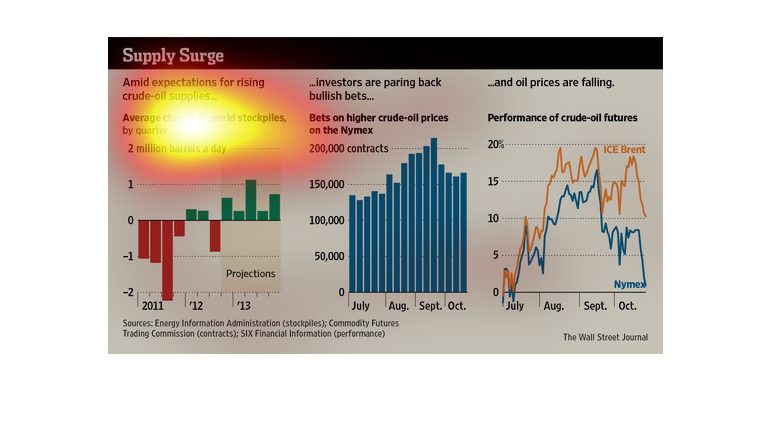
This chart describes supply surge. Specifically, amid expectations for crude oil supplies.
 The chat describes that an average change in world stockpiles by quarter.
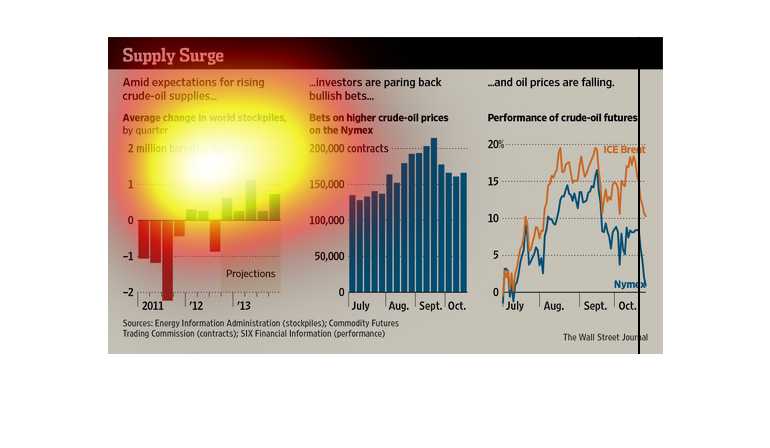
This chart describes supply surge. Specifically amid expectations for rising crude-oil supplies.
Different categories on the chart are represented by different colors.
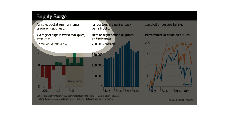
This is a series of graphs and charts depicting that average quarterly stockpiles of crude
oil and shows that there is a current surge in supply on to the market.
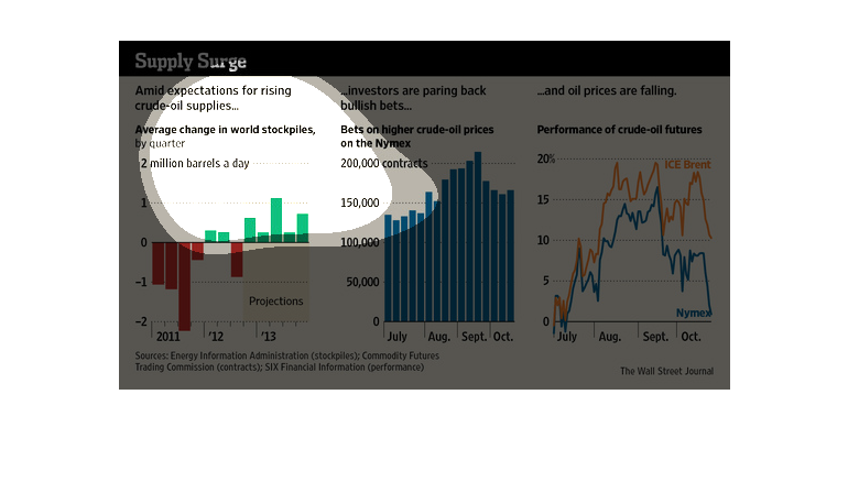
This chart clearly displays the supply surge of the average change of world stockpiles, Bets
on higher crude oil prices on the Nymex, and performance of crude oil futures.