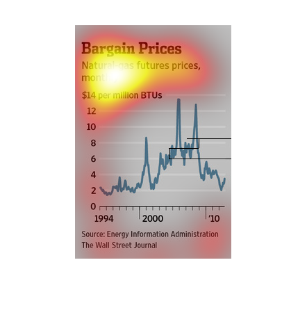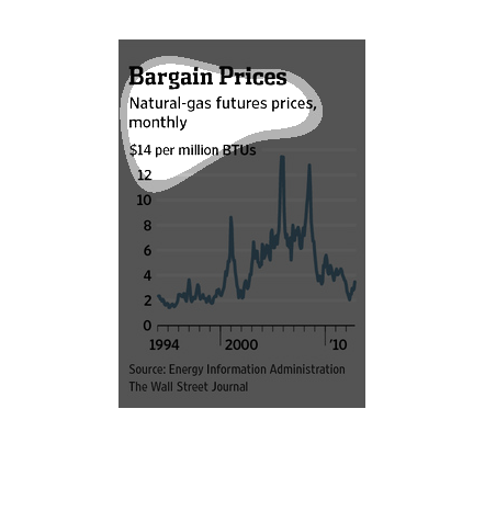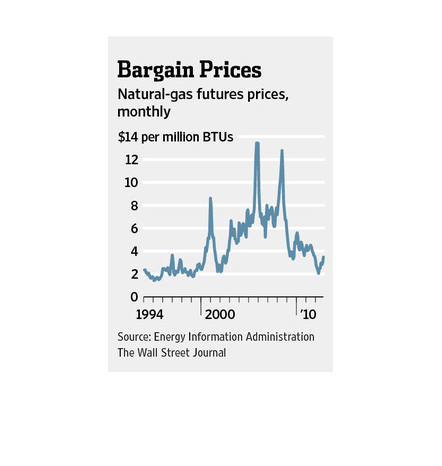
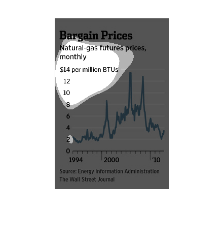
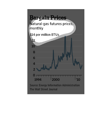
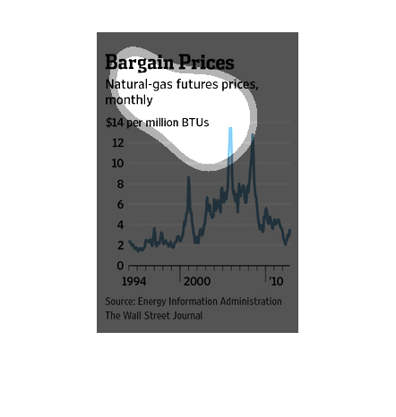
This chart describes bargain prices. Specifically, natural gas futures prices, monthly. The
chart covers the years 1994 through to 2010. It's sourced by Energy Information Administration.
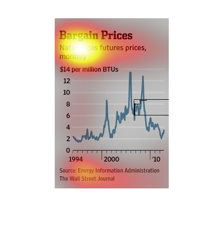
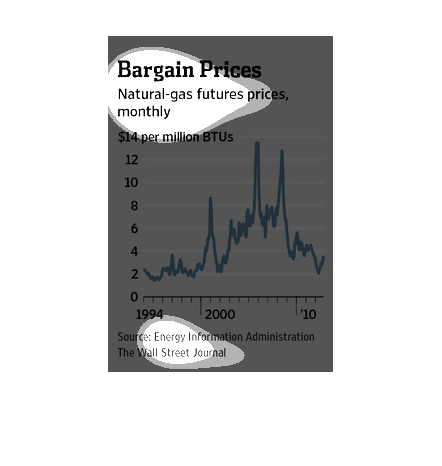
The chart shows the Bargain Prices of natural gas future prices, monthly. So $14 per million
BTUs. So from 1994 to 2010, it was increasing at the mid 2000's. And  then decreasing after
late 2000's.
This graph pertains to Natural Gas prices on a monthly basis for the period beginning in 1994
extending until 2010. The left side of the line graph is price per million BTU's and the bottom
is the year.
The figure presented is titled Bargain prices Natural-gas future prices, monthly.  The figure
is a representation of natural gas and its future prices.
This is a chart that shows the monthly value of natural gas futures from a period of 1994
to 2010 in price per million BTU. The prices trended up until the mid 2000's when the began
a steady fall. The range was between $2 and $14 per million BTU.
This chart describes bargain prices. Specifically, natural gas futures prices, monthly, for
$14 per million BTUs. The chart covers the years 1994 through 2010.
the name of this graph is called bargain prices and the graph shoes the lines of the picture
of prices.the lines represents all lines in the world and
The shows natural gas prices based on a monthly scale. The graph seems to show this over a
multi-year span with units of BTUs in the millions. The peak seems to be around 14 million
BTUs.
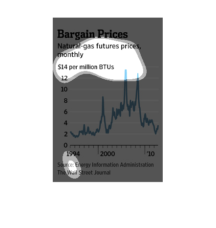
This chart clearly displays natural-gas prices by month. The chart shows that since the year
1994, the overall price of natural-gas has gone up, then back down again by the year 2010.
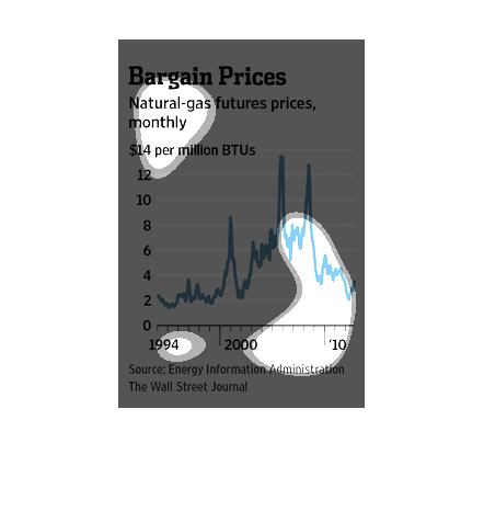
bargain price natural gas futures prices monthly, $14 per million BTU's at the top of the
Y axis all the way down to 0 by 2's. X axis is years 1994 through 2010, there are spikes in
2005? and 2006? but levels returned to the way they were in the 90's
This chart is tracking the cost of natural gas from 1994 to the present. We can see that the
cost of gas has steadily risen since 1994 with a peak in the early 2000s and then a drop in
the 2010s. Now prices are starting to rise again.
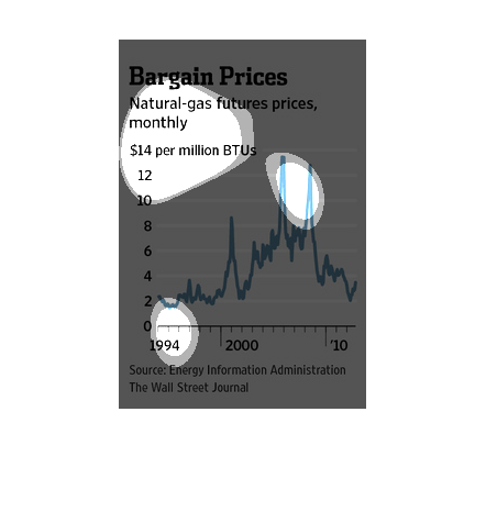
This chart shows the monthly prices of natural gas as a timeline from 1994 to 2010. The price
has fluctuated wildly over the years, but the overall trend was an increase until mid-2007.
Since then, the price has continued to trend downward, despite a few peaks here and there.
This information was provided by the Wall Street Journal.
This chart from the Economist shows the price of natural gas over time and how it has spiked
and fallen drastically recently and is more volatile.
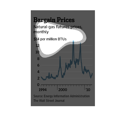
A study made from 1994-2010 shows the decline in natural gas prices within that time period.
Sure, the graph shows there were huge spikes in price every now an then, the natural gas remained
relatively inexpensive.