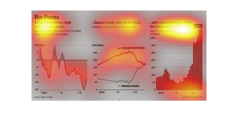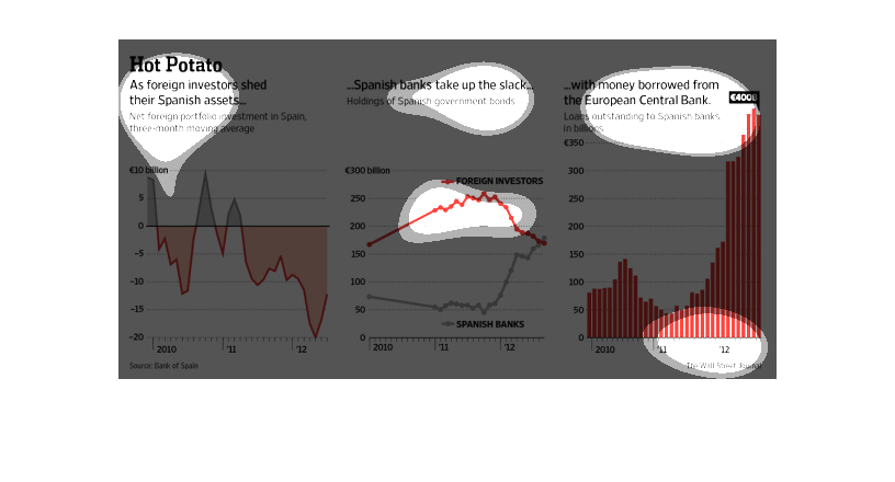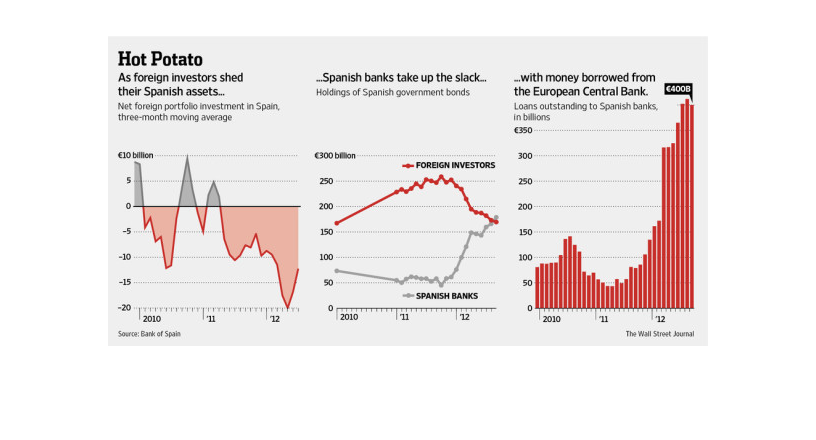
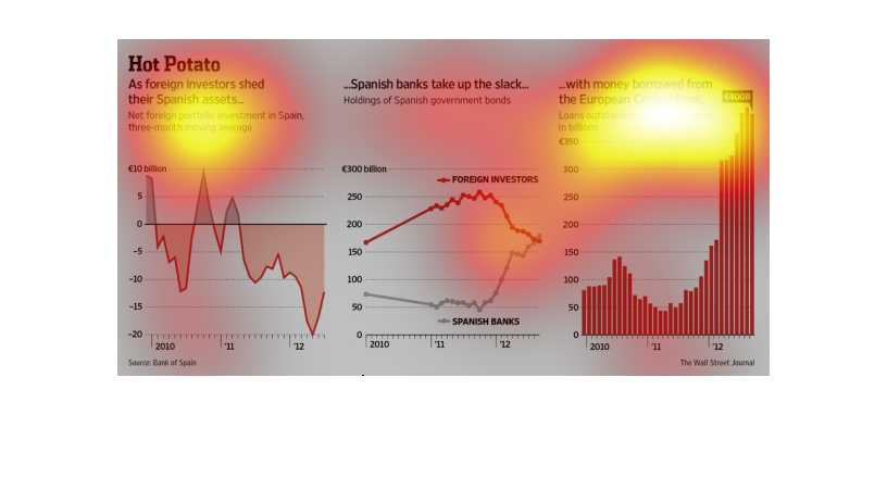
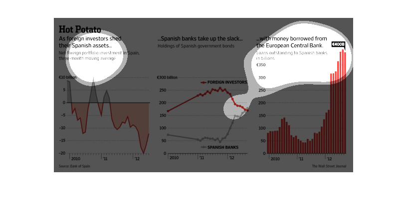
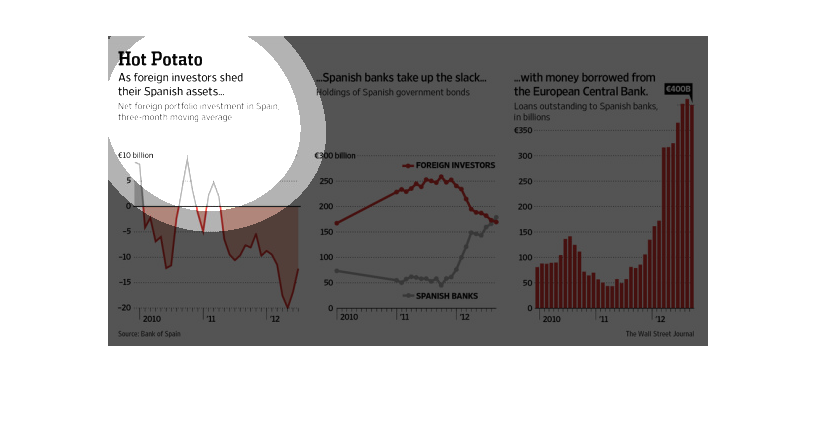
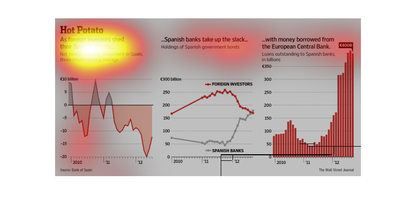
This chart describes hot potato. Specifically, as foreign investors shed their Spanish assets.
The chart also describes that Spanish banks take up the slack.
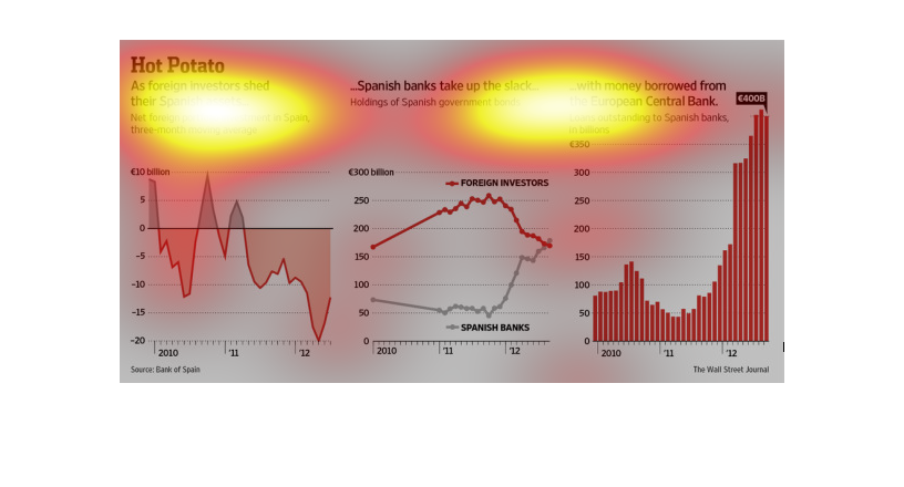
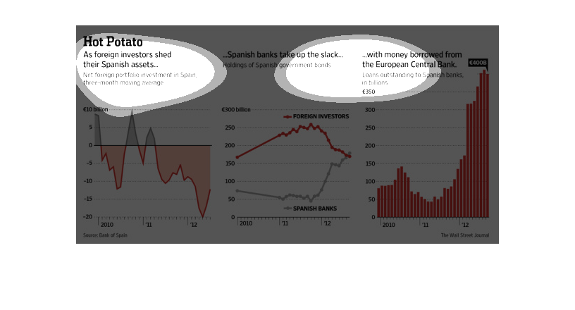
three graphs indicates situation of economy in Spanish as they paid back money owed to the
European central bank. The red line indicates the fluctuation of values of money in Spain.
The graph contained within this images seems to detail the cause and effect of foreign bankers
taking their investments out of Spanish owned and operated banks.
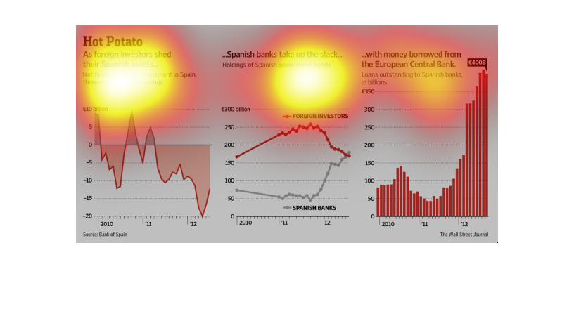
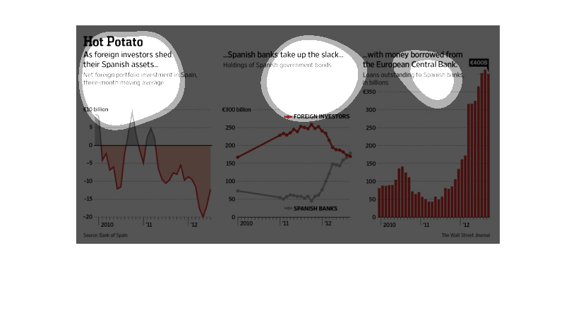
This is a set of three charts that describe the recent trends of the Spanish economy in term
of  debt, investment and amount of money that borrowed from the European central bank.
Spanish assets are decreasing rapidly and no one wants a part of it, lest they want to be
on the losing end of things. In this graph we see perfectly how this is affecting the country's
economy.
This is three sets of graphs that describe the effects of what happened after foreign investors
dropped their Spanish assets. The first two graphs show a negative trend and the final graph
shows a strongly positive trend. Overall it paints a sad picture.
This is a graph that shows that there is actually a very big problem occurring because a large
number of foreign investors are ditching their Spanish assets.
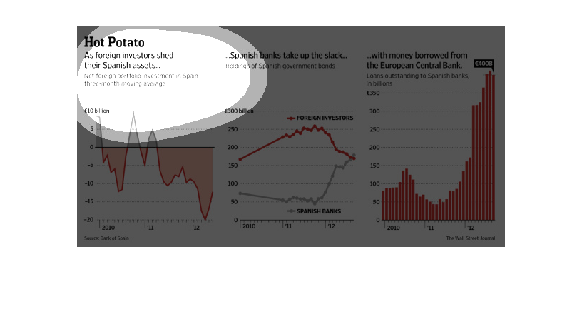
The figure presented is titled Hot potato: as foreign investors shed their spanish assets.
 The figure is an actual representation of foreign investors shedding assets.

Net foreign portfolio investment in Spain has sharply declined over the past few years. As
foreign investors shed their Spanish assets, Spanish banks picked up the slack, and there
were increased holdings of Spanish government bonds using money borrowed from the European
Central Bank.
This chart from the Economist shows the impact on what the Spanish debt crisis will have on
Spanish banks and the Spanish economy as a whole.
hot potato, as foreign investors shed their spanish assets, spanish banks take up the slack
with money borrowed from the central european bank. Three types of corresponding graphs that
display this trend