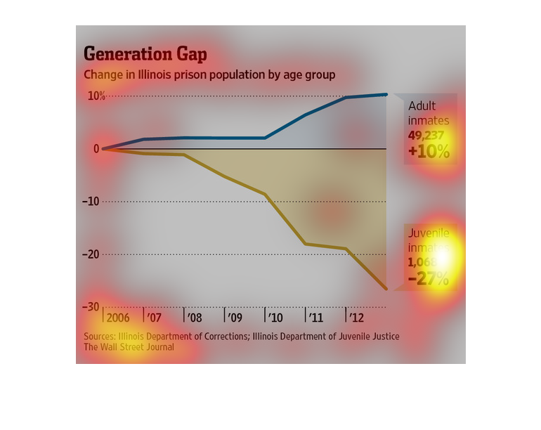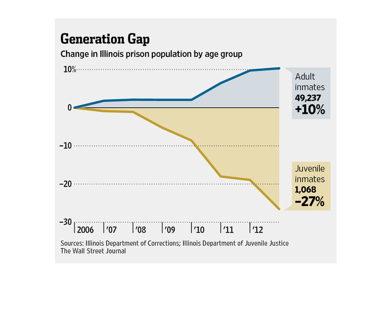
This chart describes the generation gap. Specifically, change in Illinois prison population
by age group. The chart is divided into two groups, adult inmates and juvenile inmates.
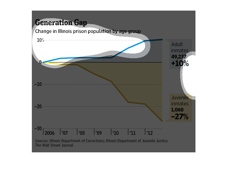
this graph shows the generation gap in prison. this specific graph focuses on the change in
Illinois prison population ages. From what i can gather the juvenile population has significantly
lowered in numbers compared to adult prisoners. they got this information from the Illinois
department of corrections, Illinois department of juvenile justice and the wall street journal.
This is a color coded chart depicting the change in Illinois  prison population by age group
from the years 2006 to 2012. It shows that the juvenile group is sharply down while the rest
are steadily up.
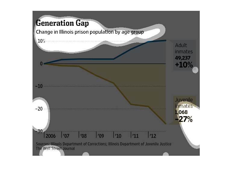
This chart shows the change in the Illinois prison population by age group, from 2006 to 2012.
Two color lines show the trends: juvenile inmates are down 26%, while adult inmates have risen
ten percent.
The image depicts the change in Illinois prison population by age group from 2006-2012. The
adult inmate population has increased by +10%, while the juvenile inmate population has decreased
by -27%.
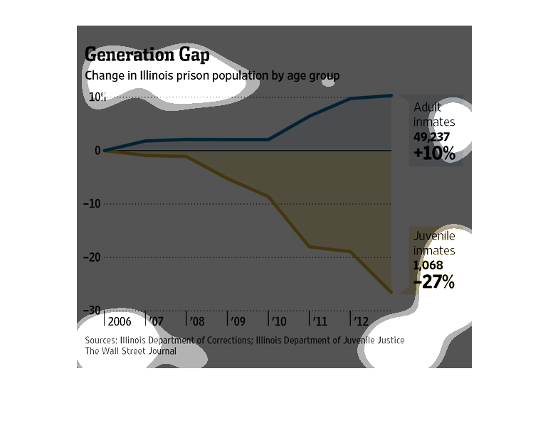
This graph shows the change in percentage of incarcerated people in specific age groups over
a period of time in the Illinois prison system. It shows that while the percentage of adult
inmates has gone up the percentage of juvenile inmates has decreased dramatically.

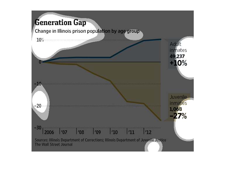
This chart describes the generation gap. Specifically, the change in Illinois prison population
by age group. The chart is divided into two categories, including  adult inmates.
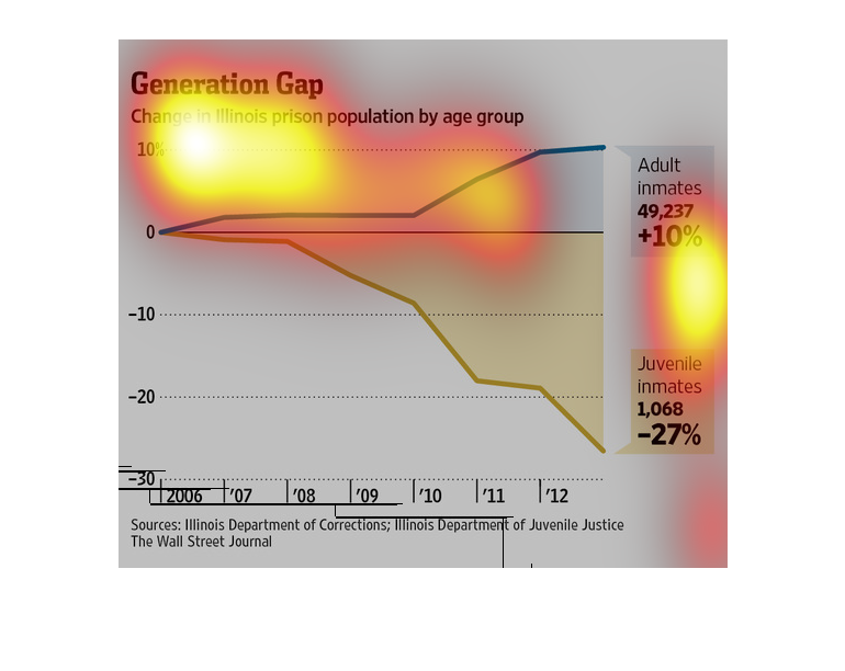
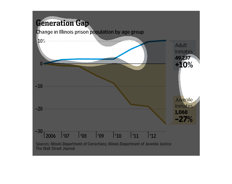
This chart shows the generational gap change in Illinois  prison population by age group from
the years 2006 to 2012.  It's split between adult inmates which is +10% and juvenile inmates
which is -27%.
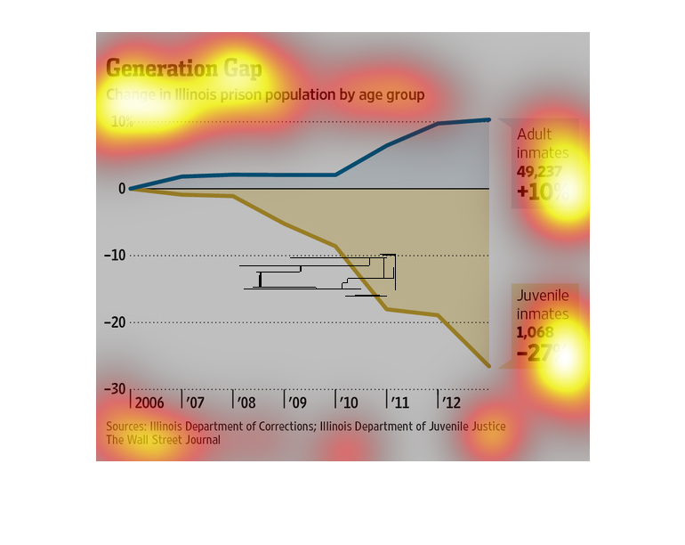
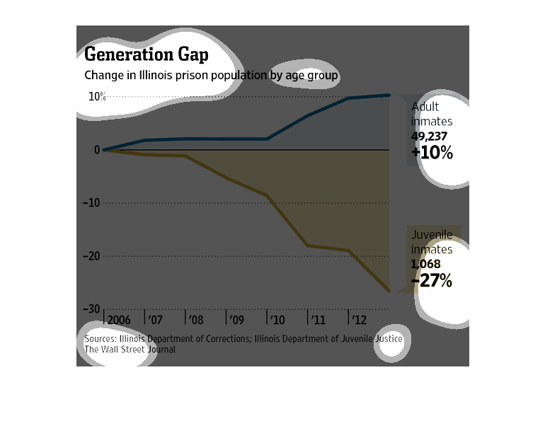
The figure presented is titled Generation Gap: Change in Illinois population by age group.
 The figure is an actual representation of Illinois population.
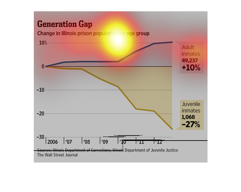
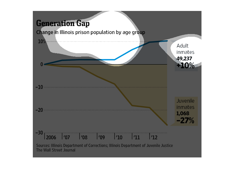
This graph shows the change in Illinois prisoner population by age group.  Adult inmates increased
10% from 2006 to 2012  .  Juvenile inmates decreased 27% during this same time period.
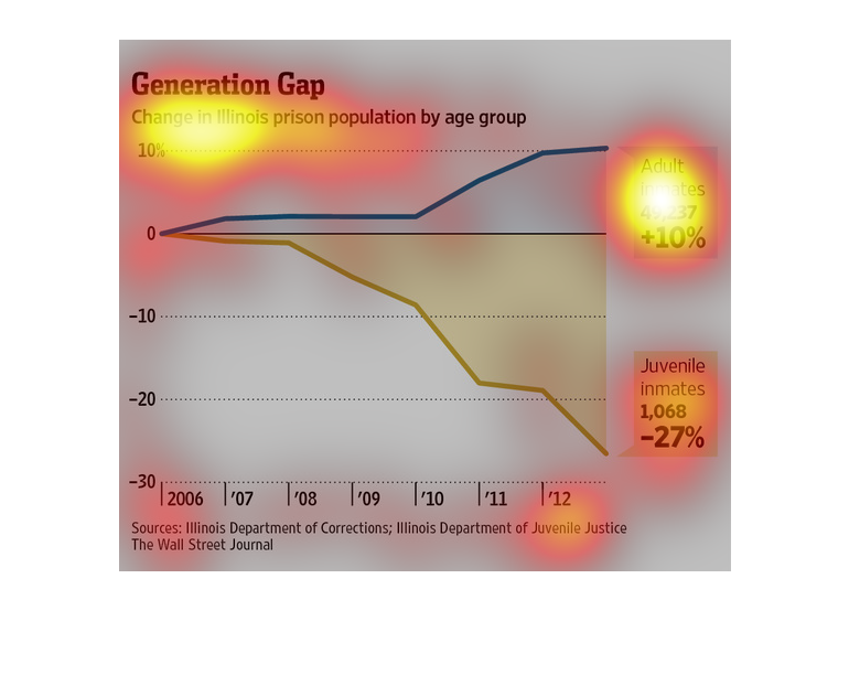
the name of this graph is called generation gap its about the illness in prison by age group
and which age group has more illness then others.and why.
this graph shows the change in ration between adult and juvenile inmates in the prison. It
indicates the number of juvenile and adult inmates spiked in the year of 2010 and onward.
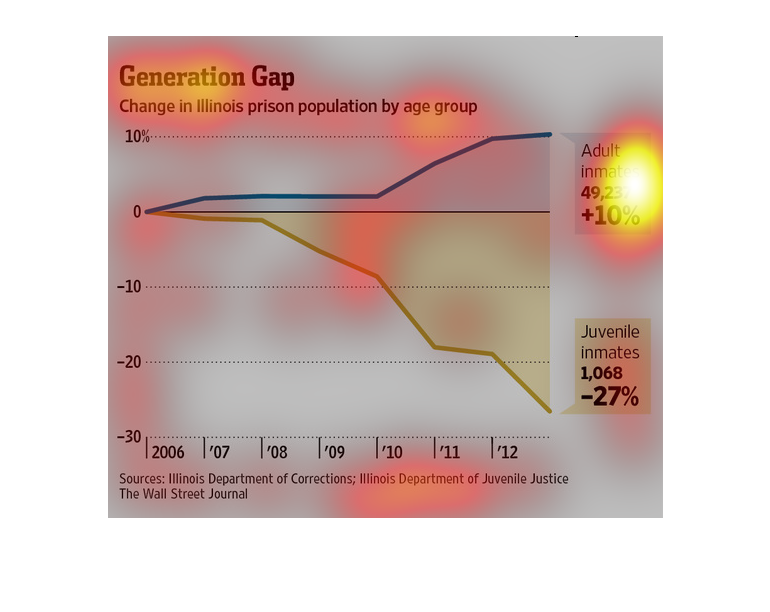
generation gap. change in illinois prison population by age group. Y axis percentages, X axis
shows years 2006 through 2012, this line and shade graph show a 27% (1,068)) decline in juveniles,
and a 10% (49,237) increase in adults
This is a graph that illustrates the change in the Illinois prison population by age groups.
it divides these ages in to two groups i.e. Adults and juveniles.
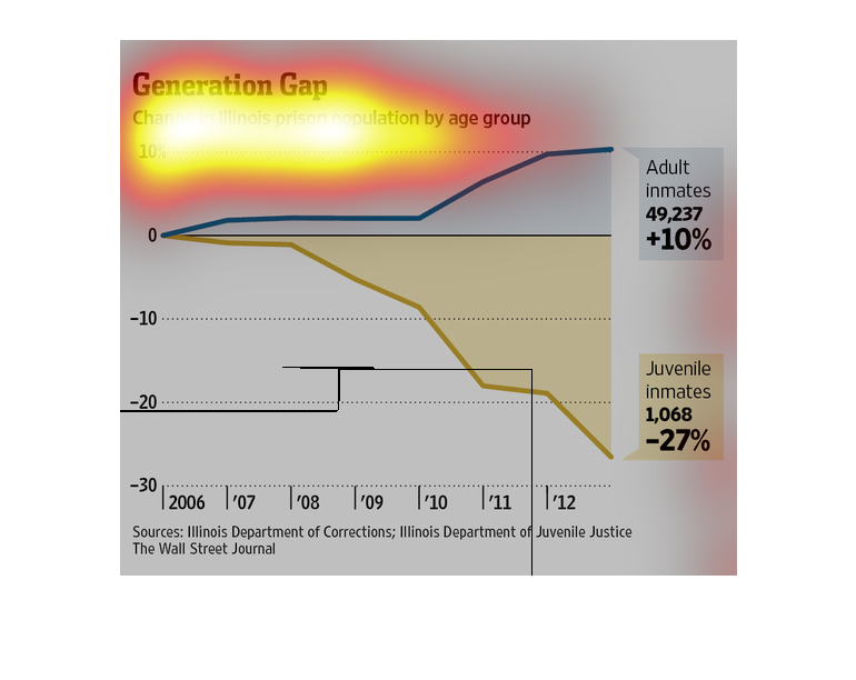
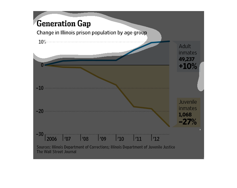
This chart from the Wall Street Journal looks at the general gap in Illinois prison population,
by age or group.  Adult inmates increased by 10% and juvenile inmates decreased by 27% between
2006-2012.