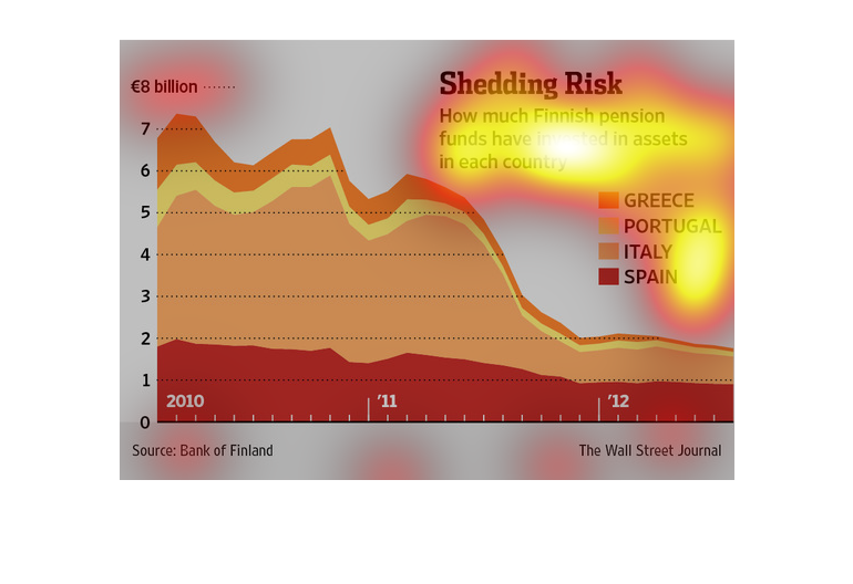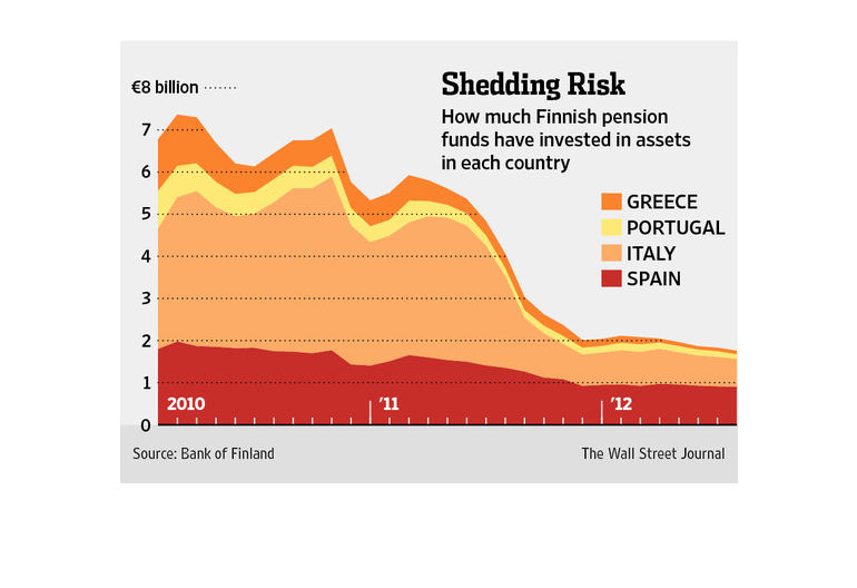
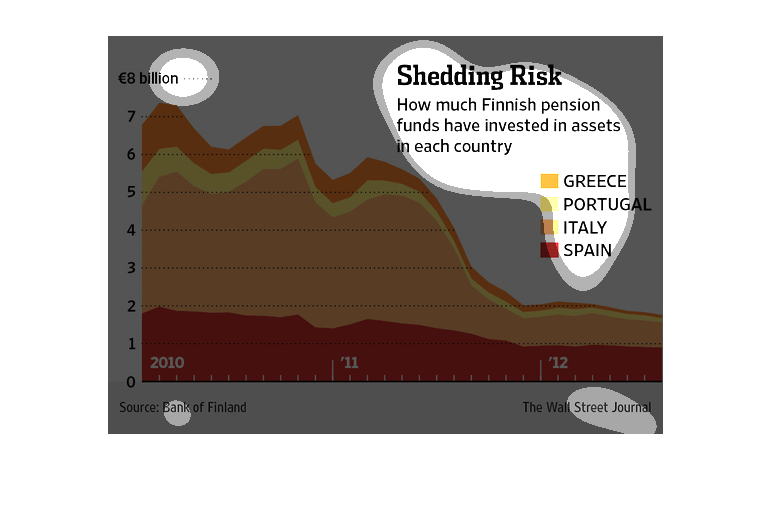
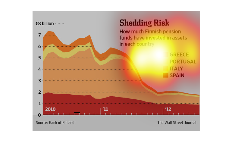
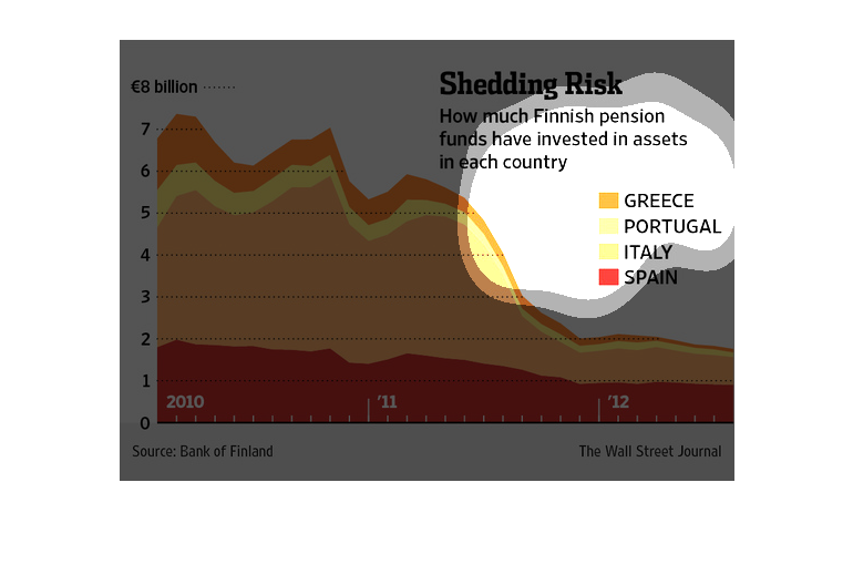
This chart shows us the amount of money the Finnish National bank has invested in several
Mediterranean countries over the years. They initially invested just under 7 million into
Spain, Italy, Portugal, and Greece in 210. As the years went on they invested much less into
the countries by 2012 which shows a drop to about 2.5 million.
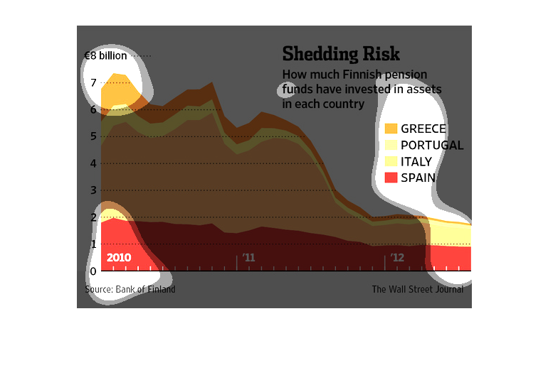
This graph depicts the total amount of Finnish money is invested in four other countries.
There was a sharp decrease in investments during 2012. Spain had a steady decrease while Italy
saw a sharp drop.
Graph shows how much Finnish pension funds invested in Greece, Portugal, Italy and Spain from
2010 to 2012.  As the years have gone on less money has been invested.  Majority of money
was invested in Italy.  Between 2011-2012 was the biggest drop
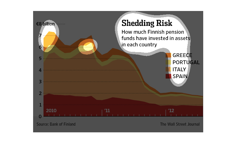
This graph shows the investment of the Finnish government on debt that can be recouped from
the countries listed, and how it is in their best interest these nations do well in order
to get a good return on their purchase of debt.
Shedding risk, how much finnish pension funds have invested in assets in each country. A shaded
line graph, Y axis shows billions in Euros. X axis shows years 2010 through 2012. Spanish
investment slowly declined while all others rapidly declined, especially italy.
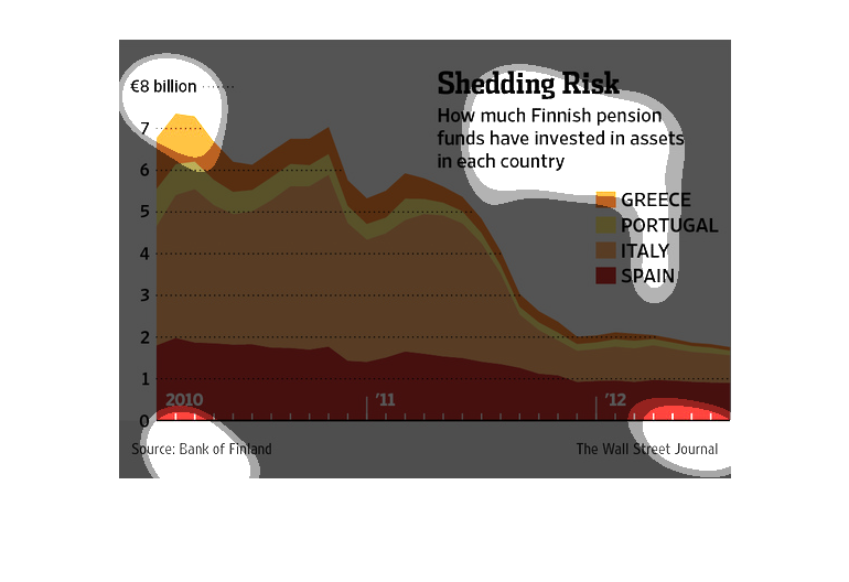
This graph shows how much finnish pension funds have invested into each country. The data
is provided in a color area graph, with the height being money invested, the horizontal span
labelled from 2010 to 2012, and each color denoting a different european country.
An infographic showing the loss of risk, the amount of finnish pension funds that are invested
in assets in otuer countries. Shows this amount has decreased from 2010 to 2012
The figure presented is titled Shredding risk: how much Finnish pension funds have invested
in assets in each country.  The figure is a representation of shredding risk.
This chart shedding risk. Specifically, how much Finnish  funds have invested in assets in
each country. Categories on the chart include Greece and Portugal.
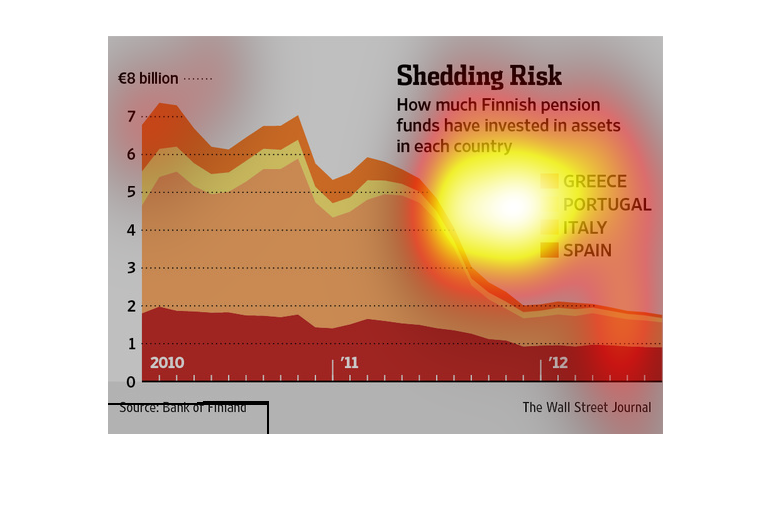
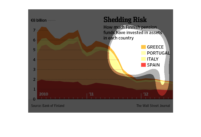
The image depicts how much Finnish pension funds have invested in assets in each country.
The data indicates that investment has noticeably decreased in almost all countries.
This is a graph of shedding risk and how much Finnish pensions funds have invested in assets
in each country. The data shows that they have the most money invested in assets in Italy.
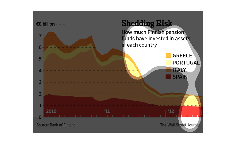
this graph looks like a hill and it has a lot of colors on it. the name of this graph is called
shedding risk the colors represents different countries
This chart describes shedding risk. Specifically, how much Finnish pension funds have invested
in asset in each country. Different categories are represented by different colors.
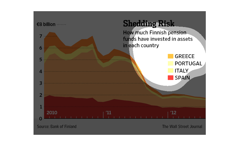
This is a color coded chart depicting how much Finnish pension funds have have invested in
assets in each of these countries: Greece, Portugal, Italy and Spain.
This is a graph that illustrates how much Finnish pension funds have invested in assets in
each countries of Greece, Portugal, Italy and Spain between 2010 and 2012.