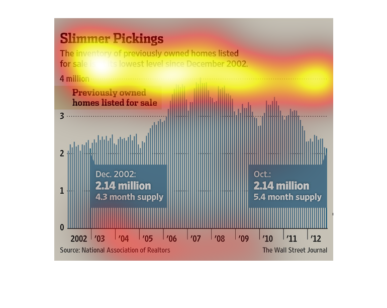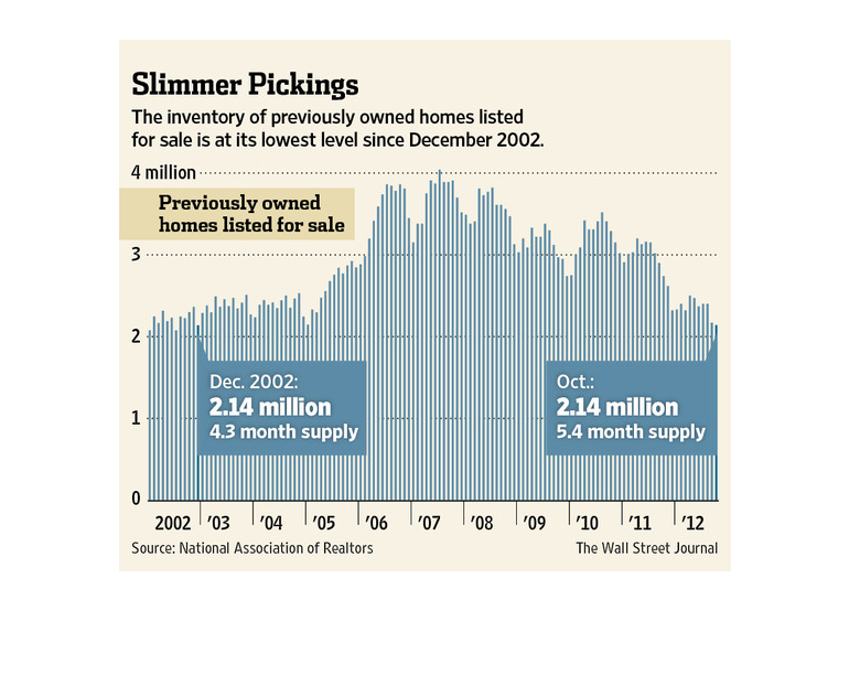
This chart shows that the inventory of preowned homes is at its lowest point since 2002. Thin
vertical bars track across the years from 2002 to 2012, and two infographics give detailed
info for the change in supply.
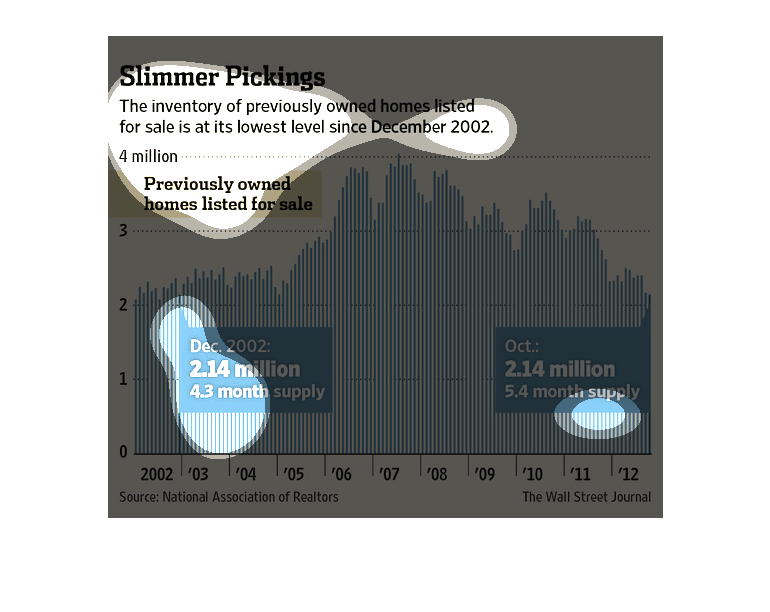
The chart shows Slimmer Pickings investments in previously used homes listed at its lowest
level. The chart shows how in the beginning the amount received was 2.14 million at the year
2002. In year 2012 the same amount was received, but with more supporters.
This is a graphic that illustrates that the inventory of previously owned properties listed
for sale is at its lowest level since the month of December in the year 2002.
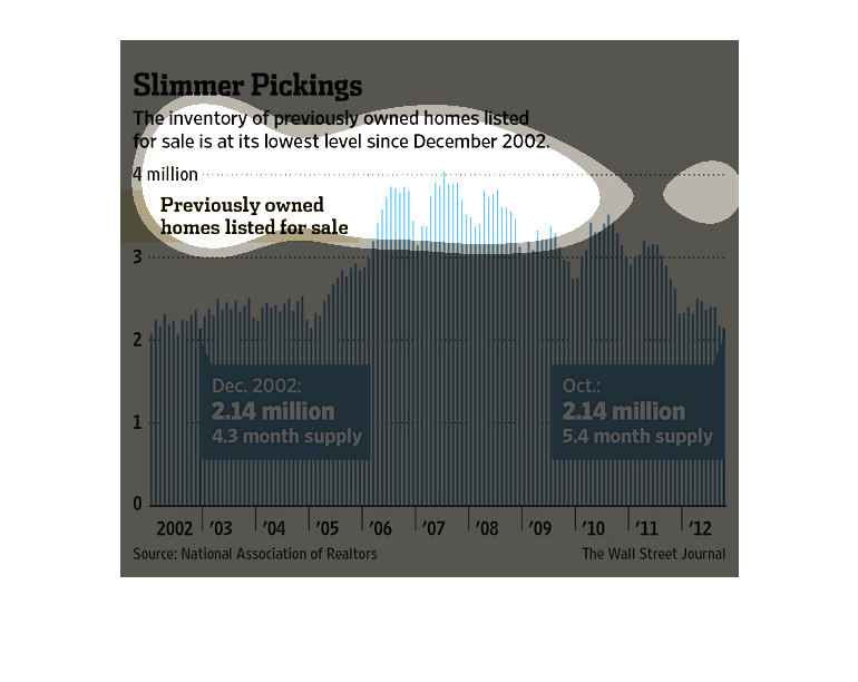
This chart shows that the available inventory of previously owned homes is declining, making
it harder for homebuyers to find available inventory to purchase.
This graph shows inventory of previously owned homes for sale, looking at trends from 2002
to 2012. This number increases notably in 2005-2007 and then slowly decreases again, back
to 2002 levels.
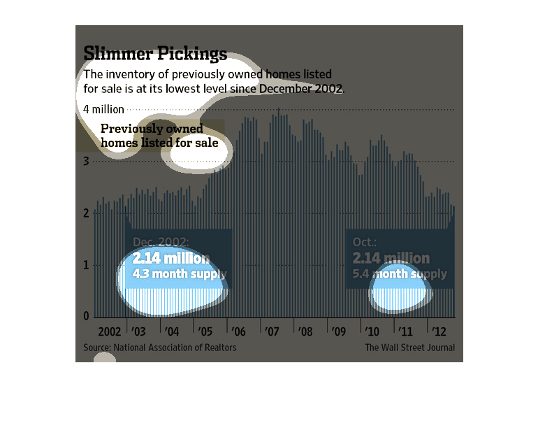
This chart describes slimmer pickings. Their inventory of previously owned homes listed for
sale is at its lowest level since December of the year 2003.
The graph depicts the number of homes that were previously owned and are now available for
purchase on the housing market. The graph shows the number of homes available from December
2002 until October. The graph over that span is a bar graph that represents the number of
homes that became available.
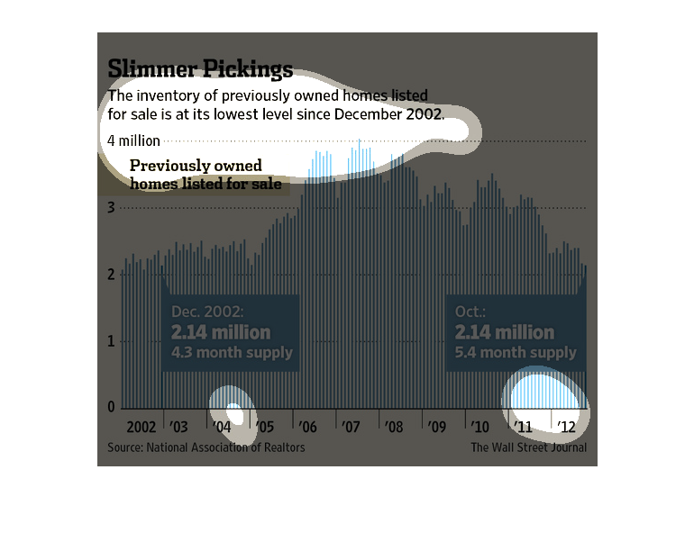
This is a graph showing the availability of previously owned homes. It shows them in millions.
It also spans across the years 2004 to 2012. It shows how we are below 2004s standards in
2012
This chart describes slimmer pickings. Specifically, the inventory of previously owned homes
listed for sale is at its lowest level since December of the year 2002.
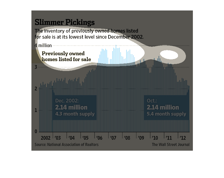
The figure presented is titled Slimmer pickings: The inventory of previously owned listed
for sale is at its lowest level since December 2002.  The figure shows data for housing.
this shows the comparison of two different aspects of the housing market. the repurchase of
previously owned homes and the purchase of new homes.  over the years the market has declined
drastically in the resale of previously owned homes

slimmer pickings, the inventory of previously owned homes listed for sale is at its lowest
level since december 2002. We see in the graph from the years 2002 through 2012 the availability
rise and peak in 3006 and peak again a few years later and then steadily decline
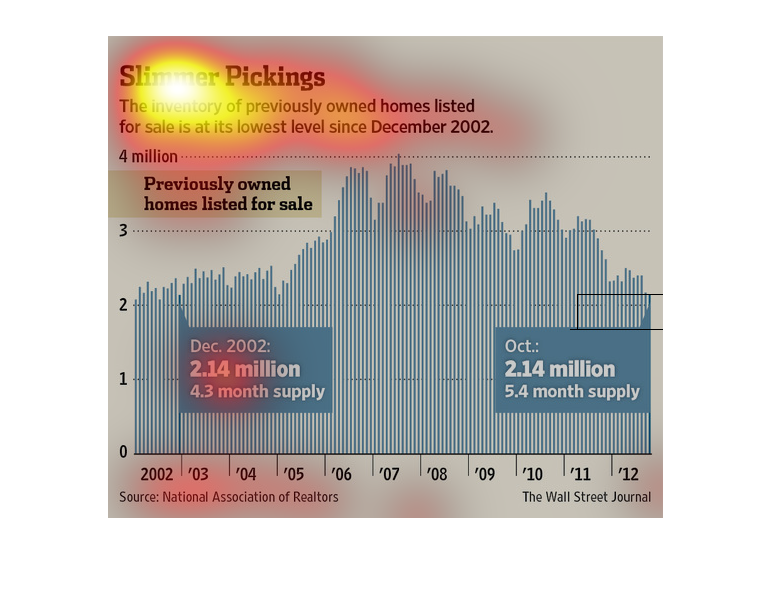
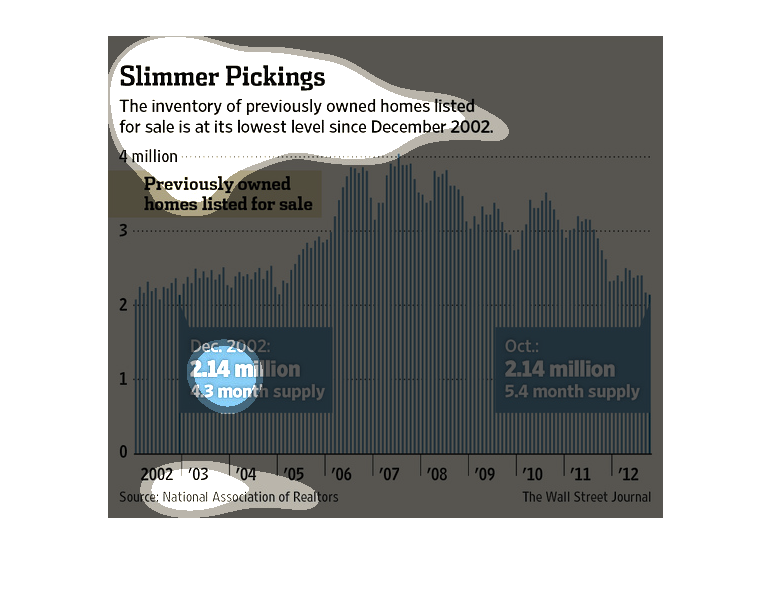
This charts shows that the inventory of previously owned homes is at its lowest level since
December 2002. After a peak level of over 4 million homes in mid-2007, the number of available
homes for sale is now below 2 million homes.
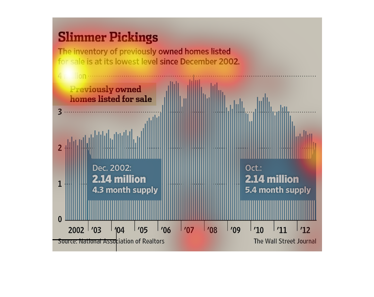
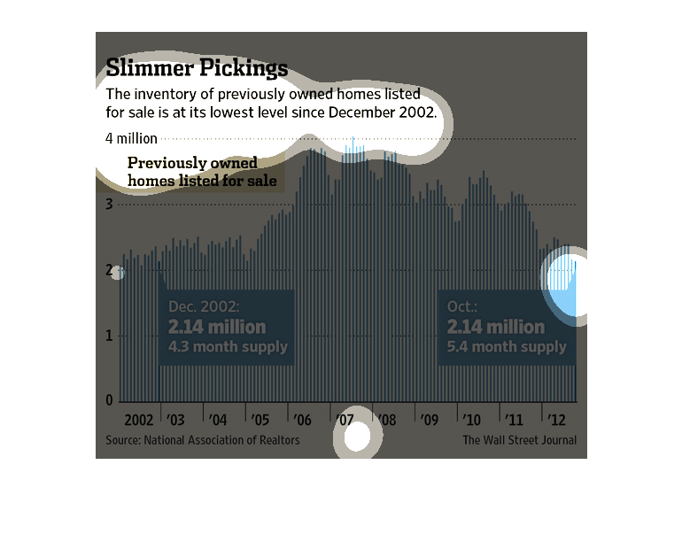
This is a graph of owned homes inventory over a time period. The inventory level at any given
time is represnted as a bar in the graph. It shows how the inventory level has changed over
time.