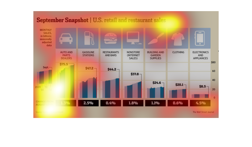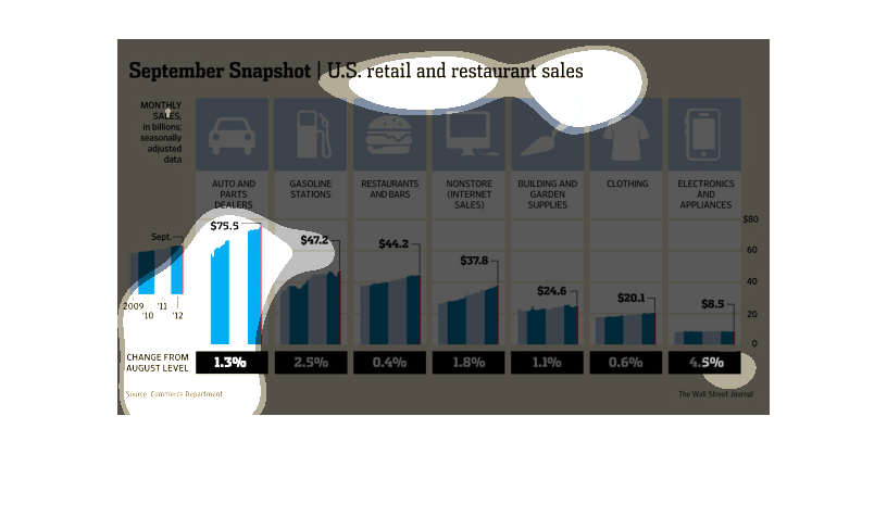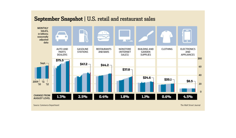
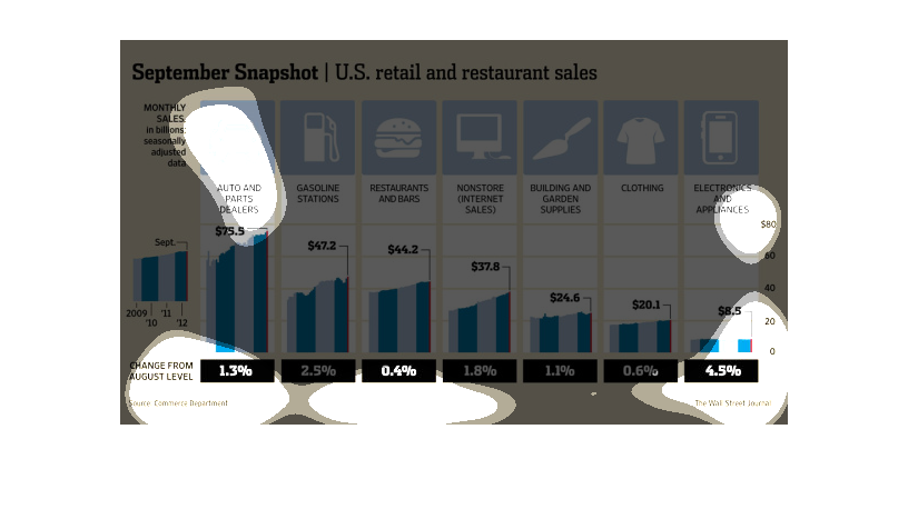
The image depicts a graph of a September snapshot of retail and restaurant sales. Auto and
parts dealers had the highest sales for the month, with gasoline stations in second, and restaurants
and bars in third. Electronics and appliances were in last place with least sales.
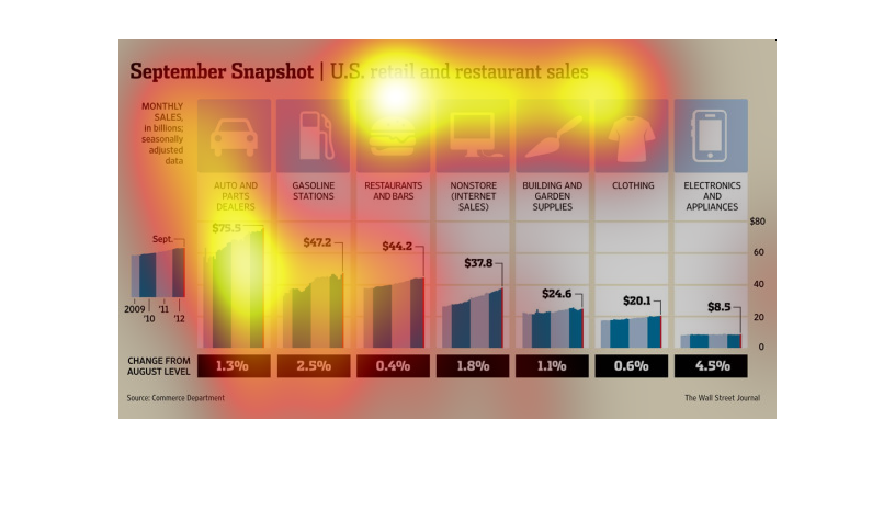
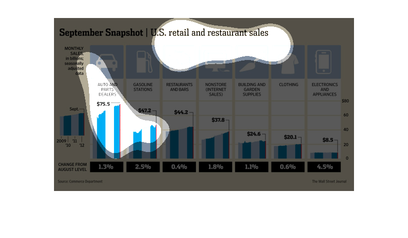
This is a graph that shows the September snapshot of retail and restaurant sales for the various
items that people buy. It is in the form of billions.
This chart shows U.S retail and restaurant sales in billions for the month of September according
to the Wall Street Journal. The change from August was greatest for Electronics and Appliances
(4.5%). The smallest increase (0.4%) was for Restaurants and Bars.
This chart describes September snapshot. Specifically US retail and restaurant sales. The
chart includes monthly sales in the billions, seasonally  adjusted data.
This chart shows differences in consumer spending for retail and restaurants in the US during
the month of September over the course of four years.  Most money was spent on automobile
related expenses, least on electronics.
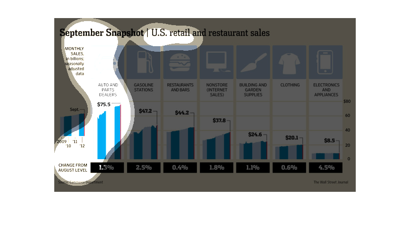
September snapshot | United States retail and restaurant sales. The Y axis shows monthly sales
in billions seasonally adjusted data. X axis shows change in percentage from August level
for each category of retail; car, gas, restaurant, internet retailers, home improvement, clothing,
electronics and appliances. There was steady growth in all categories except a stagnant electronics
and appliances market.
september snapshot united states retail and restaurant sales, vast diversity of popular markets
all seing a rise in sales over the course of the month
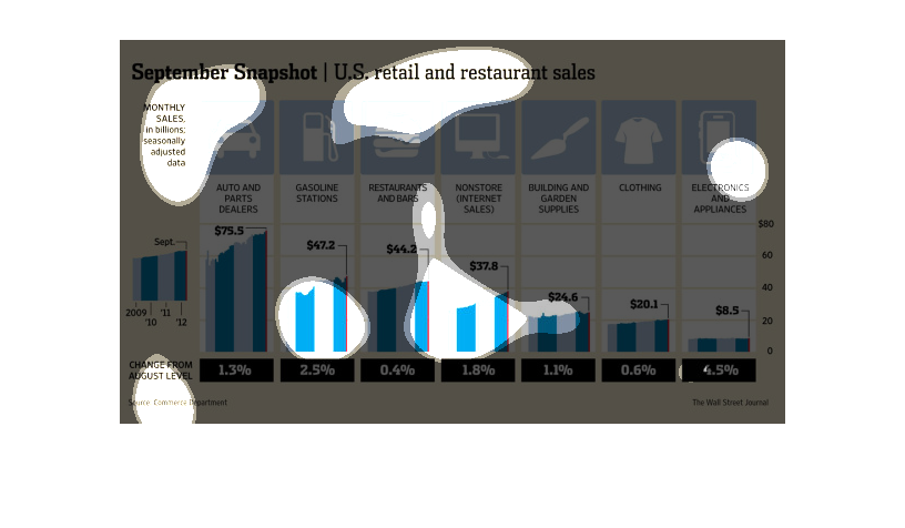
The figure presented is titled September Snapshot: United States restaurant and retail sales.
 The figure is an actual representation of US restaurant and retail sales.
This study shows the amount of money spent by the American people on different types of purchases,
from gas to electronics. The study tries to find patterns in the spending.
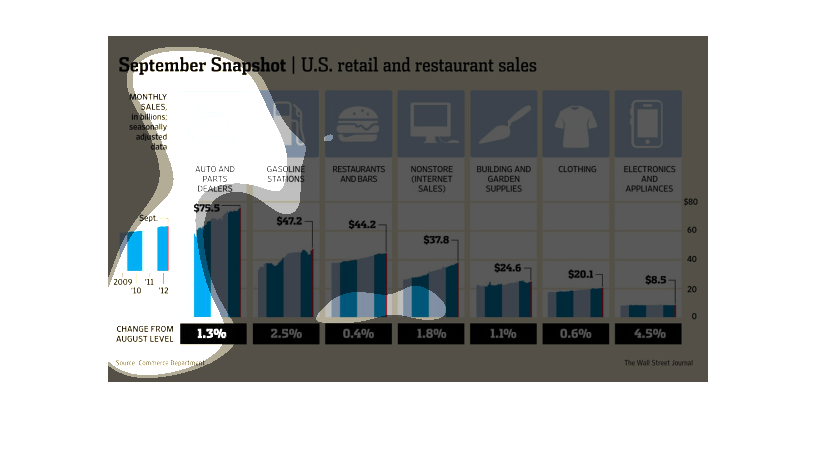
this graph shows the retail sales for the month of september. This shows the difference in
the departments for the overall growth of the business. The different categories include but
not limited to auto sales, food, and gas. These are just some of the categories that  are
listed on the chart.
This chart describes September snapshot. Specifically, retail and restaurant sales. Categories
on the chart include auto and parts dealers, and gasoline stations.
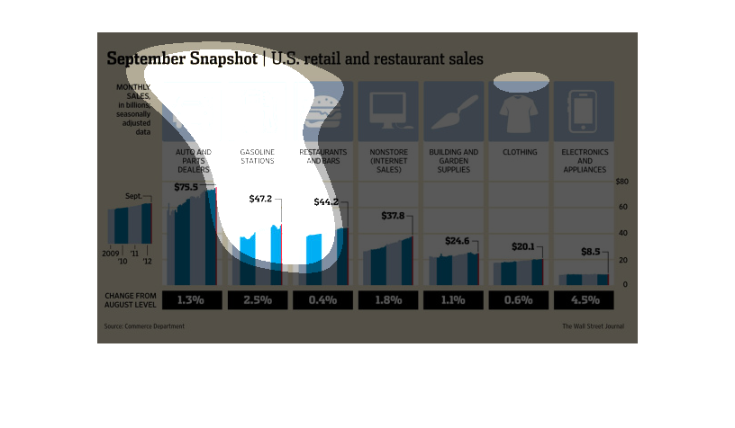
This graphic denotes a september picture of US retail and restaurant sales performance. At
the bottom of the horizontal, a change from august levels in percent is noted, and the vertical
bars represent monthly sales, divided into different sectors.
This is a graph of US retail and restaurant sales during the month of September. The chart
also displays the difference in retail and restaurant sales from the month of August.
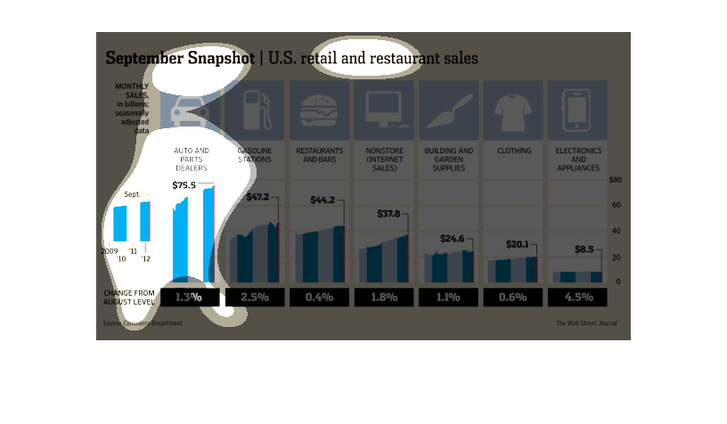
This is a chart depicting a snapshot of United States retail and restaurant sales figures
from the years 2009 to 2011. They are mostly shown to be broadly in the upward direction.