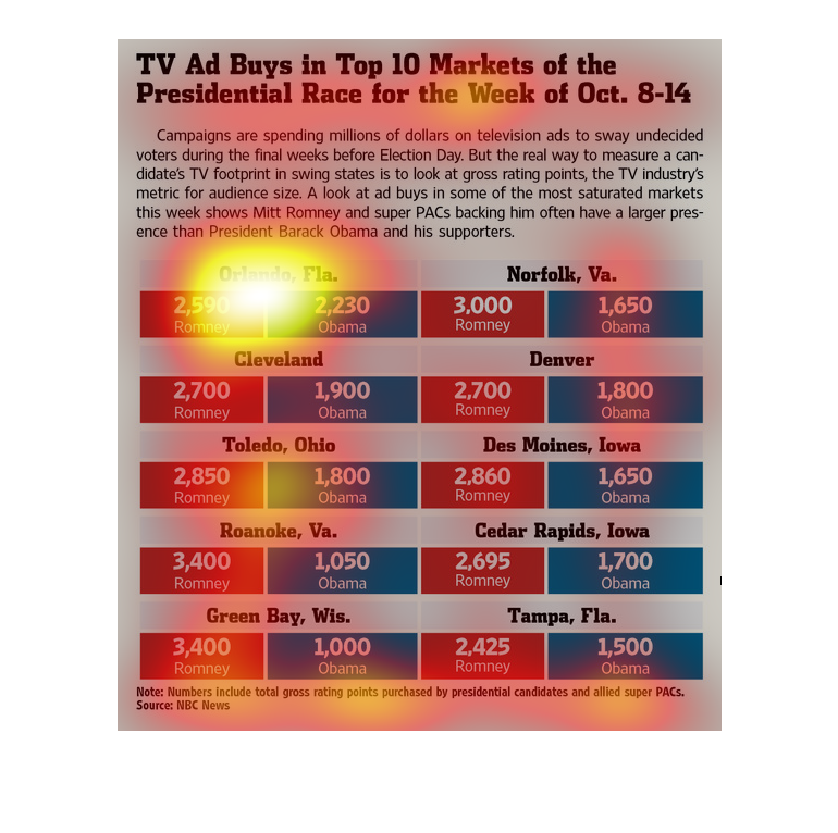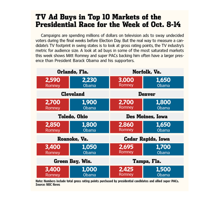
This is a chart that shows the total number of TV Advertisements buys for various identified
markets during the various presidential races between the years 2008 and 2014
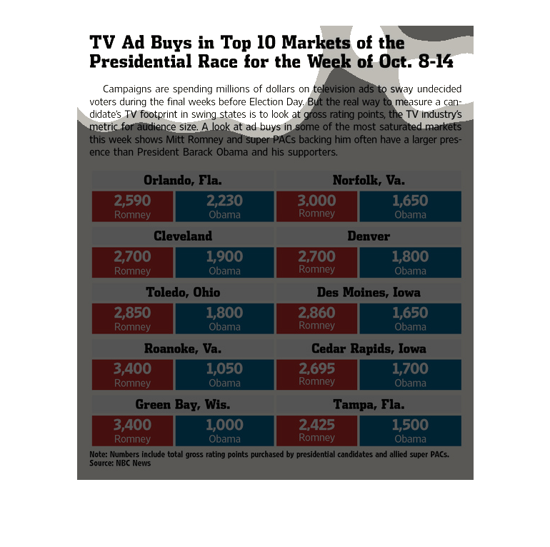
The figure presented is titled TV ad buys in top ten markets of the presidential race for
the week of Oct 8-14.  The figure is a representation of TV ads.
The graph shows the number of dollars spent on political TV ads between Romney and Obama during
the 2012 Presidential election in the month of October. The numbers of dollars are compared
in various cities throughout the country.
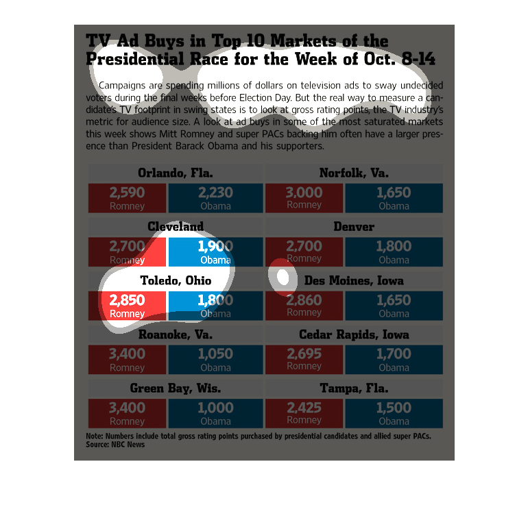
TV's ad buys in the top 10 markets, presidential race for the week of October 8-14. We see
a comparison between Romney and Obama in relation to various High population cities across
the United States
The chart shows the amount of TV ads bought by two different presidential nominees in various
locations during the week of October 8-14. The overall trend of the chart is that Obama bought
significantly less ads than Romney in practically every location throughout the week.
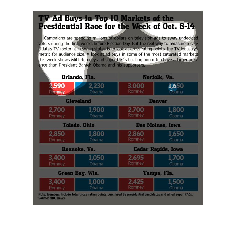
Describes the number of TV Ads each presidental candidate bought in the top 10 markets the
week of October 8. Obama and Romneys buys appear to be roughly even.
This chart describes TV ad buys in top ten markets of the presidential race for the week of
October 8 through the 14th. Regions on the chart include Cleveland.
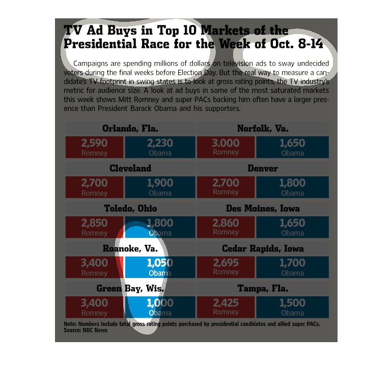
TV Ad buys in top ten markets of the Presidential race for the week of Oct. 8-14. The real
way to measure a presidential candidate's TV footprint in swing states, hwoever, is to look
at gross rating points, which is the TV industry's metric for audience size.
This visual is representing how much money was paid by presidential candidates for advertisement
time. Romney seemed to spend a lot more than Obama in most cities.
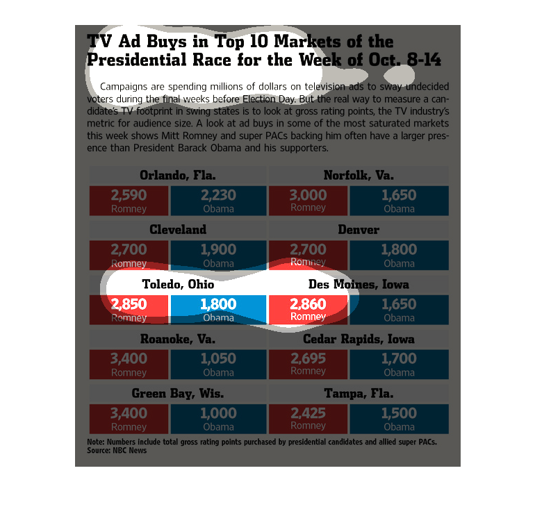
The headline is that the presidential campaigns have purchased ad space in several of the
top TV media outlets for the mid October phase of the 2008 presidential cycle. The graphic
compares the relative ad coverage of the two presidential candidates, challenger Romney and
incumbent Obama. It is continually shown that Romney outspends Obama on ads with the help
of his Super-PACS.
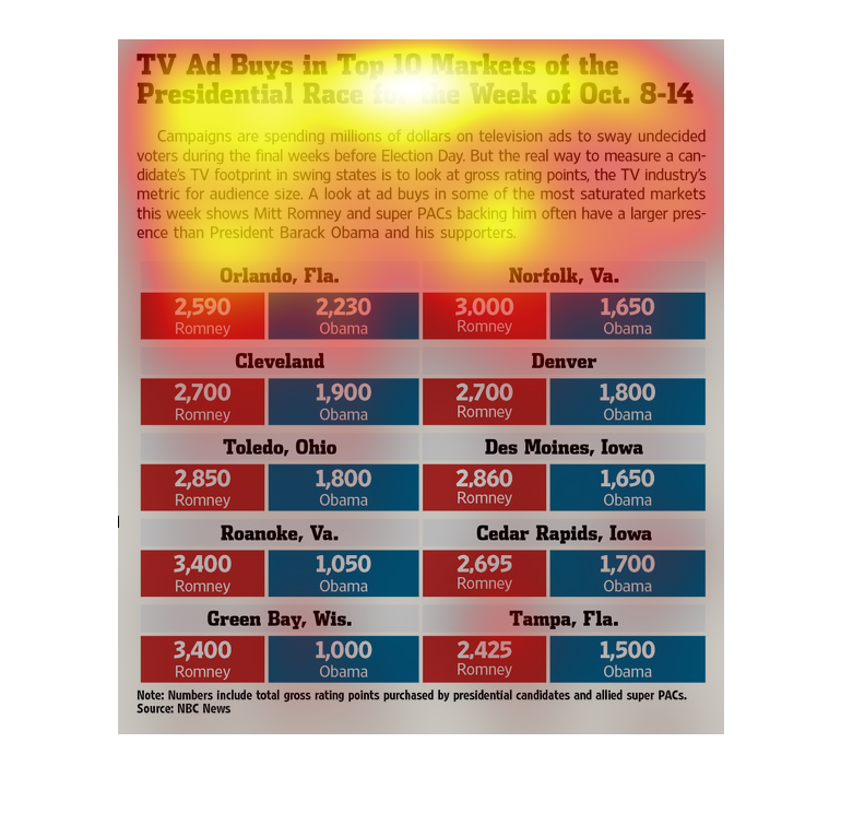
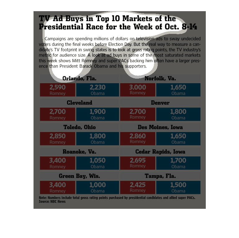
A political infographic showing the amount of political ads on television from each party
in Orlando Florida and Norfolk Virginia for the Romney vs Obama campaign
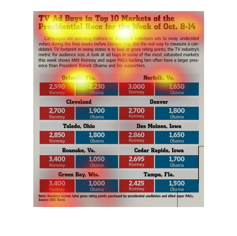
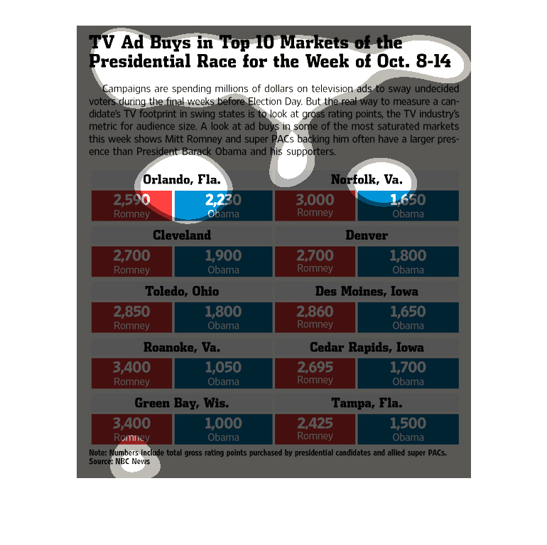
This chart describes TV ad buys in top 10 markets of the presidential race for the week of
October 8th to the 14th. Categories on the chart include Cleveland.
TV ad buys in the top ten markets of the presidential race for the week of Oct. 8-14 are showcased
on this chart. In every market listed, Obama consistantly purchased less tv ads than Romney
for this week.