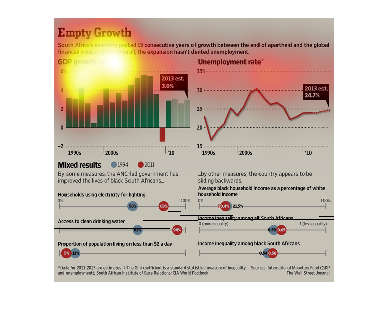
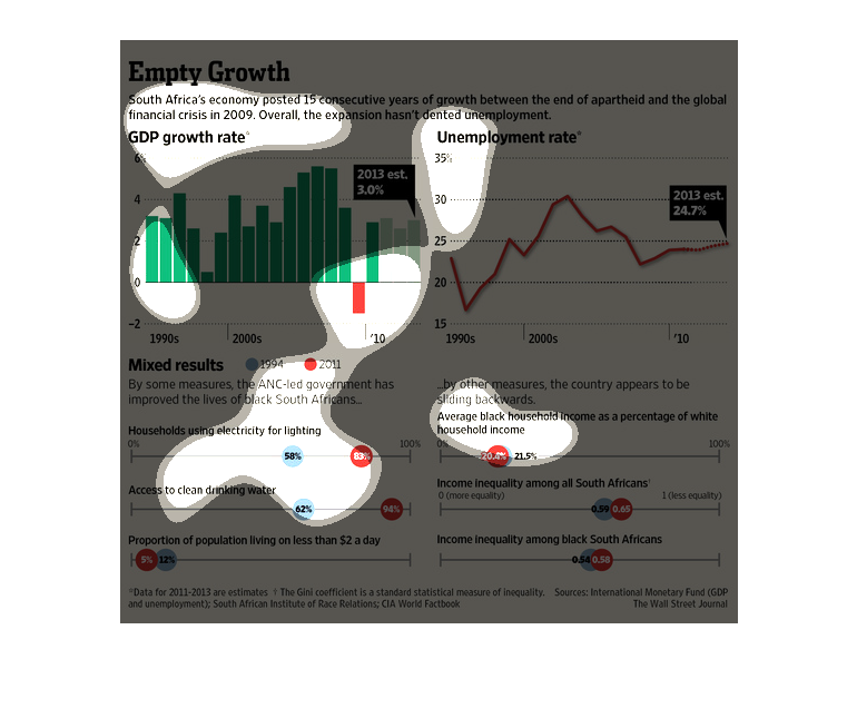
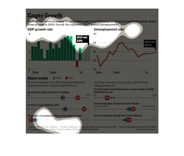
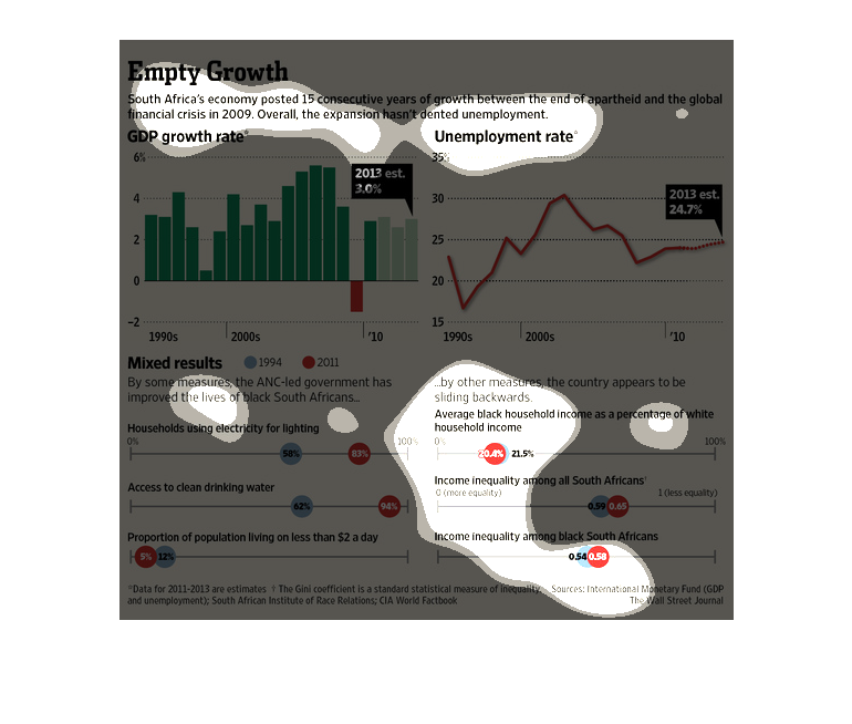
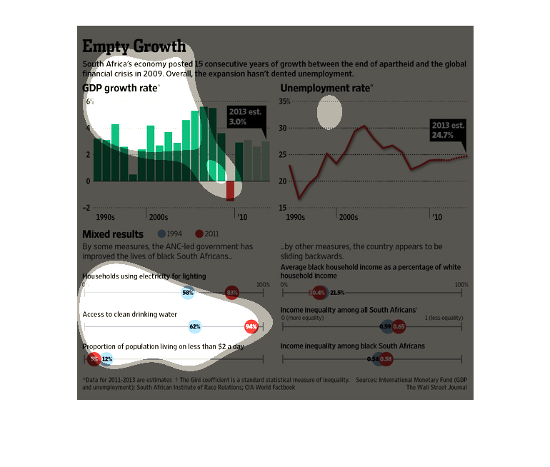
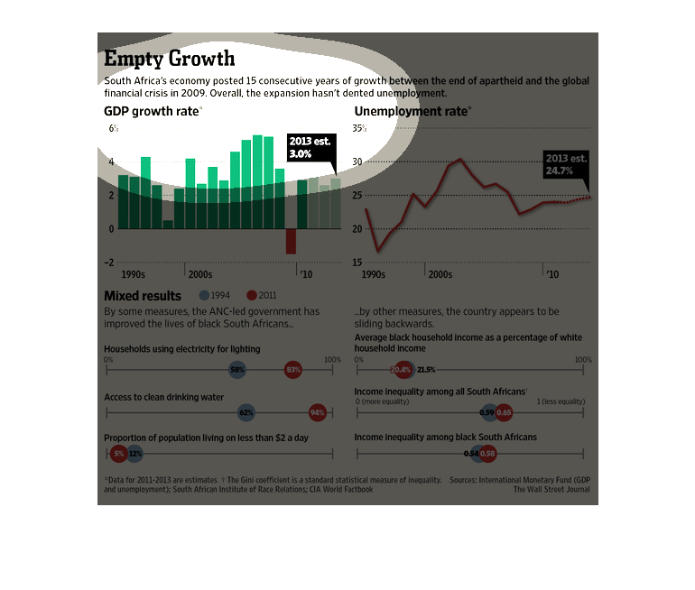
The picture contains four chart concerning South Africa's financial situation as it affect
employment.  The bar chart tracks overall growth, the line chart on the upper rate from 1990
to 2013, while the bottom charts shows a percentage of households from 1994 to 2013 who are
using electricity have access to clean water, etc.  The overall point of charts is that although
in many areas South Africa has gotten better economically, there remains only a slight change
in unemployment and a huge despair of income distribution.
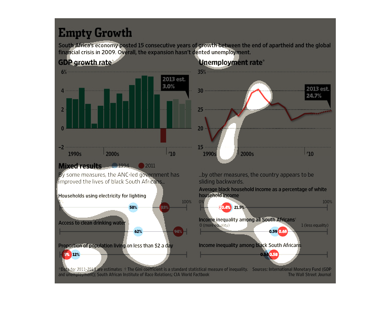
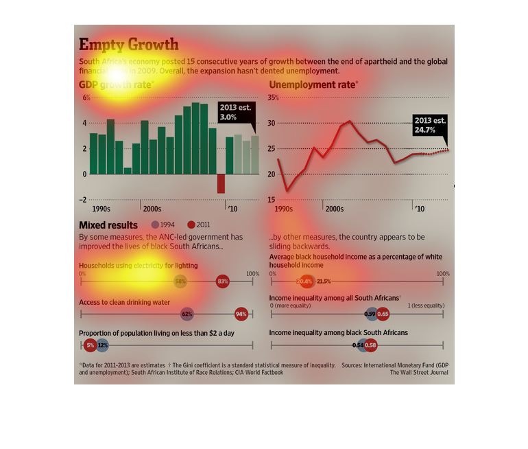
This chart shows us how the standard of living for black South Africans has been improving
since the fall of apartheid. It also demonstrations that while living standards have improved
as far electricity and drinking water goes, the people living off only 2 dollars a day has
remained about the same. Another downside is the amount of people unemployed has raised and
the dropped, but still remains at 25%. Income inequality has also stagnated since the 1990s.
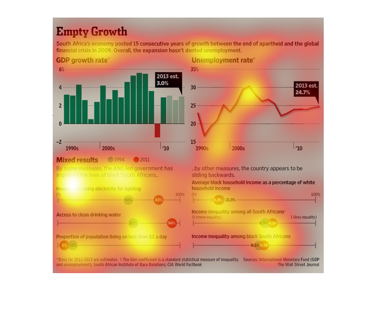
THIS CHART DESCRIBES THE GROWTH OF SOUTH AFRICA'S ECONOMY BETWEEN THE END OF APOTHEID AND
THE GLOBAL FINANCIAL CRISIS IN 2009. IT ALSO SHOWS THE UNEMPLOYMENT RATES, AND IMPROVEMENTS
OF LIFE.
This graph explains how the continuous growth in the economy over a period of 15 years did
nothing to decrease the unemployment rate. There are graphs showing the GDP growth rate, the
unemployment rate, graphs of electricity usage, and comparison of black to white income. The
graphs show mixed results on whether the increase in GDP actually helped the citizens of South
Africa.
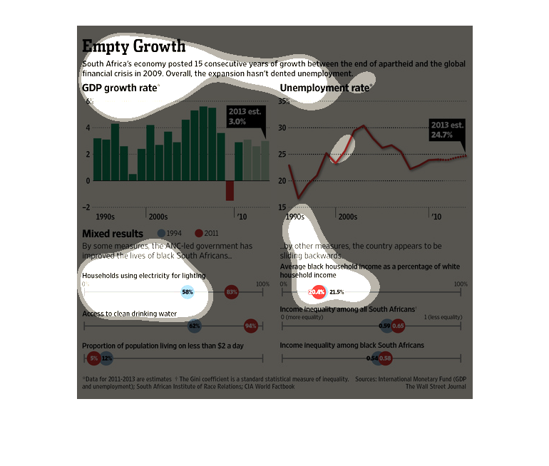
While there has been positive growth in GDP since apartheid there hasn't been much improvement
in unemployment.  Wages have gone up. Access to clean drinking water has improved.  Wages
between blacks and whites has not improve.
Empty Growth, South Africa's economy posted 15 consecutive years of growth between the end
of apartheid and the global financial crisis in 2009, overall, the expansion hasn't dented
unemployment. We see several charts show unemployment rates rising steadily and then dropping
off, leveling out and then rising again, 2013 saw nearly a 25% unemployment rate. GDP fluctuates
wildly but loosely correlates with unemployment. There is income inequality although access
to what we call basics has definitely improved..such as electricity and access to clean drinking
water.
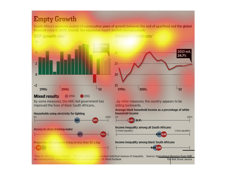
A article and infographic showing the negative growth of sub-Saharan African countries. Shows
waxing and waning gdp growth rates and general mixed results
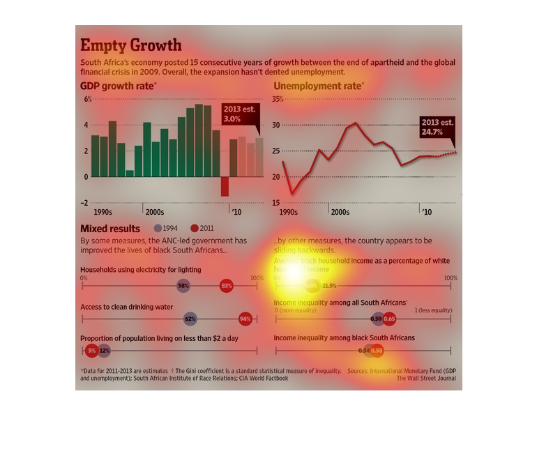
This chart shows that, while the economy of South Africa has improved significantly since
the end of Apartheid equality has not been achieved. The lives of Black South Africans has
improved with greater access to clean drinking water and electricity but Blacks still face
a larger unemployment rate and income inequality.
The figure presented is titled Empty Growth.  The figure is a representation of the statistical
data, represented through multiple graphs, of South Africa's economy.
Empty growth, South Africa's economy posted 15 years of consecutive growth between the end
of apartheid and the global financial crisis in 2009, overall the expansion hasn't dented
unemployment. The first chart shows a steady growth, free fall and then level recovery. Somehow
unemployment rates rose with GDP, plummeted and then leveled out. Access to basics such as
electricity and clean water has well improved over this time. Income inequality is still a
problem.
This chart describes empty growth. Specifically, South Africa's economy posted 15 consecutive
years of growth between the end end of apartheid and the global financial crisis in 2009.
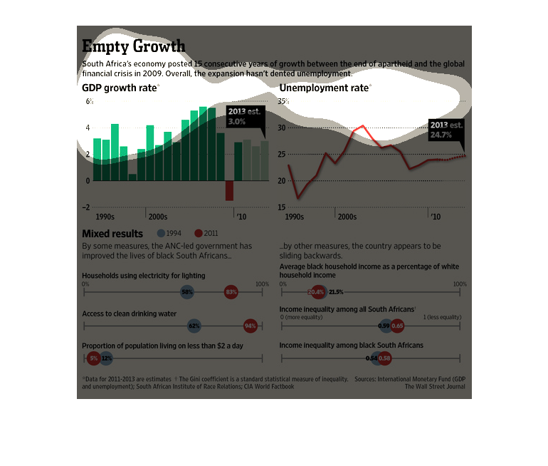
This series of graphs illustrates South Africa's 15 year growth with GDP growth rate on top
left, unemployment rate on top right, households using electricity on bottom left, and black
versus white household income on bottom right.
This is a series of charts that showcase South Africa's economic growth at the end of apartheid.
South Africa saw fifteen years of economic growth at the end of apartheid.
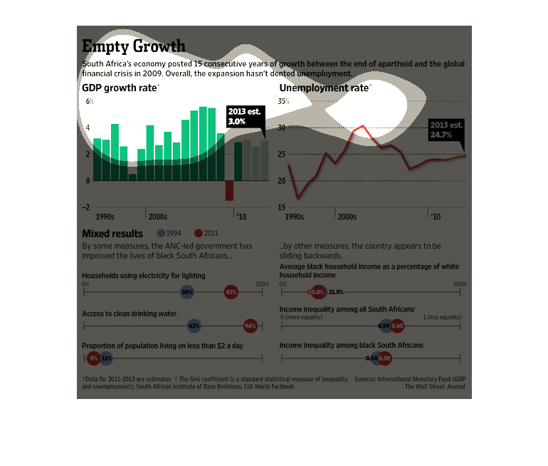
This is a graphic containing various individual graphs that are meant to illustrate that South
Africa posted 15 consecutive years of growth between the years of apartheid and the global
crisis of 2009.
This chart describes empty growth. Specifically, South Africa's economy posted fifteen consecutive
years of growth between the end of apartheid and the global financial crisis in 2009.