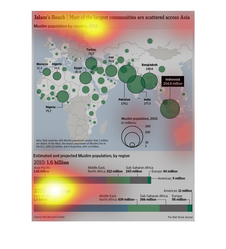
This chart describes Islam's reach. Specifically most of the largest communities are scattered
across Asia. The chart includes estimated and projected Muslim population by region.
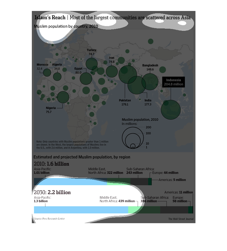
This chart/graph shows Islam research of the Muslim's population.  It seems to be a dot graph
that is scattered across of Asia. Indonesia is a point break with 204.8 million
The figure presented is titled Islam's reach: most of the largest communities are scattered
across Asia.  The figure is a representation of Islam's reach.
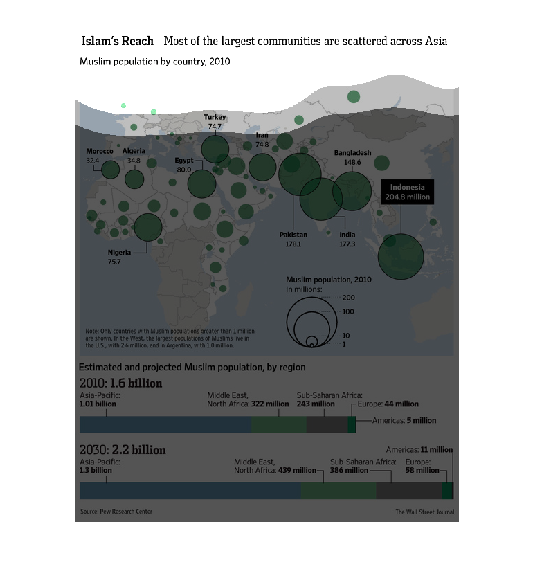
This graphic illustrates the muslim population density in regions of Europe, Asia, and Africa
using caring sizes of circle to demonstrate greater concentrations.  Asia is estimated to
have the highest muslim population density.
This chart describes Islam's reach. Specifically, most of the largest communities are scattered
across Asia. It describes the Muslim population by country for the year 2010.
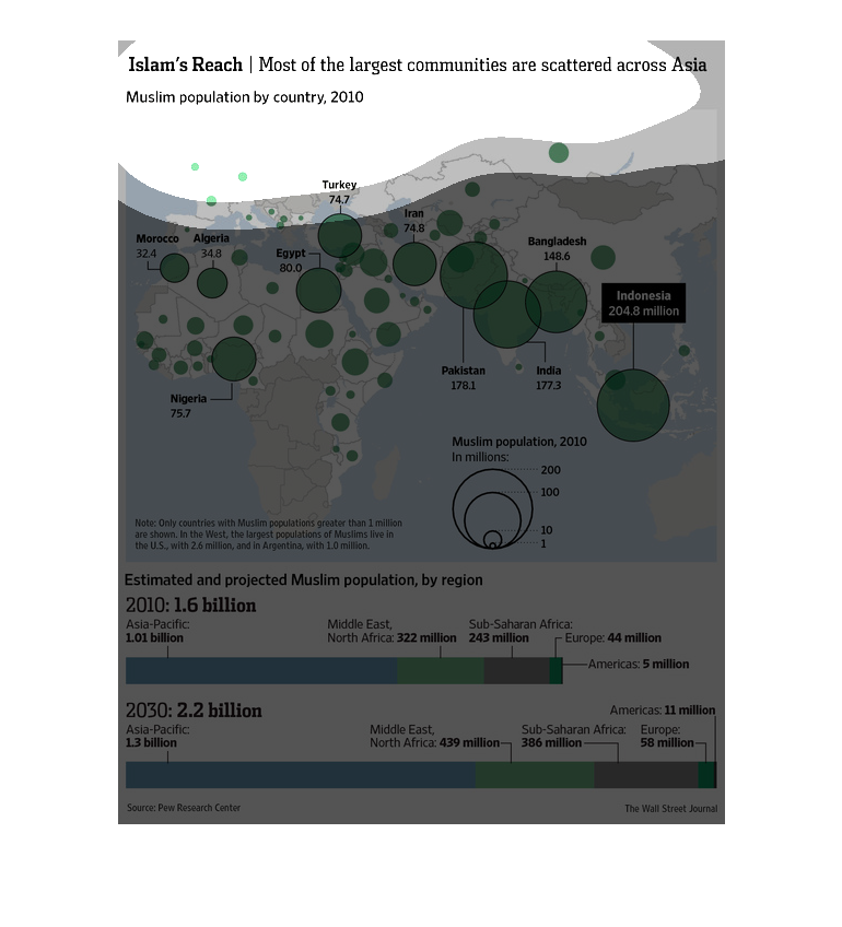
This image shows the geographical distribution of Muslims in 2010 on a world map. The largest
concentrations are spread around the world and are not relegated to one or two main areas.
At the bottom of the image it shows projected growth of Muslims populations in the different
geographical areas
A map of Africa/Asia/Europe with some kind of plotting. Estimated Muslim population by region,
Europe 44m, Sub Saharan Africa 243m, Middle East/North Africa 322m.  Total 1.6B in 2010
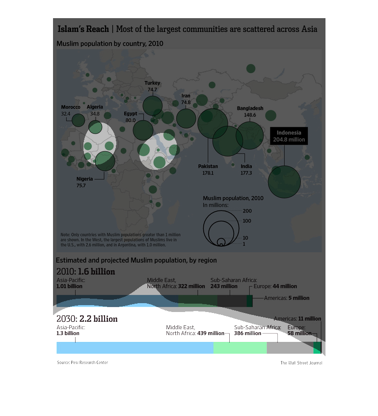
this graph illustrates Islam's reach with a world map of the Muslim population as of the year
2010.  The bottom displays projected Muslim population by region with 1.6 billion in 2010
and 2.2 billion in 2030.
This is a map showing the Muslim population around Europe, Asia, and Africa. Most of the Muslim
colonies are scattered across Asia. A very large population of Muslims reside in India and
Bangladesh, while the highest focused population is in Indonesia.
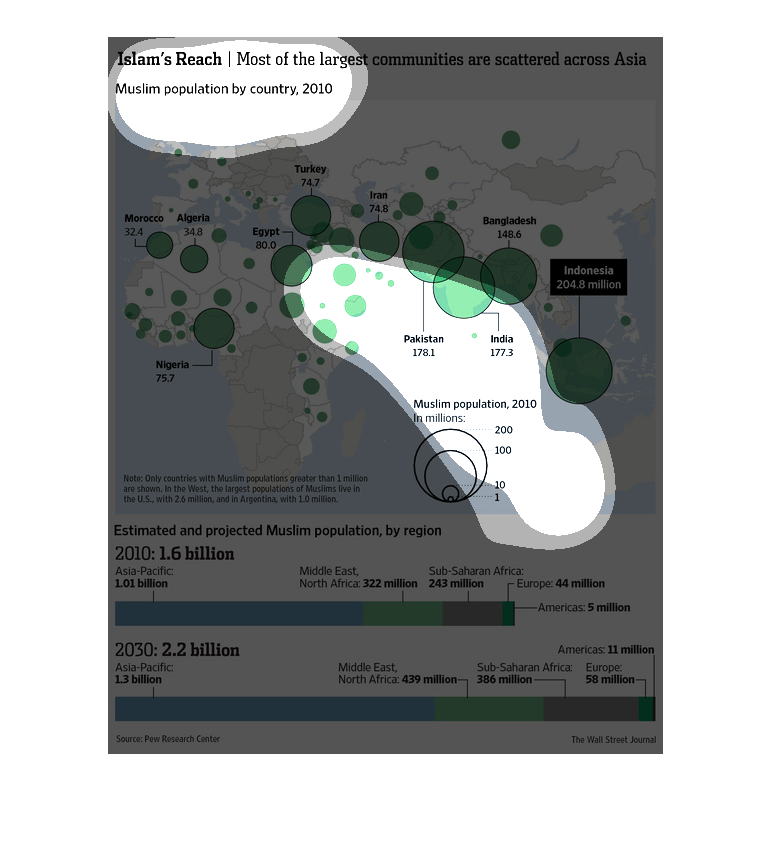
Islam's reach, most of the largest communities are scattered across Asia... Muslim population
by country, 2010. Appears to show a map of Asia. indonesia has 204.8 million.
The map illustrates the population density of Muslim community throughout the world.  The
key at the bottom is significantly more complication, but the coloration on the map communicates
the point of the graph well.  This is meant to spend more time examining than a pie graph
comparing only 2 items for example.
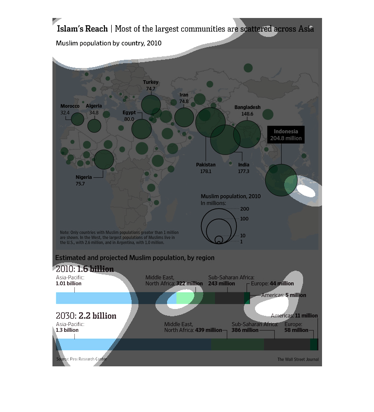
The picture shows the spread of Islam in Asia countries in 2010. For example Pakistan shows
1781. The map shows the Muslim population on each country. On 2010 is estimated 1.6 billion
people. It is projected that by 2030 the Muslim population will be 2.2 billion.