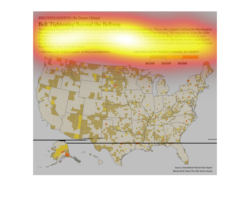
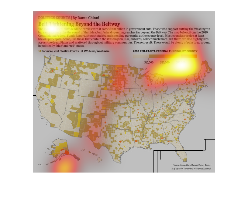
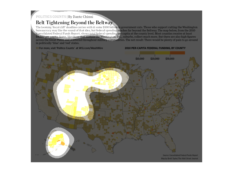
The image depicts 2010 governmental spending per capita, per county, prior to the fiscal cliff
deadline and the need to save funds and reduce spending prior to the fiscal cliff cuts.
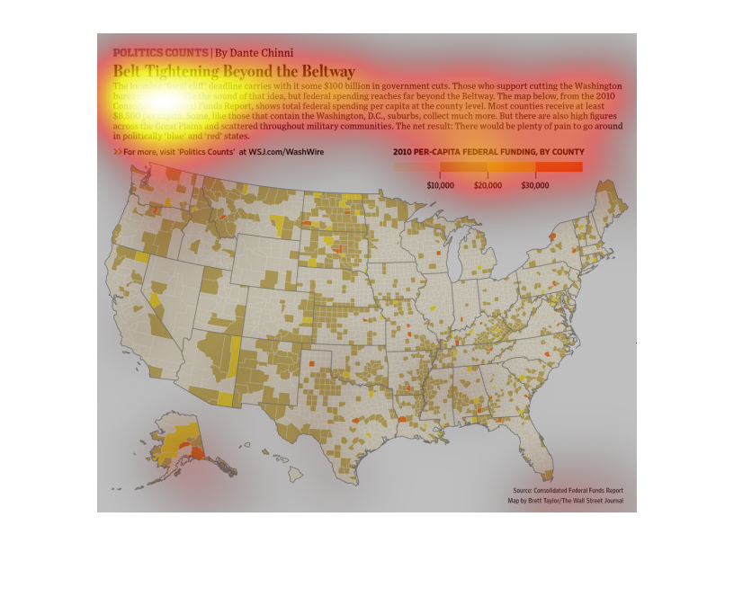
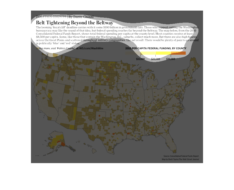
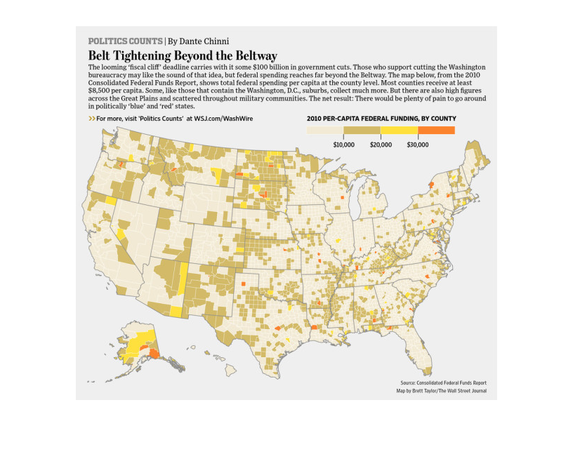
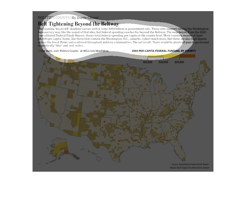
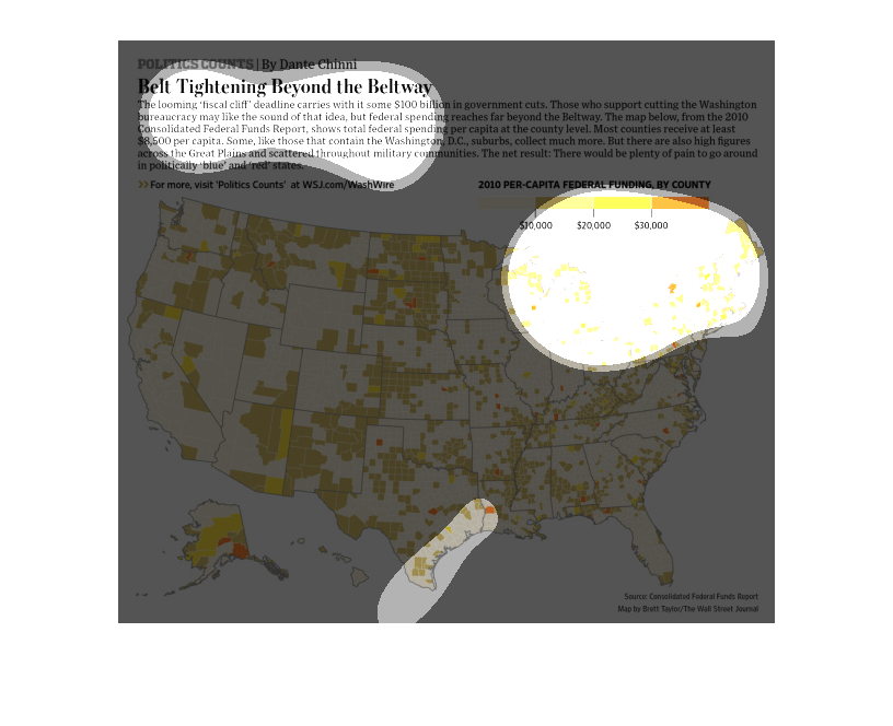
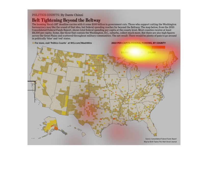
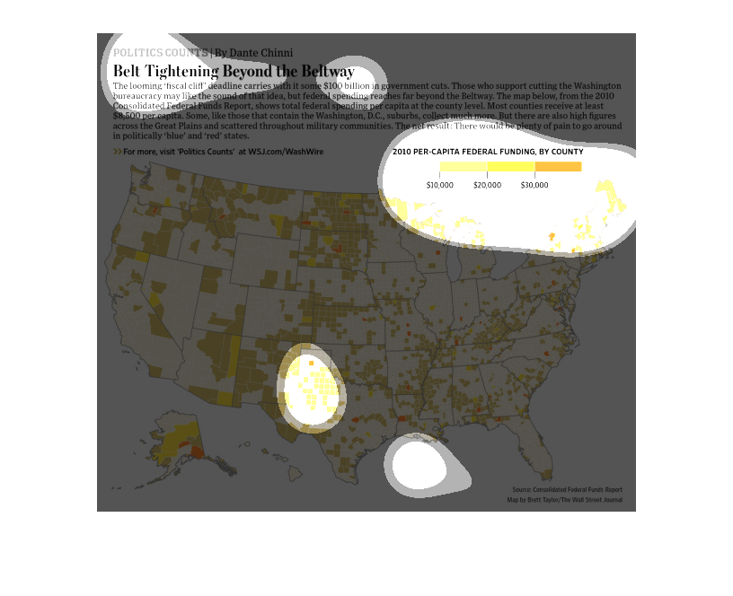
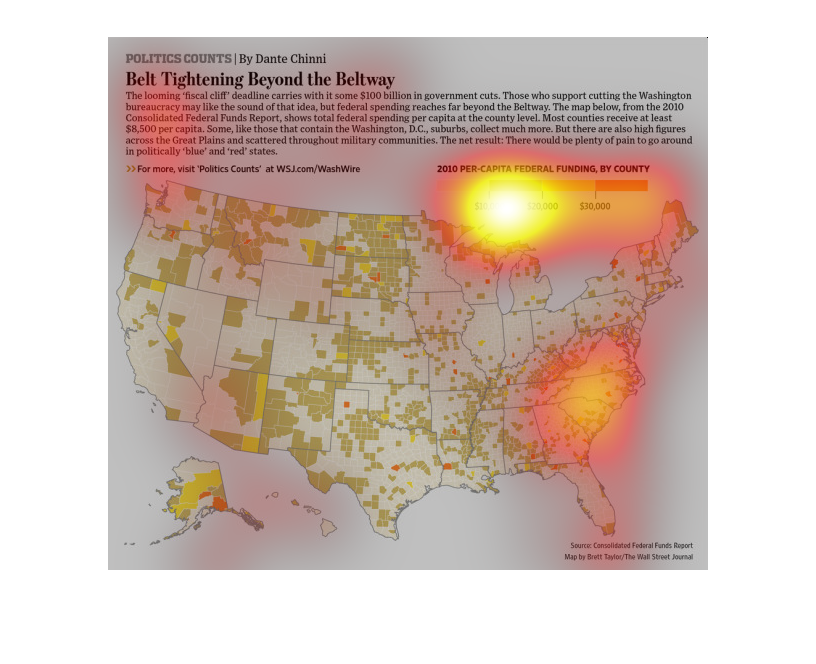
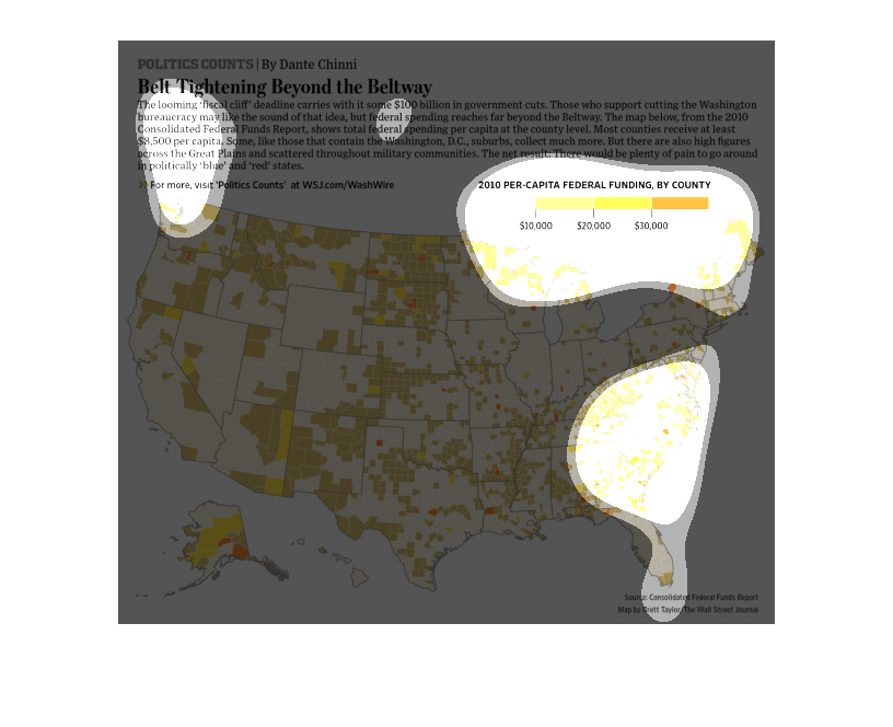
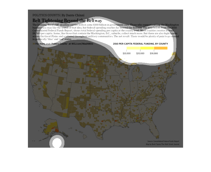
This map depicts 2010 per capita federal funding by county. The state of Alaska shows more
counties with the highest amounts of funding. Most counties receive at least $8500 per capita.
Washington D.C. suburbs collect much more.
This chart describes belt tightening beyond the beltway. Specifically, the looming "fiscal
cliff" deadline carries with it some $100 billion in government cuts.
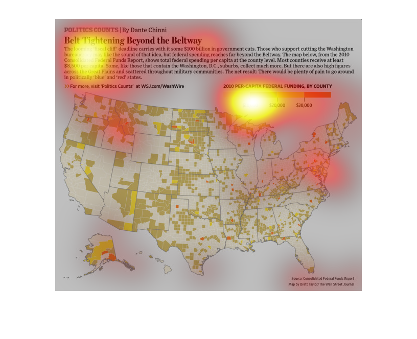
The news says that we have recovered from the recession, but analyst in this graph paint a
very interesting picture. Average Americans have had to tighten up their belts as far as living
expenses go, which demonstrates the wealth has not been distributed evenly.
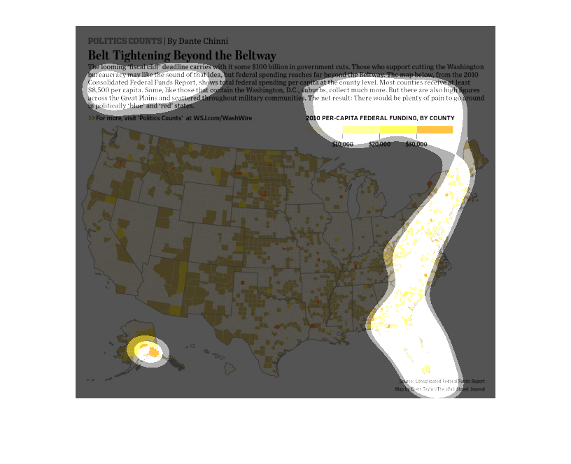
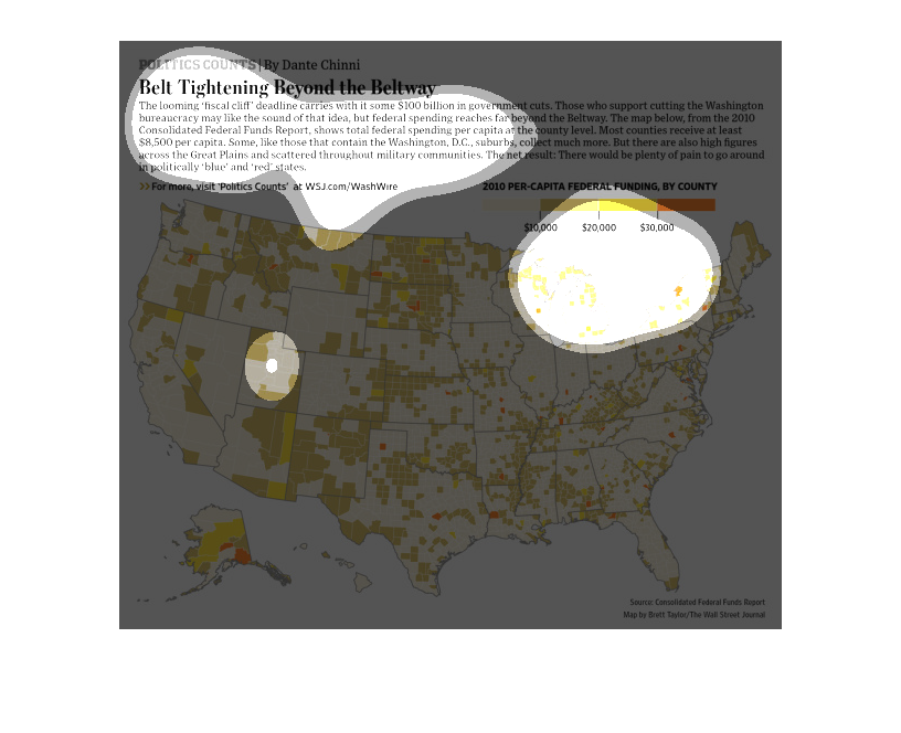
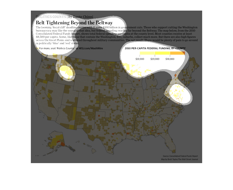
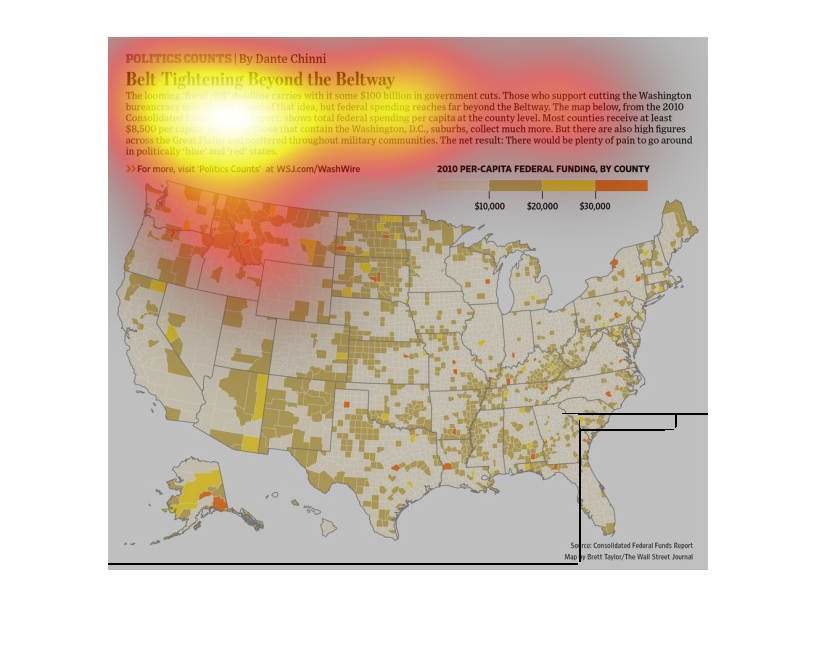
Here in a color coded map of the United States, we see Aid disbursement in the form of federal
funding by county, there is a key showing 2010 per capita federal funding. Most of the country
is experiencing the same trend of low budget expectations.
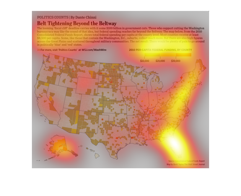
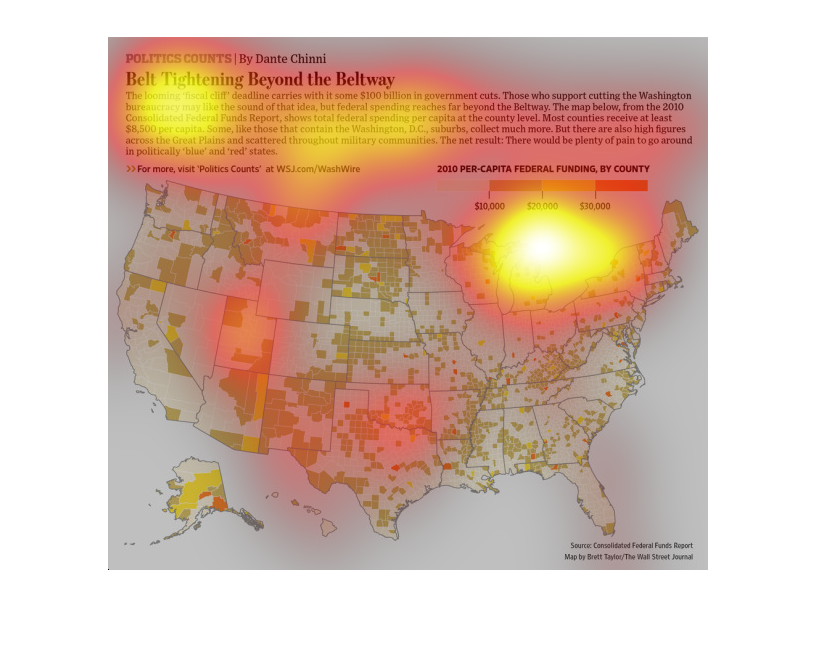
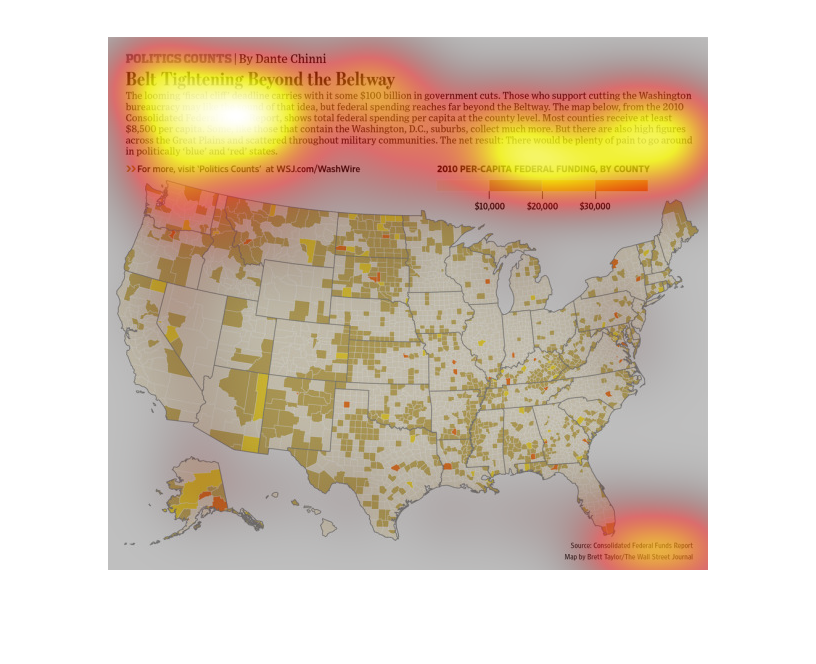
This chart describes belt tightening beyond the beltway. The chart specifically covers 2010
per-capita federal funding, by county. Different county are represented by different colors.
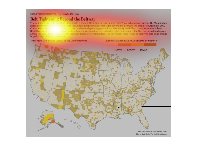
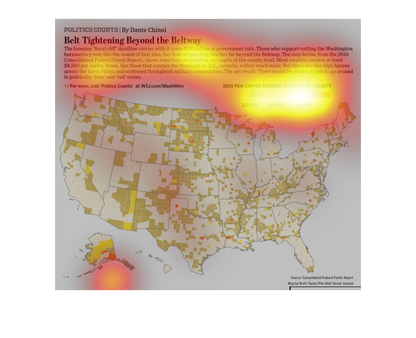
THIS PLOT SHOWS THE PER-CAPITA FEDERAL FUNDING IN THE UNITED STATES PER COUNTY IN 2010. THE
DARKER THE SHADE OF RED, THE GREATER THE PER CAPITA FUNDING IN THAT COUNTY.
A graph of places in the United States Of America where belt tightening occurs. For most of
the country, not too much is given to the cause. About $20,000 per capita for most of the
country
We hear it on the news constantly that the recession is over and the average American is doing
well, but the truth is far less than that. With low-paying, low-skill, laborious jobs only
available, the people often need to budget properly to make ends meet.
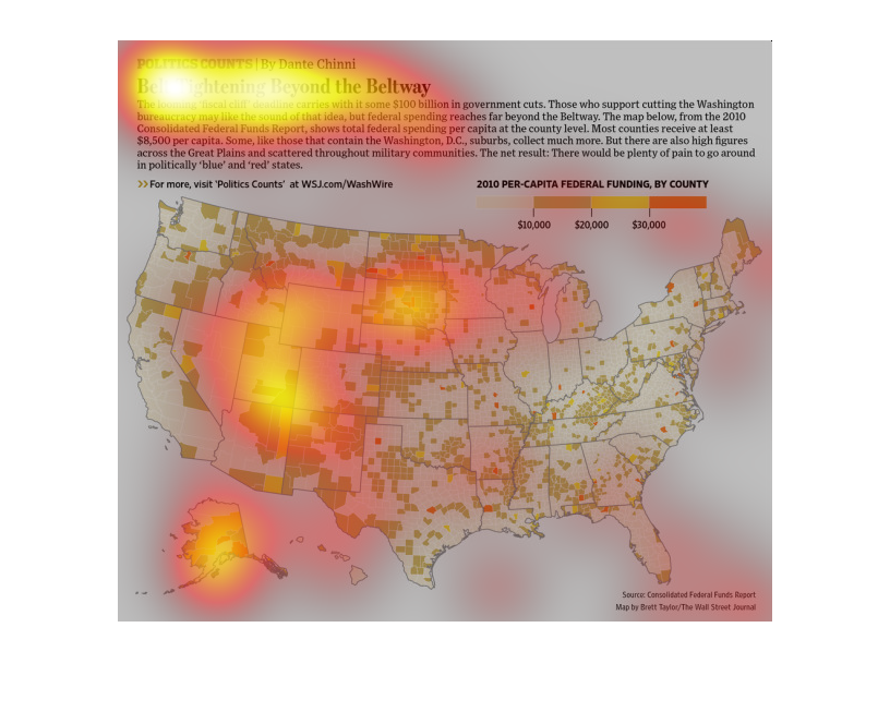
This US map shows allocation of 2010 federal funding, broken down by each county. Each is
color coded on an orange scale from tens of thousands of dollars.
belt tightening beyond the belt way. This United states map shows that funding across the
country is basically the same per capita per county with few exceptions
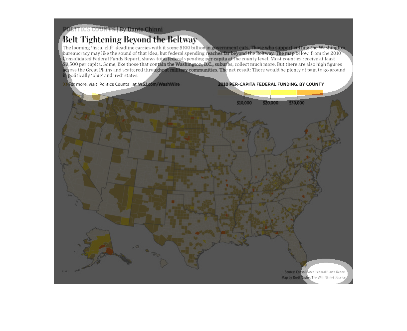
Belt Tightening Beyond the Beltway. This graph illustrates the United States of America and
portrays the 2010 per capita federal funding by county. The source of information is the Federal
Funds Report. The map is from the Wall Street Journal. The map overall illustrates the cut
in funding to the states.
This is a map that shows areas within the united states where the economic problems have mostly
affected. It shows that there is especially a major belt tightening around the beltway region.
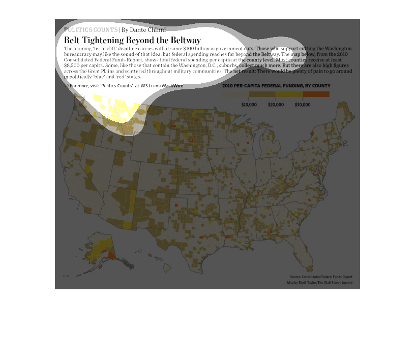
This US map shows the 'belt tightening' that comes with federal funding, shown as colored
shading in increments of 10k dollars, and broken down per county.
The figure presented is titled Belt tightening beyond the beltway.  The figure is an actual
representation of the statistical data of the fiscal cliffs of the government.