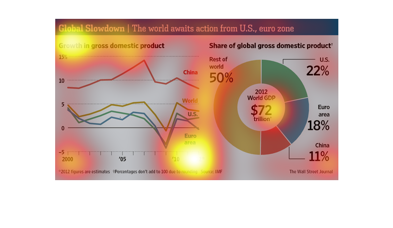
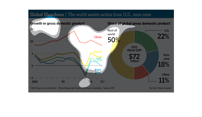
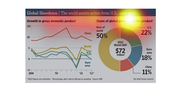
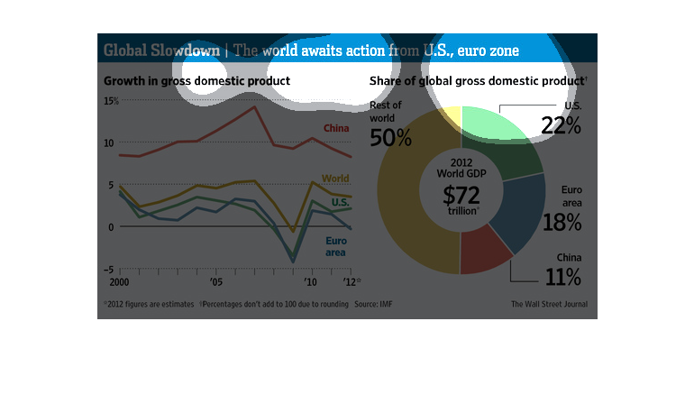
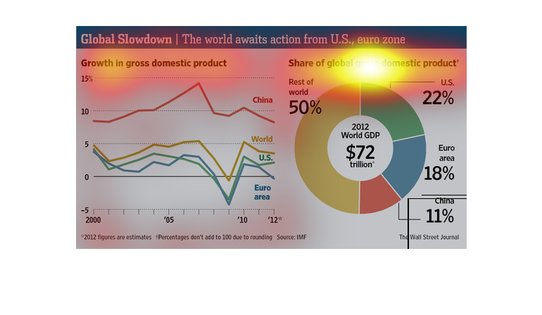
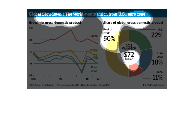
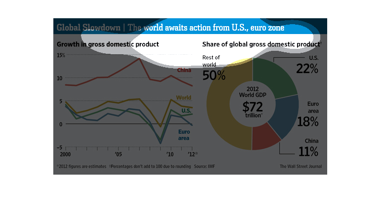
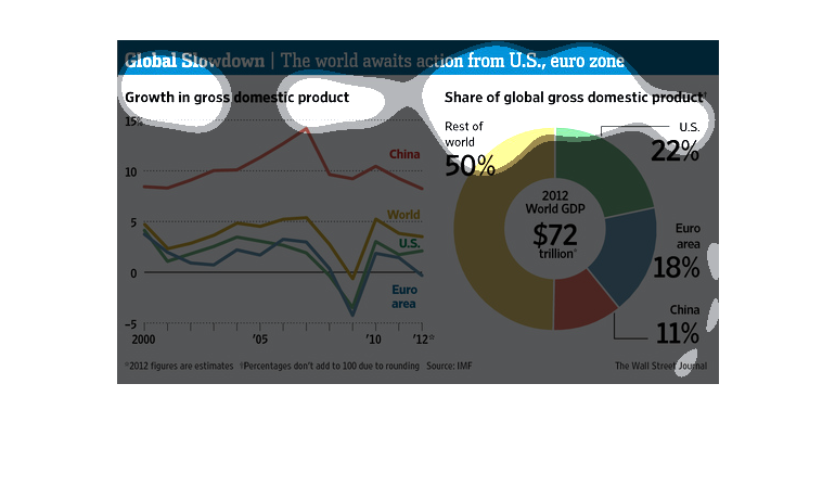
There are two graphs here. One shows how the entire global gross domestic product was divided
up in 2012; the U.S., the eurozone, and China make up half the world's gdp, with the United
States producing the most out of those three areas. In 2012, the global gross domestic product
totaled $72 trillion dollars.  The other graph shows global gross domestic product growth
in various global regions from 2000 to 2012. During those twelve years, China experienced
the most growth, while the U.S. and Euro area fall behind the entire world's growth by several
percentage points.
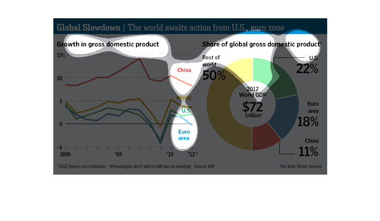
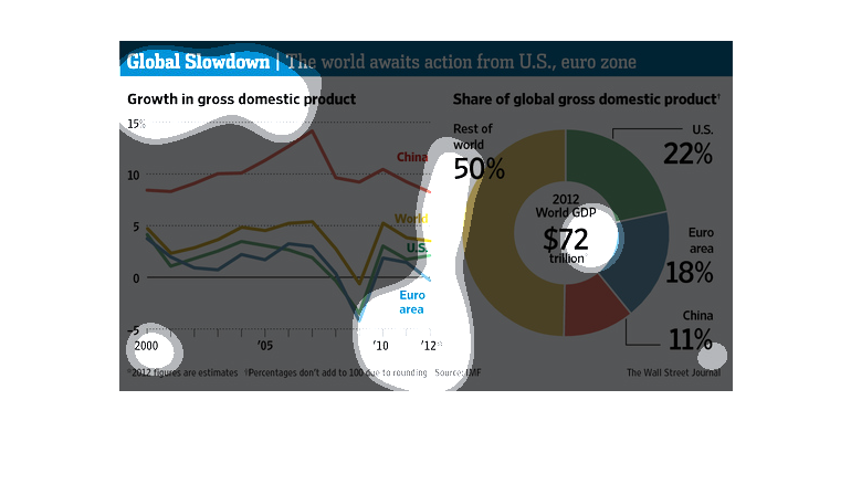
This is a graph showing the total gross domestic product in the world, and the comparisons
between China, Europe, and the United States to the rest of the world.
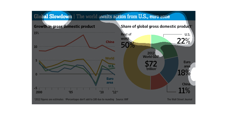
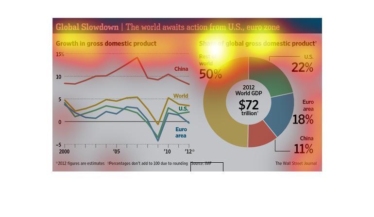
Global Slowdown: the world awaits action from US, euro zone.  The first chart shows the growth
in gross domestic product, between 2000 and 2012 for Europe, China, the US  and the rest of
the world. They all dipped dramatically around 2010 after a steady rise until then. Then began
to rise slowly again around 2012.  The second chart shows the share of global gross domestic
product.   The world GDP in 2012 was $72 trillion; of that China was 11%, the Euro area was
18%, the US was 22%, and the rest of the world makes up 50%. So between China, Europe and
the US, they have half of the global gross domestic product.
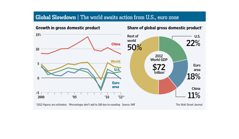
The figure presented is titled Global slowdown: the world awaits action from U.S., euro zone.
 The figure is an actual representation of Global slowdown.
There are two different charts showing global economic stats due the global slowdown.  One
shows the growth in gross domestic product.  The other shows the share of the global gross
domestic product.
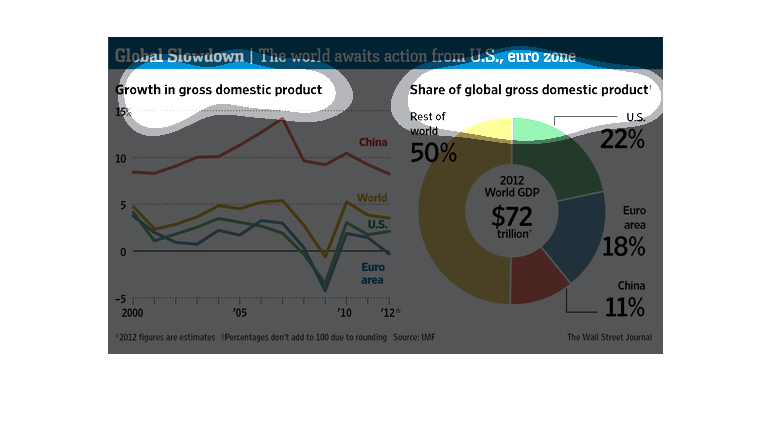
This graph titled "Growth in gross domestic product" for 2012. The world GDP is 72 trillion
dollars. The US is 22% of this, China 11%,  rest of the world is 50%
Global Slowdown The world awaits action from U.S., euro zone. It shows growth in domestic
product and the share of global gross domestic product. China has the most growth whereas
the Euro area has the least. IN 2012 the world GDP was $72 trillion. The rest of the world
has the most shares at 50%, US has 22%, Euro Area has 18%, China has 11%.
This is a set of data, a line chart and a circle chart. The line chart shows the growth in
gross domestic product and the other is the share of gross domestic product. The data is for
US, Euro, China and the rest.
This chart describes the global slow down. Specifically, the world awaits action from the
United States and the Euro Zone. Different categories are represented by different colors.
THIS PLOT HAS TWO COMPONENTS. ON THE LEFT, A LINE CHART SHOWS THE GROWTH IN GLOBAL GDP BY
REGION AND FOR THE WORLD. ON THE RIGHT, A PIE CHART SHOWS EACH REGION'S CONTRIBUTION TO THE
GLOBAL ECONOMY.
The chart describes the growth of the global domestic product over the past decade and the
current percentage of gross domestic product held by the United States, Euro Zone, China and
the rest of the world
This study conducted between 2000 and 2012 tries to inform us of the fact that global economic
growth has stalled somewhat through the years, and here we see a very thorough breakdown of
each area of concern.
This chart describes the global slowdown. Specifically, the world awaits from the US, and
 Euro Zone. Growth in gross  product and share of global domestic product.
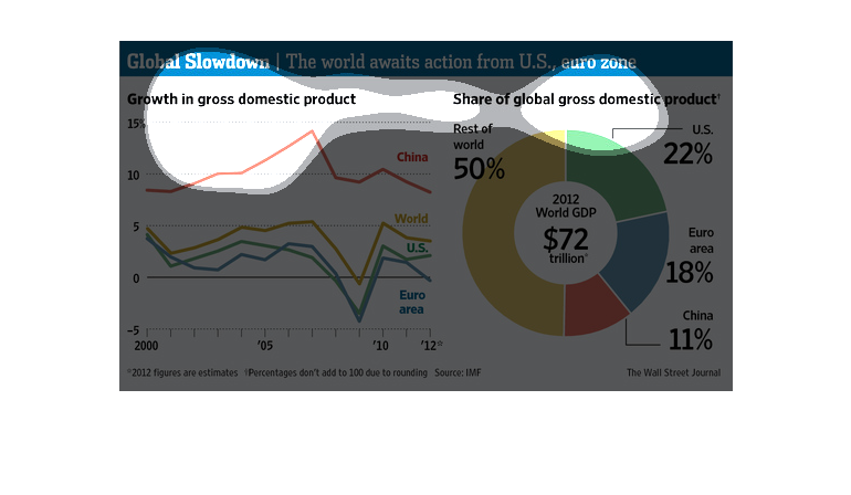
This pie chart and graph shows the world gdp. also the span of gdp per country through 2012.
According the the chart the only country that has an increase in gdp in the last 4 years is
the US suggesting that we can turn this thing around. Chinas gdp is still significantly higher
than the US