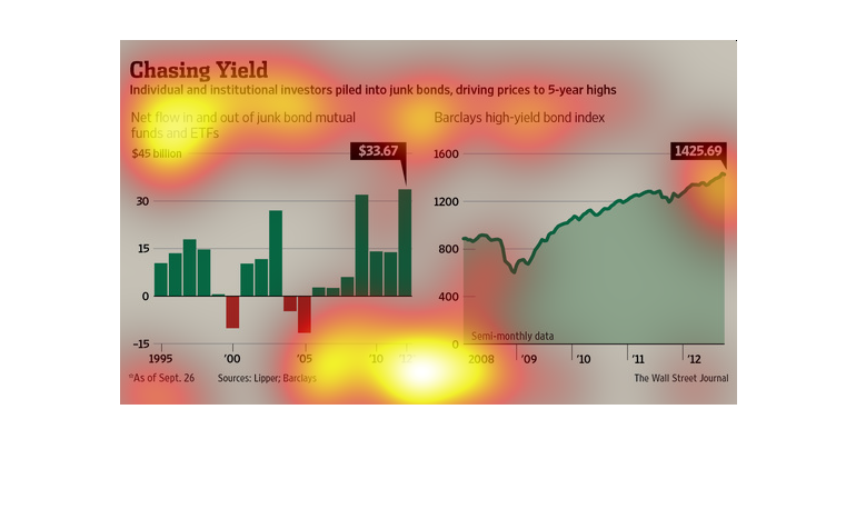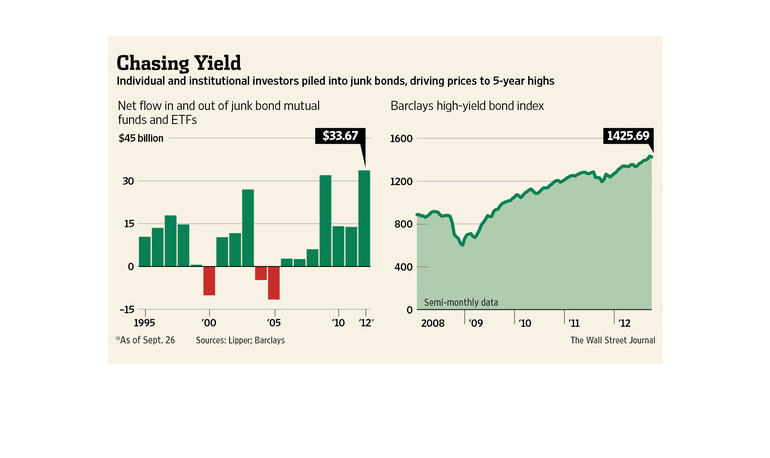
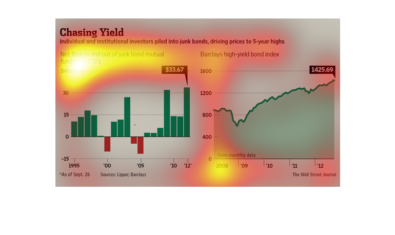
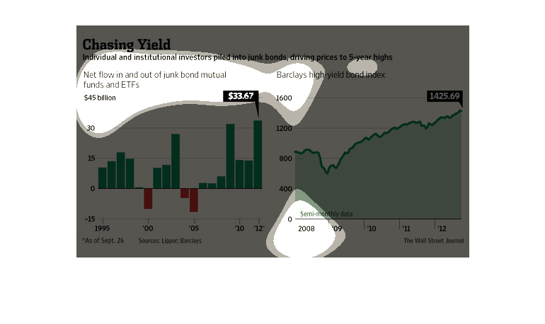
This graph is a Chasing Yield that compares the investment of junk bonds by individual and
institutional investors that drove prices to 5- year highs.
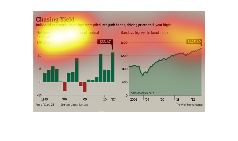
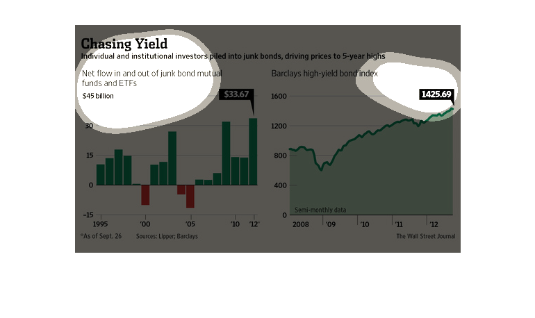
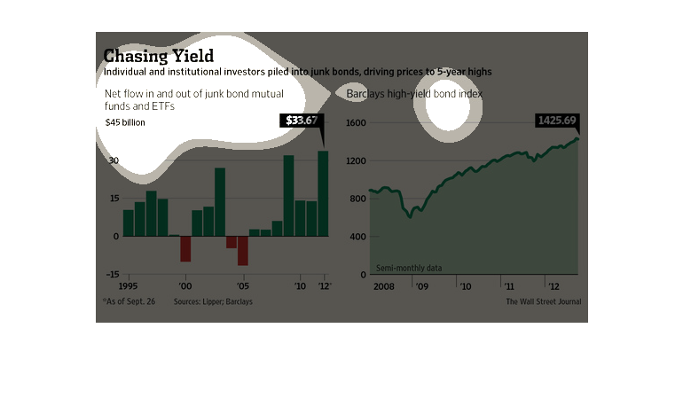
This chart illustrates the movement of individual and institutional investors into junk bonds,
driving prices to 5-year highs. Overall movement into junk bond funds has been increasing
from 1995 to 2012, with increasing investment overall punctuated by periods of negative investment
in 2000 and 2005. Total investment has increased from approximately 15 to approximately 30
billion over this time period. Barclay's high yield bond index has also increased from approximately
800 to 1425.69 from 2008 to 2012.
This chart details the correlation between investors putting money into junk bonds, and the
rates at which they climbed according to Barclay's high-yield bond index.
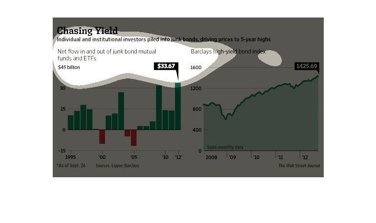
This chart describes chasing yields. Specifically, individual and institutional investors
piled into junk bonds, driving prices to five year high, starting in 1991.
chasing yield, individual and institutional investor piled in to junk binds, driving prices
to 5 year highs. Net flow in and out of junk bonds and ETF's. A graph shows data from 1995
to 2012. There is a very sporadic almost predictable  up and down. Barclays high yield bond
index shows a small dip followed by steady growth.
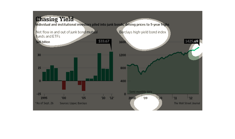
Individual and institutional investors pile money into junk bonds which drives prices to a
5 year high. The left graph shows the net money flow in and out of junk bond mutual funds
and ETF's versus time starting at the year 1995 and ending in 2012. The right graph shows
Barclays high yield bond index versus time starting in 2008 and ending in 2012.  This graph
contains semi-monthly data. Source: the wall street journal
This graph depicts the rise of the junk bonds.Like any investment it goes up and down, but
it begins at about $15 in 1995 and in 2012 it ends at over $30.
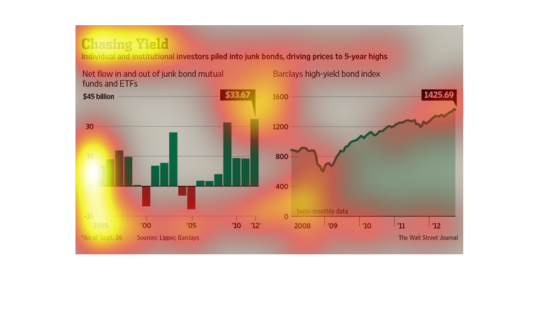
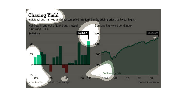
This chart is described as individual and institutional investors driving junk-bonds to 5-year
high. It shows the Net Flow into and out of junk bond mutual funds and ETFs. It shows how
in 2012, $33.67 billion dollars were invested in junk bonds.
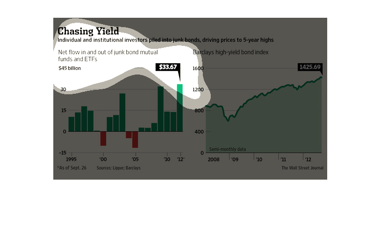
This study- conducted from 1995 to 2012- tries to illustrate the negative affects that were
produced in the market because of investors and investment firms putting money into bad bonds,
which drove up the prices ridiculously high.
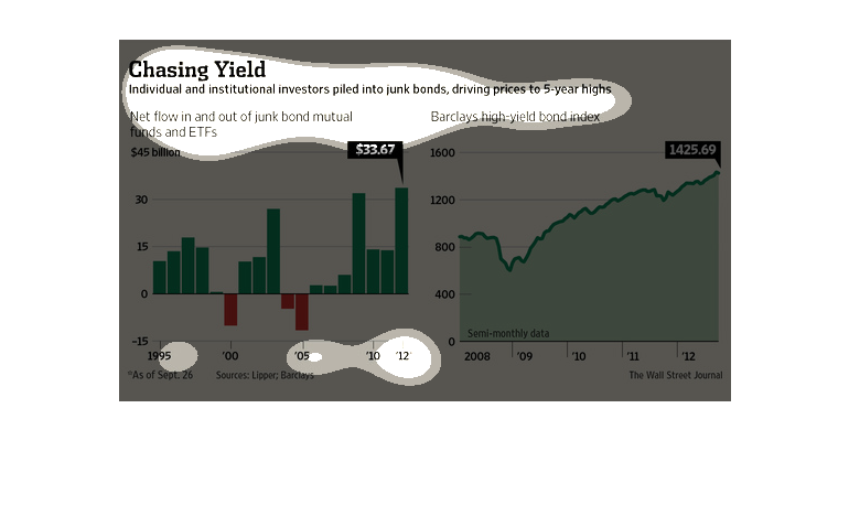
This is about investors and their bonds. It mentions junk bonds with two graphs that seem
to have increasing values by years. One graph is a bar graph and the other is a line graph.
Thus one must be demonstrating a flow over time versus values per year.
These are charts being used to illustrate that individual and institutional investors created
a problem when they piled into junk bonds. This led to a 5-year high in prices.
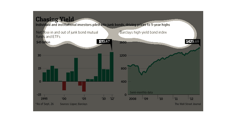
This chart describes chasing yield. Specifically, individual and institutional investors piled
into junk bonds, driving prices five year highs. The chart includes Barclays high yield bond
index.
The figure presented is titled: Chasing Yield. Individual institutional investors piled into
junk bonds, driving prices to five - year highs.  The figure has data sets for this information.
The image depicts data citing how individual and institutional investors piled into junk bonds,
thereby driving prices to 5-year highs. Data is from 1995 to 2012. In the last 5 years, the
prices increased rapidly due to speculation and rush to purchase.