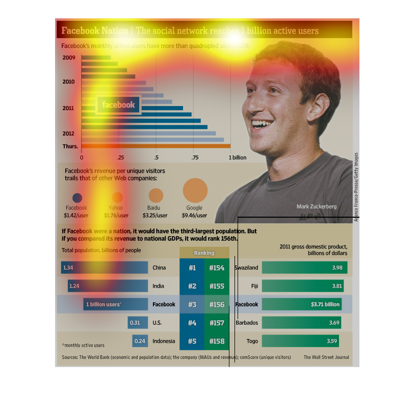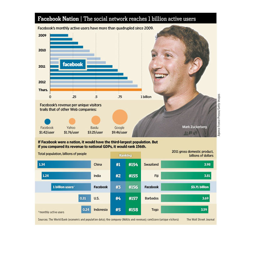
An infographic on the user base of Facebook as it surpassed 1 billion users. Shows a nearly
quadruple increase in users since 2008 but weak revenues per users
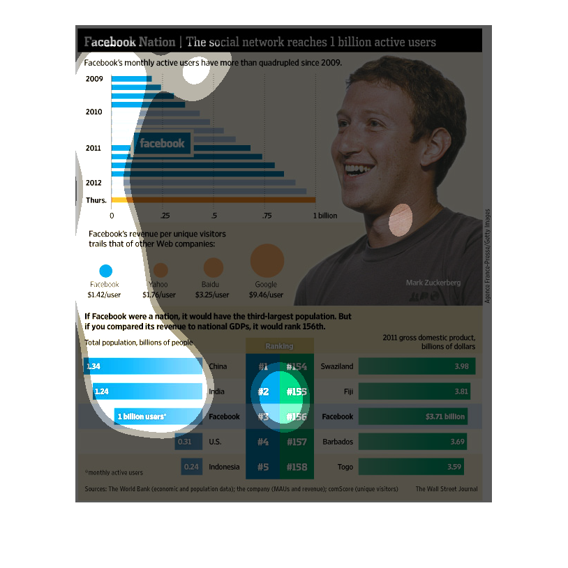
This is a series of charts, graphs and statistics depicting the growth and dominance of Facebook
as it reached one billion active users and shows various metrics based on those users.
This chart describes Facebook nation. Specifically, the social network reaches one billion
active users. Countries on the chart include Indonesia, and the U.S.
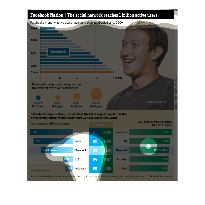
facebook nation, the social network reaches 1 billion active users, stead predictable growth
between 2009 and 2012. Still has yet to surpass yahoo, baidu and google.
This chart clearly displays how the Facebook social network has received one billion active
users. The chart shows several years, with a steady increase in the amount of active users
each year.
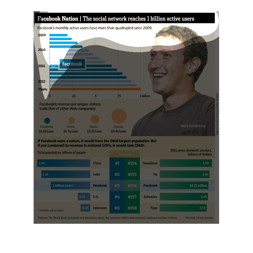
This graph shows the growth in activity for Facebook users since 2009.  The graph also depicts
user nationality as well as a comparison to other popular online entities.
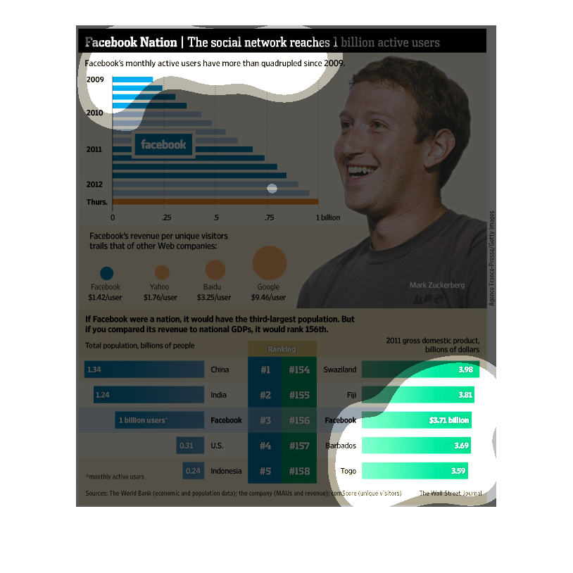
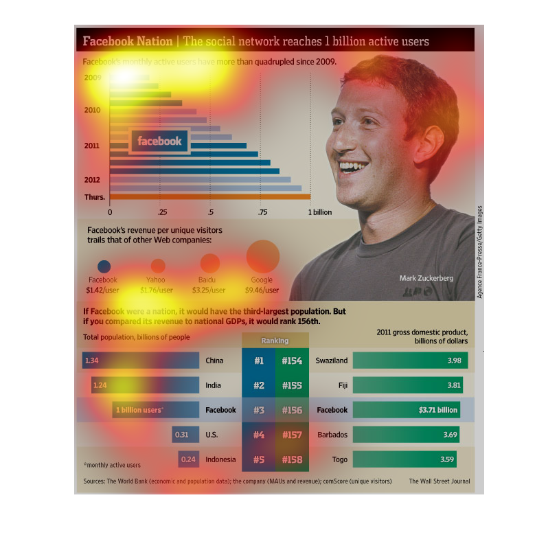
Facebook has reached one billion active users while the number of monthly active users has
quadrupled since 2009, going from .25 billion to 1. The amount of revenue generated by each
user is much smaller, though, with Google generating 9.26 dollars per user while Facebook
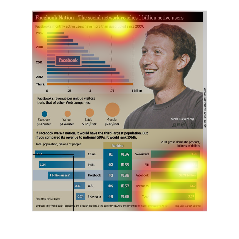
only generates 1.42. If it were a country it would be the third largest, after India and China,
but with a GDP rank of 156.
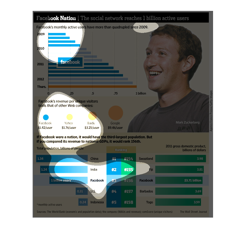
This is a chart showing how Facebook has grown over the years. The monthly active users has
quadrupled over the past 5 years. Making Facebook more capital than countries like Barbados
or Togo.
This is a collection of bar charts and data points that describe the growth of facebook in
recent years. It describes amount of users, the comparison to other platforms, and where the
userbase is located.
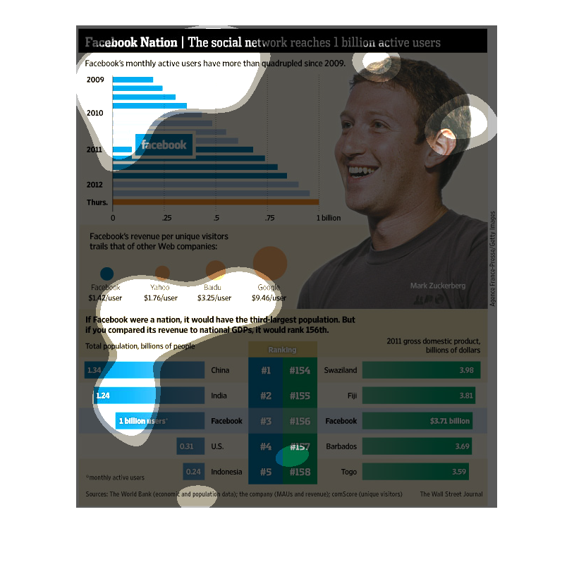
The image depicts the statistics for the wildly successful facebook. Facebook's monthly active
users have more than quadrupled since 2009 to 2012. The totality of the data points to an
increasingly powerful corporate entity.
This image shows or depicts using various statistical charts including bar graph format data
concerning on how well Facebook social media is doing. They have reached 1 billion active
users currently.
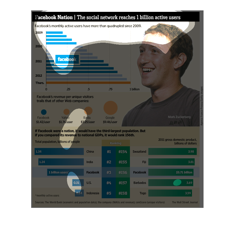
This chart shows the dominance of Facebook over the years. It's active users have nearly quadrupled
since 2009. But it still has a lower amount earned per user than Yahoo, Google, and Baidu.
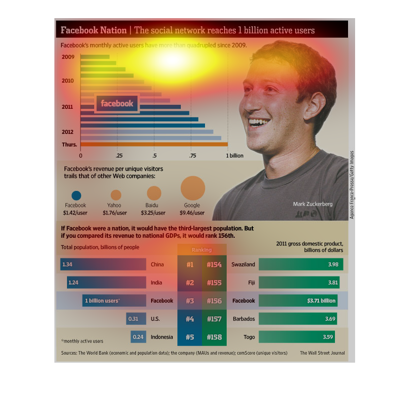
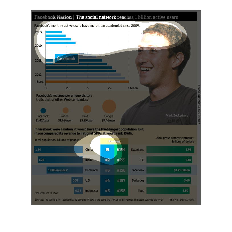
This chart describes Facebook nation. Specifically, the social network reaches one billion
active users. Different categories are represented by different colors.