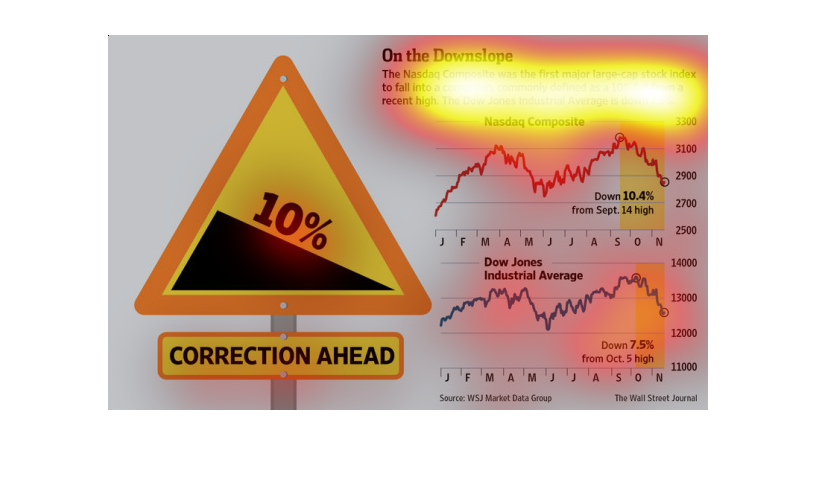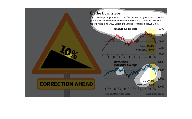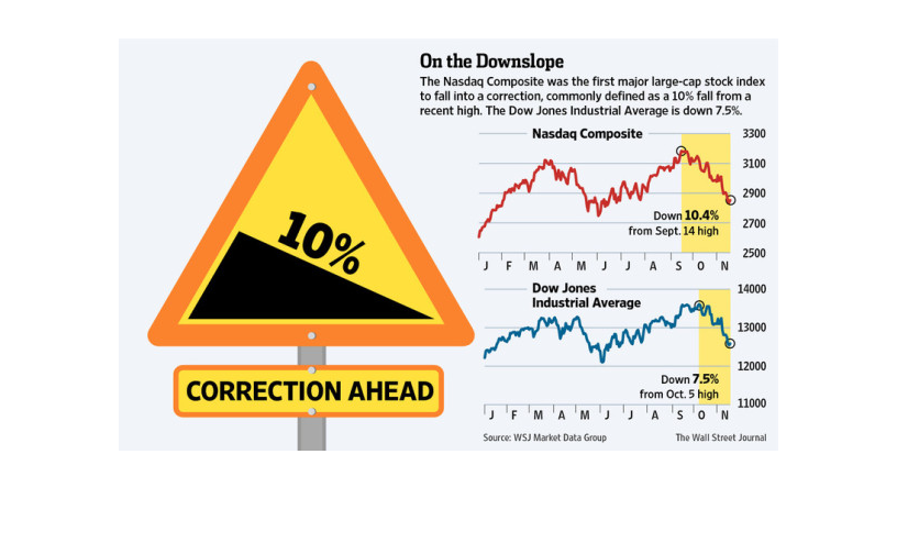
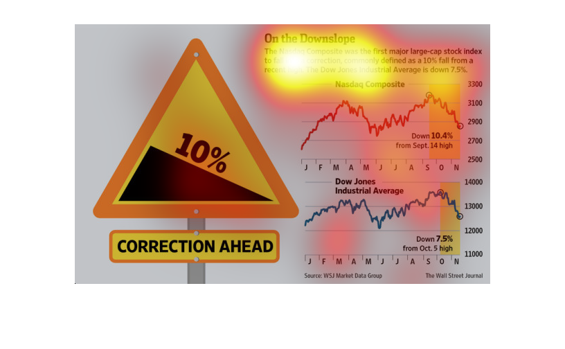
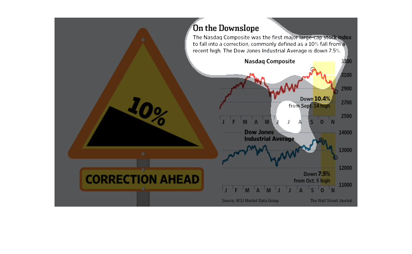
This graph describes the recent downturn in the Nasdaq profits. It explains that the Nasdaq
market is down 10% and the Dow Jones index is down 7.5%. These figures follow a high in the
stock market.
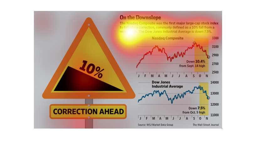
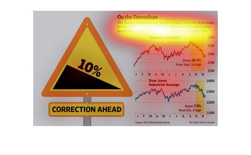
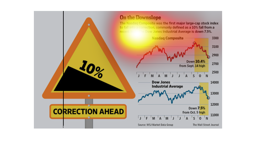
This illustaration states that the nasdaq is on a course that hopefully corrects the wrongs
that have been going on. It showcases how things have been heading down and now will be going
up.
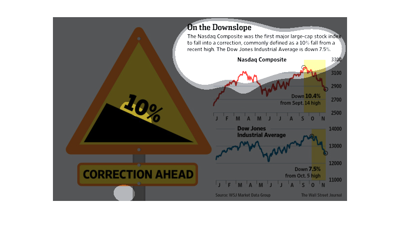
The chart is showing the Nasdaq Composite and Dow Jones Industrial Average falls from what
there highs were. Nasdaq Composite went through a 10% fall from a recent high.
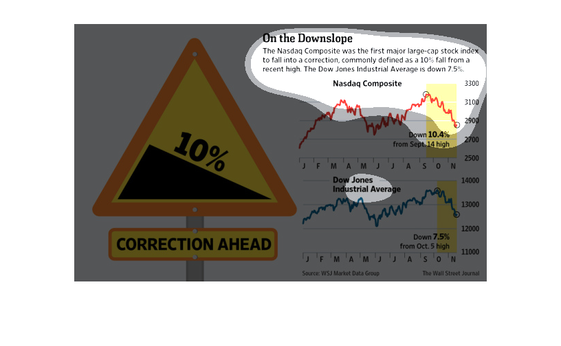
This chart compares the Nasdaq to the Dow Jones fluctuation over a year. While both are currently
down and demonstrate an extremely similar fluctuation pattern throughout the year.
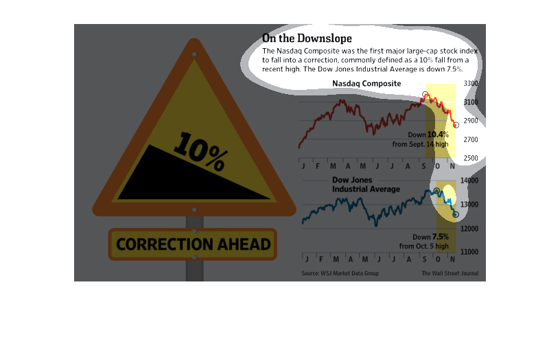
This chart describes on the down slope. Specifically, the Nasdaq composite was the first major
large cap stock index to fall into a correction, commonly defined as a 10 fall from a recent
high.
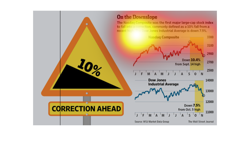
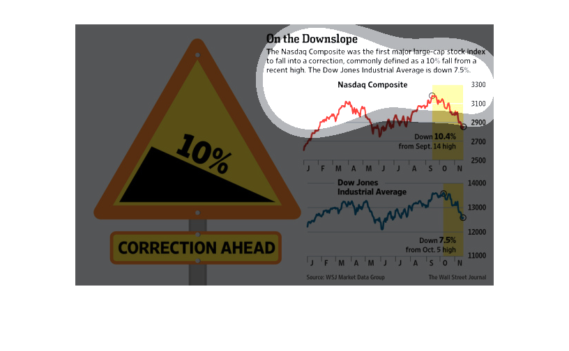
This is a chart showing how the NASDAQ and Dow Jones has been decreasing at the end of the
year. It's not clear what year this chart is from. The infographic seems to suggest the slide
should continue.
This is a series of charts and an associated diagram depicting the Nasdaq Composite was the
first major large-cap stock index to fall into a correction of more than 10%.
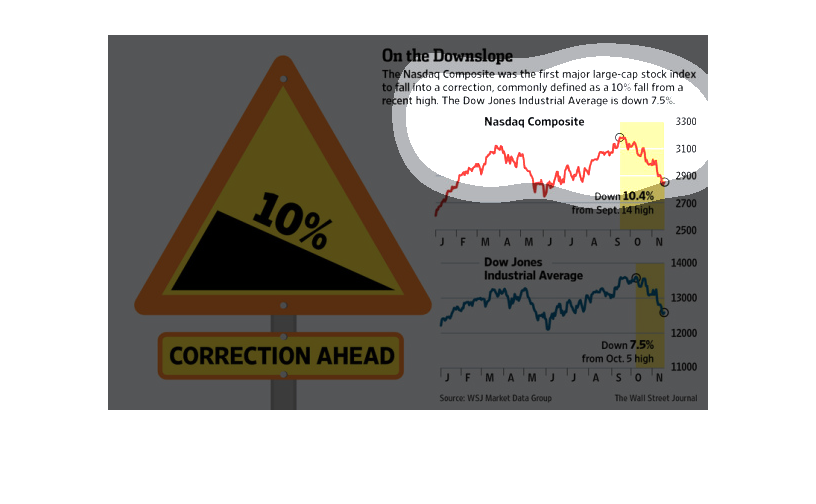
The image depicts both the Nasdaq and the Dow Jones decreasing by 10% and 7.5%, defined as
falling into a 'correction'. Corrections occur when the market corrects any inflated trading
occurring for a certain time frame, and then returns to 'normal' levels. This data indicates
a correction occurred in both Nasdaq and Dow Jones.
The graphs show falls in a stock index, which happened in october/november which is occurring
after  a previous rise. The fall seems to be some sort of correction of 10% instead of a natural
fall.
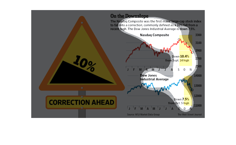
The image explains what is known as NASDAQ composite's "10% fall" from a recent high point
compared to the Dow Jones' average downward slope of 7.5% in the stock index.
This graphic shows the correction of two stock market indices. It shows the dow jones and
the nasdaq. THe changes are shown in terms of a line graph that depicts changes over time
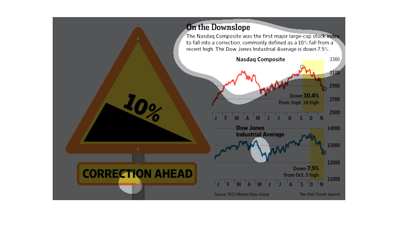
On the down slope. Specifically, the Nasdaq composite was the first major large cap stock
index to fall into a correction, commonly defined as a ten percent fall.
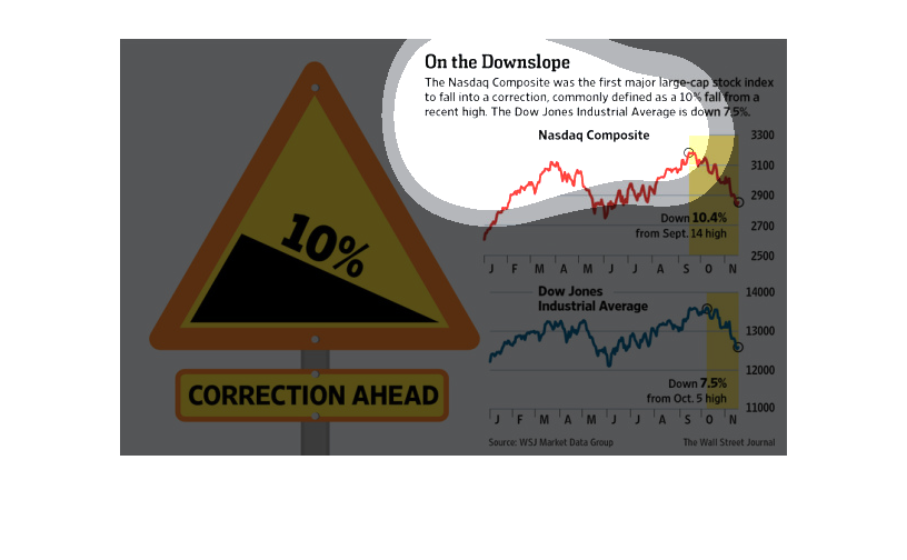
The image depicts how the Nasdaq-composite was the first major large-cap stock index to fall
into a correction (10%). The Dow Jones industrial is also down to the tune of 7.5%. The data
indicates that both indexes have declined noticeably within the time frame studied.