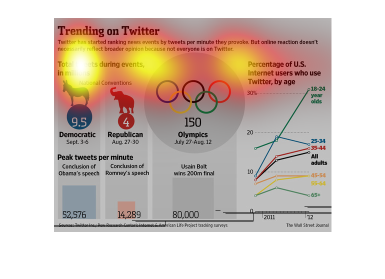
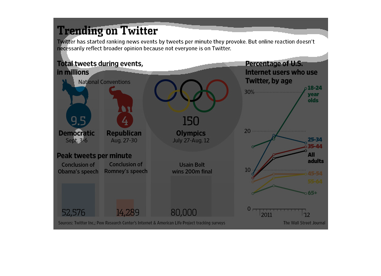
The image depicts how twitter is starting to rank news events by tweets per minute. Different
categories of discussion are included, indicating which category is more popular. From democrats
versus republicans, to interest in the Olympics.
A lot of people share their political views on twitter. However there are more democrats using
the site than republican and so representation is skewed.
This chart describes trending on Twitter. Specifically,  Twitter has started ranking news
events by tweets per minute they provoke. But online reaction doesn't necessarily reflect
broader opinion.
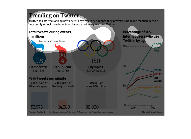
This is a chart showing the trends on Twitter between the Republican and Democratic parties
tweets, Olympic related tweets, and population that are using Twitter on a regular basis.
A infographic showing the trending of subjects on twitter as a minute to minute phenomenon.
Showing ages 18-24 are the largest user base for twitter

During the presidential election everybody is fired up to support their favorite candidate,
and twitter is a great way to track that sentiment. We can see who are what is being said,
as this graphic informs us.
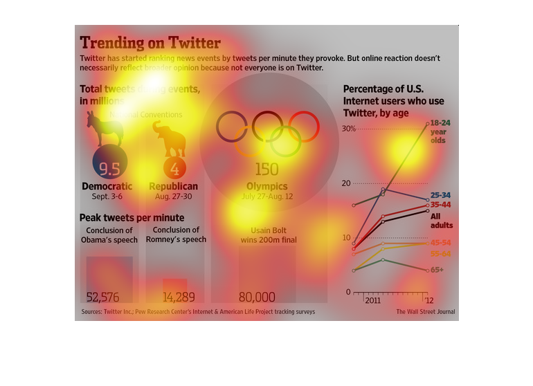
The title of the graphs is Trending on Twitter. It says that Twitter has started ranking events
by tweet per minute that the events provoked,  but these reactions are inflated.
Trending on Twitter Rated based on tweets per minute provoked Doesn't reflect broader opinions
because not everyone's online.  Shows tweets in millions based on different events as well
as the peak tweets per minute about an event.  Example: The National Conventions, The Olympics
 There's also a graph depicting percentages of US internet users who use Twitter over time
(2011-2012)
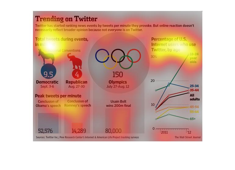
This image is depicted the rise in popularity of news events on twitter. The image states
that even though there is a rise in tweets that doesn't mean there is a rise in opinions generated
The amazing this about twitter that this illustration tries to inform us is how it so marvelously
looks at what people are really interested in and lets you know.
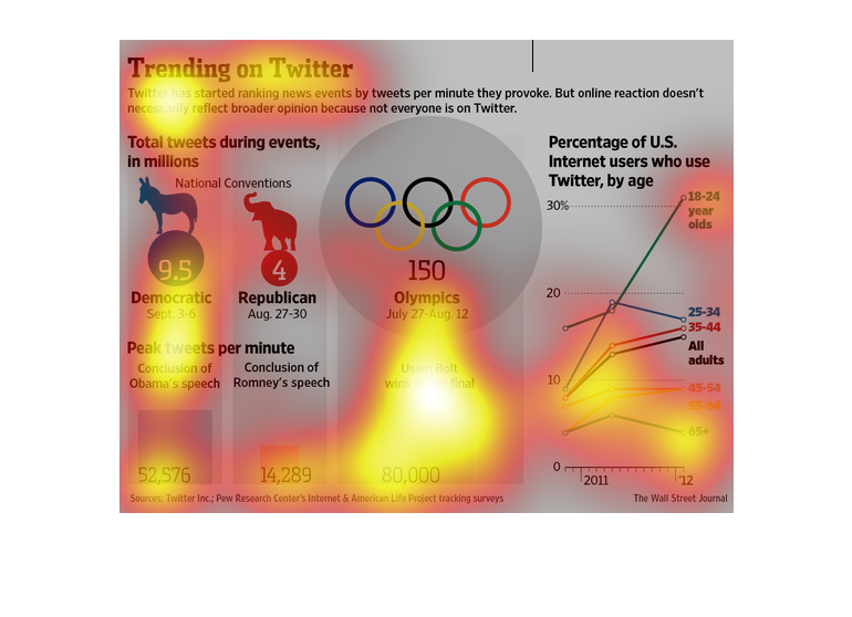
This image describes what is trending on Twitter. The events are rated by the amount tweets
they generate per minute. So far, it appears the Olympics is garnering more responses than
anything else.
This series of infographics shows the trending topics on twitter, such as presidential debates,
olympic wins, and a color coded breakdown of twitter users by age. Details of specific events
are listed in text for relevant spikes in traffic.
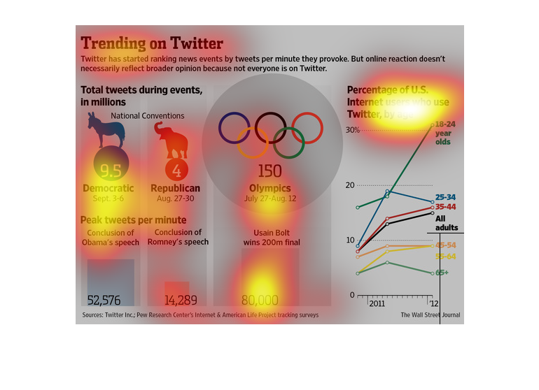
The image depicts popular topics trending on Twitter. The image shows a caparison of different
events and their popularity on twitter when comparing popularity, as well as popular topics
trending.
This chart describes trending on twitter. Specifically, twitter has started ranking news events
by tweets per minute they provoke. But online reaction doesn't necessarily reflect broader
opinion.