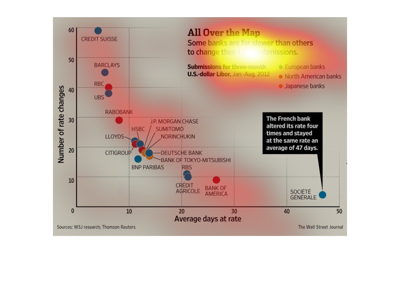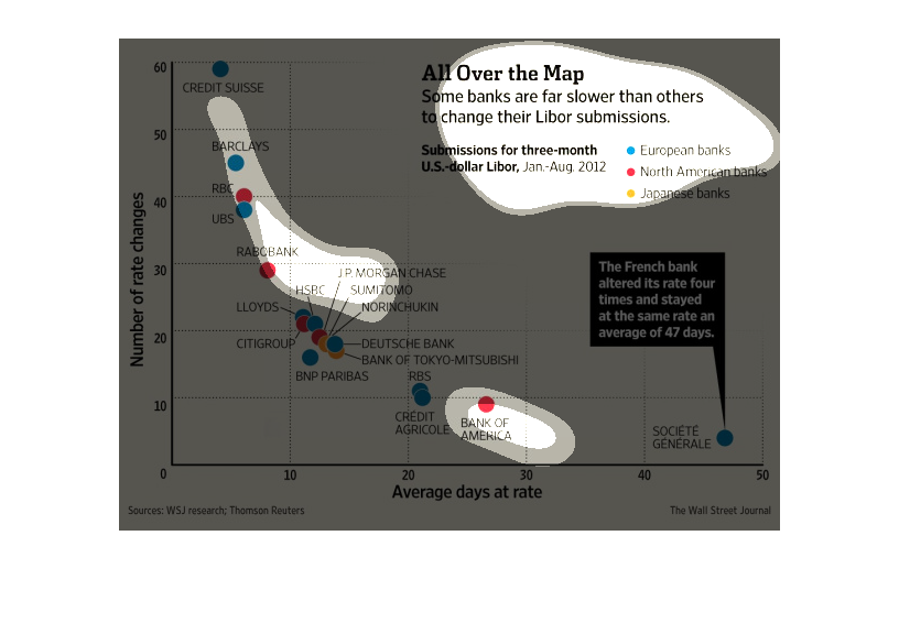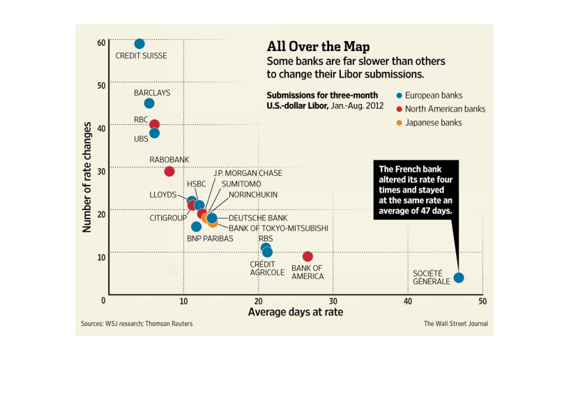
This chart describes all over the map. Specifically, some banks are far slower than others
to change their Libor submissions. Categories are represented by different categories.
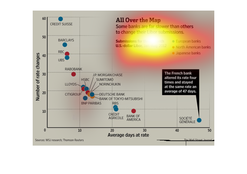
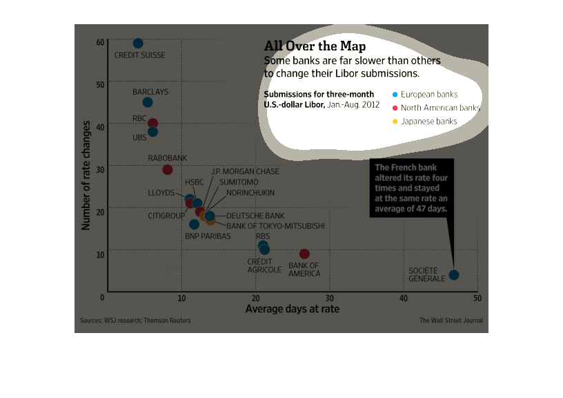
A chart infographic of various banks and their average days at rate to submit their Libor.
It shows the French bank Societele General was the slowest
This illustrates the speed in which banks change policies on libor. It is on a map to show
how quickly different areas change their policies, French banks averaging 47 days
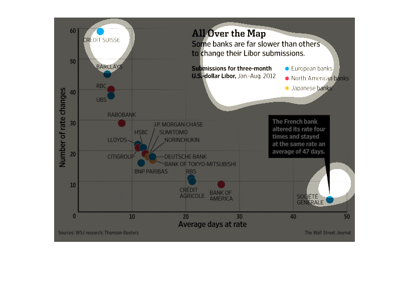
This graph shows the difference between European, North American, and Japanese banks in how
quickly they change their Libor submissions rate. North American banks tend to be relatively
fast.
This chart clearly displays a three-month period for U.S. dollar Libar submissions, during
the year 2012. The chart shows several different banks and the number of rate changes for
each bank.
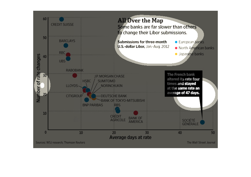
This is a color coded plot line chart depicting how some banks are far slower than others
to change their LIbor submissions across several select areas around the world.
The chart to my left has a graph that is titled "All over the Map" some banks are far slower
than other to change their libor submissions. Then it shows a variety of things
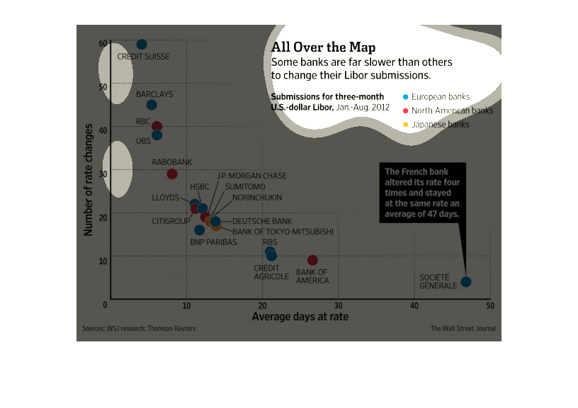
The image depicts how some banks are slower than others to change their libor submissions.
It appears most banks are fairly uniform in their actions, while a minority are slower than
others, with one french bank changing it's rate four different times staying at the same rate
for 47 days.
The image depicts how some banks are slower than other when it comes to changing their libor
submission. A majority of the banks appear to be centralized around the same area on the graph
as it relates to their libor numbers, with very few straying from the pack.
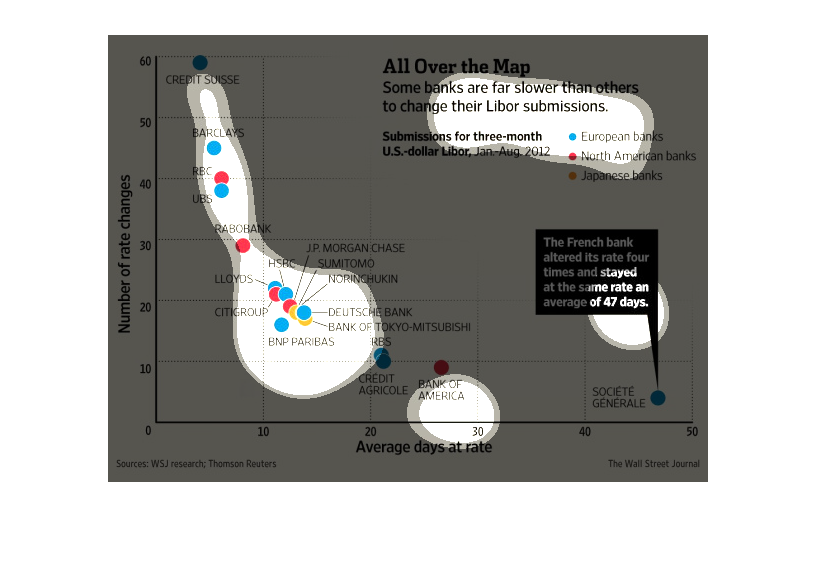
This shows the progression of banks changing their Libor rates with European, North American,
and Japanese banks and the average number of days at that rate.
This is about banks and libor submissions. It shows the number of rate changes vs. the average
days at that rate, with a list of banks in order of slowness.
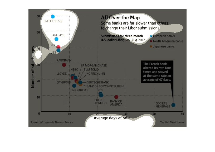
This graph is showing how some banks are much slower than others when it comes to changing
their Libor submissions. The french changed its rate four times and stayed at a single rate
for an average of 47 days.
This graph shows how some banks are slower than others to change their libor submissions.
The data is color coded into european, north american, and japanese banks, and shown on a
scatter plot. Vertical axis is number of rate changes, while horizontal is number of days
at that rate.

This chart describes all over the map. Specifically, some banks are far slower than others
to change their Libor submissions. Different categories are represented by different colors.
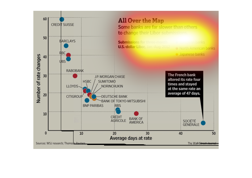
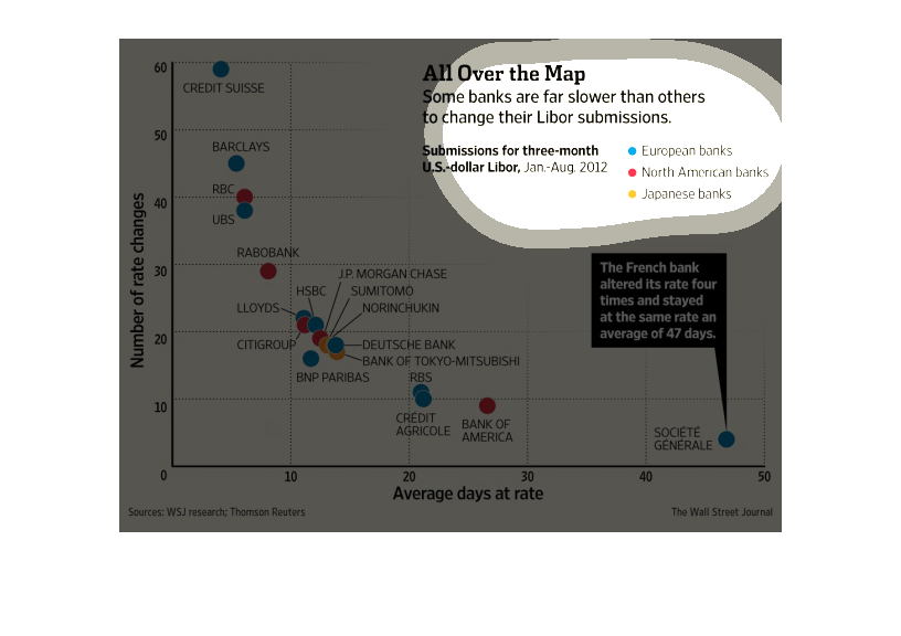
All over the map: a diagram showing that some banks are slower than others in changing their
libor. a lot of the banks seem to be clustered together at the bottom of the graph