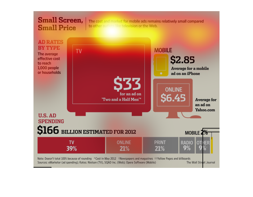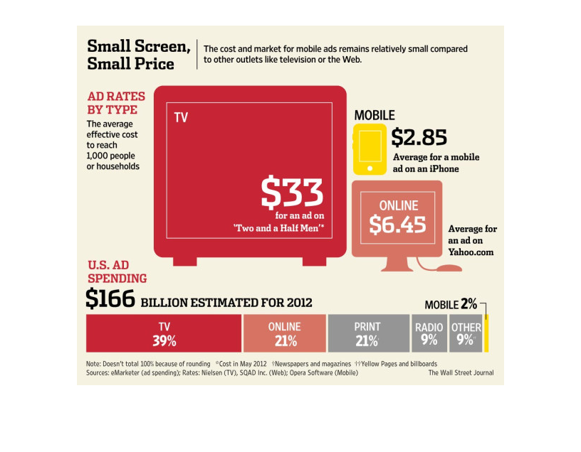
This is a chart outlining the price it takes for an ad to reach 1000 people in several mediums,
contrasted with total ad spending. The upshot of it is that mobile ads are vastly cheaper
than all other mediums.
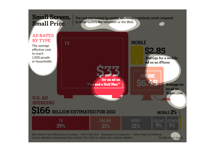
This image shows that it is more expensive to show ads to a certain number of audience members
on a larger screen device, like a television, than it is to show that same number the ad on
a smaller screen, like on mobile.  It shows the price of reaching 1000 people on a number
of devices ranging in size from televisions to phone screens.  It also shows the total spending
on ads in the US with TV totaling 39% of spending and mobile totaling only 2%.
This chart describes small screen, small price. Specifically, the cost and market for mobile
ads remains relatively small compared to other outlets like television.

This chart is showing the ad prices of mobile vs TV ads. The US spends 166 billion dollars
in ad spending. On a tv show an ad can run for 33 dollars, while only 2.85 for an average
mobile ad on an iphone.
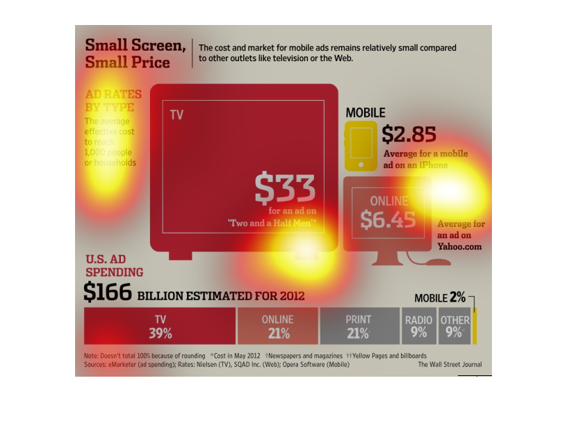
This is a series of graphs and related statistics depicting the cost and market for mobile
ads remained  relatively small compared to other outlets like television or the Web.
These are two infographics that are describing how mobile ads are both a small share of the
advertising market relative to other formats and also inexpensive relative to ad rates for
other formats.
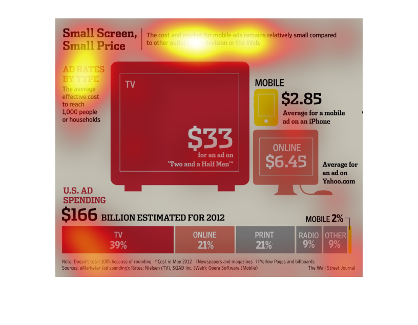
the name of this graph is called small screen small prices. the graph is a graph about mobile
ads and the prices of ads there are different types of adds
This image charts the average cost of running an ad in various markets, like TV ads, online
ads, print, radio, and others. TV during a primetime slot is the most expensive at $33 per
1000 people reached.
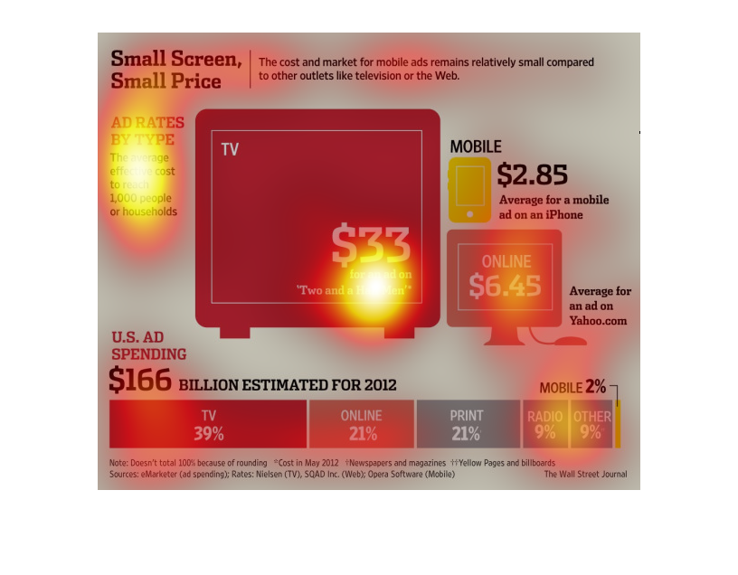

This chart compares the cost of reaching 1,000 people/households through different mediums
of advertising. The bottom graph breaks down the percentage of US ad dollars spent on different
mediums. By far, mobile phone ads are the cheapest way to reach 1,000 people, yet account
for the least amount of ad spending in the US.
This image or infographic shows how much it costs to reach 1000 people or households via ads
using different media formats. TV ads cost the most. Web site ads are substantially less and
come in 2nd in terms of price. Ads displayed through mobile apps come in third. The image
also shows the the total estimated spending on ads in 2012 and breaks down what media type
got what percentage of the total. TV and Web ads are still first and second respectively;
However, mobile ads are in last place, being overtaken by print ads, radio ads, and other,
unspecified ad types.
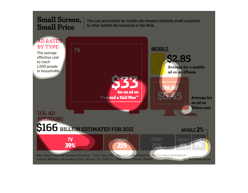
This is a graph showing different sized screens of different types of things like a television
or a telephone or a computer screen. It then shows that ads of different sizes cost different
amounts of money.
This chart shows the amount of money it cost to place and add on various media. The chart
also breaks down the percentage that each media ads are used in the usa
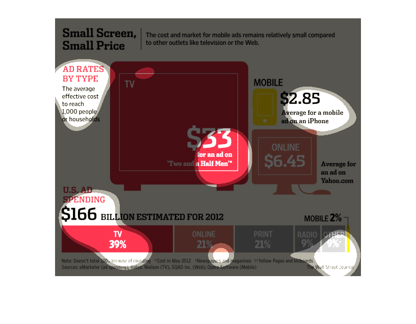
The image depicts the costs and markets for ads remaining relatively small compared to outlets
like TV and Web. TV dominates advertising, with online following in 2nd, and print in 3rd.
The image depicts the average effective costs of ad rates to reach 1,000 people by household
and device. Categories compare: TV, mobile, and internet advertising. Most spending occurs
in the TV market, with least spending occurring in radio/other.
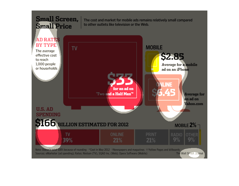
This chart describes small screen, small price. Specifically, the cost and market for mobile
ads remains relatively  compared to other outlets like television.