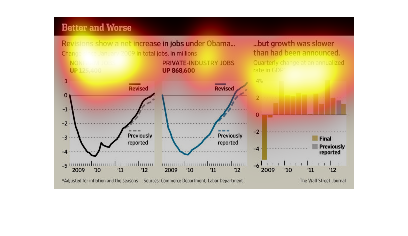
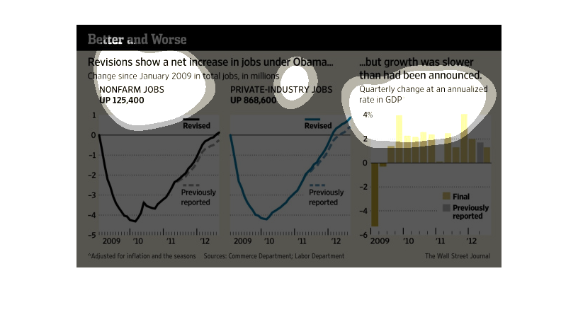
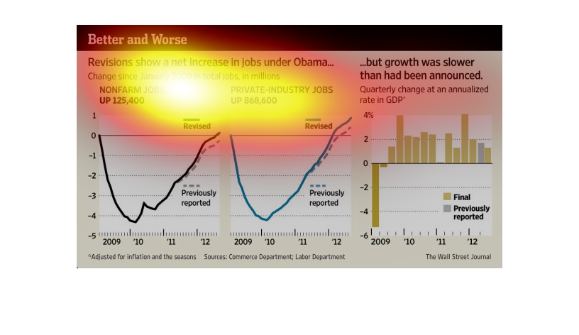
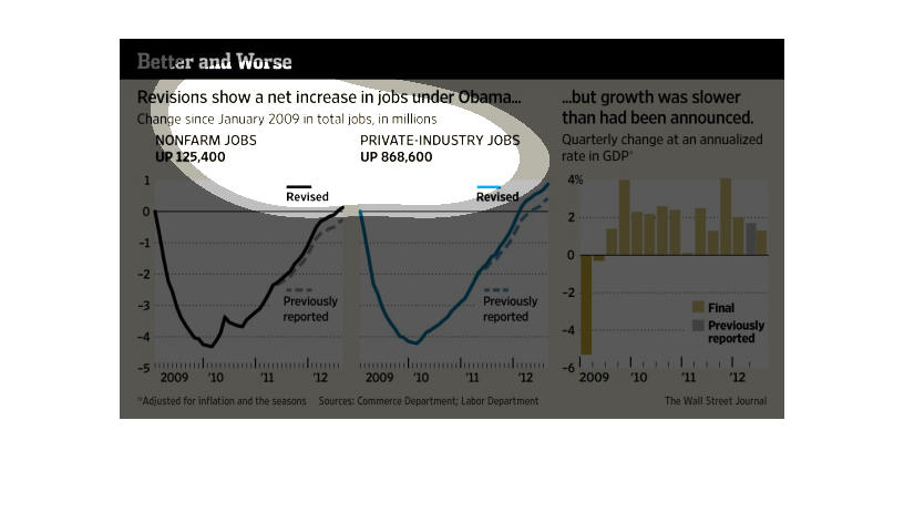
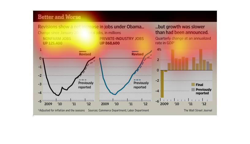
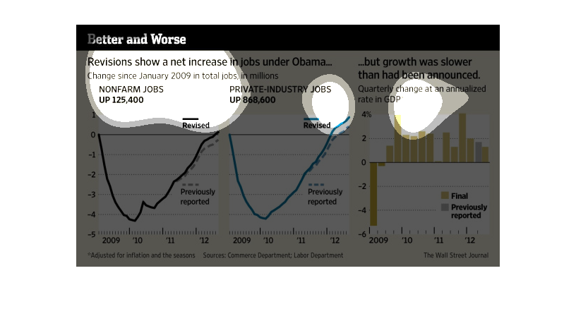
The image shows a graph of jobs and the rate of growth under the Obama administration. It
also shows another graph that shows slower growth is the only thing that has been announced
to the public. It also list the number and percentage of the polls that were used for the
graph.

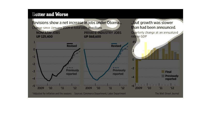
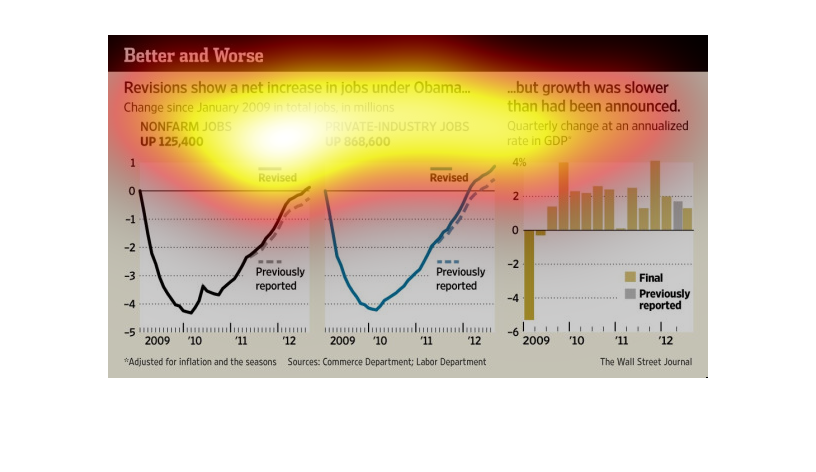
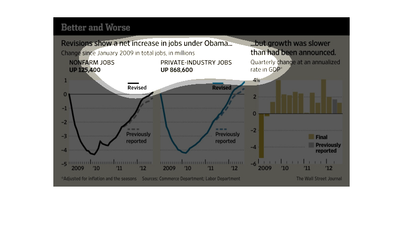
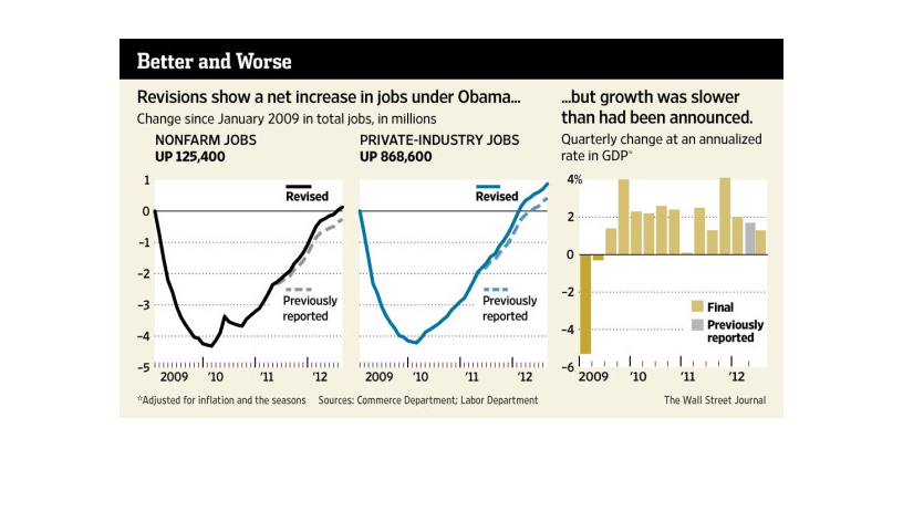
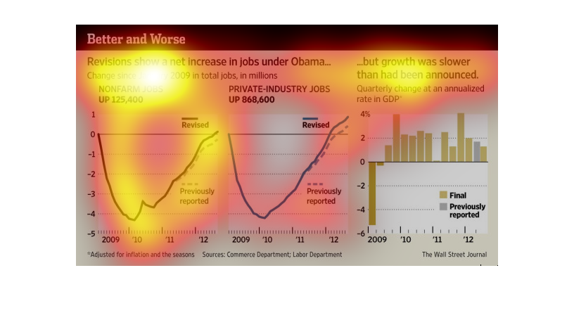
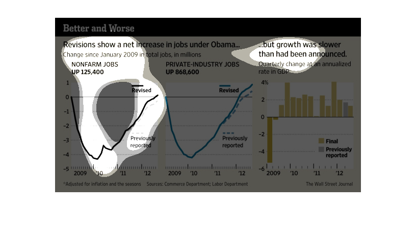
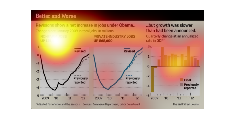
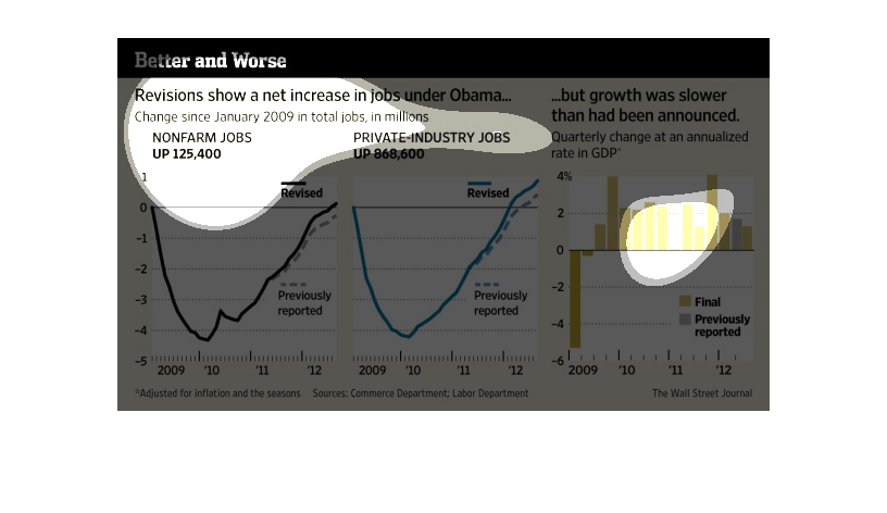
This series of charts shows a net increase in jobs under the presidency of Obama in the United
States.  It illustrates non farm jobs, private industry jobs, and growth in GDP.
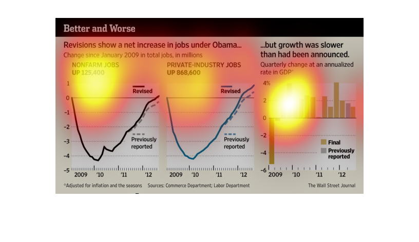
The image depicts revisions showing a net increase in jobs under Barack Obama. Post-revision,
job creation is slightly higher than previous stated under Barack Obama's leadership.
This chart describes better and worse. Specifically, revisions, show a net increase in jobs
under President Barack Obama. Change since January of 2009 in total jobs, in millions.
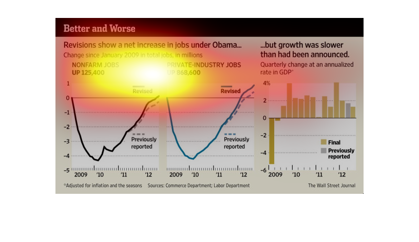
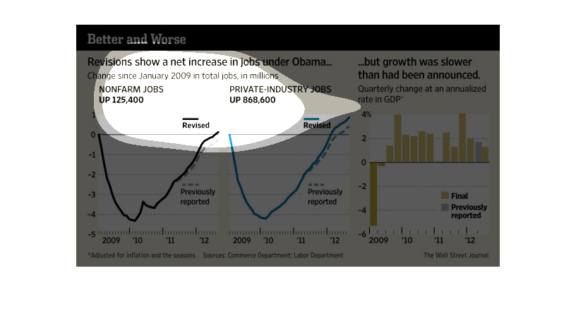
This is a series of charts and graphs depicting that revisions show a net increase in jobs
under President Obama but that growth was slower than had previously been announced.
This graph shows the relationship between job growth reported under Obama's administration.
It shows what growth was reported and what the growth actually was. It shows that job growth
was lower than was repoorted.
The image depicts how revisions show a net increase in jobs under Barack Obama. Contrary to
false statements citing job stagnation/losses, job growth under Obama is actually taking place,
as is evident by this graph.
This chart describes better and worse. Specifically, revisions show a net increase in jobs
under President Barack Obama. Change since January 2009 in total jobs in the millions.
This is a series of charts and graphs along with related statistics depicting that revisions
had shown a net increase in jobs under Obama but that growth was slower than had been announced.
the name of this graph is called better or worse and the graph is about increase made under
obmama amd this is the graph to change the world and everyone in it.
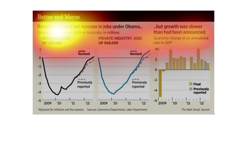
Better and Worse. Revisions show a net increase in jobs under Obama, but growth was slower
than had been announced. A couple of graphs show non farm jobs grow as well as private industry
jobs in 2010 after a free fall in the previous year.
The graph show the net increase in the number of jobs under the Obama administration since
January 2009. The growth rate was slower than had been expected.
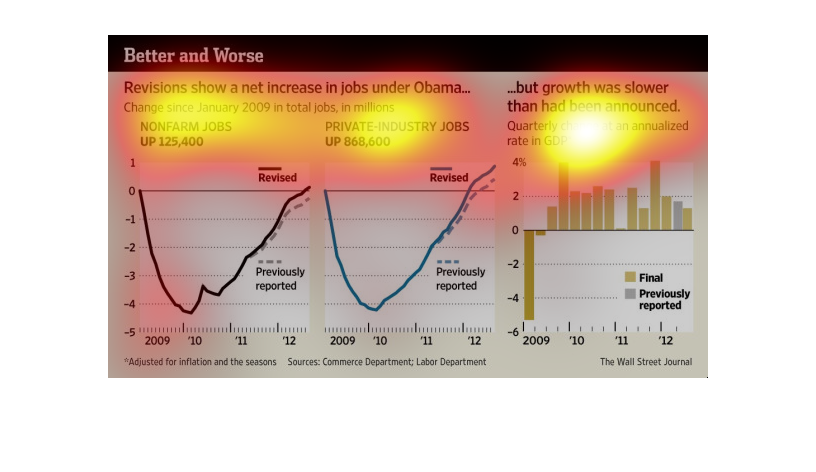
A study conducted from 2008 to 2012 shows that there were increases in job availability under
the Obama administration, but it has been very slow and you have to strain to see the progress.
This chart is titled better and worse. It shows that revisions show a net increase of jobs
under the Obama presidency. The change is in total since January 2009, in total jobs in millions.