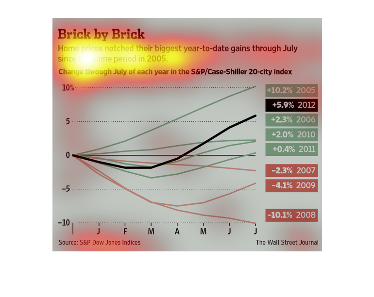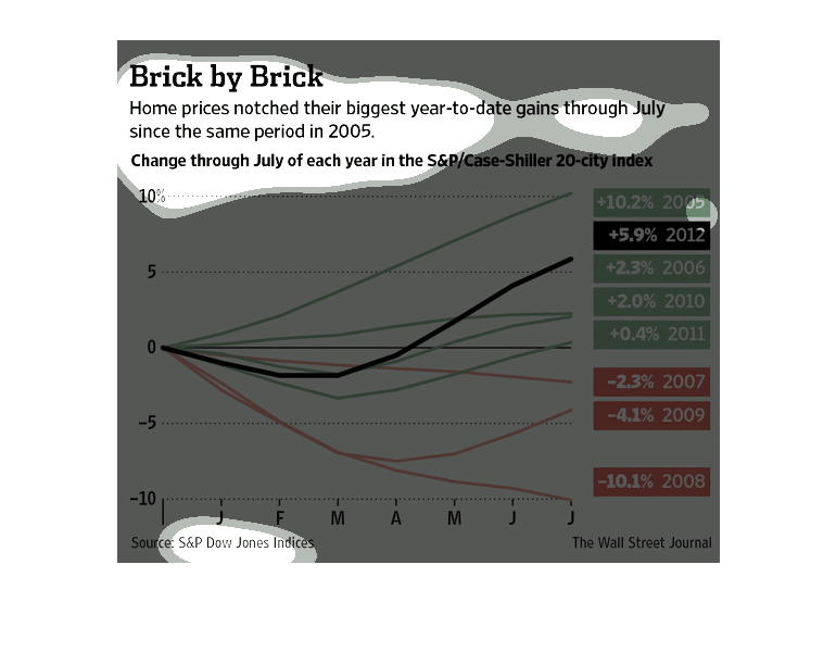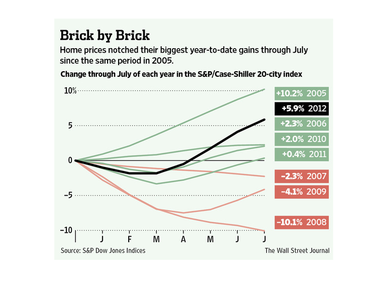
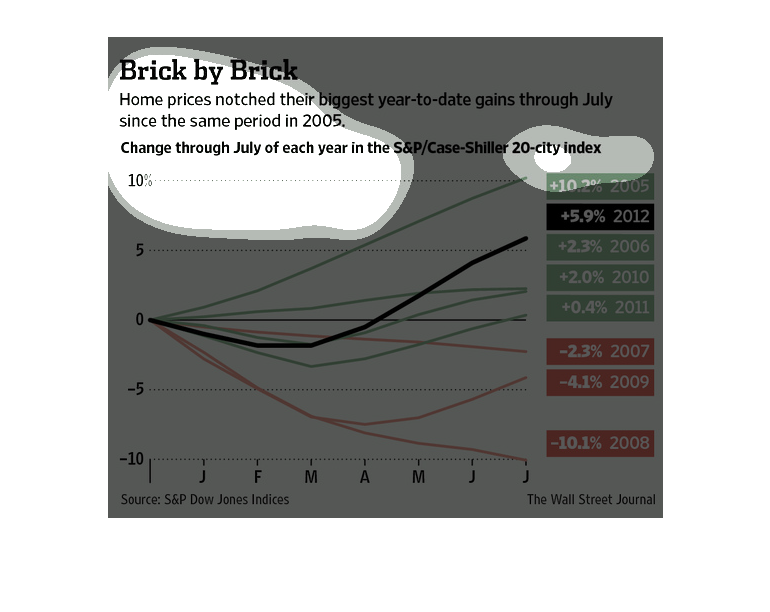
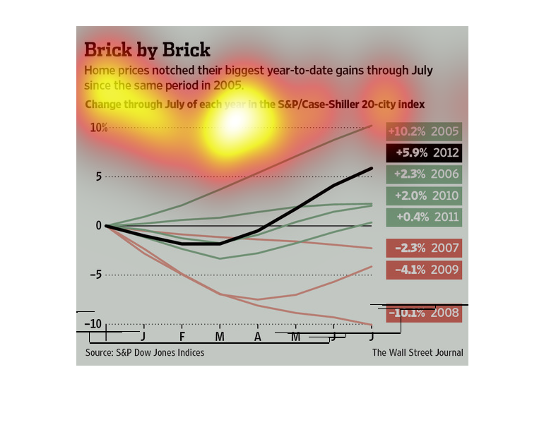
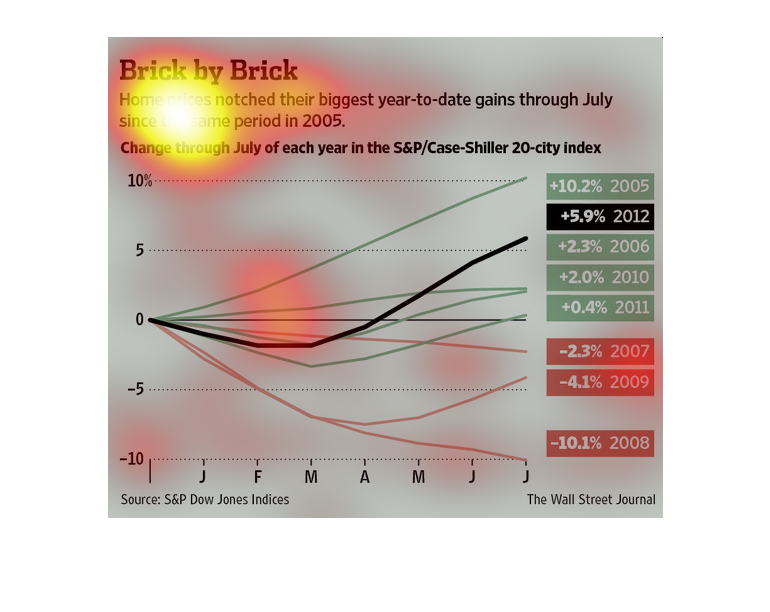
This chart describes brick by brick. Specifically, home prices notched their biggest year
to date gains through July, since the same period in the year 2005.

This image is detailing the amount of gains that home prices underwent within the same amount
of time in 2005. The home prices have "notched their biggest year to date."
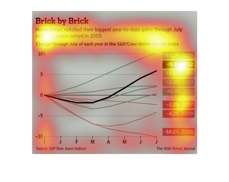
This image shows or depicts in statistical line graph format data concerning home prices notching
their biggest year to date gains through July since the same period in 2005.
This is a chart and related statistics depicting that home prices had notched their biggest
gains year to date through July 2006 as compared to the same period a year earlier.
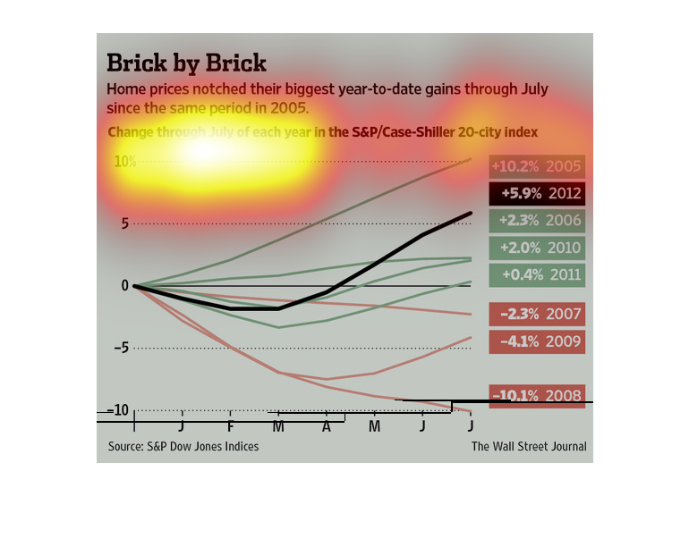
A char infographic showing the rise in home prices in the year previous for the year 2012.
It shows in 2012 there was an average 5.9% increase in home values
The image depicts how home prices have increased to their biggest year-to-date gains through
July since the same period in 2005. From 2005-2012. 2005 had the highest increase at +10.2%,
with 2008 having the largest fall of -10.1%
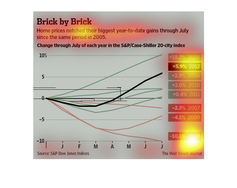
The chart depicts gains in home prices during the same period of each year from July 2005
to July 2012. Info is provided by the S&P Dow Jones, and the S&P Case-Shiller 20 city index.
 The chart shows a significant decline in 2008, with similar decreases in 2007 and 2009.
The gains pick up again in 2006 with an increase of 2.3%, and are highest in 2005 with the
greatest increase of 10.2%.
This is is a color coded chart depicting how home prices had shown their biggest year to date
gains through July 2006 as compared with the same period a year prior.
This chart describes brick by brick. Specifically, home prices notched their biggest year
to date gains through July since the same period in the year 2005.
This graphic provided by the Wall Street Journal, showcases the fact that homes have gone
up in price since the recession, furthering a gigantic divide in affordability for the less
affluent.
This chart shows how home prices have gone up year to date from July since the same period
in 2005 since July in each year. The rise shows a change in home prices.
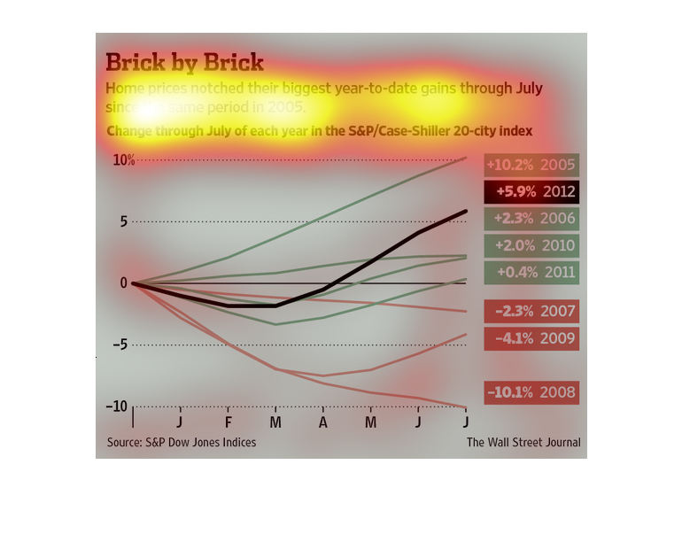
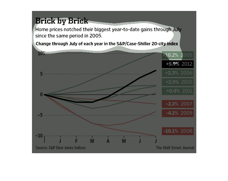
This chart shows the change in house prices through July in each year since 2005. in 2005
prices rose 10.2% by July in 2005 and 5.9% by July in 2012. House prices dropped 10.1% by
July in 2008.
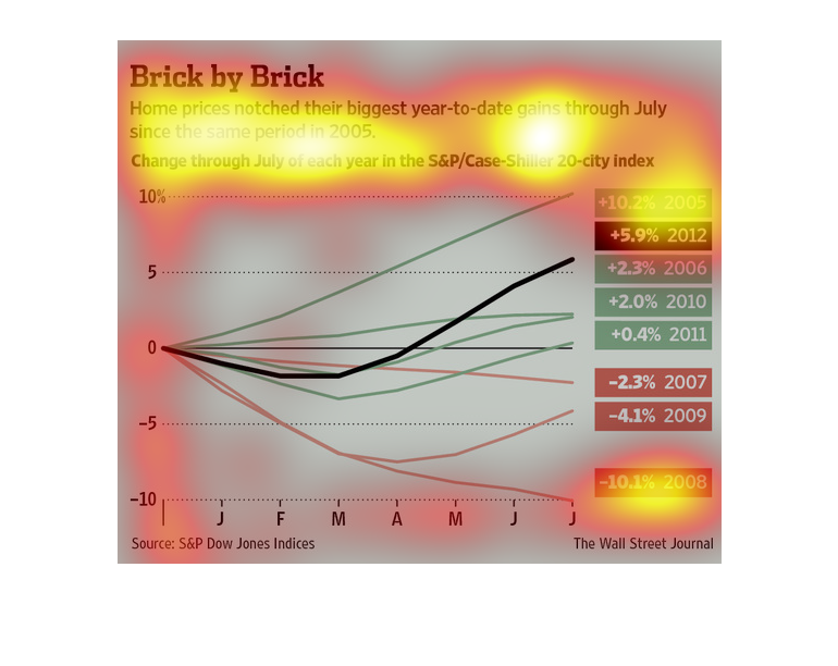
This is a Wall Street Journal article that reports that home prices have had their biggest
year-to-year gains  since 2005 as indicated by the S&P Dow Jones Indices.