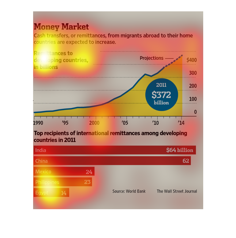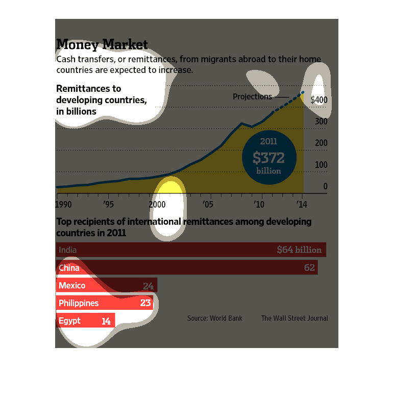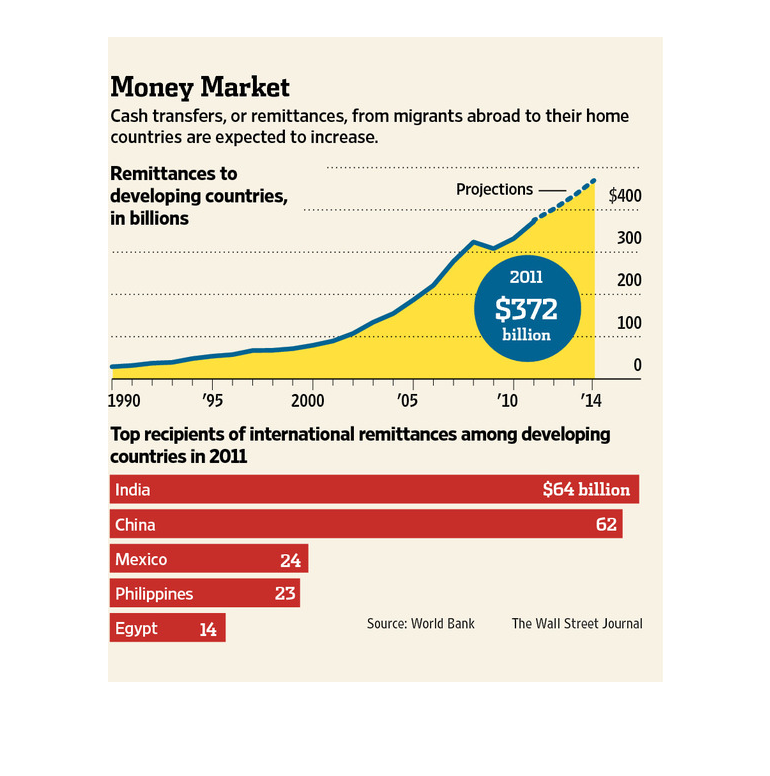
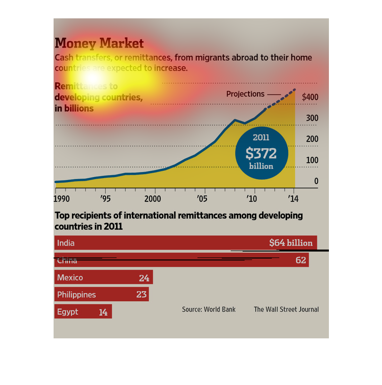
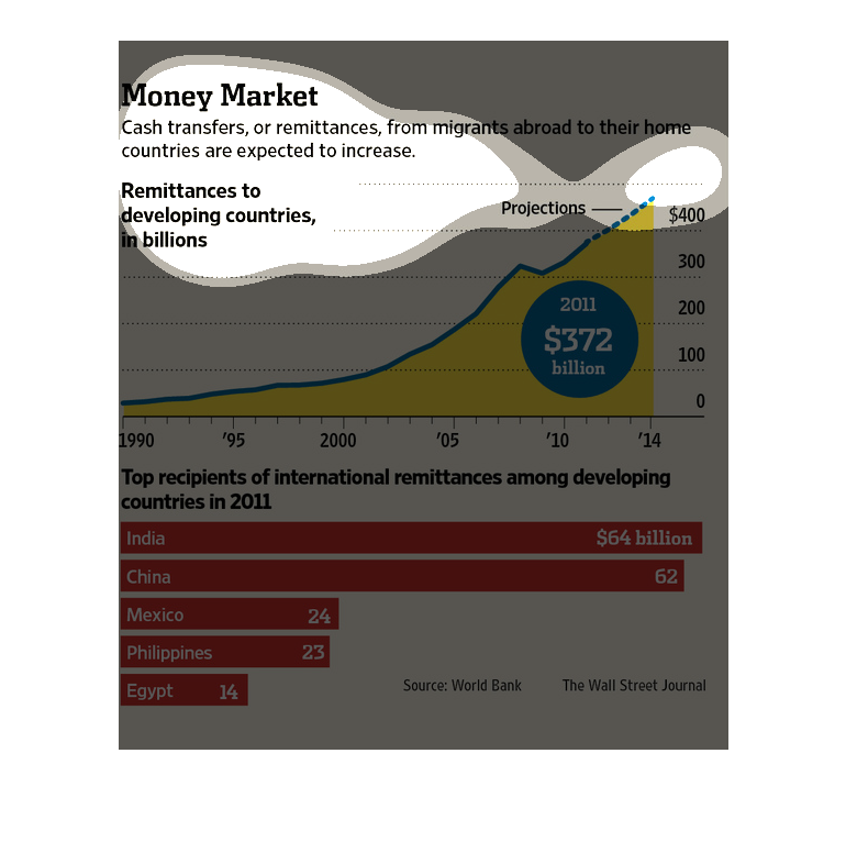
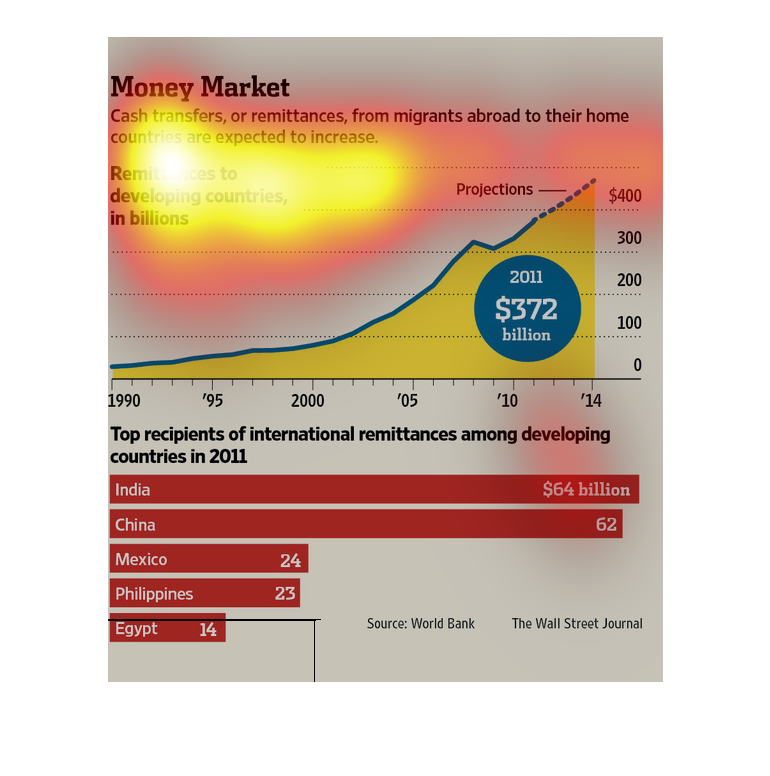
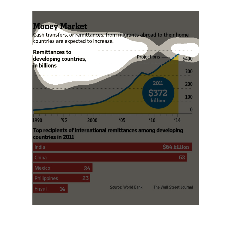
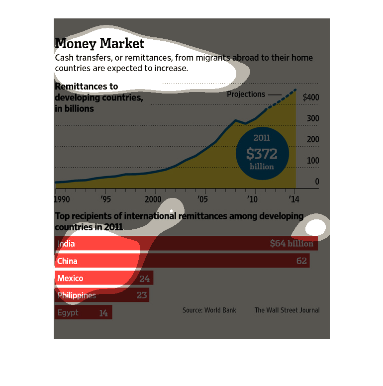
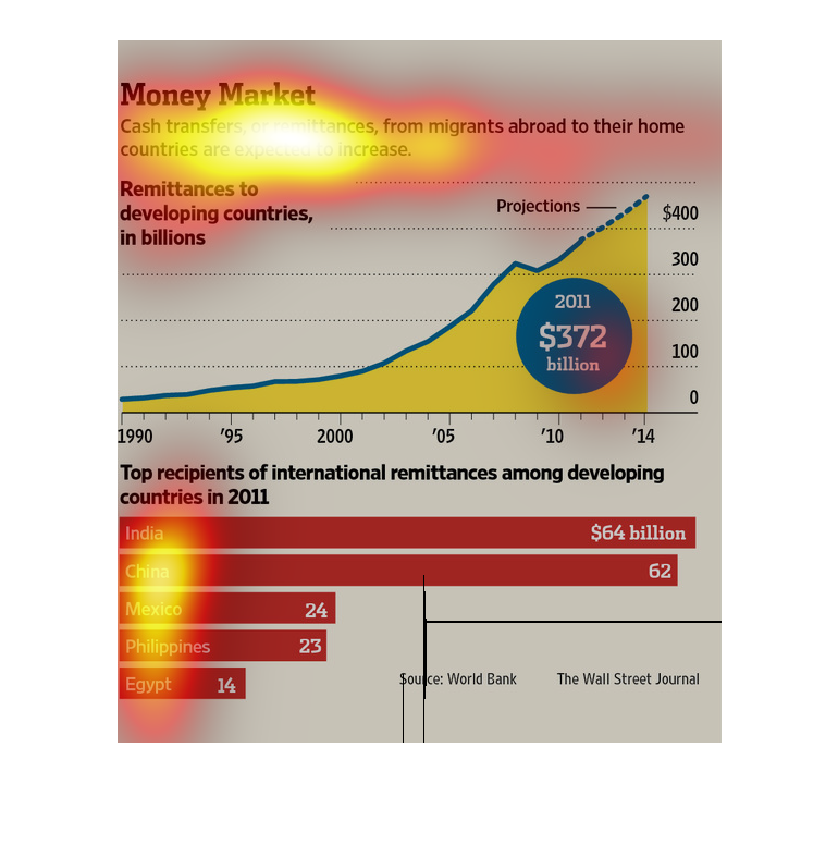
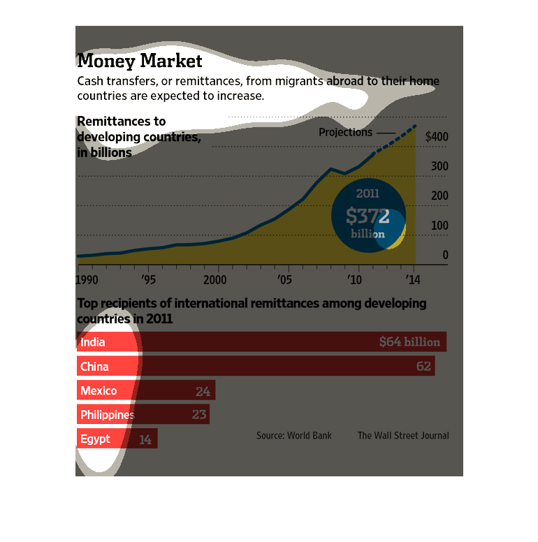
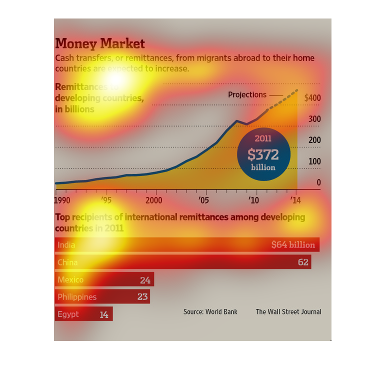
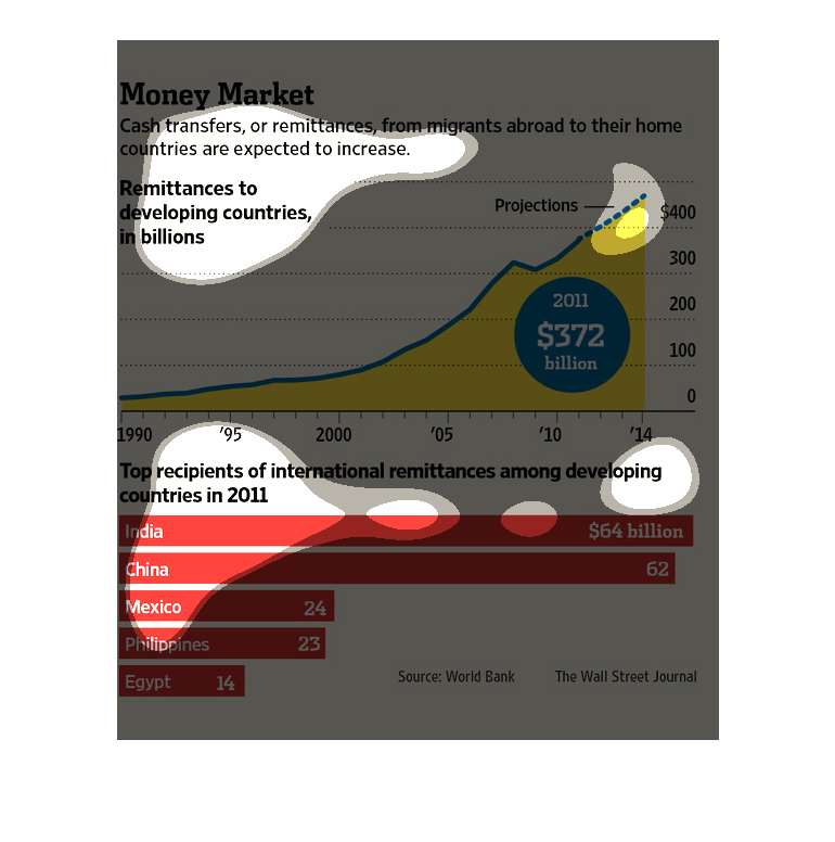
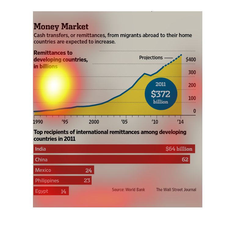
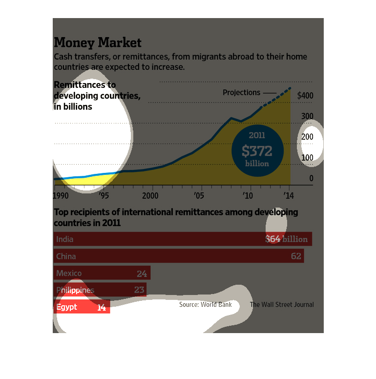
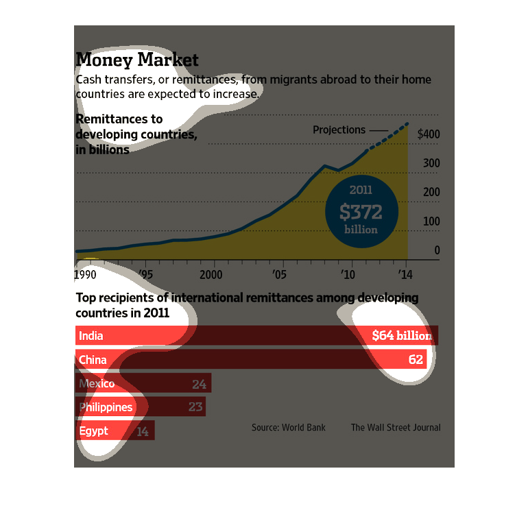
This image is detailing the transfer of money from migrants to their home countries. These
transfers are also called remittances. The image says that it is likely for these remittances
to increase, and projected remittances are in the 400 billion range. It also shows the top
remittances of 2011, of which India is top $64 billion.
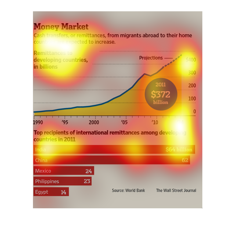
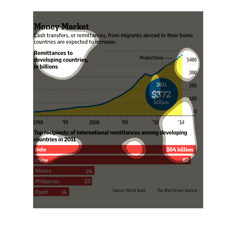
This chart describes money market. Specifically, cast transfers, or remittances, from migrants
abroad to their home countries are expected to increase.
This is a series of charts and graphs depicting that cash transfers, or remittances, from
migrants abroad to their home countries are expected to increase.
This is a series of bar graphs and charts depicting that cash transfers from migrant workers
abroad to their home countries were expected to increase.
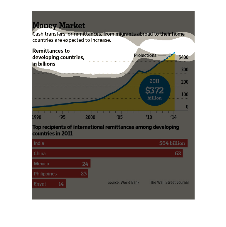
The following chart suggests that cash transfers or remittances will increase from migrants
abroad to their home countries. The data was shown from 1990 to 2014 and shows India being
the number one recipient.
The image depicts the cash transfer, or remittances, from migrants abroad to their home countries
are expected to increase. The image explains how migrants are making money in wealthier countries
abroad, and sending an ever-increasing number of monies back to their families in their countries
of birth.
this is a Money Market chart that states that cash transfers from migrants to their home countries
will continue to increase. The money transfers are reported to be in the billions. The chart
tracks from 1990-2014 the highest recipients are India.
The image depicts the manner that consumer spending trends have changed for U.S. consumers.
 It stands to be the case that the costs of necessities have caused consumers to be able to
allot more money toward other wants and desires.  The images depicts a chart detailing the
trends for different areas on which money is commonly spent, over a span of decades in America
(from the 1900s through 2000s).   In addition, another chart depicts  the amount of money
consumers presently allot toward different areas, based on the total average annual spending--utilities,
healthcare, vehicles, education, entertainment, etc.
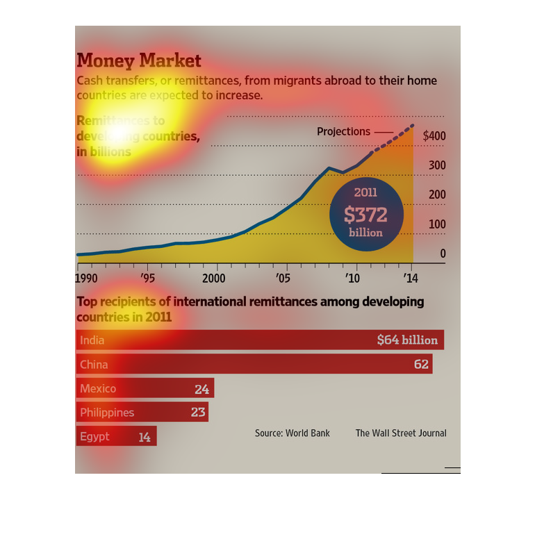
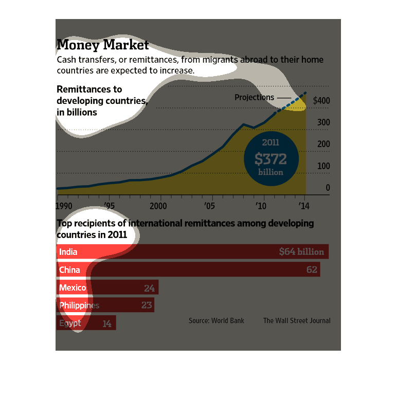
Two different graphs with "Money Market" as the title. The first one details Remittances to
developing countries in billions. The second one is a bar graph focused on Top recipients
of international remittances among developing countries in 2011.
This chart describes money market. Specifically, cash transfers, or remittances, from migrants
abroad to their homes countries are expected to increase.
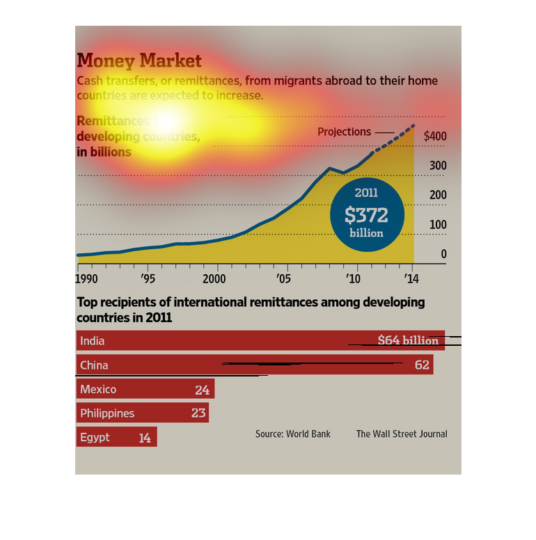
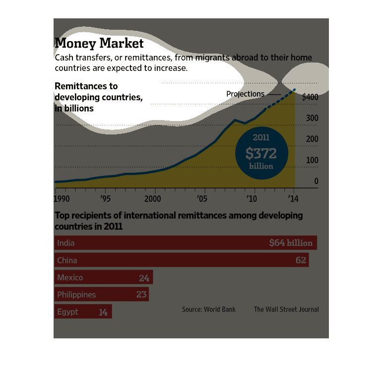
This chart shows the amount remittances of migrants working abroad to their home countries
in billions. in 1990, remittances were less than $billion, they are projected to be around
$400 billion in 2014. India and China both receive over $60 billion. Mexico receives 24 billion.
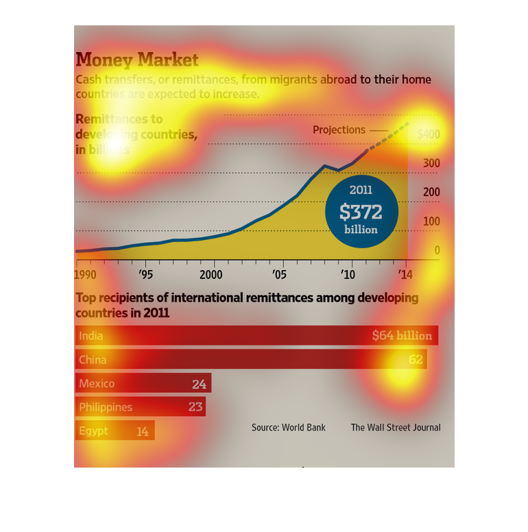
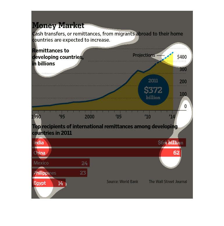
The graph discusses the amount of money transferred from migrants into their home countries
and how it has increase from less than $100 billion in 1990 to $400 billion in 2014. Below
it shows the top developing countries which receive the money and how much. India taking the
lead among those with$ 64 billion in 2011.
This graph shows the amount of money that countries receive from migrant workers that send
money back to their home countries. India received $64 billion, China  received $62 billion,
Mexico received $24 billion, Philippines received $23 billion, and lastly Egypt received $14
billion.
This is a Wall Street Journal article reporting that cash transfers or remittances from migrants
abroad to their home country are expected to increase.  By 2014, the amount is project to
reach $400 billion.
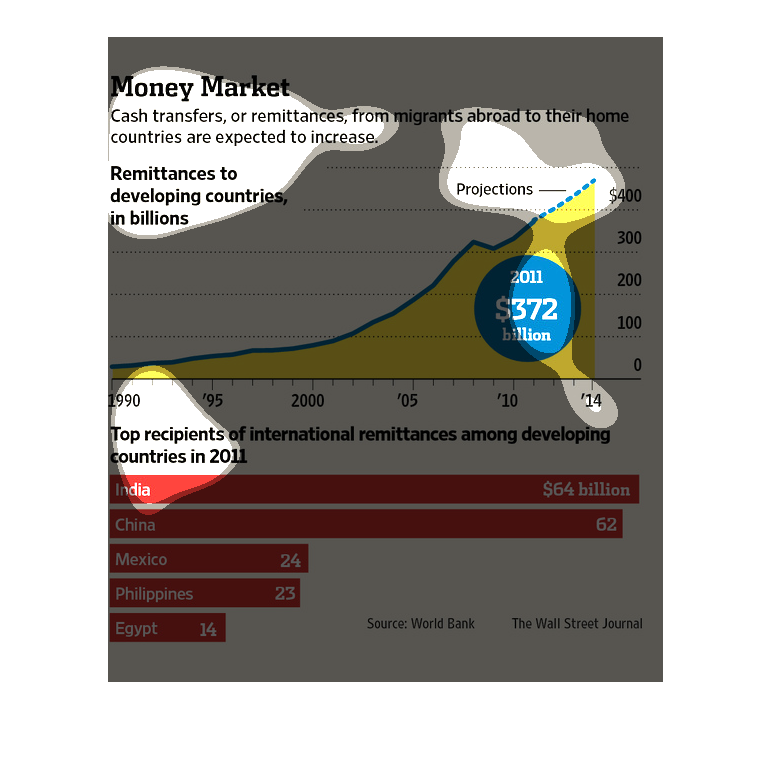
Remittances from immigrants to their home countries have increased dramatically from 1990
to 2014. Indian and Chinese guest workers return the most money home, but Mexican, Philippino
and Egyptian workers return billions of dollars, as well.