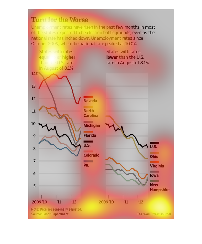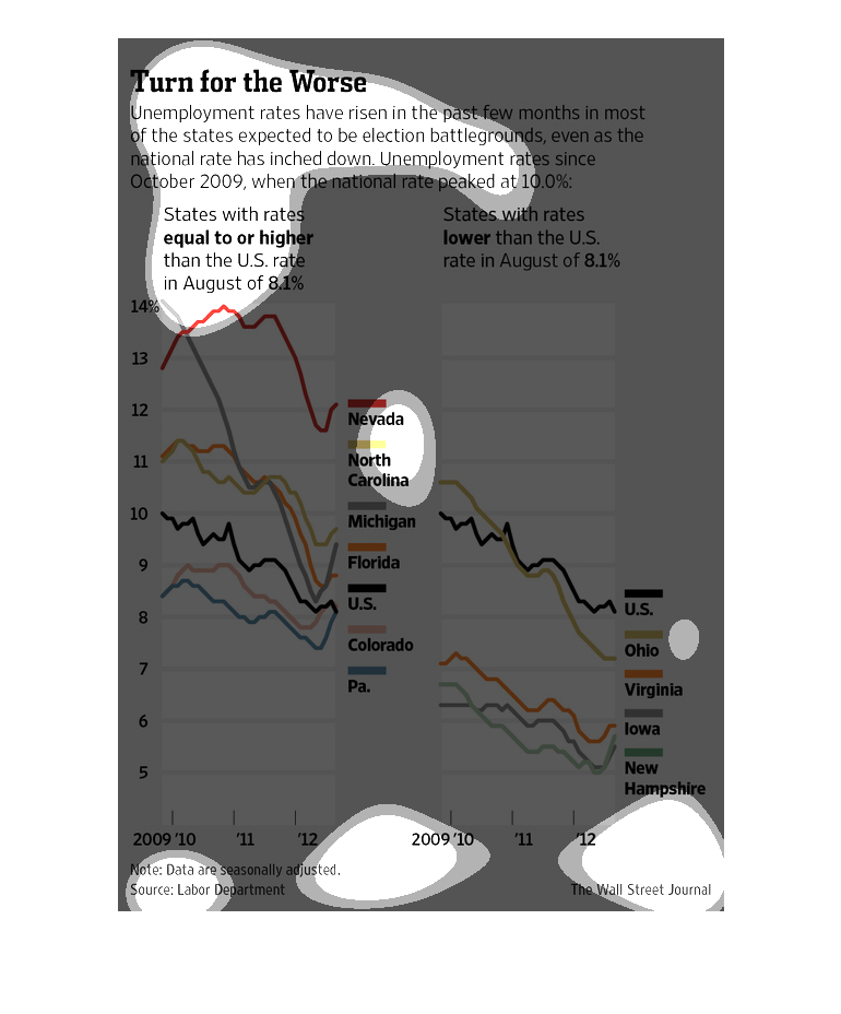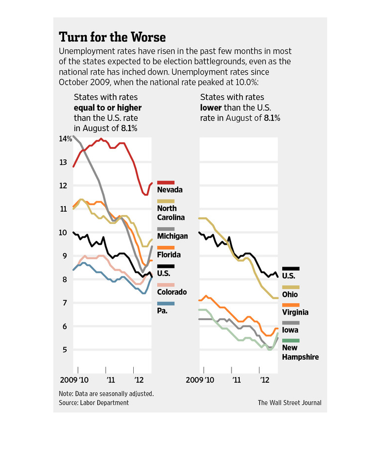
This image shows or depicts in statistical in a line graph format the data concerning the
worsening trend in unemployment rates across the US since 2009.
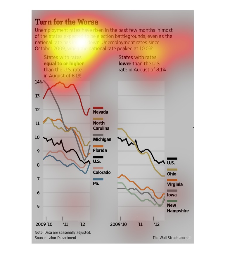
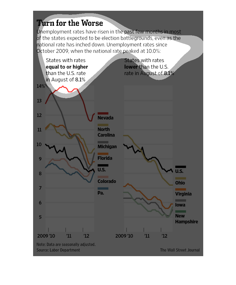
The following chart showed that unemployment rates had risen during 2012. This happened in
many of the swing states that are crucial for the presidential election.
The image depicts how unemployment rates have risen in the past few months in most of the
states which are expected to be battleground states, even though the national unemployment
rates have slightly decreased.
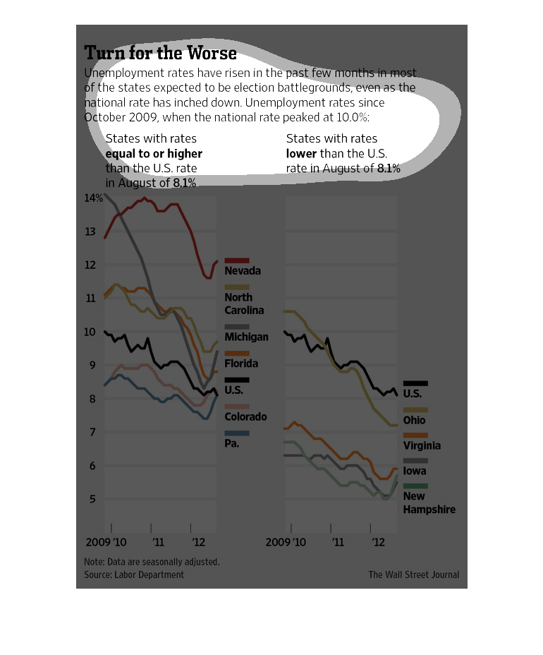
This chart describes turn for the worse. Specifically, unemployment rates have risen in the
past few months in most of the states expected to be election battlegrounds.

Study done in 2009 showcases that unemployment is on the rise in various sectors in the United
States of America. The study goes into detail, and breaks down the information state to state.
This is a chart showing that unemployment rates were the worst since October 2009. The chart
shows Nevada with 14% unemployment before dipping to a little below 13%.
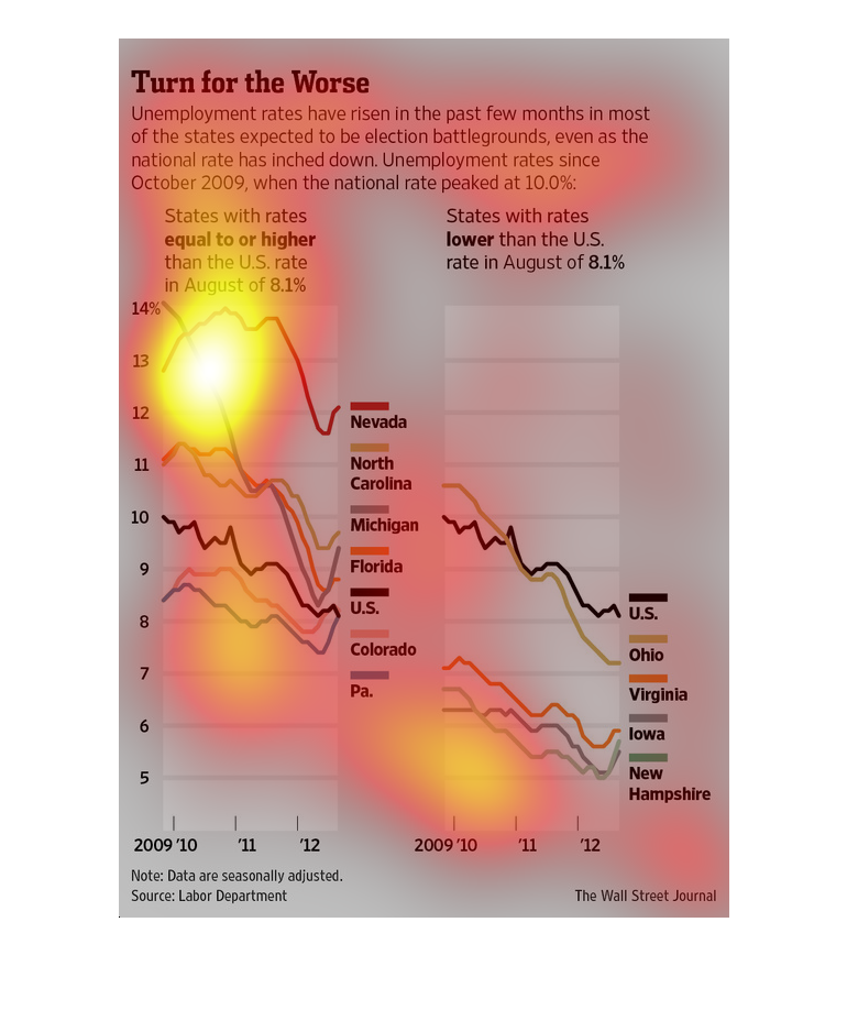
The chart shows a range of unemployment rates in US states.  States include Florida, North
Carolina, Nevada, Michigan, Colorado and Pennsylvania respectively.
This chart describes turn for the worse. Specifically, unemployment rates have risen in the
past few months in most of the states expected to be election battlegrounds.
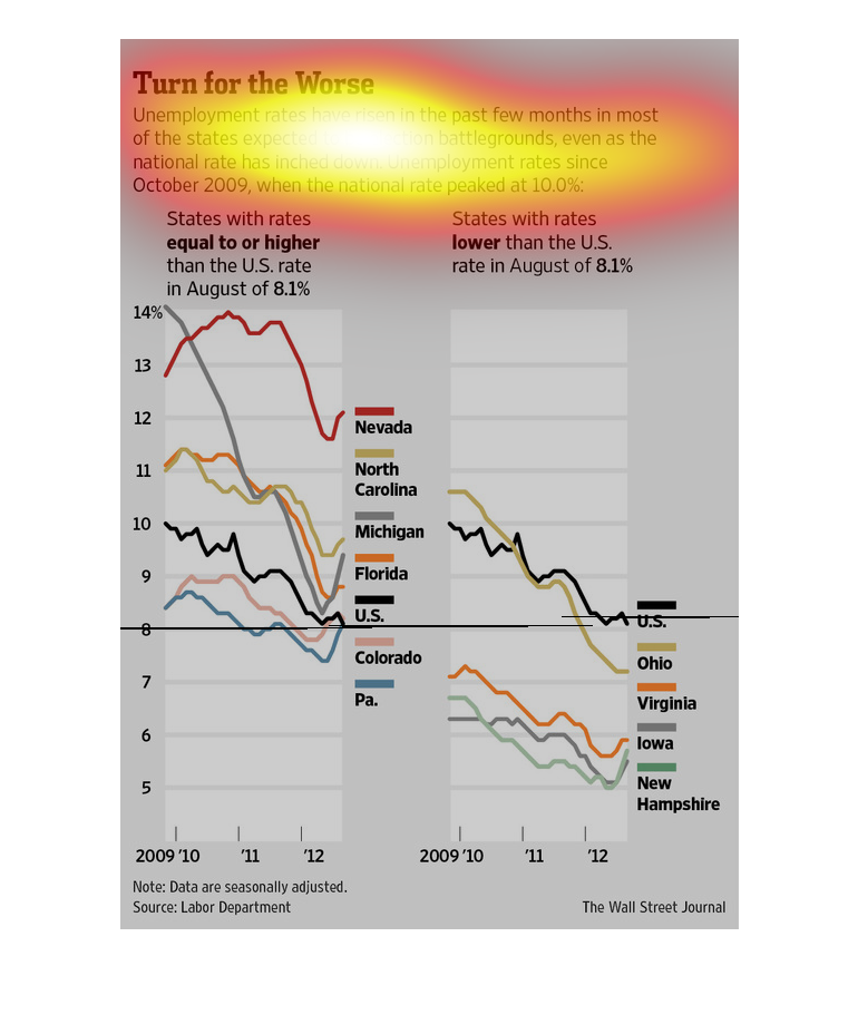
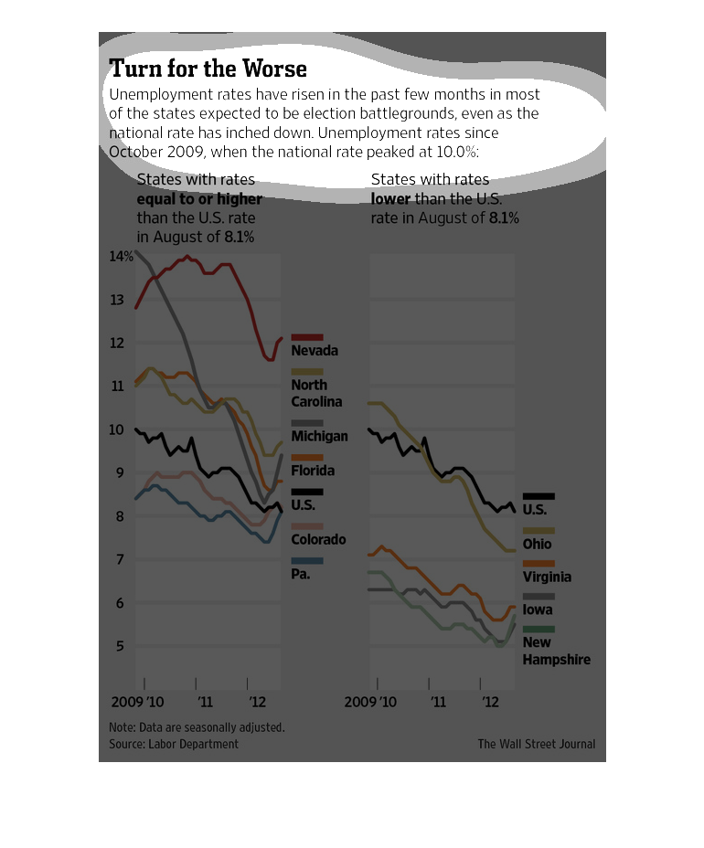
Turn for the worse. Unemployment rates have risen in the past few months in most of the states
expected to be election battlegrounds, even as the national rate has inched down. Unemployment
rates since 20090, when the national rate peaked at 10% What we see based on the line graph
representing various states is a mostly steady decrease and then a tail of rising unemployment
at the end.
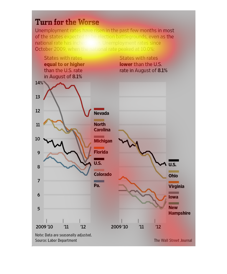
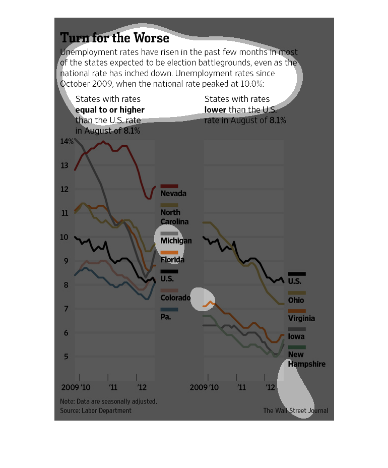
This is a series of color coded charts depicting that unemployment rates had risen in the
past few months in most of the states expected to be election battlegrounds in 2012.
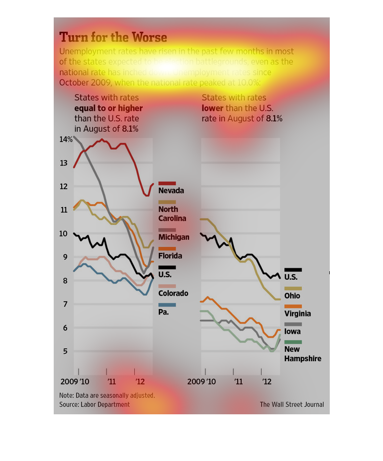
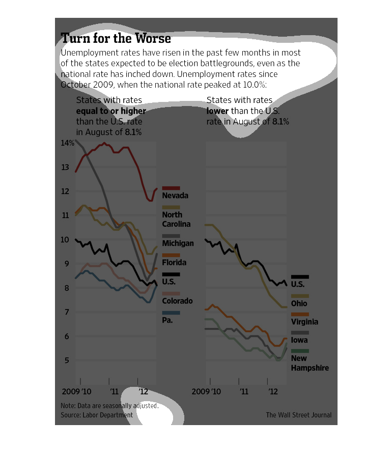
This chart shows the impending danger of ever increasing unemployment rate throughout the
United States. It indicates that along almost all of the states in USA, it is emerging as
most targeted and detrimental situation.
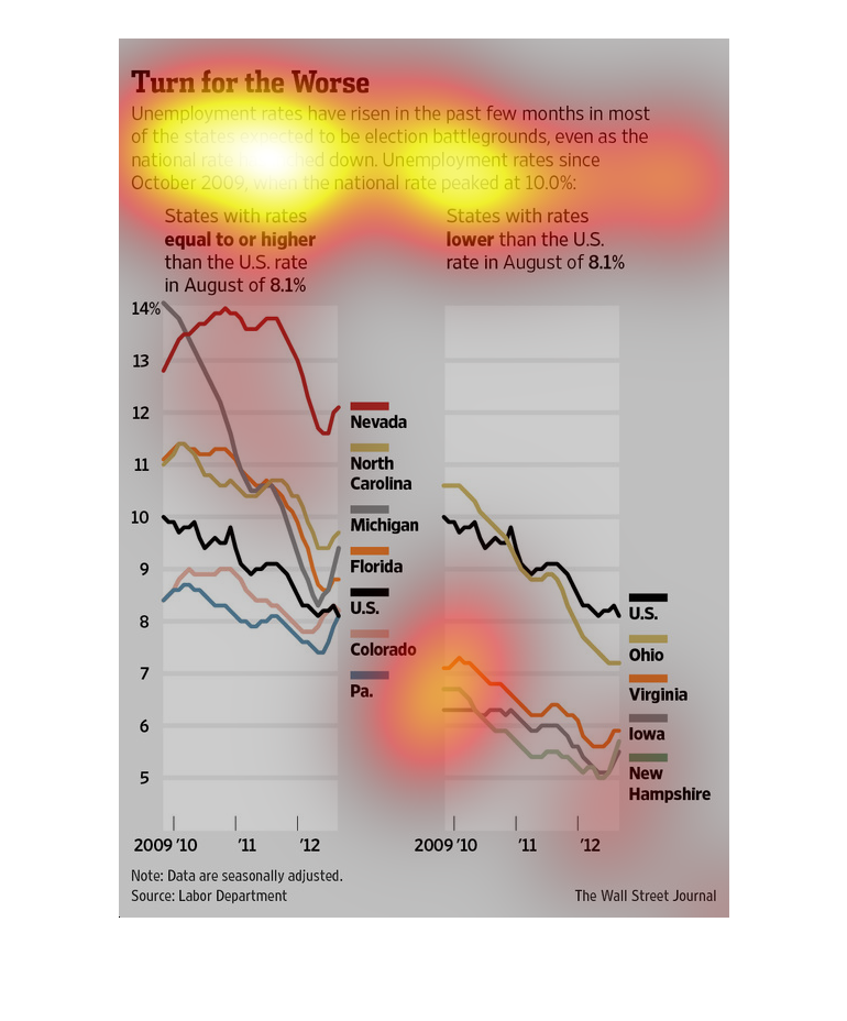
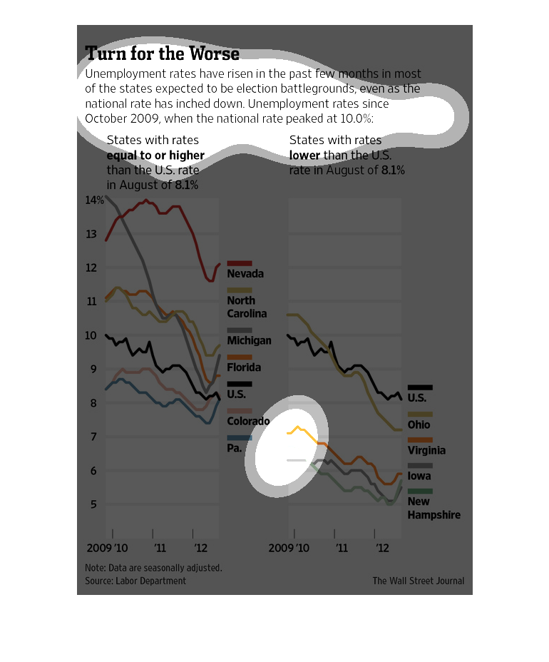
A chart infographic showing a rise in unemployment rates in recent months, a turn from shrinking
unemployment. It indicates the states where unemployment is increases are election battlegrounds
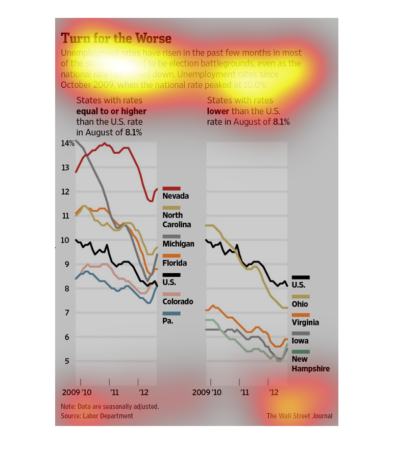
This chart shows the unemployment rates for several states as well as the national average
from 2009-2012. The unemployment rates have risen in the past few months in most of the states
considered to be battleground presidential election states even as the national rates have
lowered.
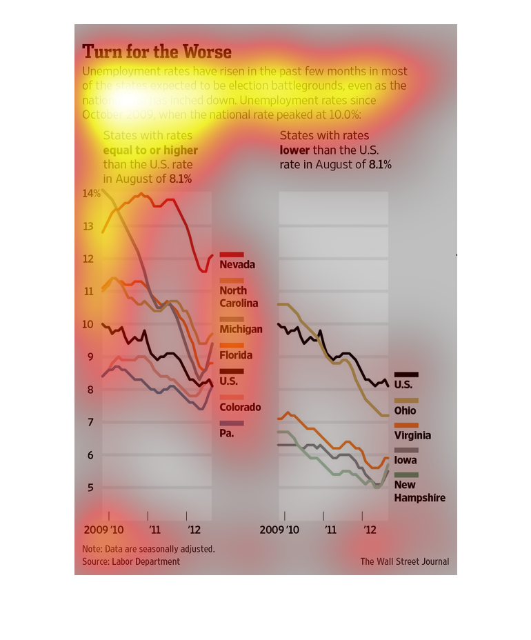
The title for this graph is, "A turn for the Worse"  The graph displays information on two
segments.   Unemployment rates equal to or higher than the US rate in August.  The second
segment measured for this data was states with rates of unemployment lower than the U.S. rate
in August.
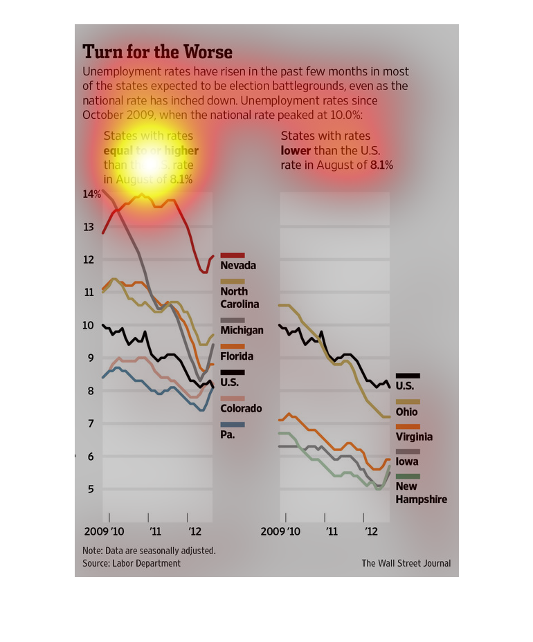
In this Wall Street Journal study, we find that alot of states are having a really tough time
during these lean years after the recession, and unemployment is on the rise.