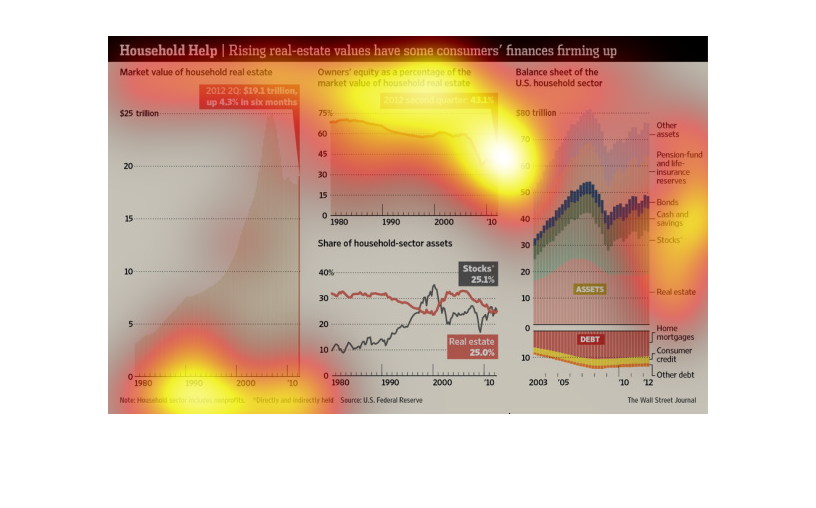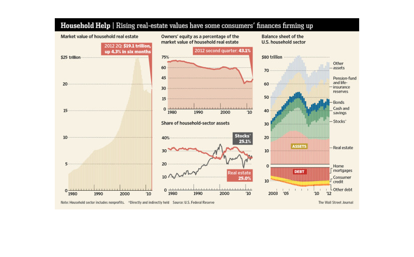
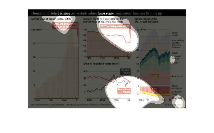
This is a series of charts and graphs with related statistics depicting that rising real-estate
values have some consumers finances firming up through the year 2010.
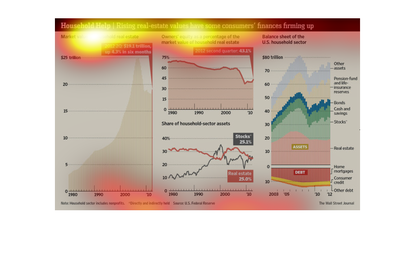
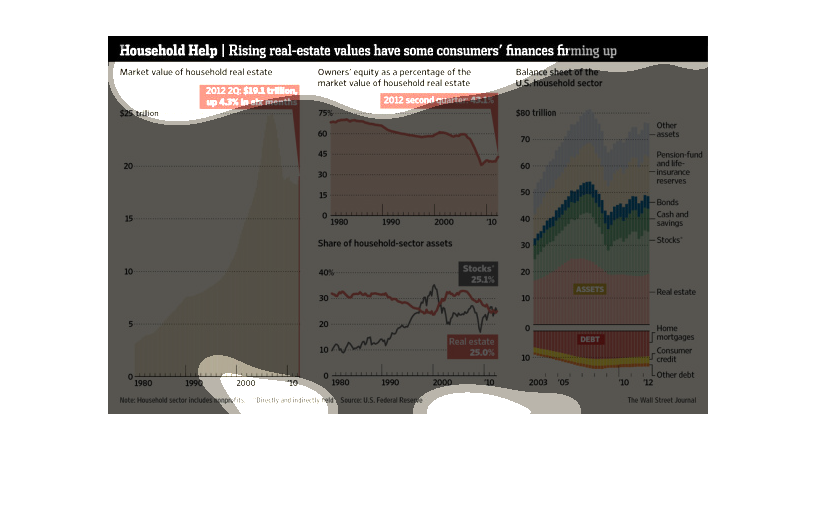
These images attempt to provide evidence that homeowner assets are improving due to rising
real estate value as well as returns for other investments such as stocks.
Home equity is a tricky thing that goes up and down; it is highly volatile and unpredictable.
In this study we see the turbulence of this housing situation take place.
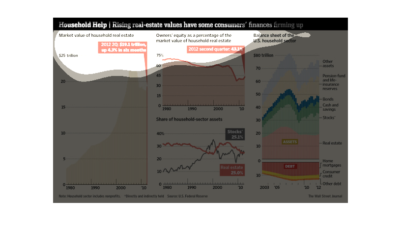
The following chart talks about the financial status of Americans since the housing bubble
market crises. It shows that housing values gone up along with the overall stock market and
that Americans are financially starting to be more stable. This data appears to come from
the year 2012
This is a chart showing Household help, rising real-estate values have some consumers' finances
firming up. It shows the values for the second quarter of the year 2012.
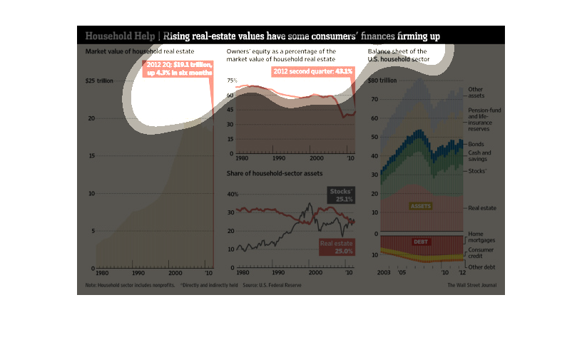
The image show 4 different graphs relating to rising real estate values. The first graph shows
the vast increase in market real estate from 1980 to approximately 2012, going from 4 trillion
in 1980 to about 25 trillion in 2007, but then dropping back to about 19 trillion in 2012.
The second graph shows owner equity as a percentage of real estate value, which has decreased
overall since 1980, but has started to rise since 2010. The third graph show the share of
household-section assets versus stocks. Both have fluctuated since 1980, but are within .2%
of each other in 2012. The final graph is a balance sheet of the U.S. household sector, in
which home mortgage and real estate seem to make up much smaller percentages of as opposed
to stocks, pensions and life insurance, and other assets.
This chart describes household help. Specifically, rising real-estate values have some consumers'
finances firming up. Different categories are represented by different colors.
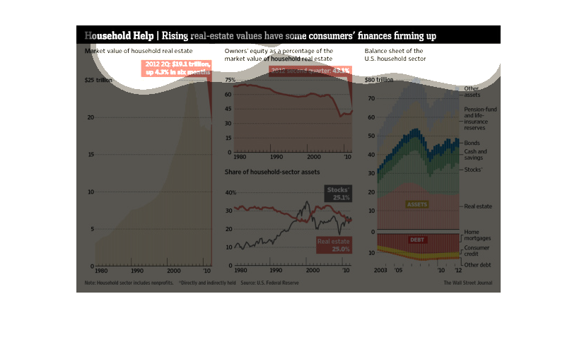
An infographic of market value of household real estate as compared to the owners equity to
the value of their home and a balance sheet of us household sector
This is a series of color coded charts and graphs depicting that rising real-estate values
have some consumers finances firming up as of data available in 2012.
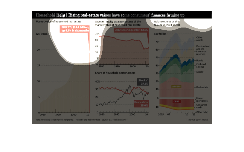
This is a chart showing different aspects of real estate. It shows the market value of houses
in one graph. It shows a graph of owners equity and a balance sheet. There is also an assets
graph.
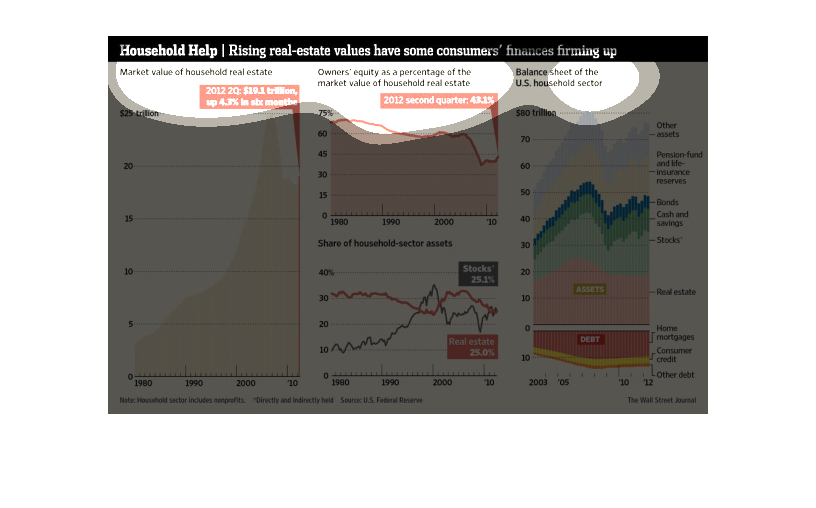
The image depicts how rising real estate values have some consumer financial firms feeling
more positive. The real estate markets seems to be, at the very least, stabilizing more so
than it has throughout the last few years.
This is a graphic that is illustrates that the rising real estate values have led to some
consumers finances firming up. It shows the years 1980 to 2010.
The image depicts how the rising real-estate values have some consumer financing firms feeling
better about the market. The markets have increased somewhat and show more stability since
the financial implosion around 2008.
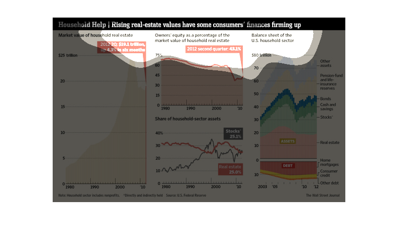
This chart shows the value of residential real estate significantly in the period 1980 - 2010
as the owner's equity in these homes plummeted from over 70% to under 45% in the same time
period.   The chart also shows personal balance sheet amounts for the period.