This chart shows a comparison of some us states and the average salary people make in each
state listed. It also shows weather the mean income in each state is rising or falling
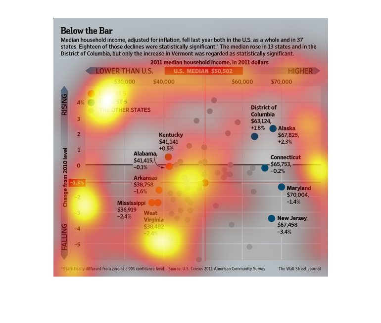
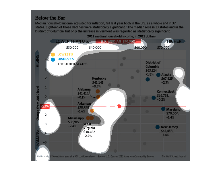
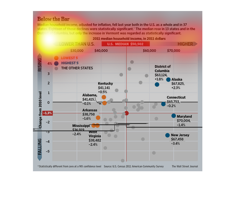
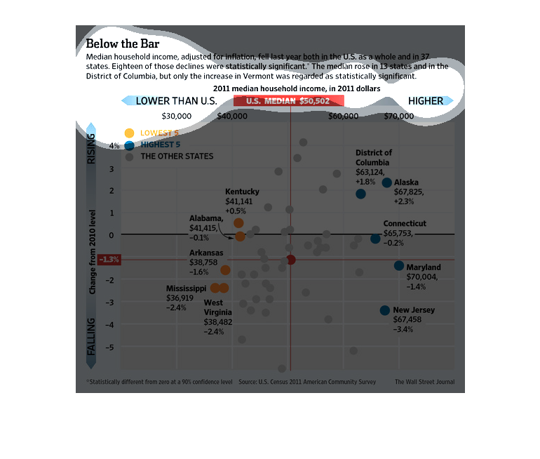
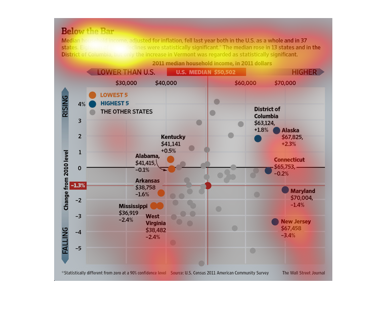
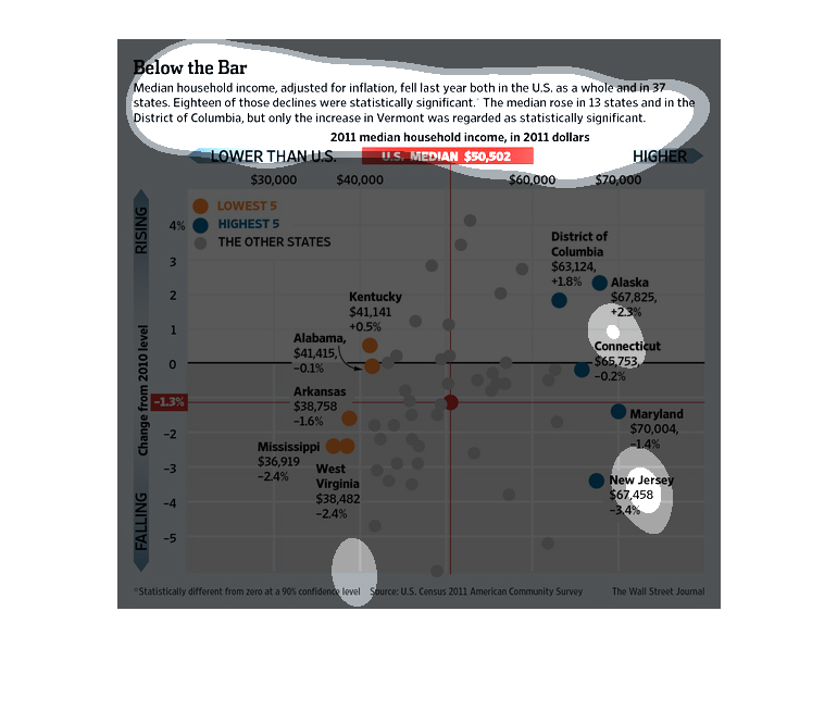
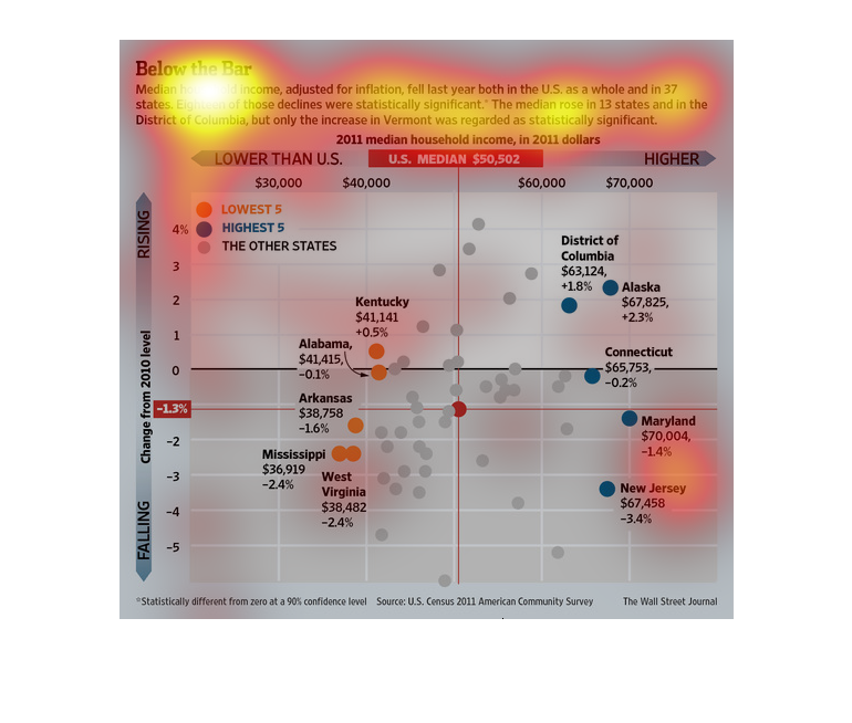
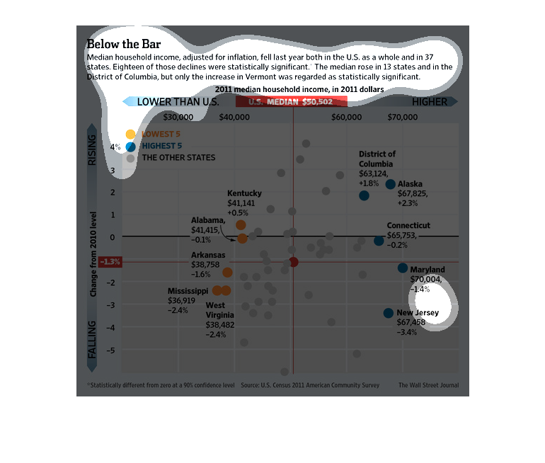
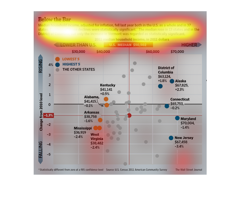
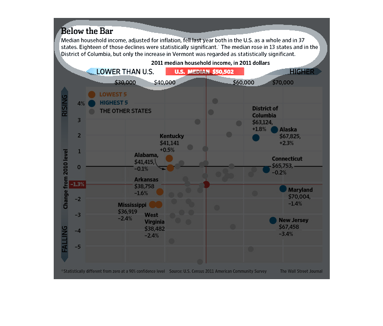
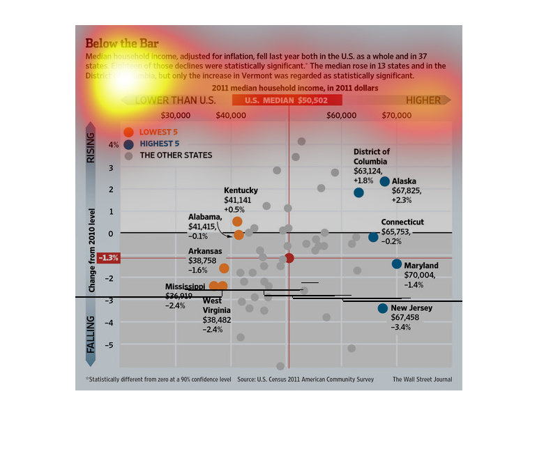
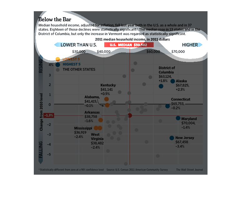
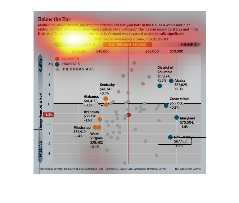
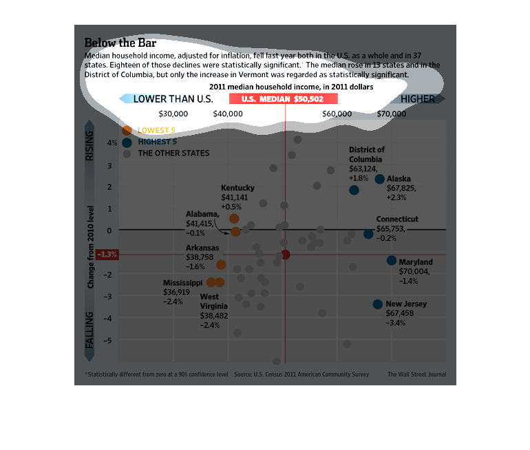
This graph shows Below The Bar, median household income adjusted for inflation in the US and
in 37 states. Eighteen of those declines were significant. The median rose in 13 states and
in the District of Columbia, but only the increase in Vermont was regarded as statistically
significant. The graph studies show the median for 2011.
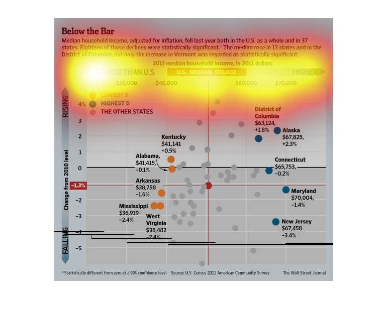
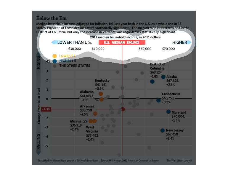
This image shows or depicts in percentage statistical format data concerning areas around
the US that median household incomes adjusting for inflation have fallen in 2011.
This chart compares median household income change over one year. Median income dropped in
37 states, 18 of those were statistically significant. Median income rose in 13 states, but
only one of those, Vermont, was statistically significant.
This chart shows the change in median household income in the 50 states. 18 have had significant
declines. 13 have had increases, but only Vermont's has been statistically significant. New
Jersey had the most significant decline, 3.4%.
This is a color coded plot line chart and related statistics depicting that median household
income, adjusted for inflation, fell in the previous year.
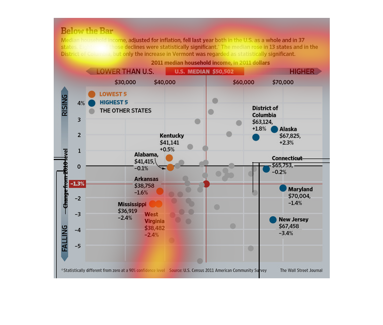
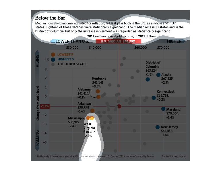
The image depicts median household income, adjusted for inflation, as haven fallen in the
year studied both in the US as a whole and in 37 states. The data indicates that incomes have,
in fact, fallen and/or stagnation has taken place.
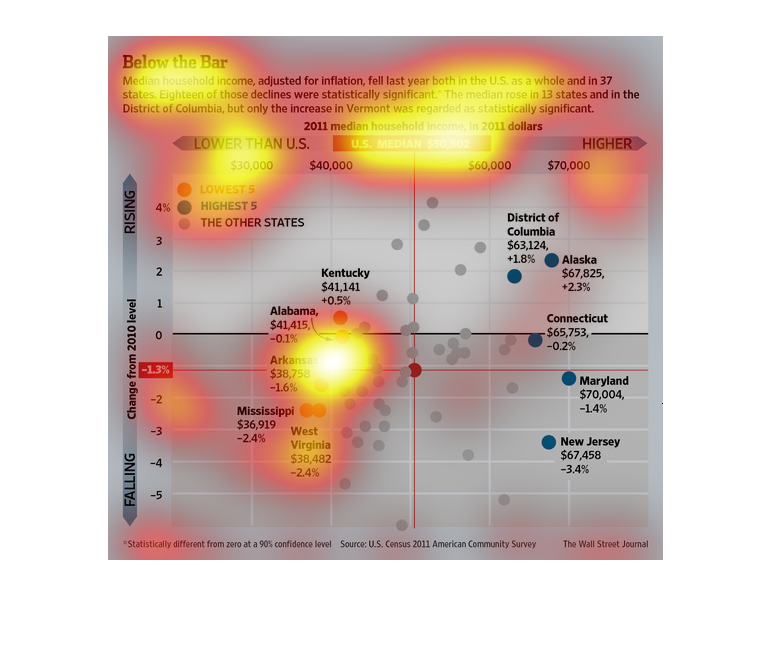
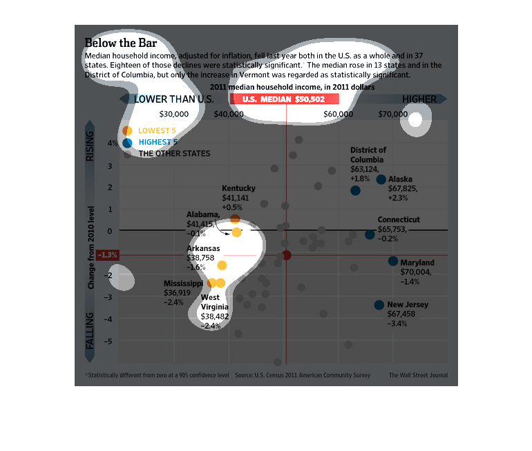
This chart describes below the bar. Specifically, median household income, adjusted for inflation,
fell last year, both in the United States as a hold and in 37 states.
The image depicts the median household income adjusted for inflation fell last year both in
US as a whole and in 37 states. The median rose in 13 states, with 18 states citing a statistically
significant decrease.
the chart of the median household income in Washington DC and to the surrounding states throughout
the years and the percentages increasing or decreasing.

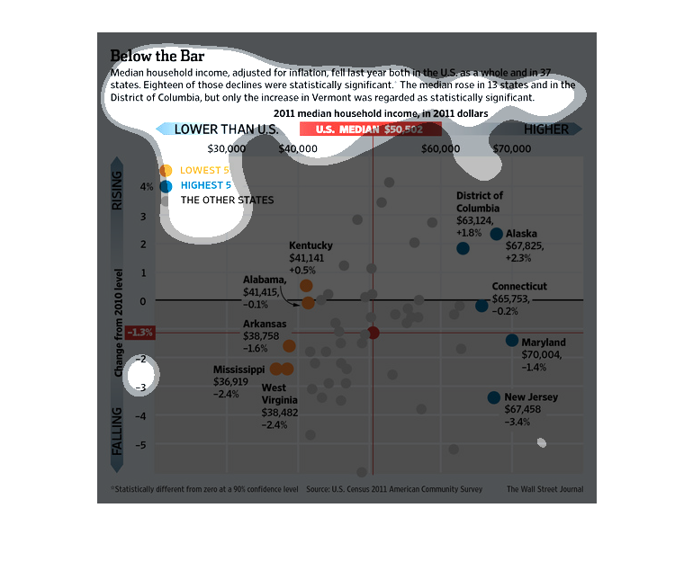
This is a graphical plot line/chart depicting that median household income, adjusted for inflation,
fell last year both in the US and as a whole and in 37 states.

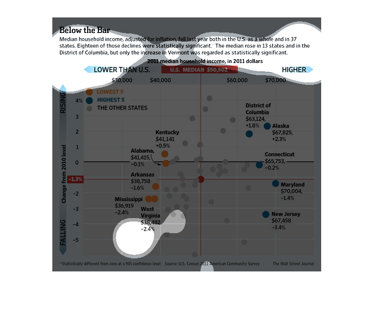
This chart describes below the bar. Specifically, median household income, adjusted for inflation,
fell last year both in the U.S. as a while and in 37 states.